Doublemint Mints Packaging
Topics
Details
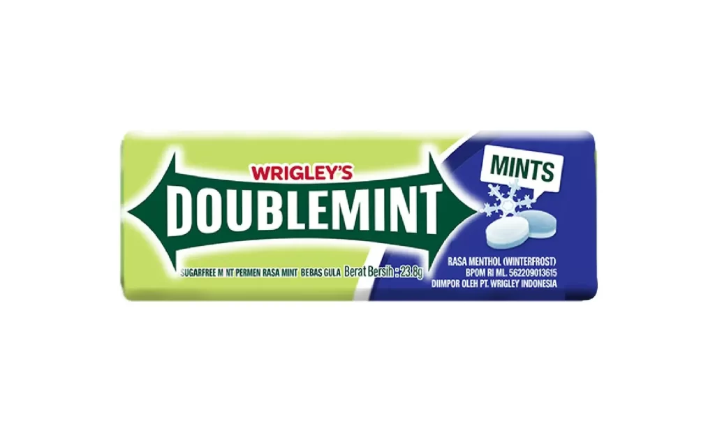
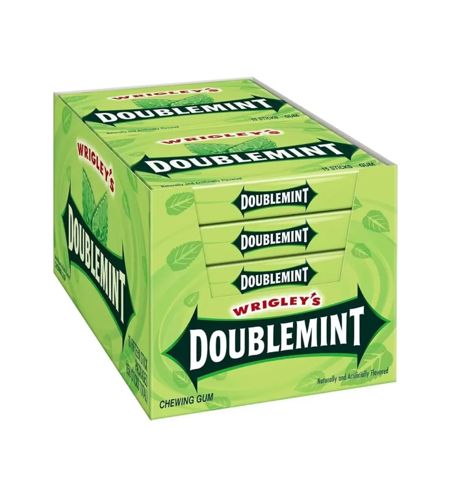
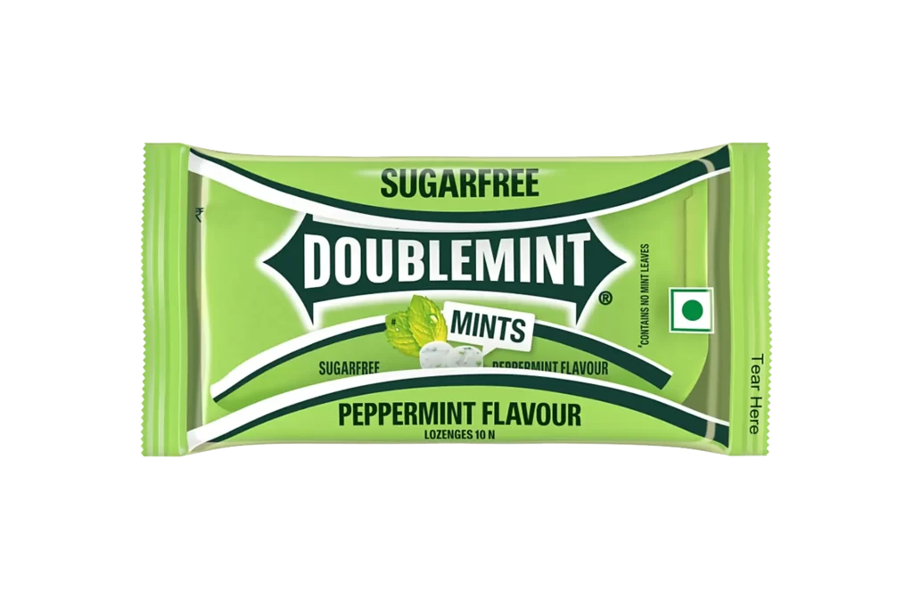
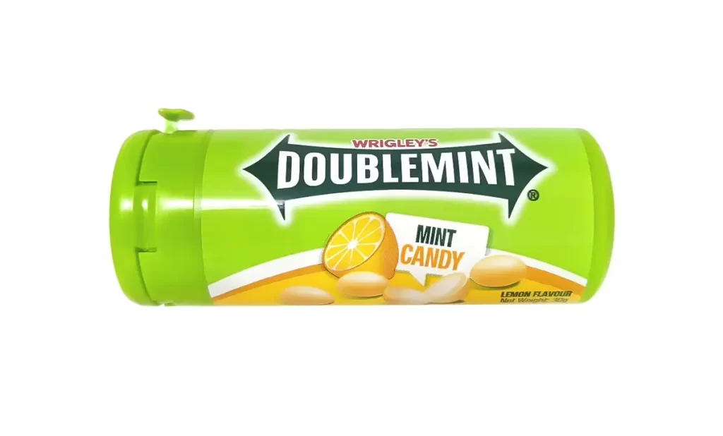
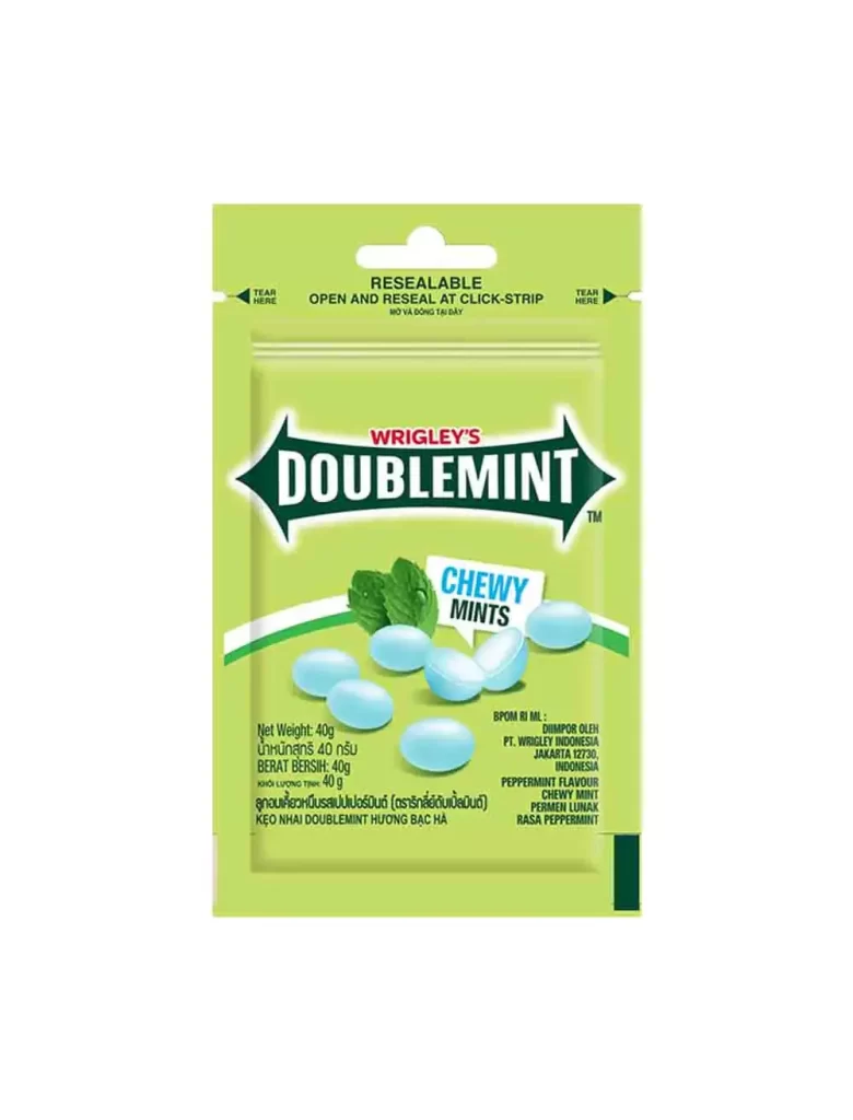
A vibrant lime-green sachet dominates the frame, featuring a resealable click-strip mechanism at the top with distinct tear notches on either side. The central branding consists of the 'WRIGLEY'S' name in red above a bold, white 'DOUBLEMINT' logotype set within a dark green, arrow-shaped shield. Below this, realistic illustrations of pale blue chewy mints are scattered alongside fresh mint leaves, while multilingual text detailing the 40g net weight and peppermint flavor occupies the lower portion against a clean, neutral background.
Visual interest is generated by the sharp contrast between the acidic green background and the cool blue tones of the product imagery. The packaging architecture cleverly balances functional elements like the resealable header with decorative graphics that emphasize freshness. Furthermore, the inclusion of multiple languages—ranging from Thai and Malay to Indonesian and Vietnamese—signals a broad regional distribution strategy that adds textural complexity to the layout.
Brand historians analyzing Wrigley's market expansion in Southeast Asia would find this specific variant invaluable for tracking visual identity shifts. Packaging engineers could study the practical application of the click-strip closure system shown here to improve their own flexible pouch designs. Additionally, color theorists might utilize the specific palette of mint greens and icy blues to research effective hue combinations for oral care products.