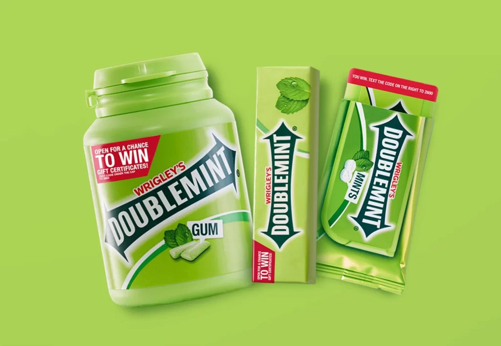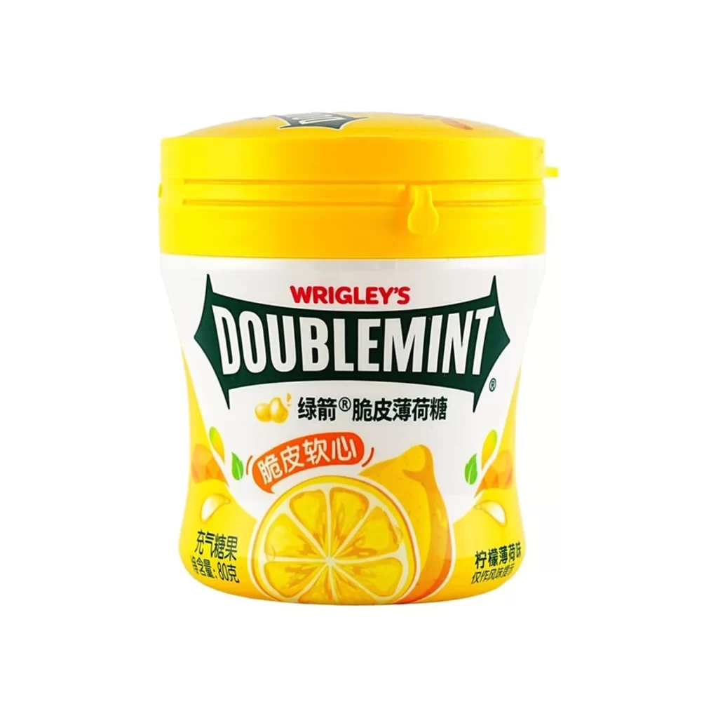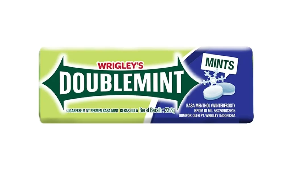
Doublemint Gum Packaging
Topics
Details
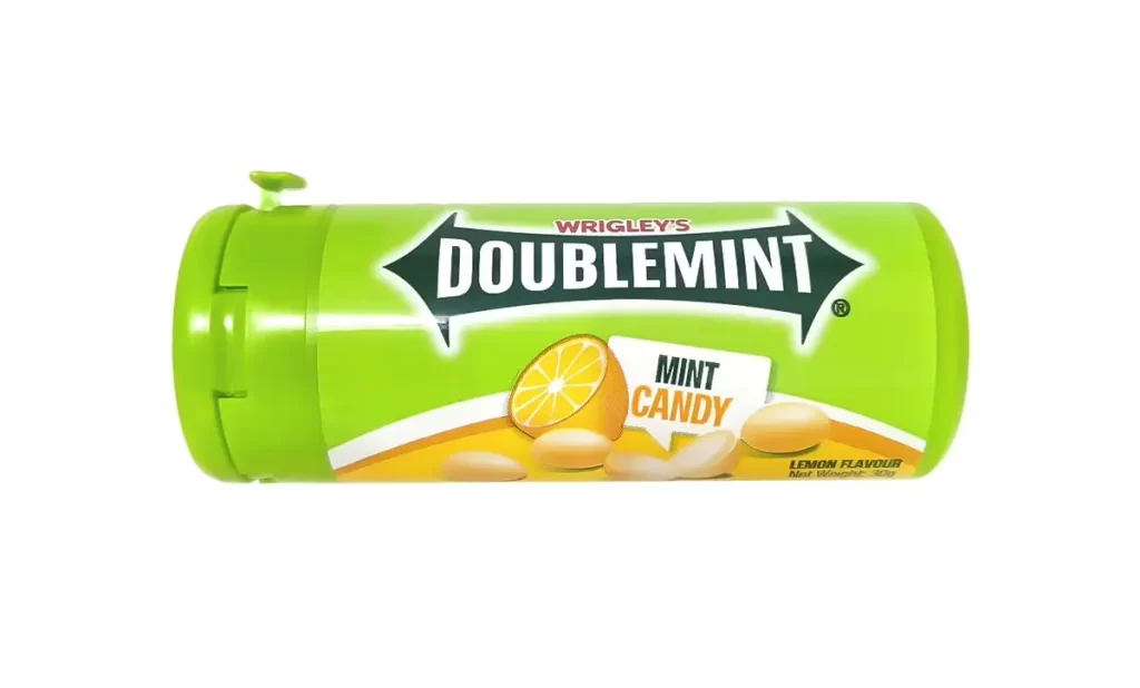
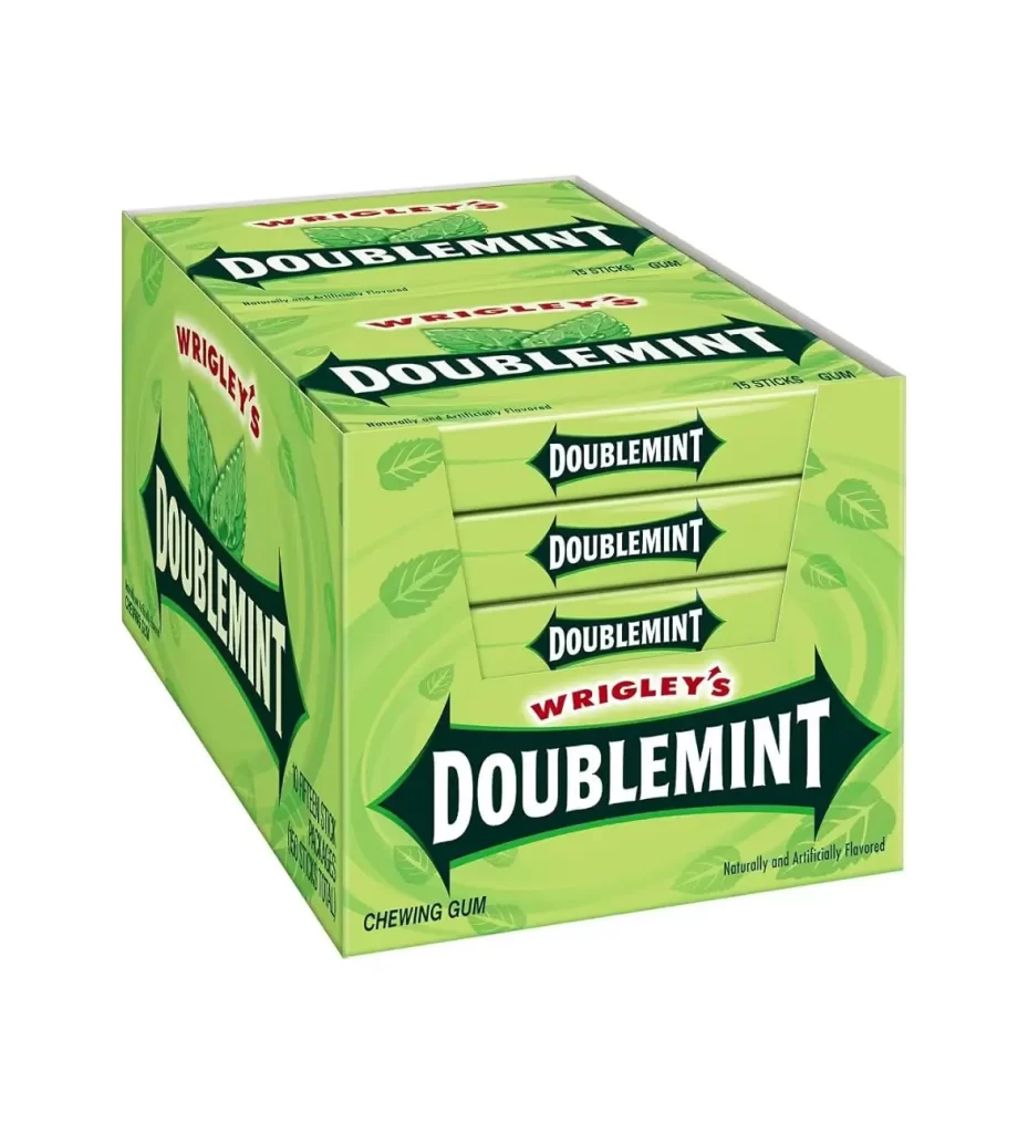
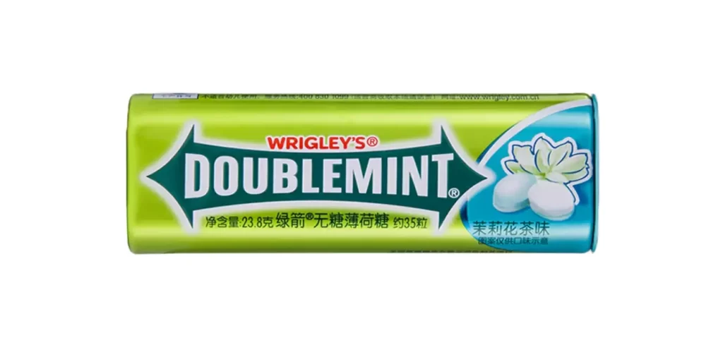
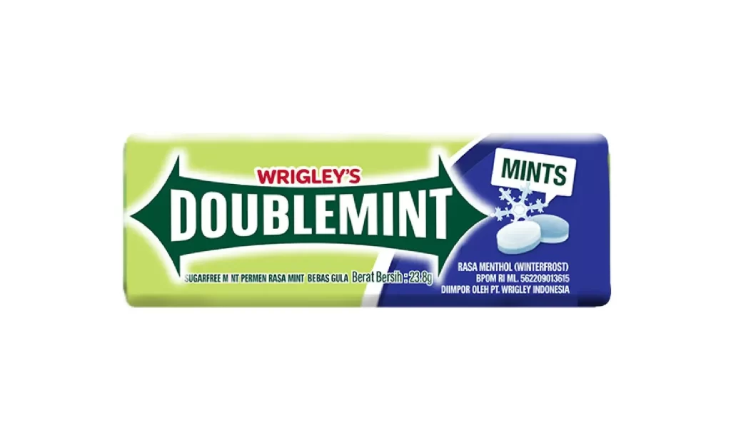
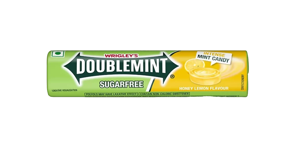
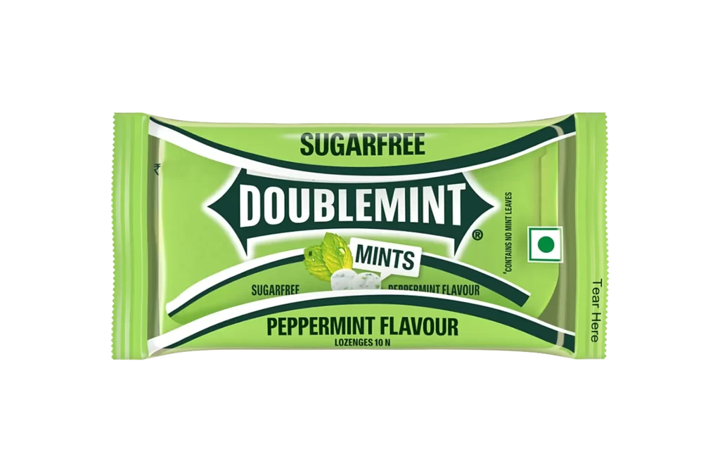
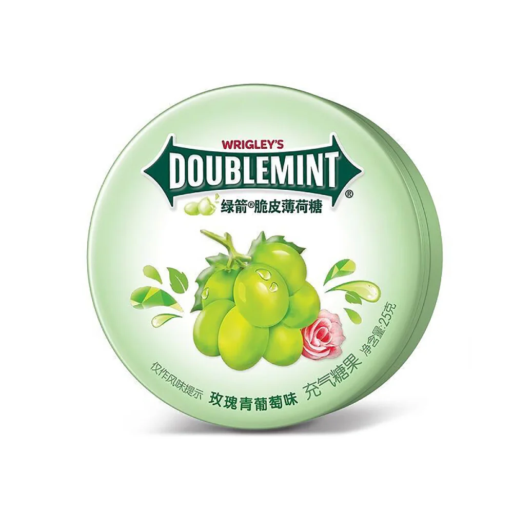
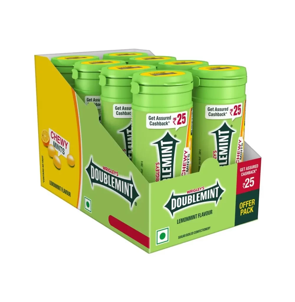
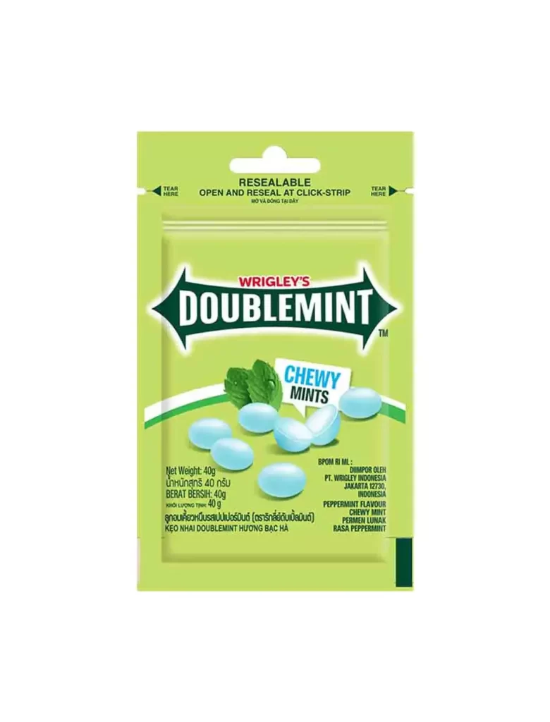
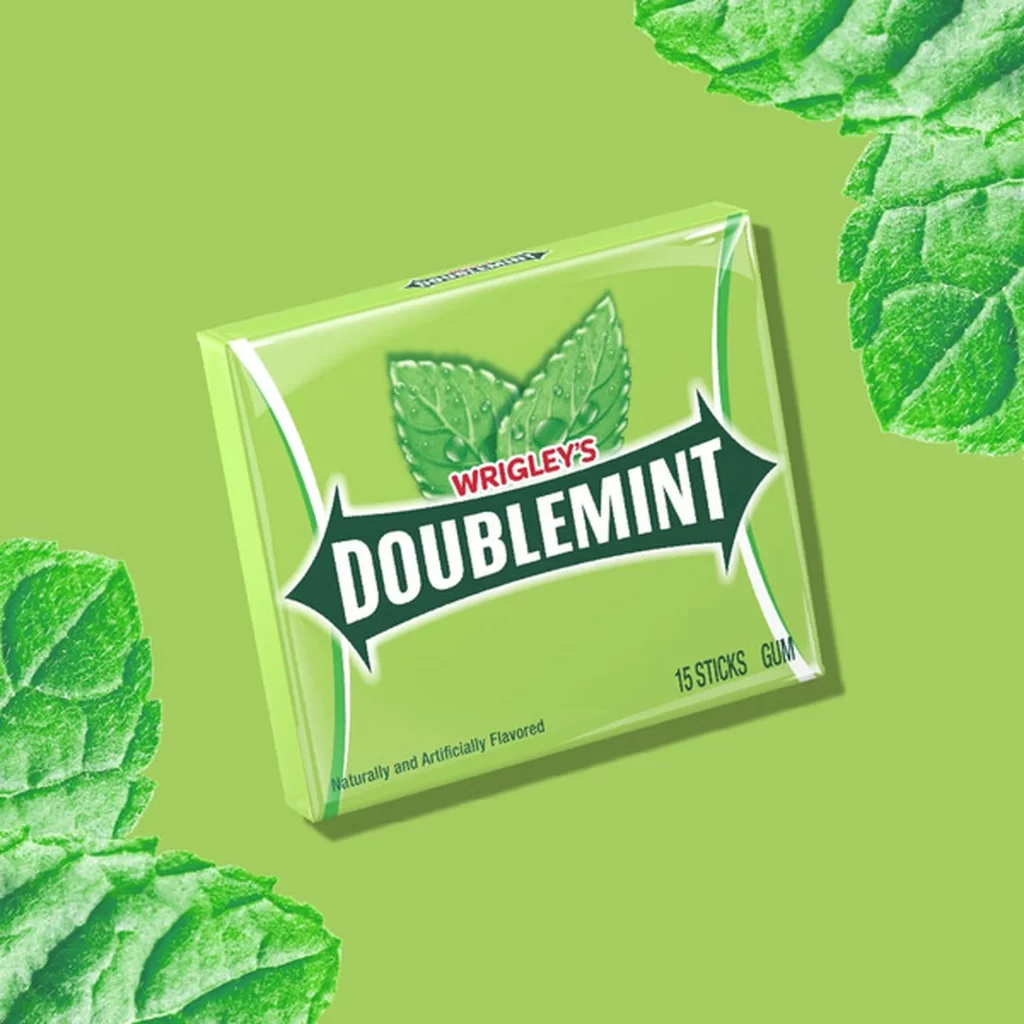
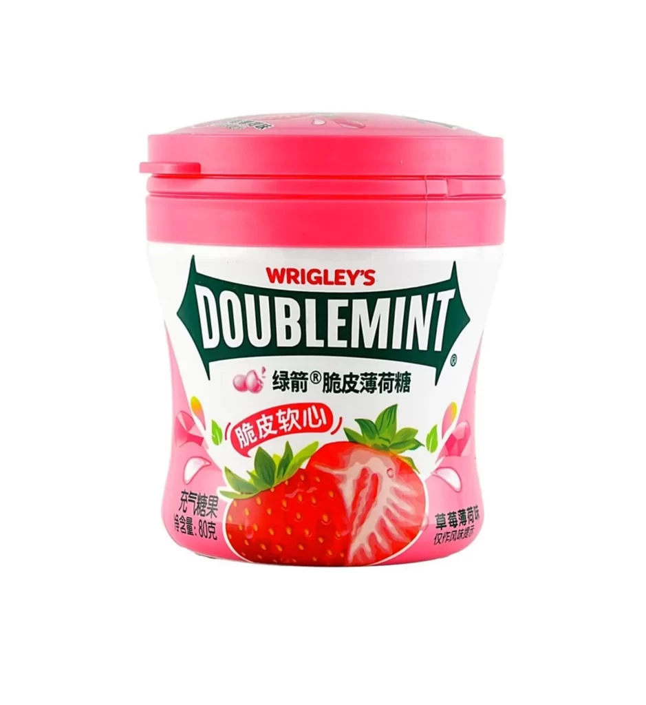
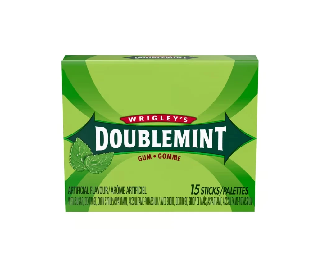
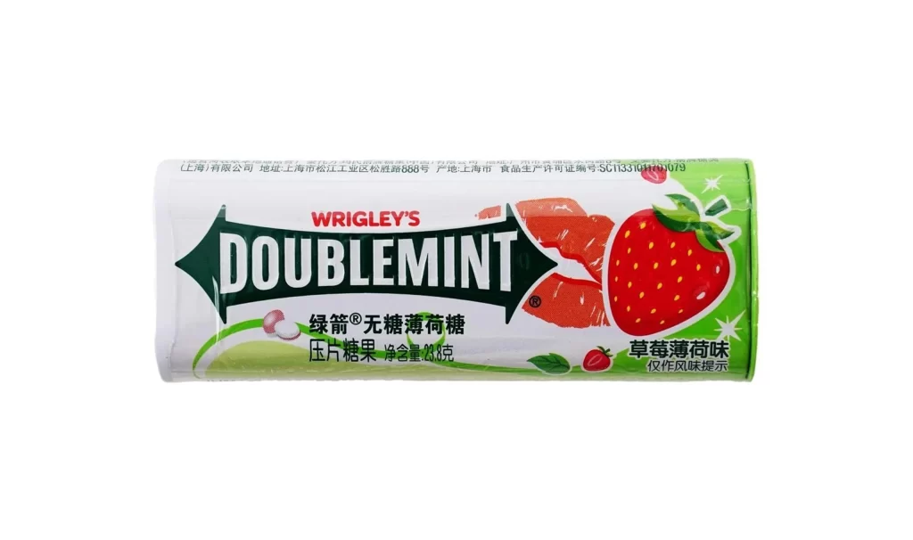
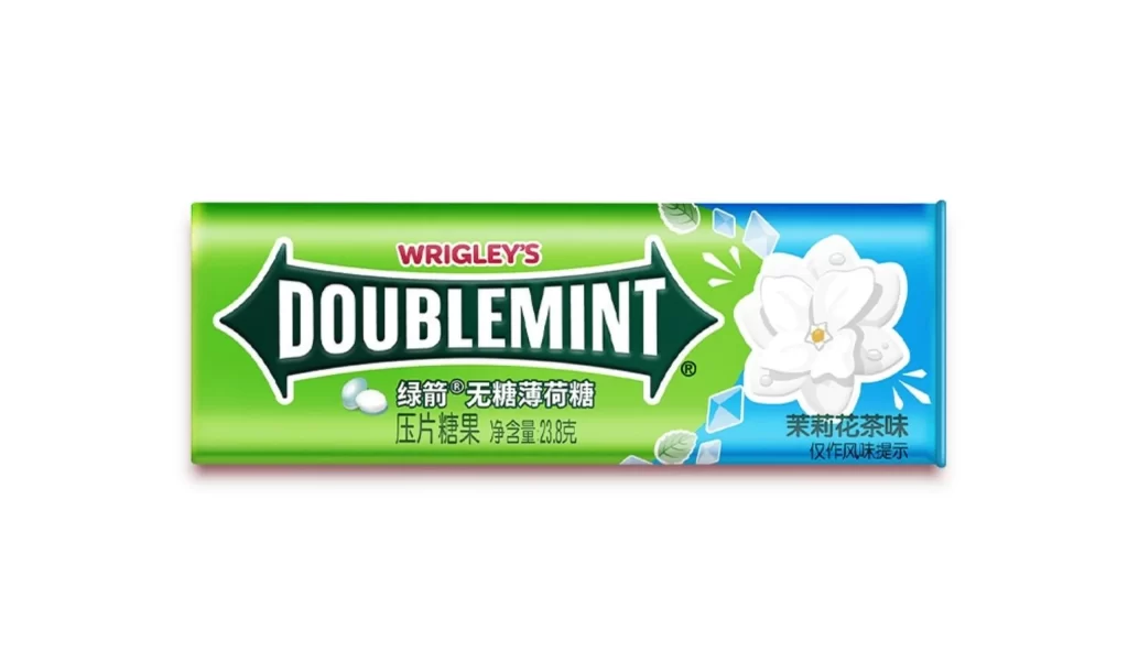
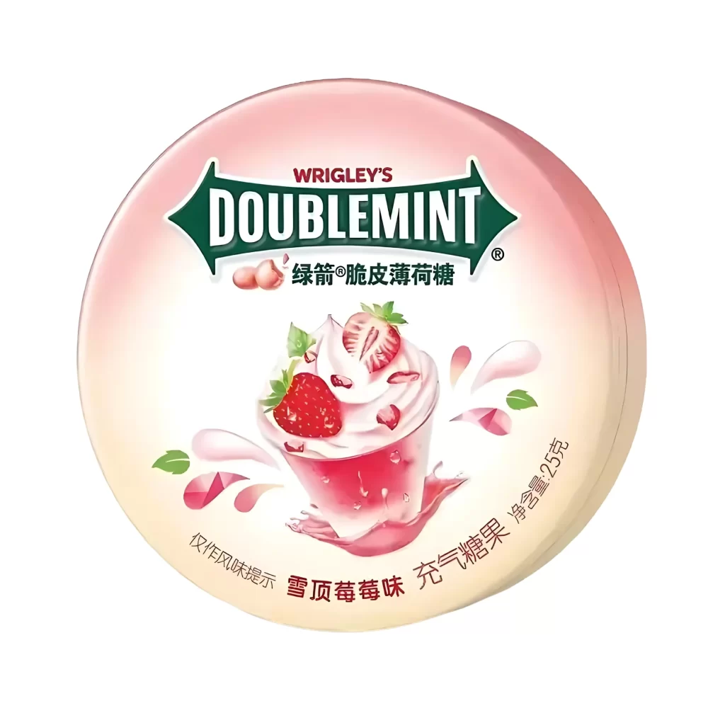
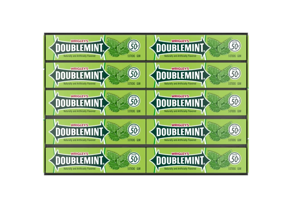
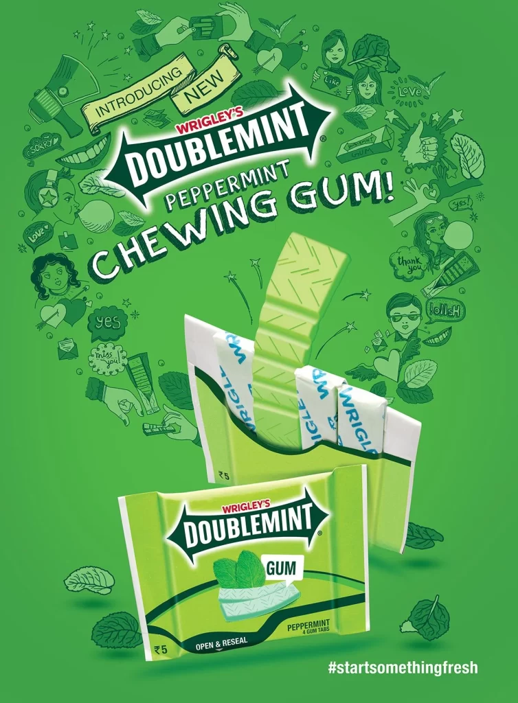
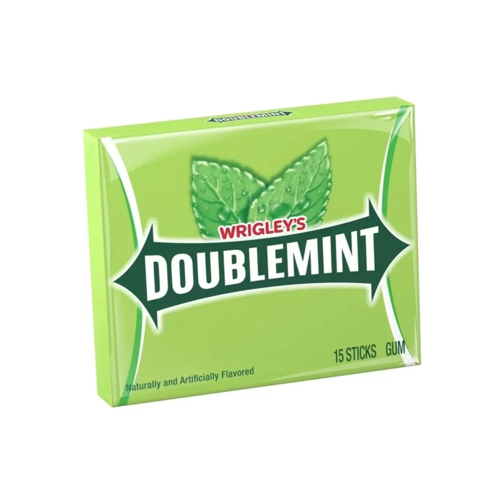
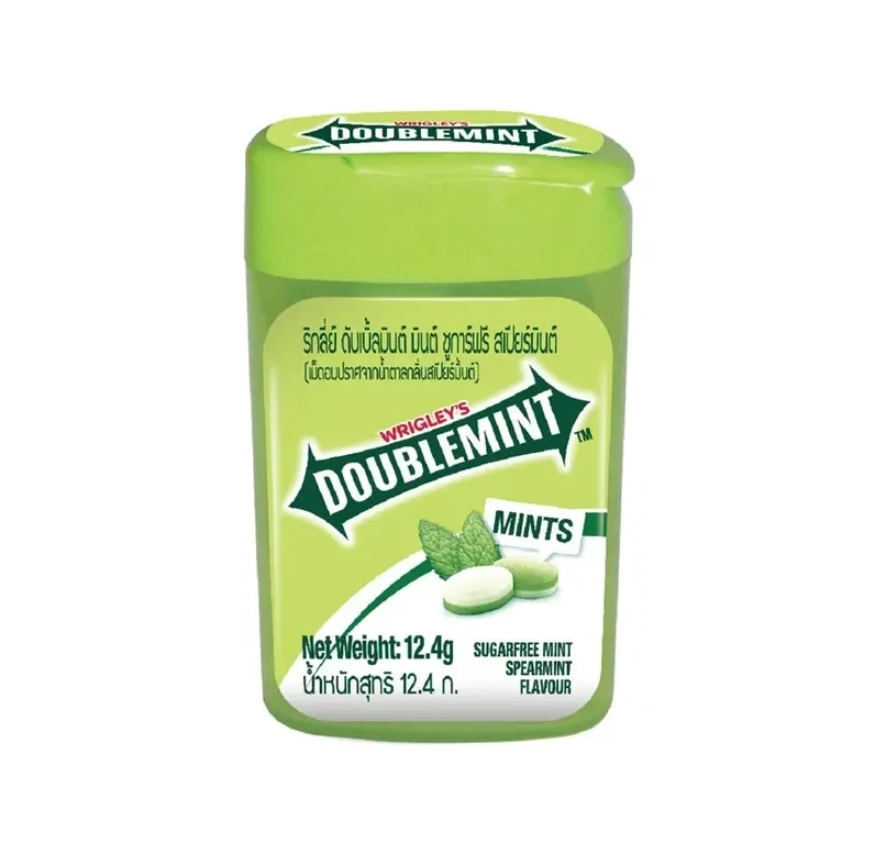
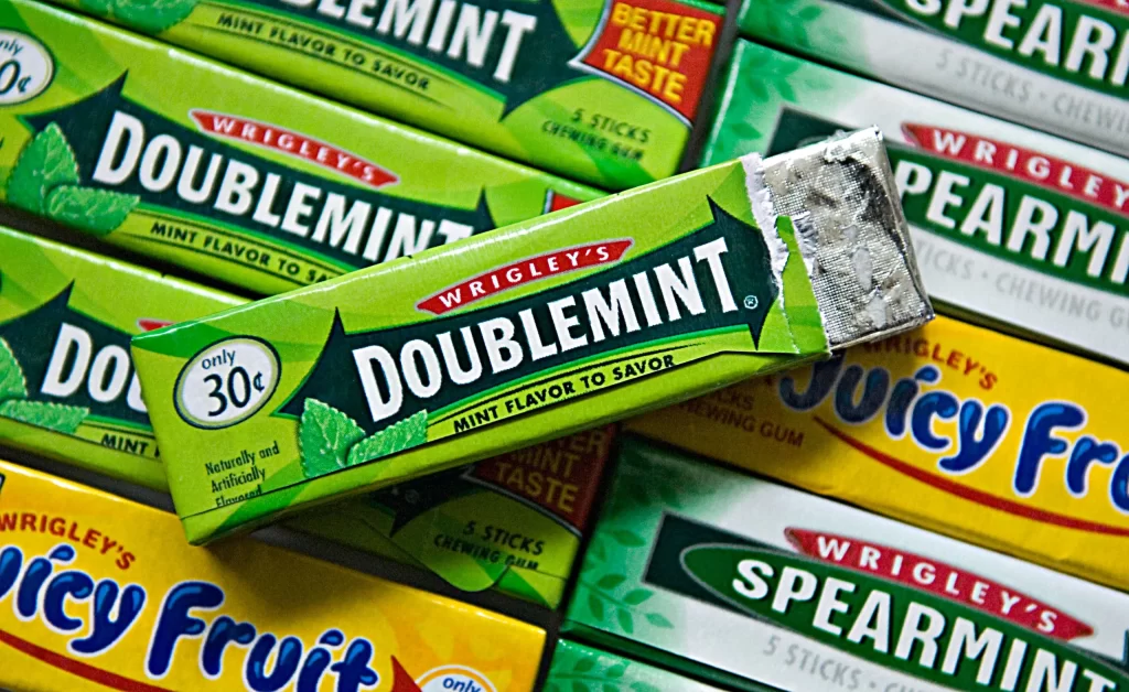
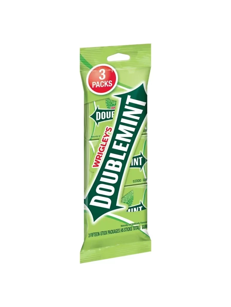
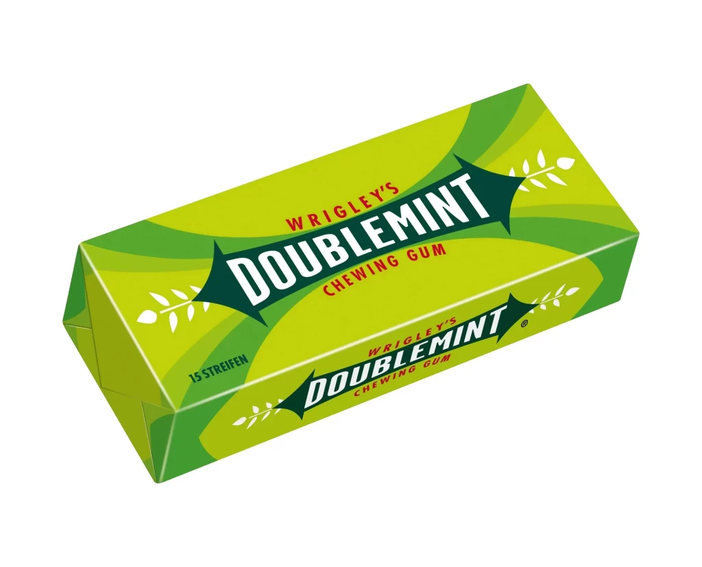
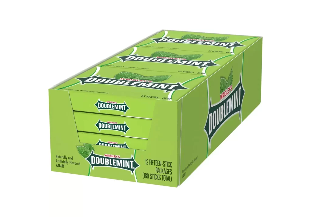
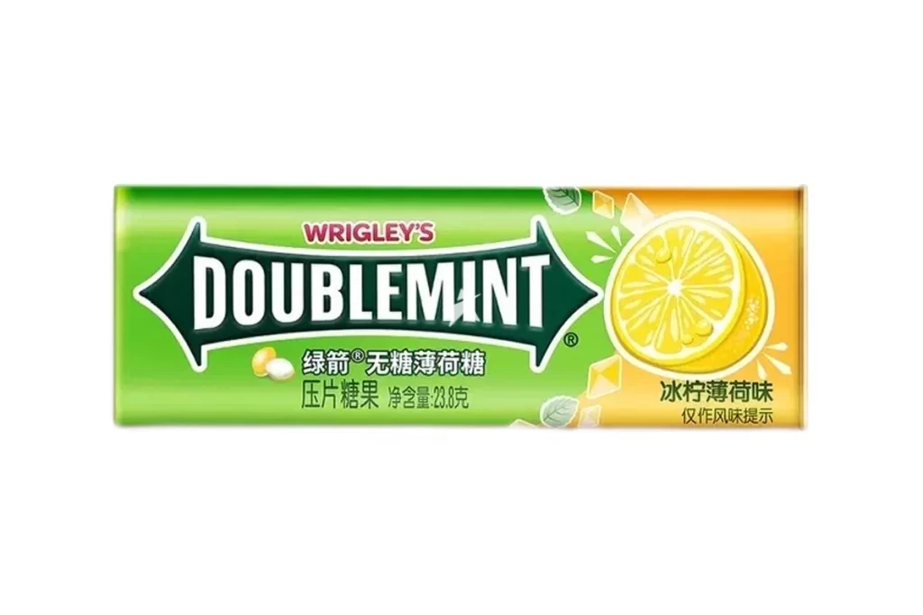
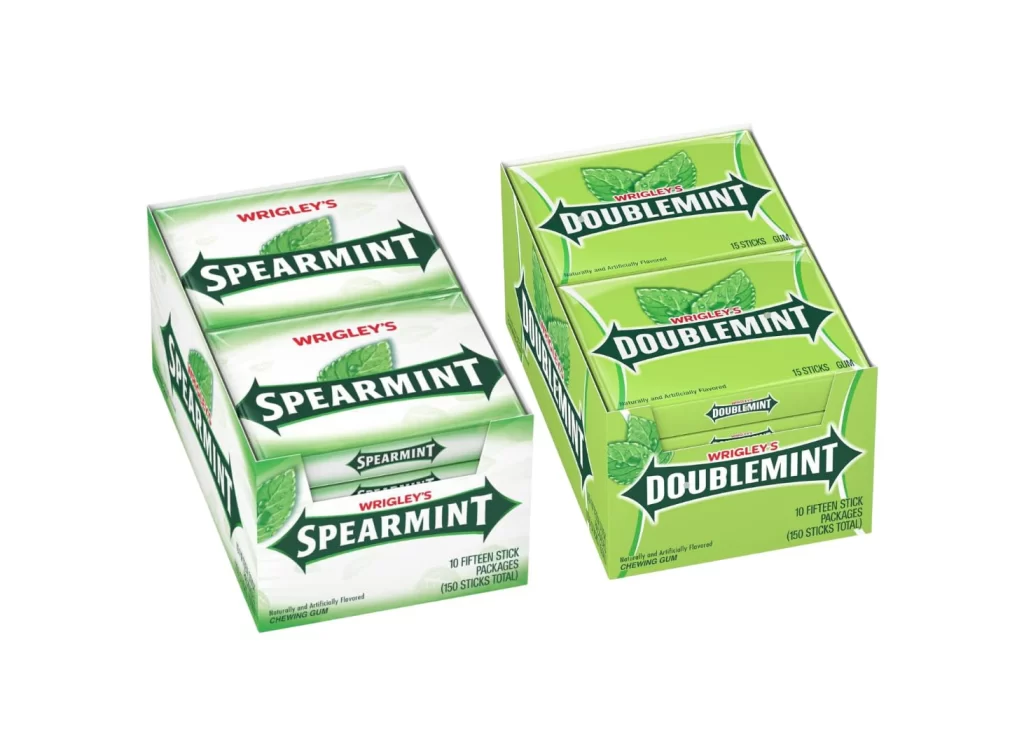
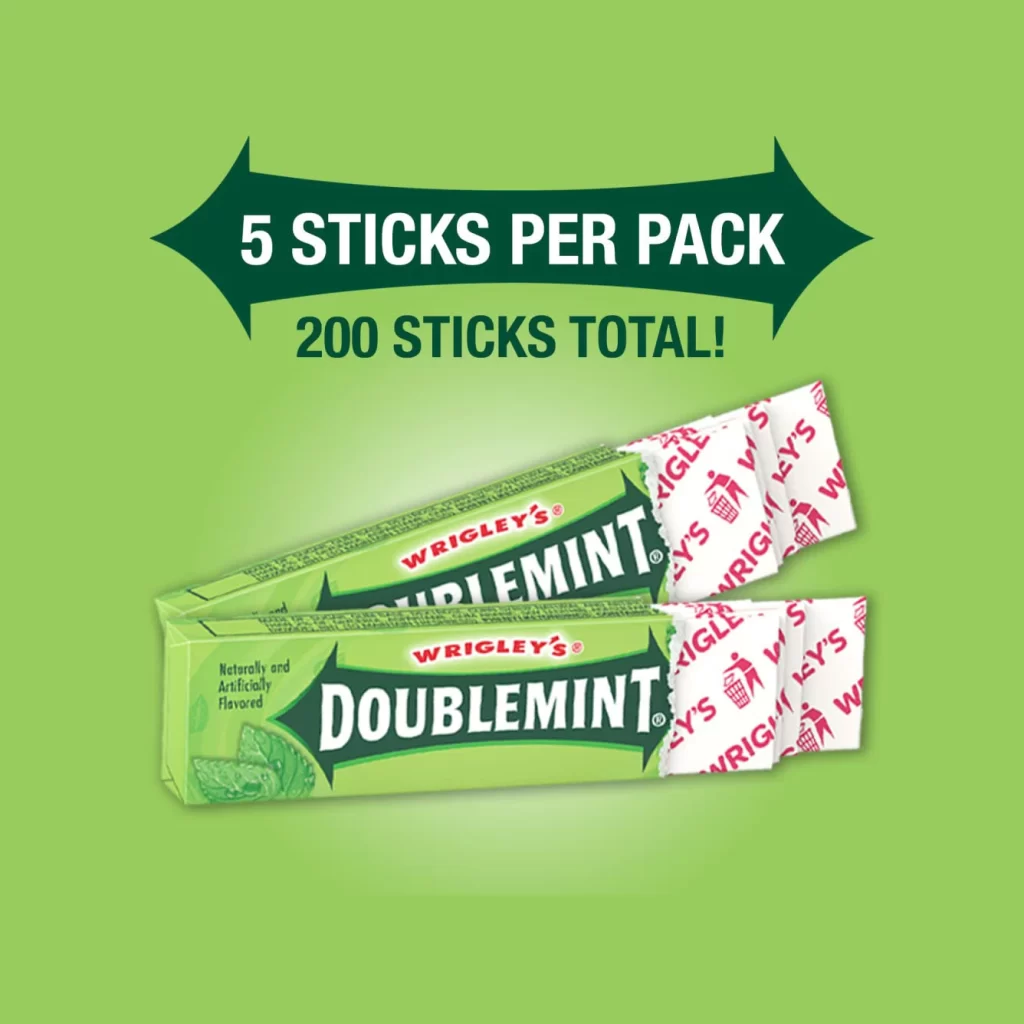
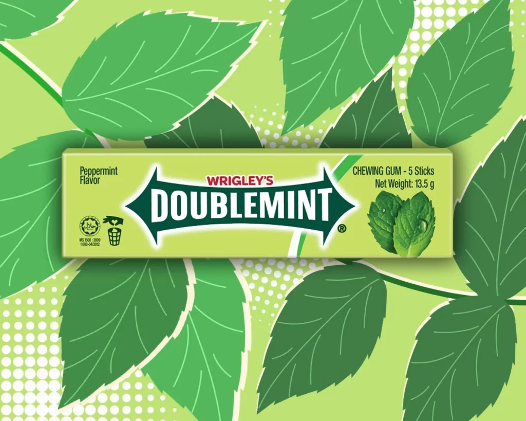
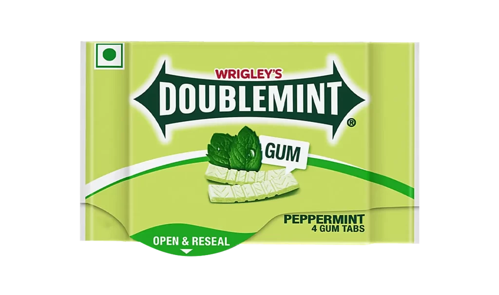
A pale lime-green background dominates the rectangular package, featuring a central dark green arrow-shaped logo that houses the word 'DOUBLEMINT' in bold white serif lettering. Above the main brand name, 'WRIGLEY'S' appears in a smaller red font, while the bottom right corner specifies 'PEPPERMINT 4 GUM TABS' in black text. The composition includes realistic illustrations of mint leaves and two white gum tabs positioned behind a white label reading 'GUM', all set against a clean surface with soft, even lighting from a straight-on camera angle.
Visual interest stems from the high-contrast color palette combining acidic green with deep forest tones and crisp white accents. The distinctive arrow-shaped brand mark creates strong directional movement across the horizontal plane, while the curved white stripe adds dynamic flow beneath the product imagery. This particular layout balances regulatory elements like the top-left green square icon with commercial graphics, demonstrating effective hierarchy in small-format consumer packaging design.
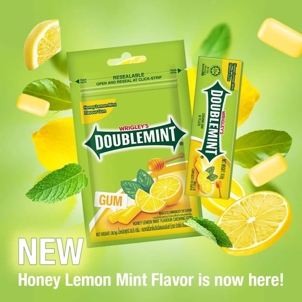
Brand historians studying Wrigley's visual identity evolution would find this specific regional variant useful for comparative analysis of international packaging adaptations. Packaging engineers examining resealable mechanisms could reference the 'OPEN & RESEAL' callout placement within the curved green footer element. Color theorists analyzing food-industry hue associations might employ this example when documenting how light greens signal freshness in confectionery contexts.