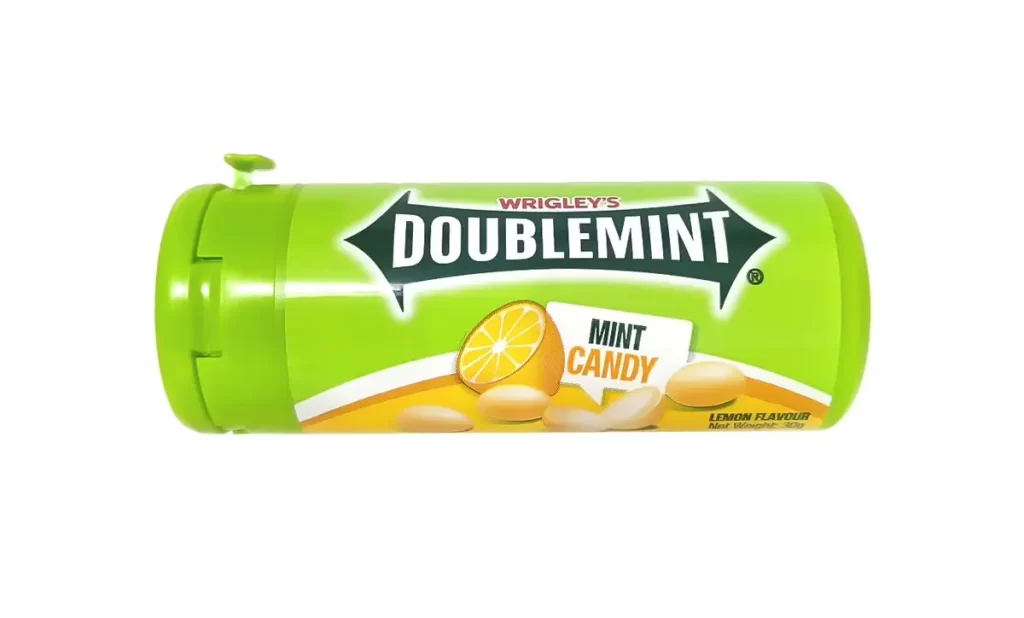
Doublemint Mint Candy Packaging Lemon Flavor
Topics
Details
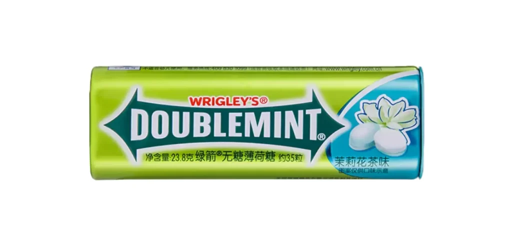
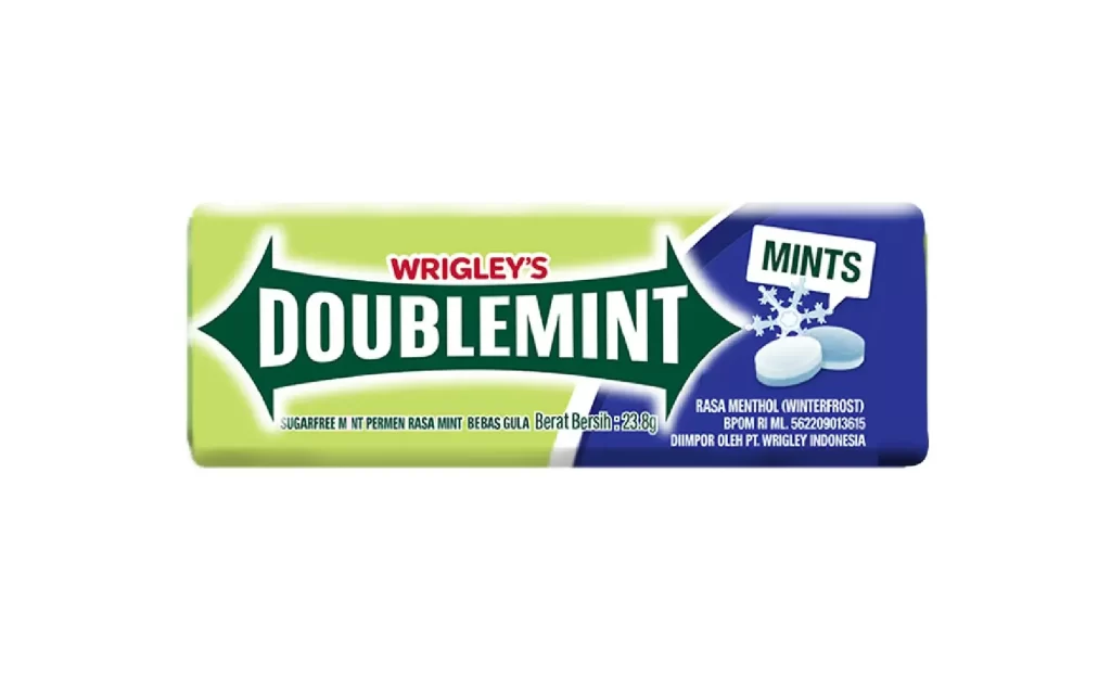
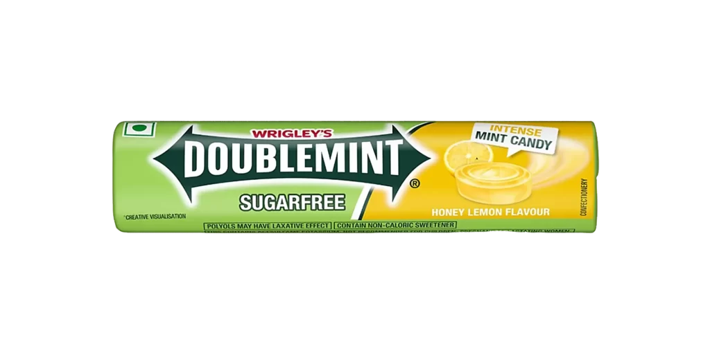
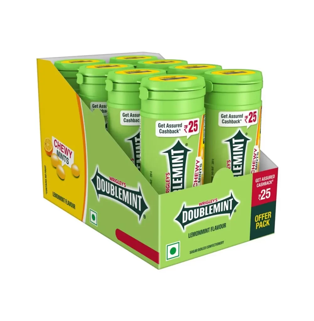
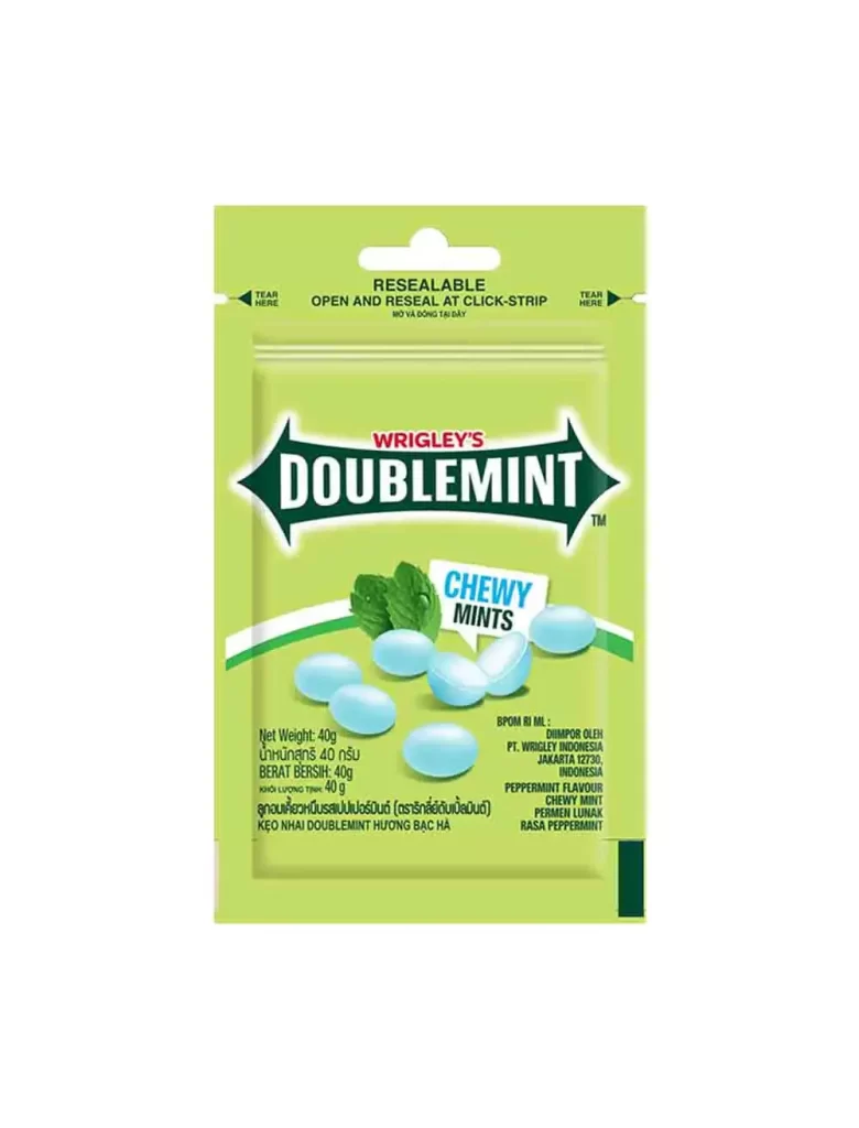
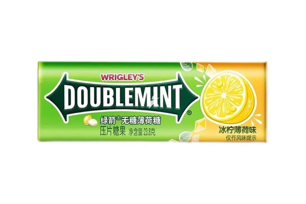
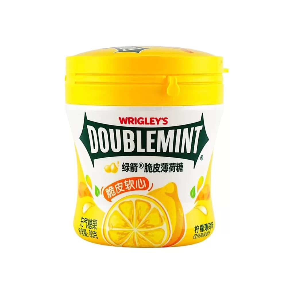
A vibrant lime-green cylindrical container features a distinct flip-top cap mechanism visible on the left side. The central composition displays the 'WRIGLEY'S' brand in red above a dark green, arrow-shaped banner containing the word 'DOUBLEMINT' in bold white serif type. Below this primary branding, a graphic of a sliced lemon and several oval candies appear against an orange-yellow gradient on a white surface.
Visual interest is generated by the sharp contrast between the acidic green substrate and the deep forest green of the directional logo mark, which creates a strong focal anchor. The inclusion of citrus imagery alongside traditional mint terminology suggests a hybrid flavor profile that deviates from the brand’s standard monochromatic identity. Furthermore, the utilitarian shape of the dispenser implies portability and ease of access, distinguishing it from conventional blister-pack or paper-wrapped confectionery formats.
Product photographers might utilize this specimen to study how specular highlights define the curvature of glossy packaging materials under studio lighting conditions. Brand strategists could analyze the typographic hierarchy to understand how parent company logos are integrated with sub-brand identifiers on limited-edition releases. Additionally, packaging engineers may examine the mechanical details of the hinge and latch system to inform the design of similar dispensing mechanisms for other consumer goods.