Doublemint Sugarfree Honey Lemon Confectionery
Topics
Details
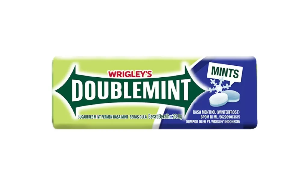
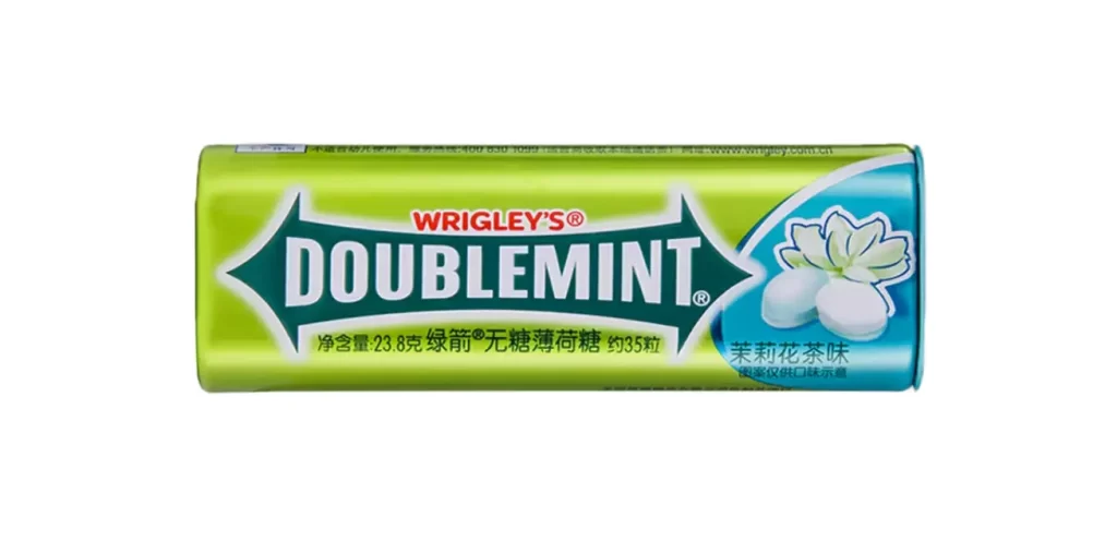
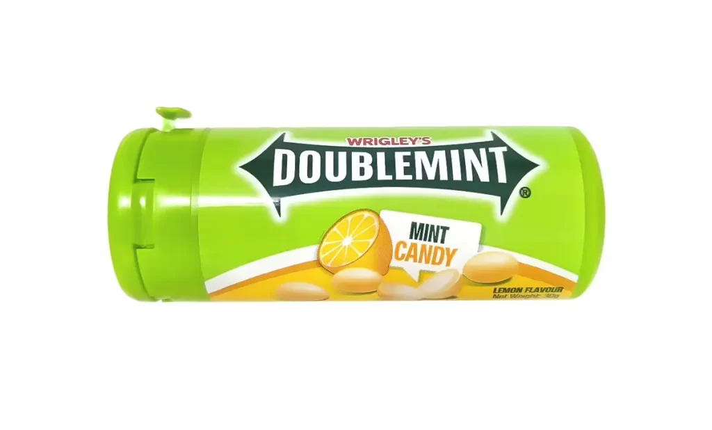
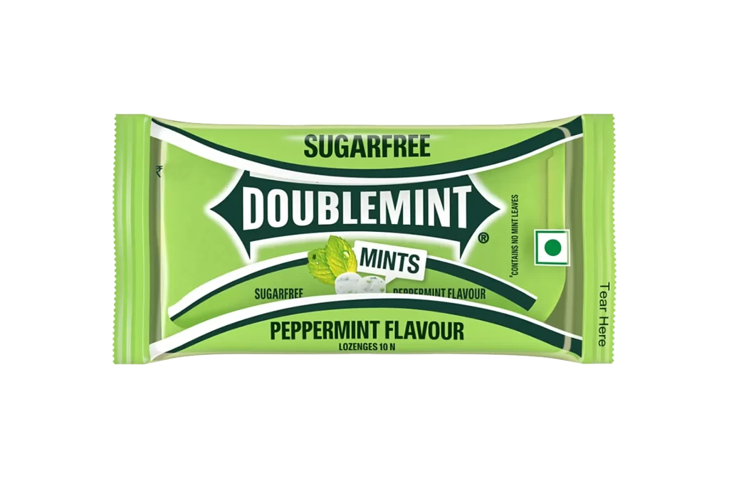
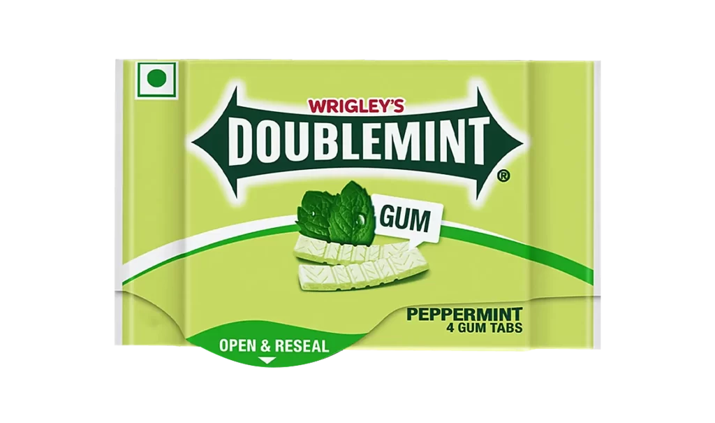
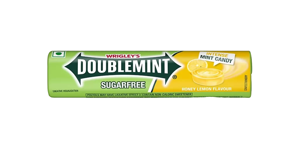
A cylindrical roll of Wrigley's Doublemint Sugarfree candy displays a two-tone color scheme, with the left half rendered in vibrant lime green and the right half in bright sunny yellow. A dark green chevron-shaped logo containing 'DOUBLEMINT' in bold white sans-serif lettering spans across the center of the packaging, which sits on a white surface. The right side features imagery of lemon slices and a round mint candy, accompanied by text reading 'INTENSE MINT CANDY' and 'HONEY LEMON FLAVOUR', while 'SUGARFREE' appears below the main brand name.
Visual interest is generated by the sharp diagonal division between the green and yellow fields, which creates a sense of dynamic movement across the otherwise static object. The yellow section includes a realistic illustration of a lemon slice alongside a translucent, disc-shaped mint, reinforcing the ‘Honey Lemon Flavour’ text printed nearby. Small typographic details, such as the ‘Intense Mint Candy’ callout and the regulatory warnings about polyols, add layers of information that ground the product in its specific market context.
Brand historians and packaging analysts might utilize this visual to study the evolution of confectionery branding within the Indian market, specifically noting the green dot symbol indicating vegetarian status. 3D modelers seeking to recreate consumer goods for commercial renders will find the specific gradients and shadowing on the curved surface particularly useful for understanding how light interacts with metallic foil materials. Furthermore, color theorists could reference this specific palette when researching high-contrast combinations used to signal freshness and energy in food marketing.