Gum Container Wrigley’S Doublemint Cool Ice
Topics
Details
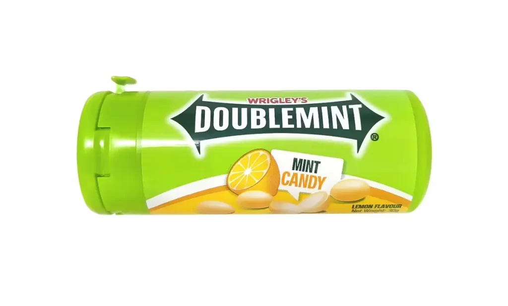
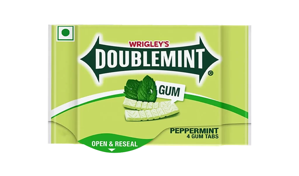
A cylindrical plastic bottle of Wrigley's Doublemint Cool gum stands upright on a white surface, viewed from a direct frontal perspective. The container features a vibrant lime-green body and matching flip-top cap, with the label dominated by a bold black banner displaying 'DOUBLEMINT' in white serif lettering. Below this, a deep purple graphic sweep anchors the lower portion of the design.
Visual interest stems from the striking color contrast between the fresh green upper half and the rich violet base, creating immediate shelf appeal through temperature-associated hues. The diagonal orientation of the main brand banner adds dynamic energy to an otherwise symmetrical composition, while the photorealistic ice cube renderings effectively communicate the product’s cooling sensation without relying on text alone. Typography hierarchy cleverly guides the eye from the red ‘WRIGLEY’S’ identifier down to the functional ‘GUM’ classification box.
Product photographers studying commercial packaging layouts will find value in analyzing how lighting eliminates harsh shadows on curved plastic surfaces while maintaining color fidelity. Brand identity specialists examining legacy product iterations can reference the specific font weights and color palette choices used for this regional variant. Packaging engineers assessing flip-top closure mechanisms for confectionery containers might utilize the visible structural details to inform their own prototyping work.