Doublemint Gum Container Packaging
Topics
Details
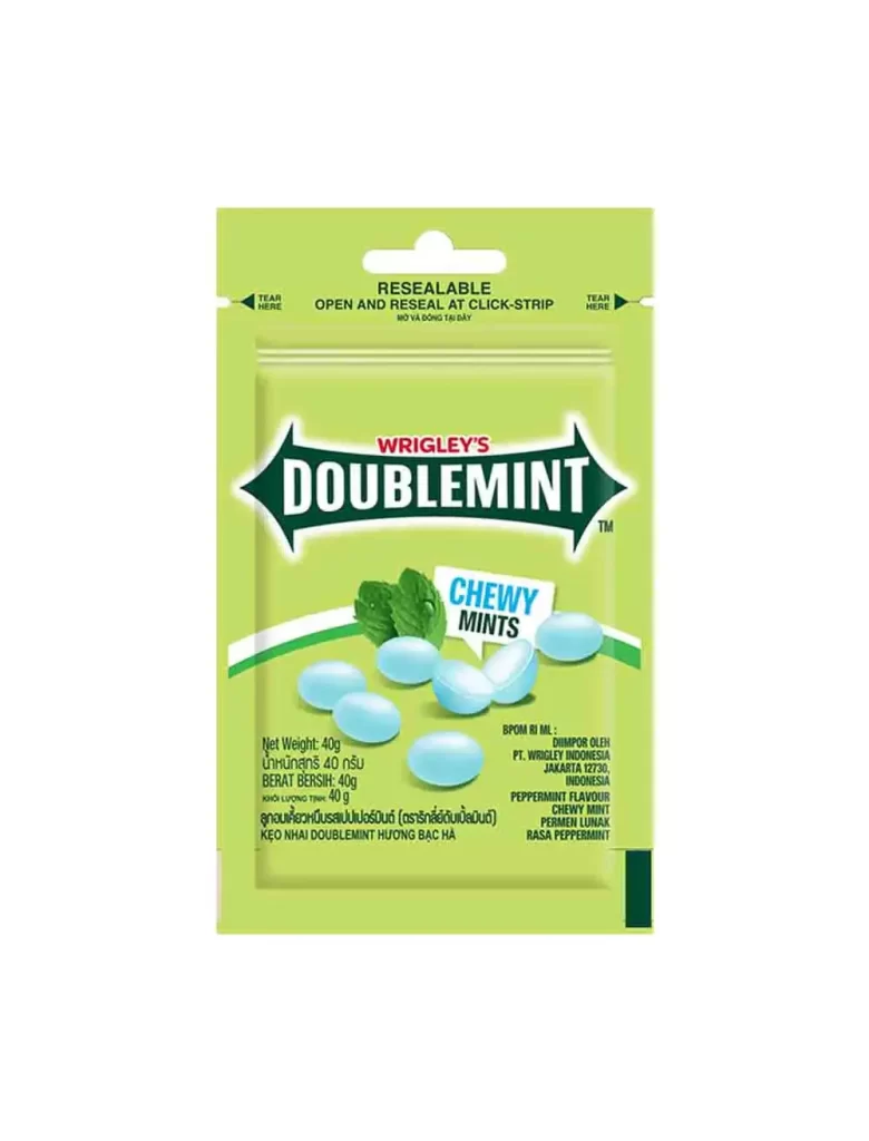
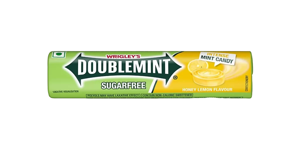
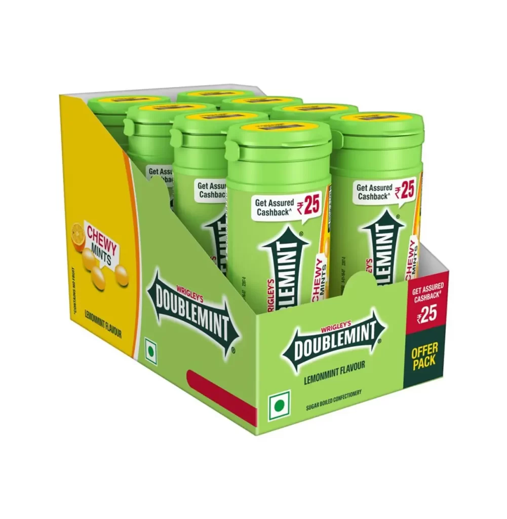
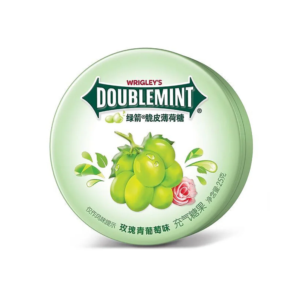
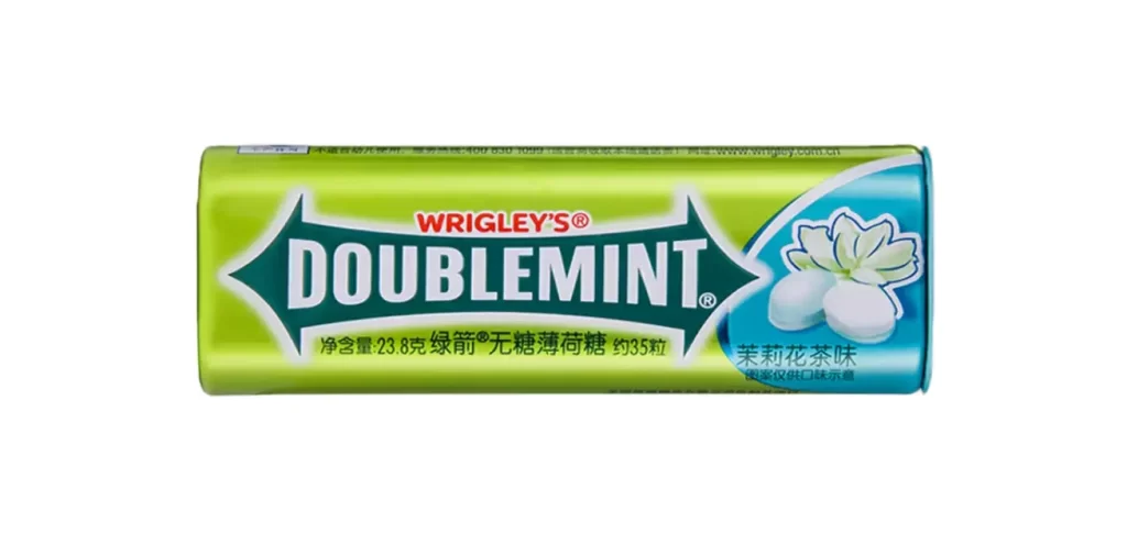
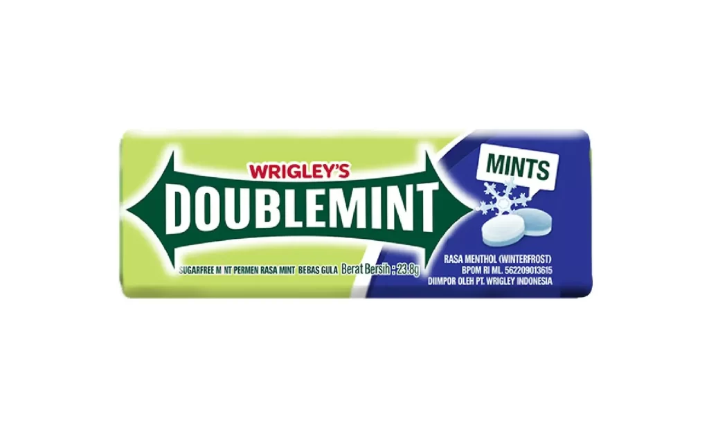
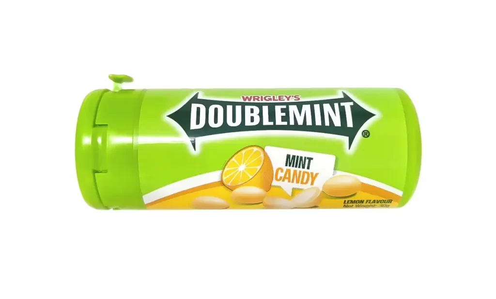
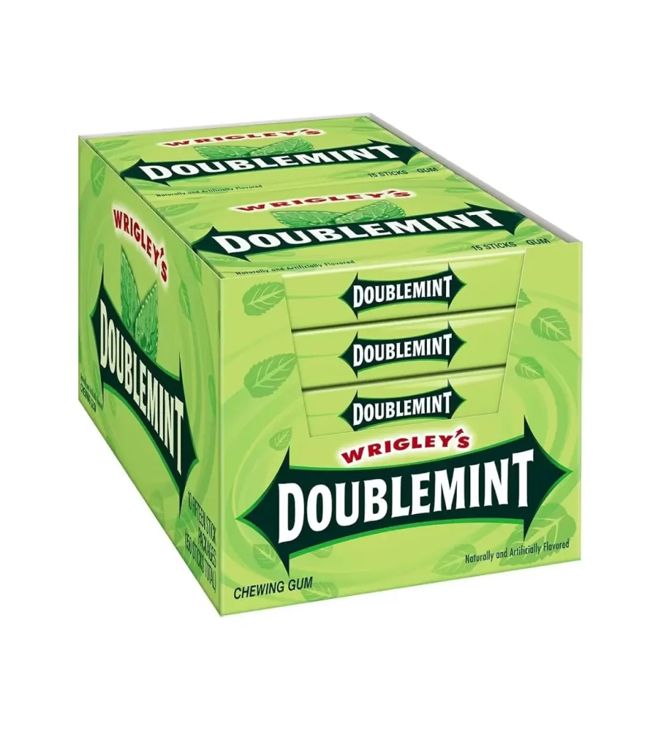
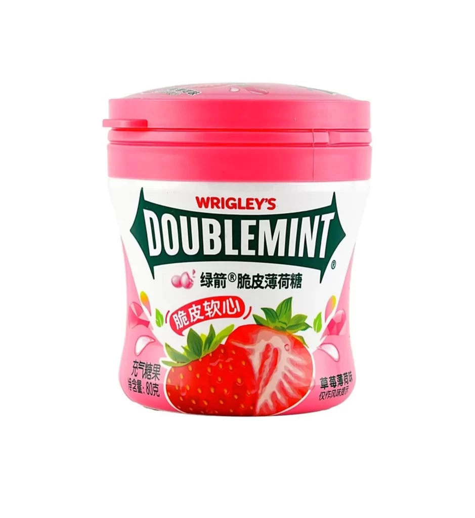
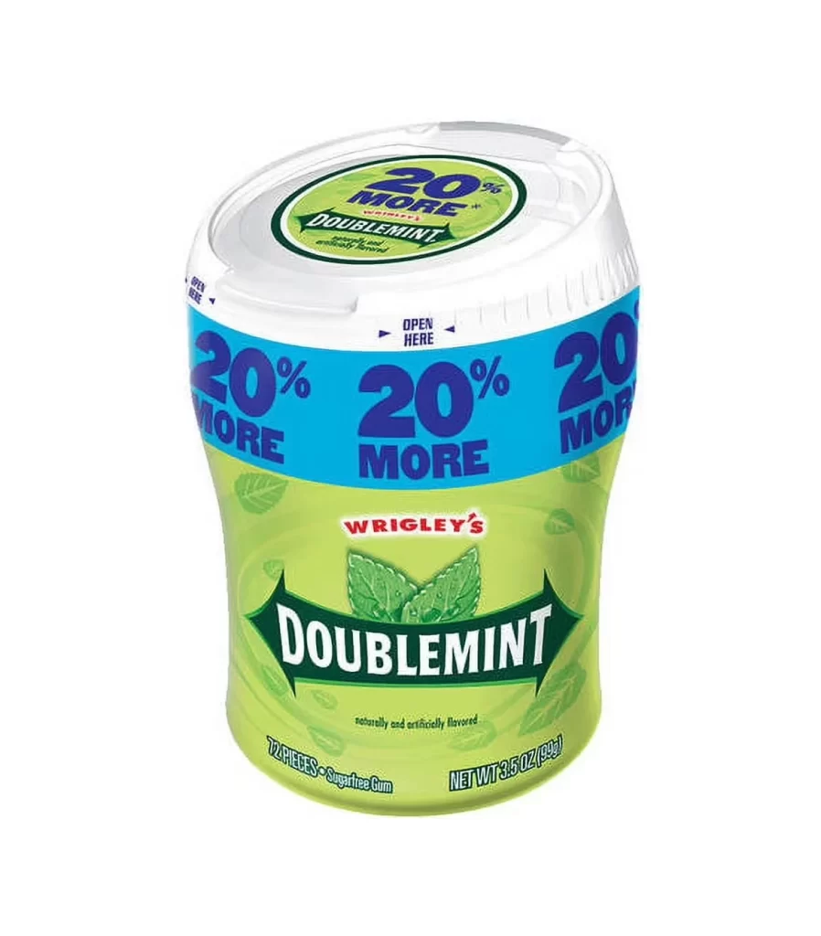
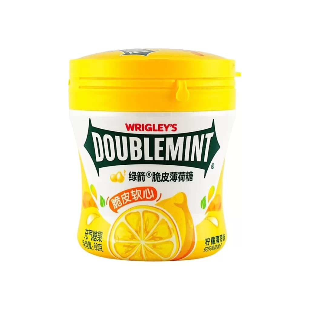
A cylindrical bottle of Wrigley's Doublemint gum dominates the frame in a vibrant lime green hue that transitions into a sunny yellow band near the base. The container features a matching green flip-top cap and displays the iconic 'WRIGLEY'S' brand name in red script above a bold, white 'DOUBLEMINT' logo. Two pale green rectangular pieces of gum rest on the white surface in front of the 64g package.
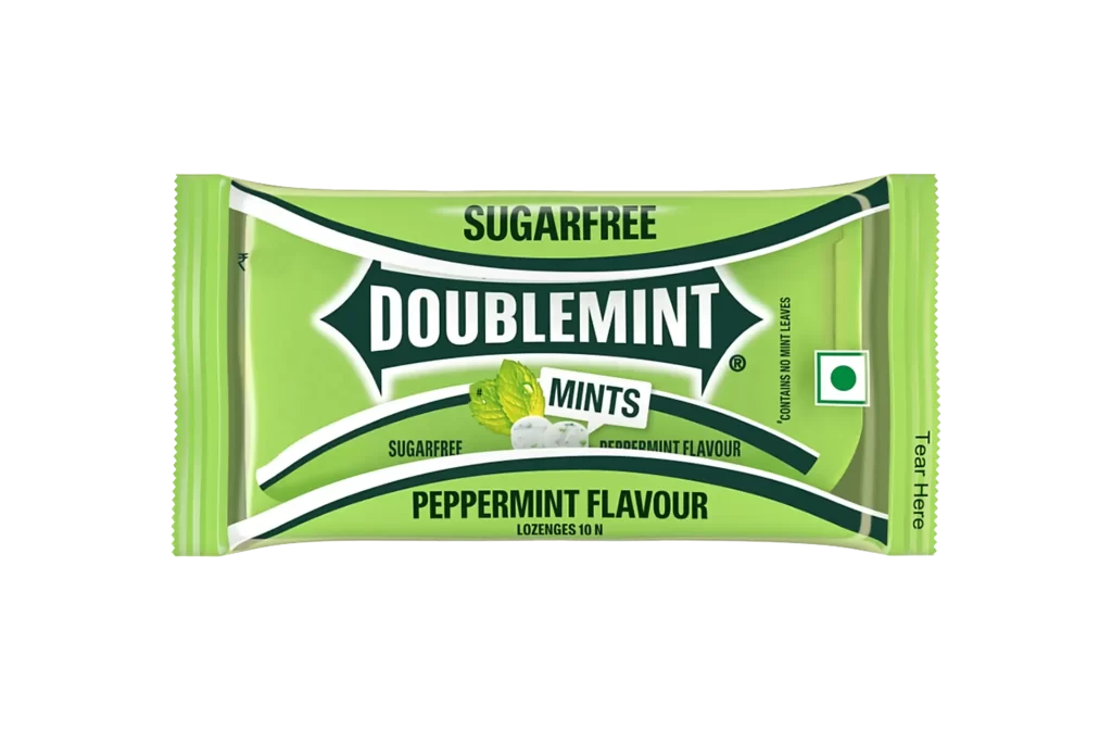
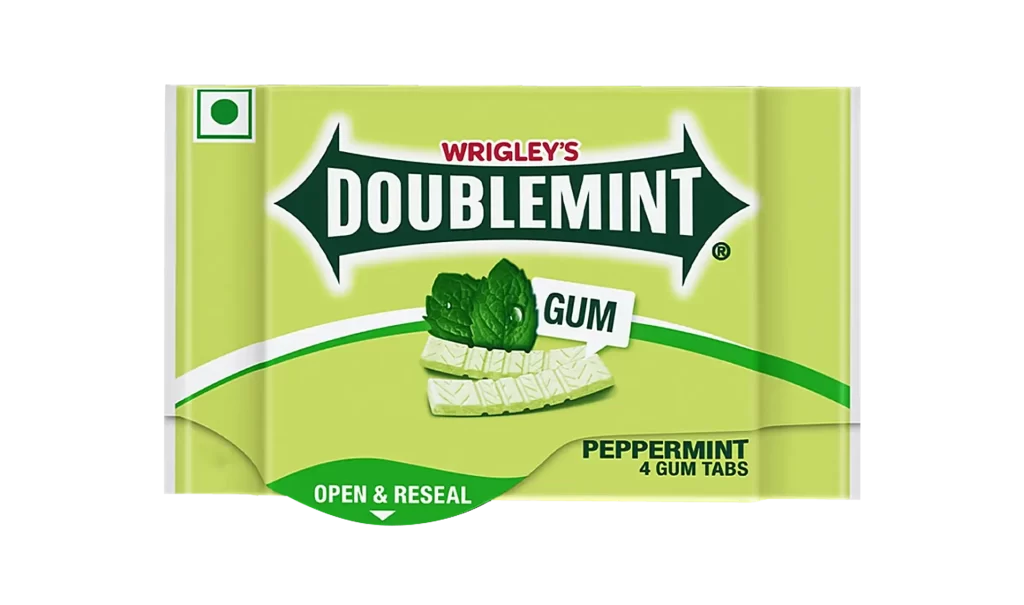
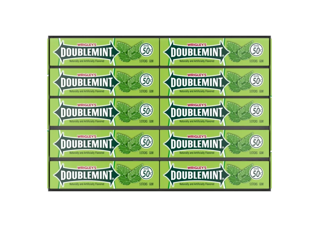
What makes this specific packaging iteration visually compelling is its departure from the traditional flat blister pack, opting instead for a bulk bottle format that offers more surface area for branding. The color palette relies heavily on fresh greens to immediately signal the mint flavor profile, while the dynamic angle of the main logo adds energy to an otherwise static cylindrical shape. This design successfully balances corporate identity with consumer-friendly functionality, using the small illustration of mint leaves and gum pieces to reinforce the product’s sensory experience without cluttering the label.
Product photographers might study this composition to understand how to effectively showcase both packaging and loose contents within a single frame. Industrial designers could analyze the way the brand elements are scaled to fit a curved surface, ensuring legibility while maintaining visual hierarchy. Marketing teams looking to refresh legacy brands would benefit from examining how classic color schemes can be adapted for modern, reusable container formats that appeal to eco-conscious consumers seeking value-sized options.