Wrigley’s Doublemint Twin Box Gum Packaging
Topics
Details
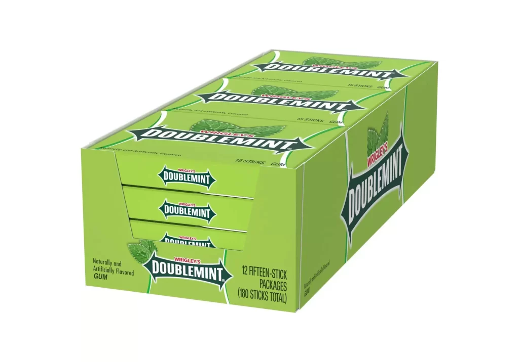
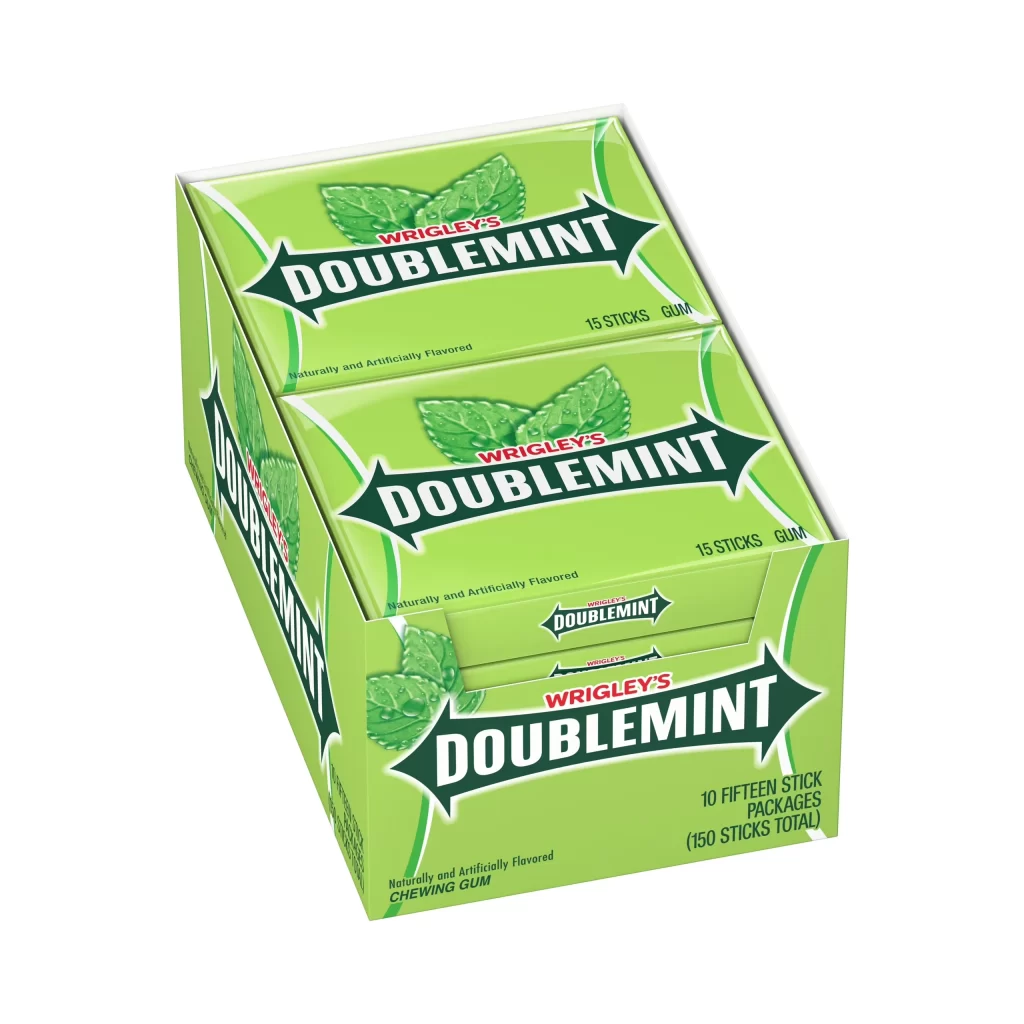
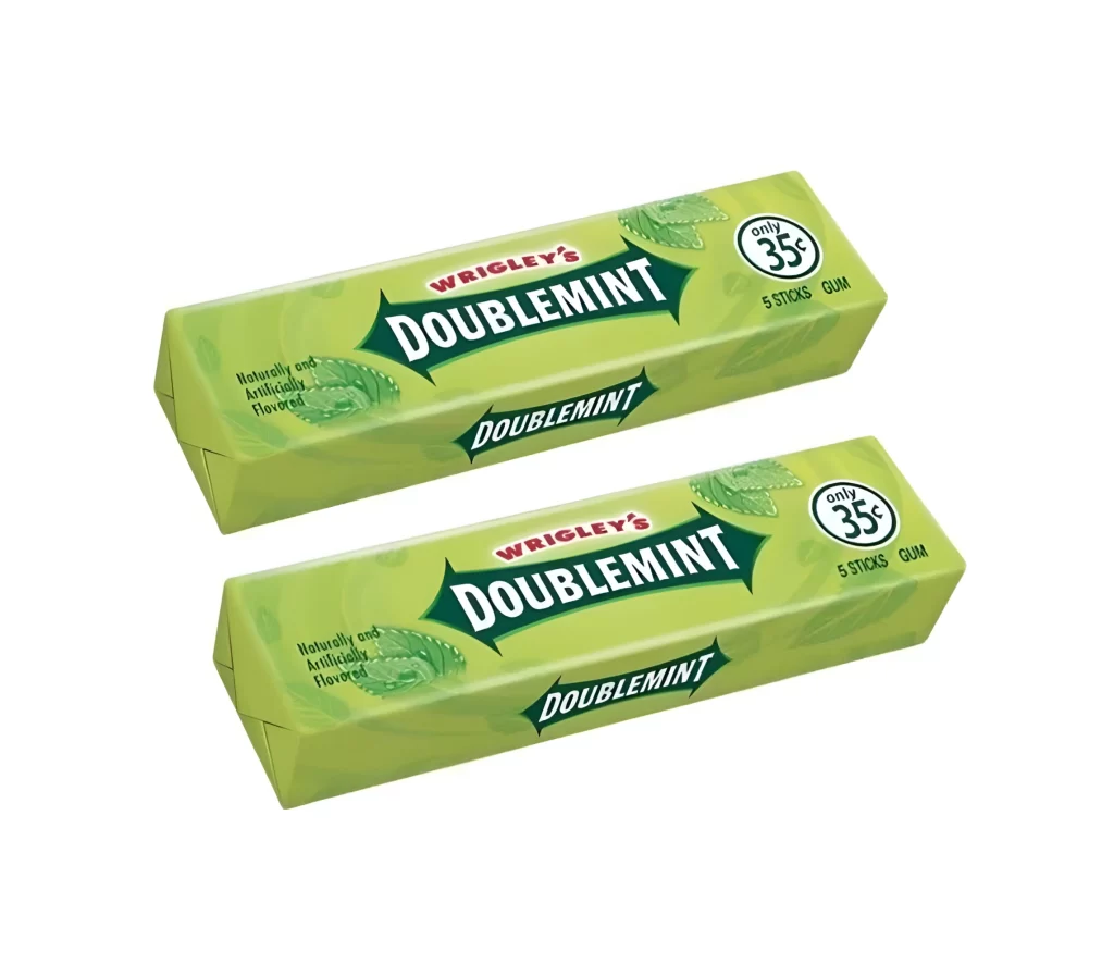
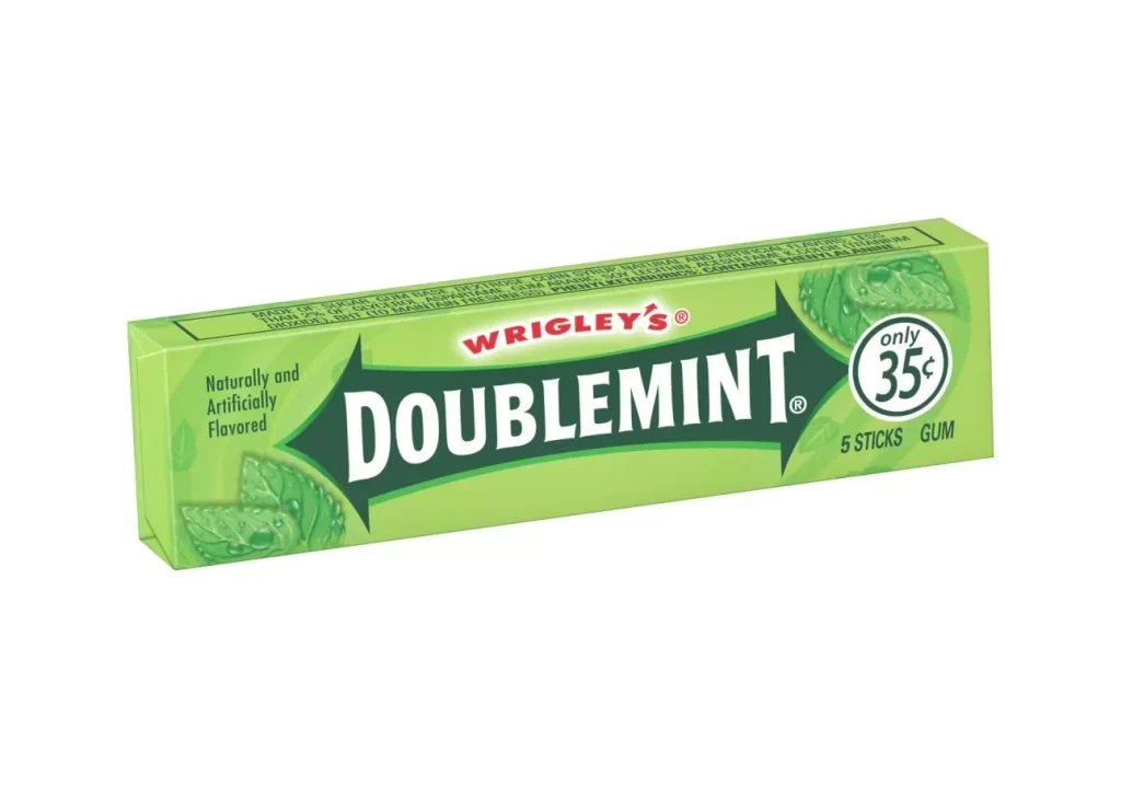
A large green cardboard container holds forty individual packs of Wrigley's Doublemint gum, with a bold red promotional banner wrapping around the left side to display yellow text announcing a 'Twin Box Pack' and 'Now a Great Value!' The slightly elevated camera angle reveals the grid of smaller green packs arranged in rows, each marked with '35¢' and the brand name, all resting on a white surface.
Visual interest is driven by the high-contrast clash between the vibrant crimson marketing sleeve and the signature mint-green color palette of the core product. This specific bulk configuration emphasizes economy through its dense stacking arrangement and the prominent placement of the total count. The repetition of the logo across the surface creates a rhythmic pattern that draws the eye, while the sharp geometry of the outer box provides a solid frame for the softer, rounded edges of the individual sticks inside.
Brand managers studying historical retail strategies would find this layout useful for analyzing how value propositions were communicated through physical packaging design. 3D artists looking to practice rendering translucent plastics and layered cardboard materials can use the lighting reflections here as a technical benchmark. Furthermore, typography enthusiasts might examine how the bold, sans-serif promotional type interacts with the traditional brand script to create a sense of urgency without losing brand identity.