Wrigley’s Doublemint Gum Box Packaging
Topics
Details
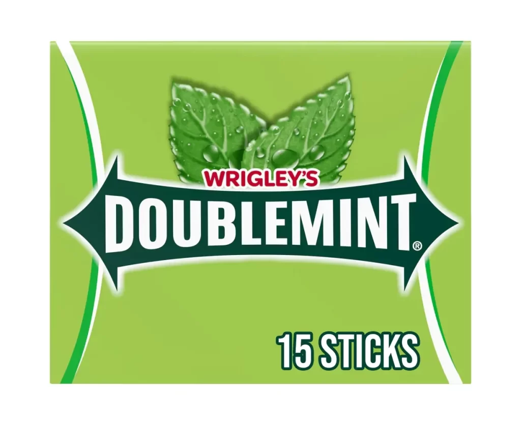
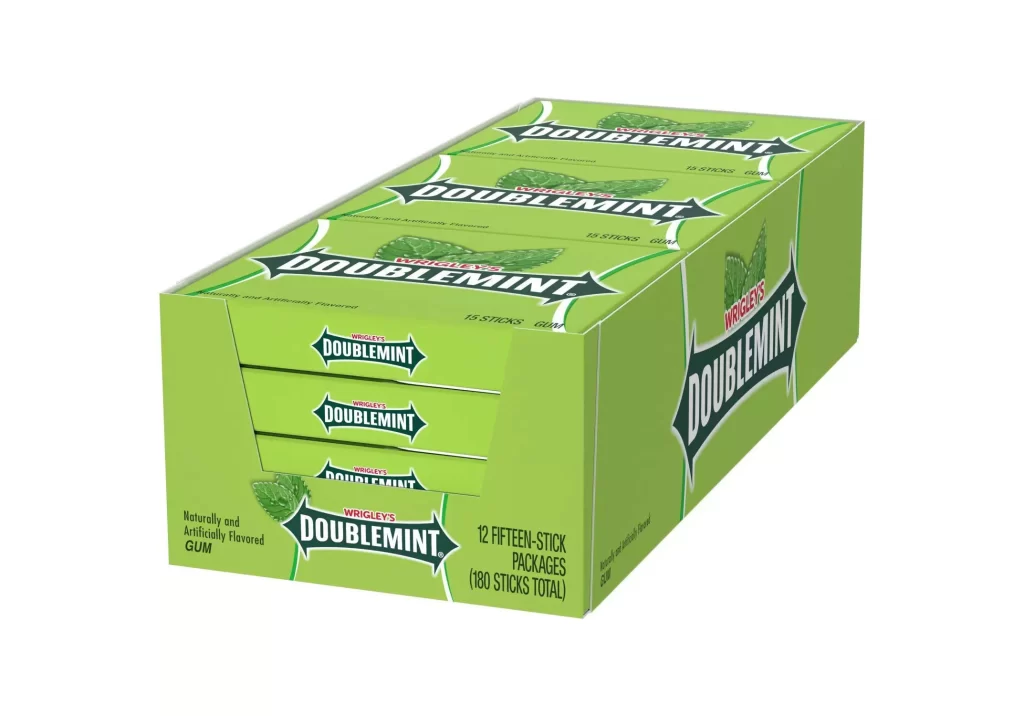
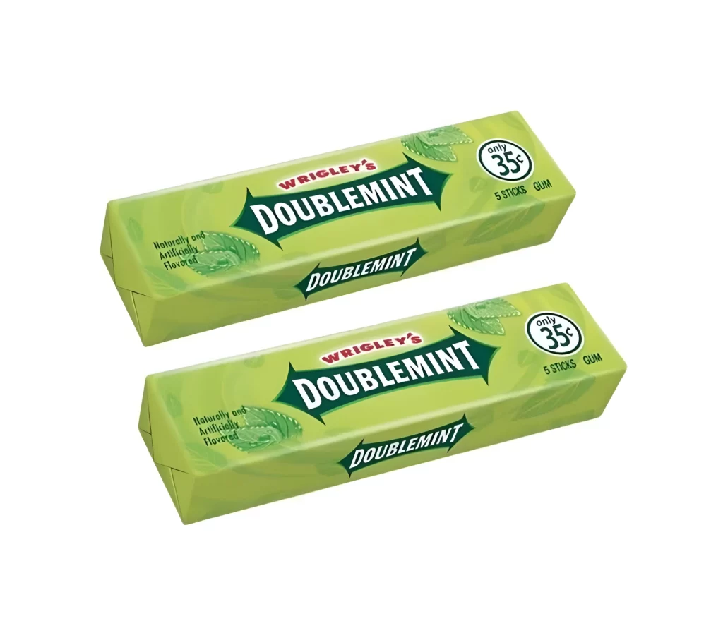
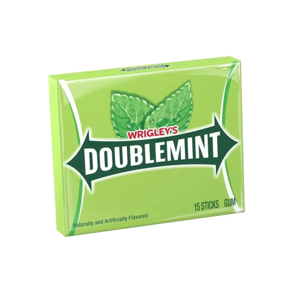
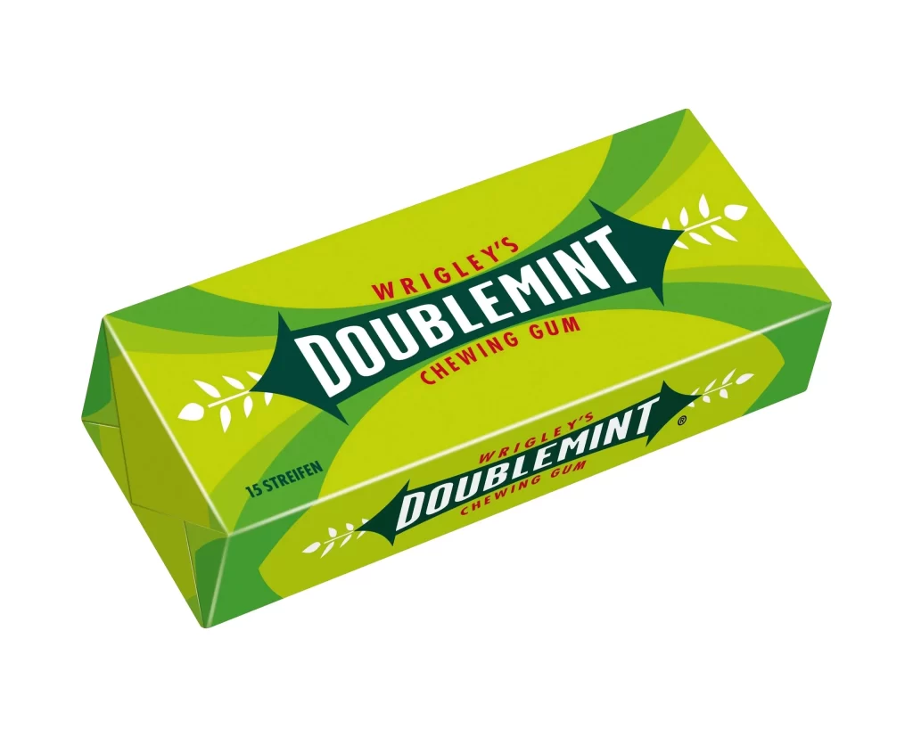
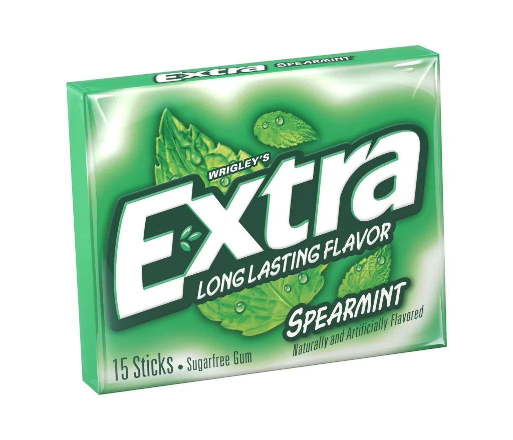
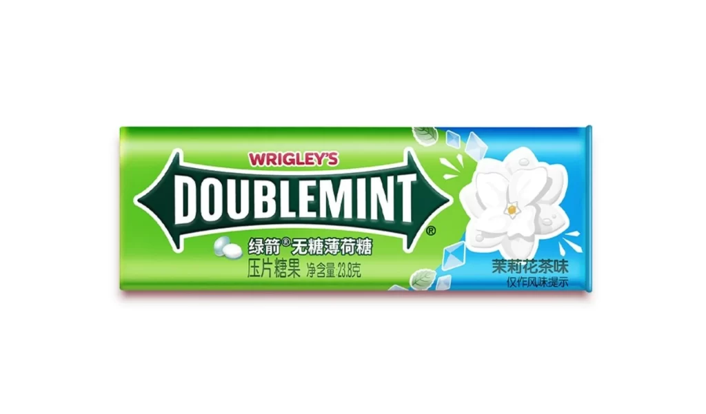
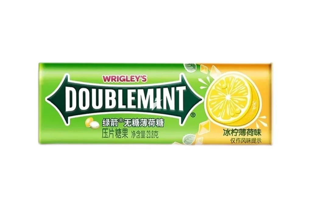
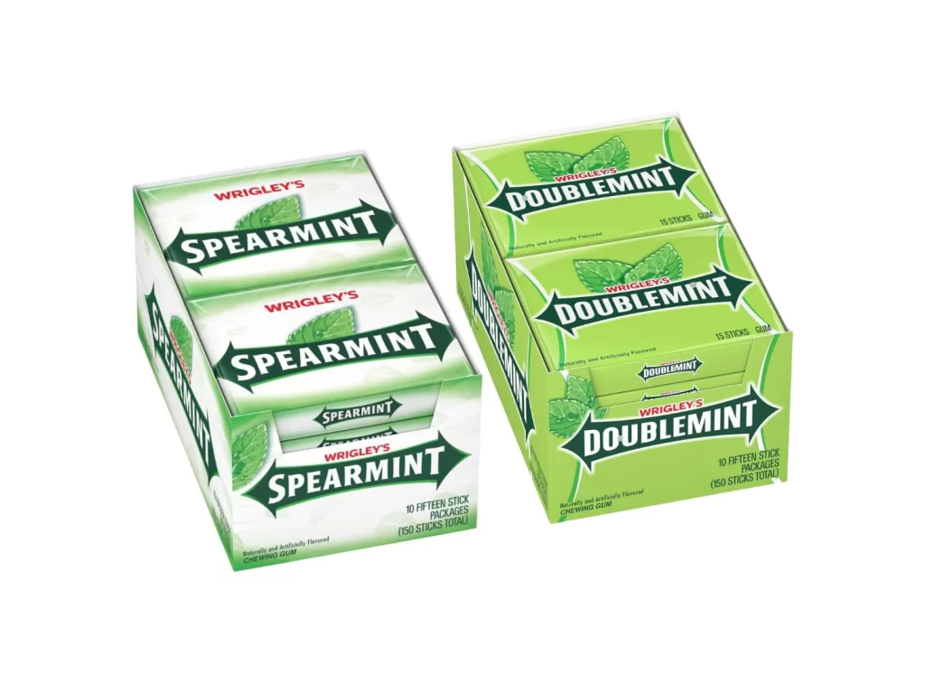
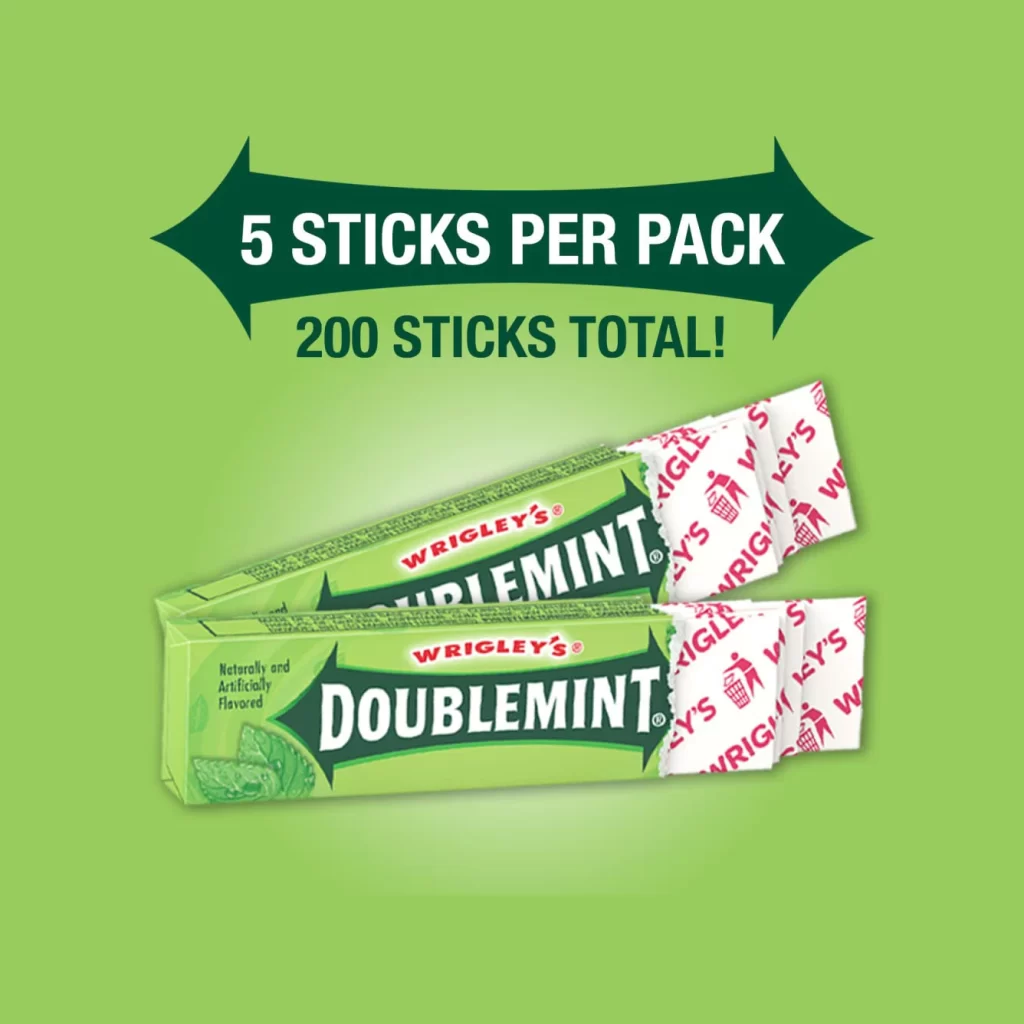
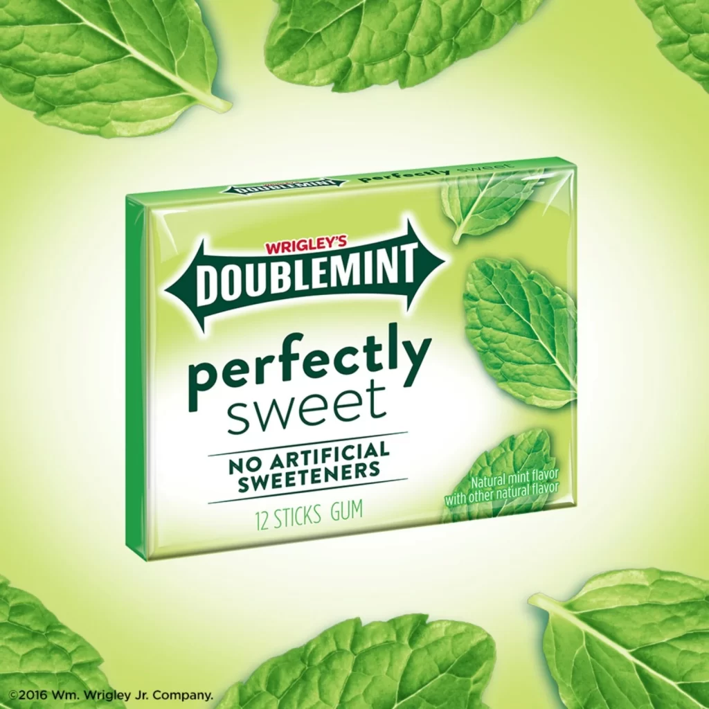
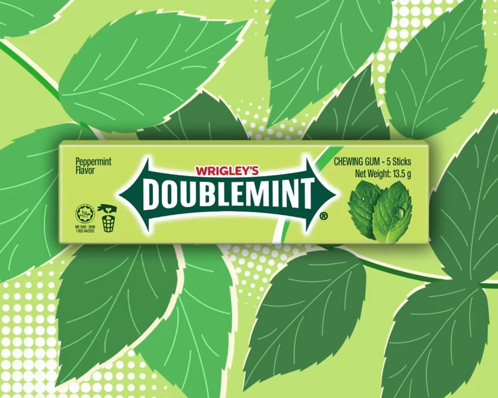
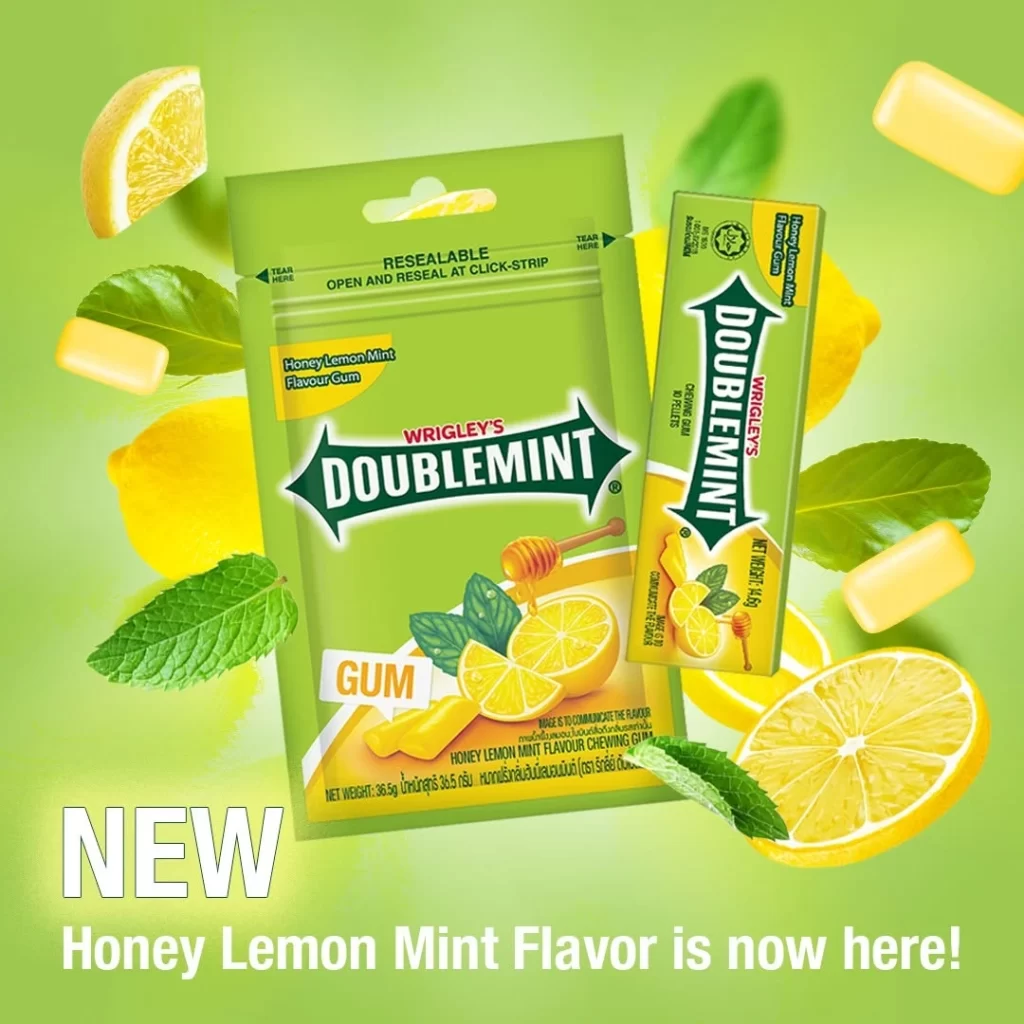
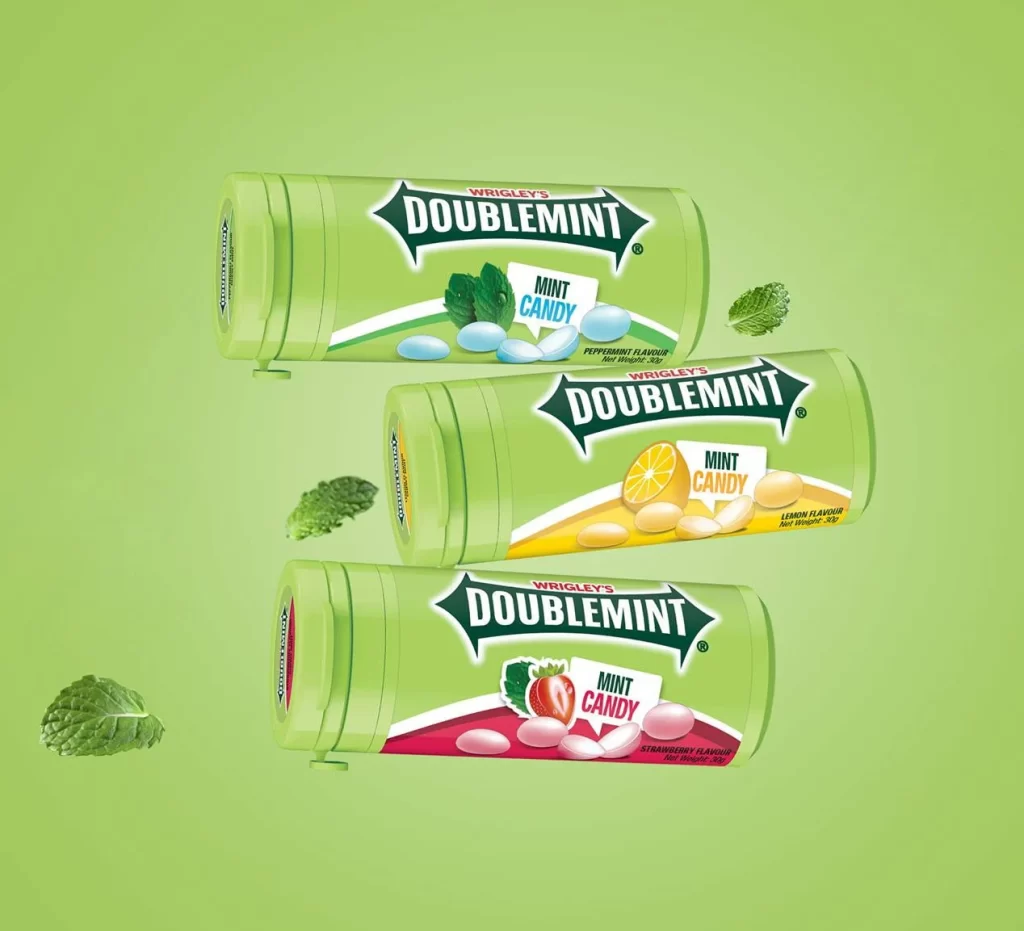
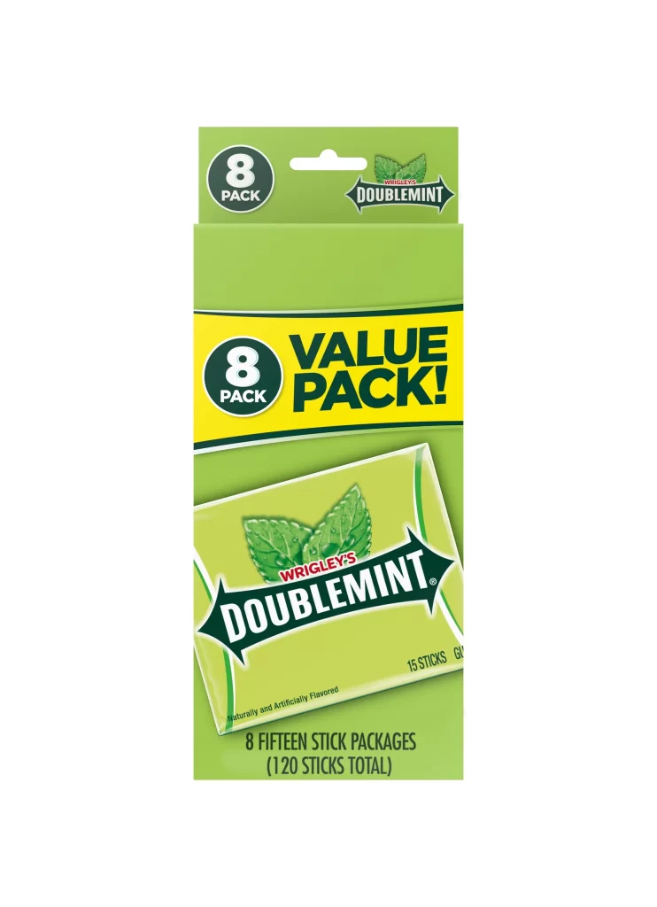
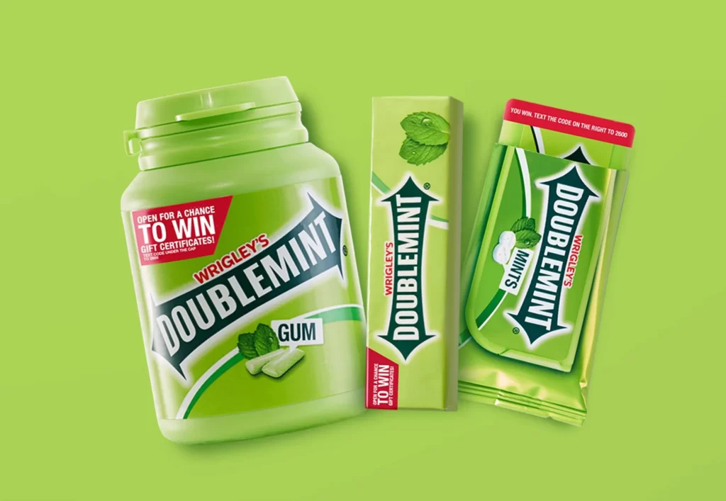
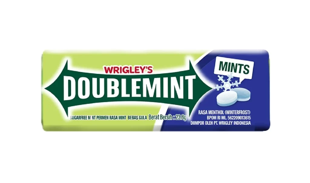
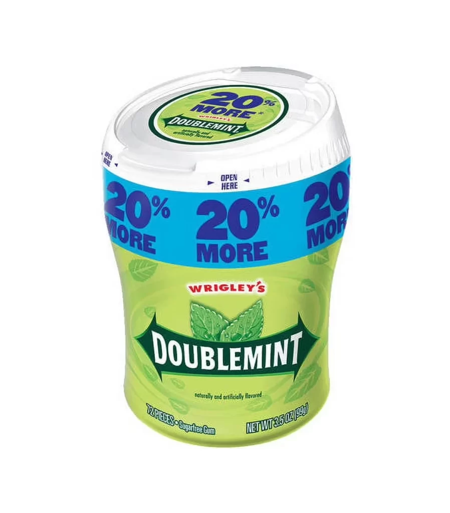
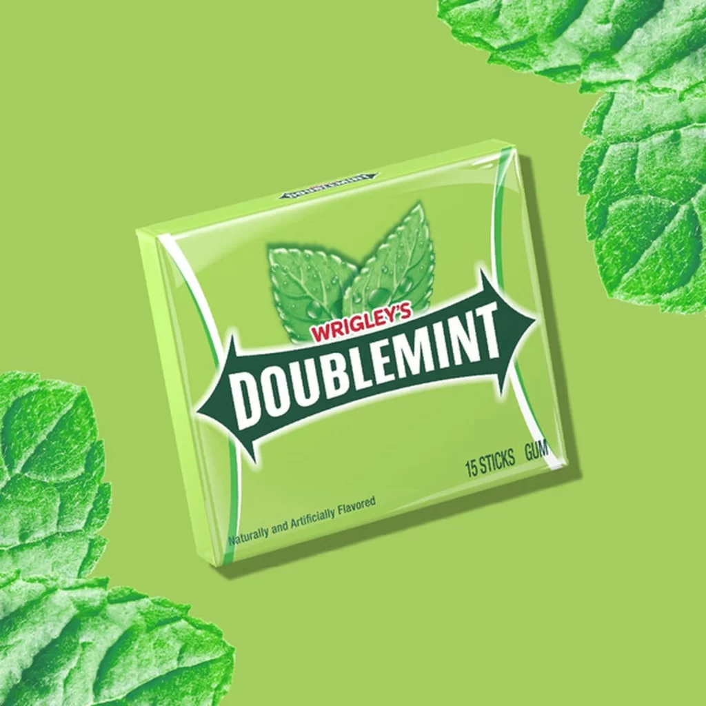
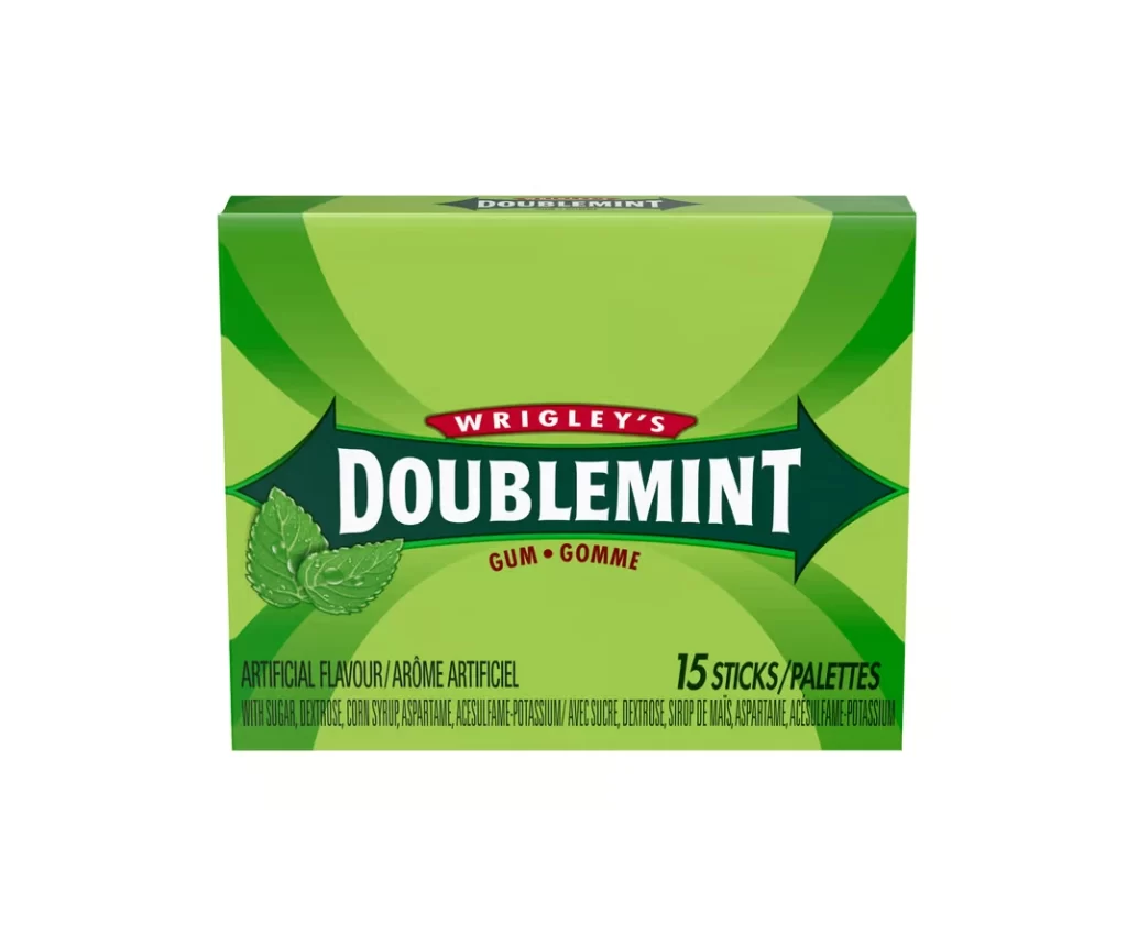
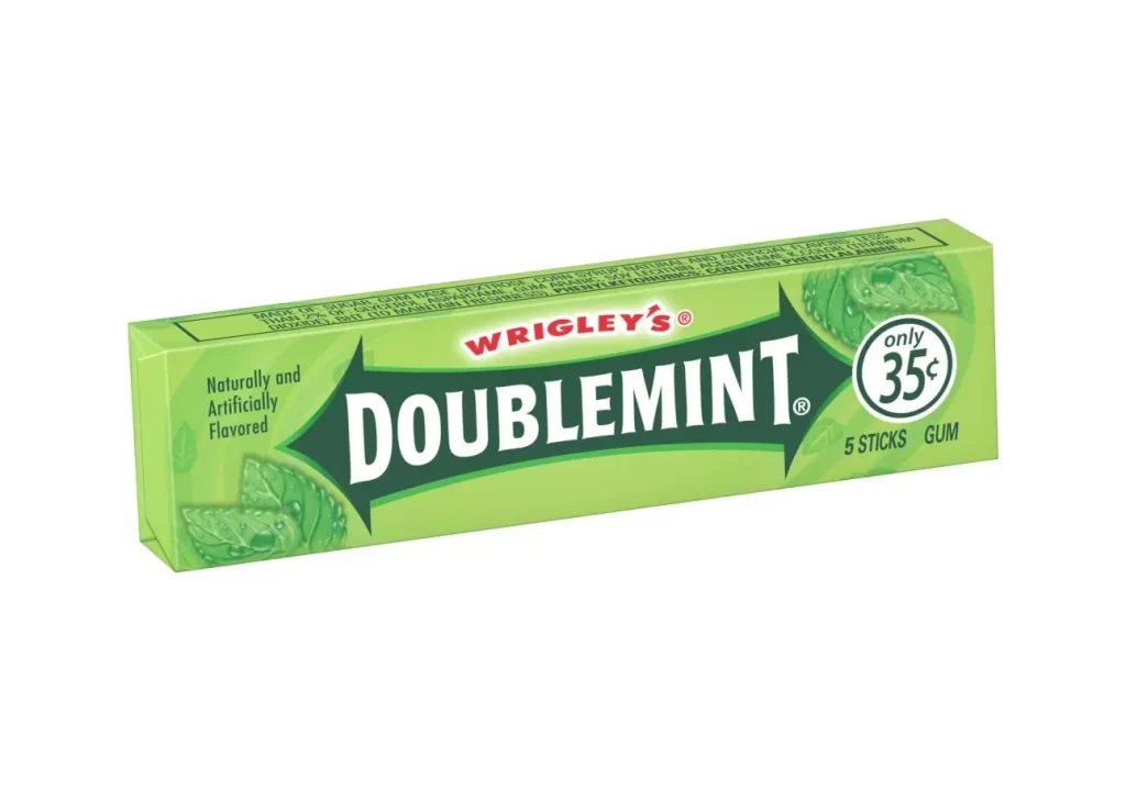
A single pack of Wrigley's Doublemint gum sits at a slight three-quarter angle on a white surface, revealing its top and front faces under even, shadowless studio lighting. The packaging is dominated by a vibrant lime-green hue, featuring the iconic dark green arrow-shaped banner that houses the word 'DOUBLEMINT' in bold, white serif lettering. Above this central branding element, the red 'WRIGLEY'S' logo sits prominently near the upper edge of the box.
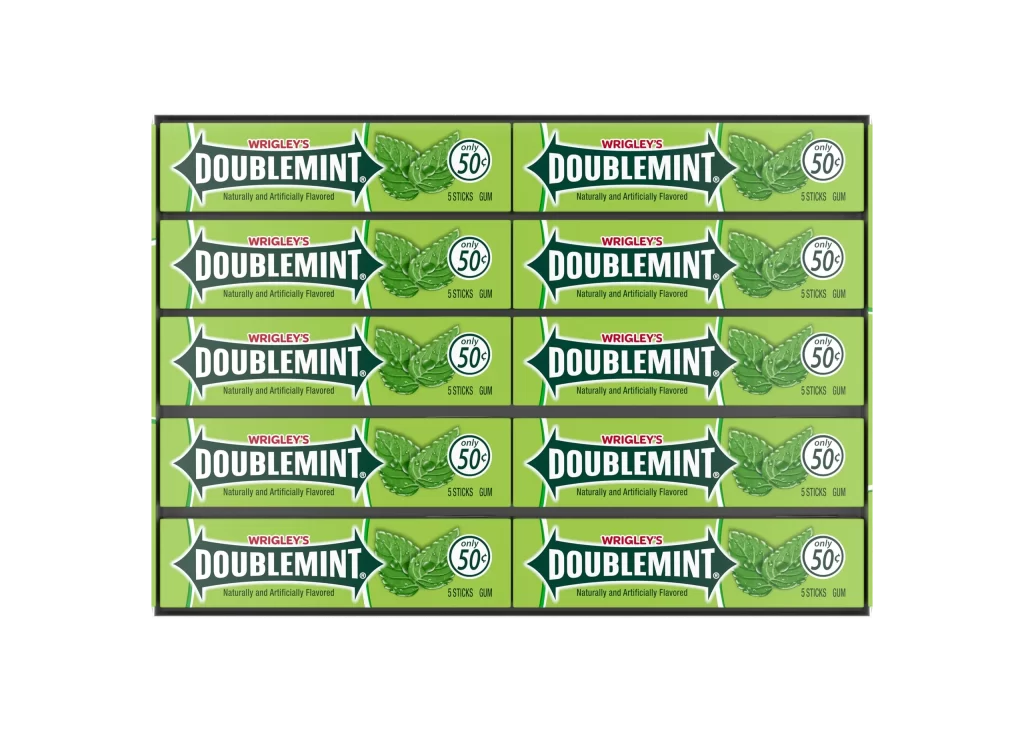
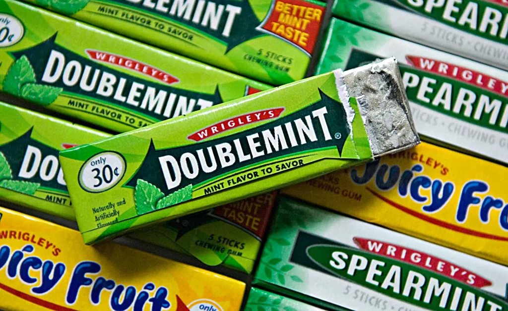
What makes this particular iteration of the packaging visually compelling is its reliance on high-contrast color blocking and classic geometric forms to establish brand recognition. The sharp, directional shape of the dark green banner creates a strong focal point that draws the eye immediately to the product name, while the bright green background evokes freshness without overwhelming the viewer. Typography plays a crucial role here, mixing the casual red script of the parent brand with the authoritative white serif of the product line, creating a hierarchy that feels both established and accessible. The inclusion of specific vintage pricing elements gives the design a nostalgic quality that distinguishes it from modern minimalist trends.
Brand historians and packaging students might examine this artifact to understand how color psychology was utilized in mid-to-late 20th-century consumer goods marketing. A 3D artist tasked with creating realistic grocery store environments could use the specific proportions and material textures shown here to populate their virtual shelves accurately. Furthermore, illustrators looking to practice rendering reflective surfaces and printed text on cylindrical or folded objects will find the clear legibility and simple geometry of this box an excellent starting point for technical studies.