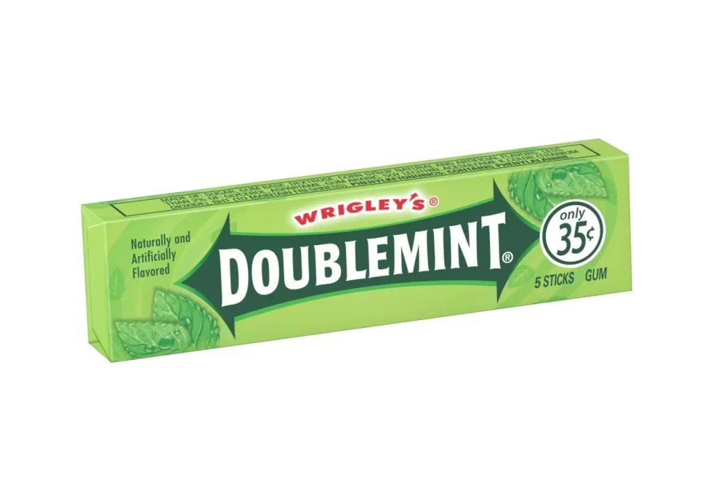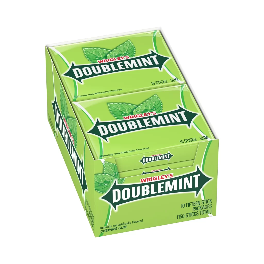
Wrigley’s Doublemint Sugar Free Gum 10 Count Box Packaging
Topics
Details
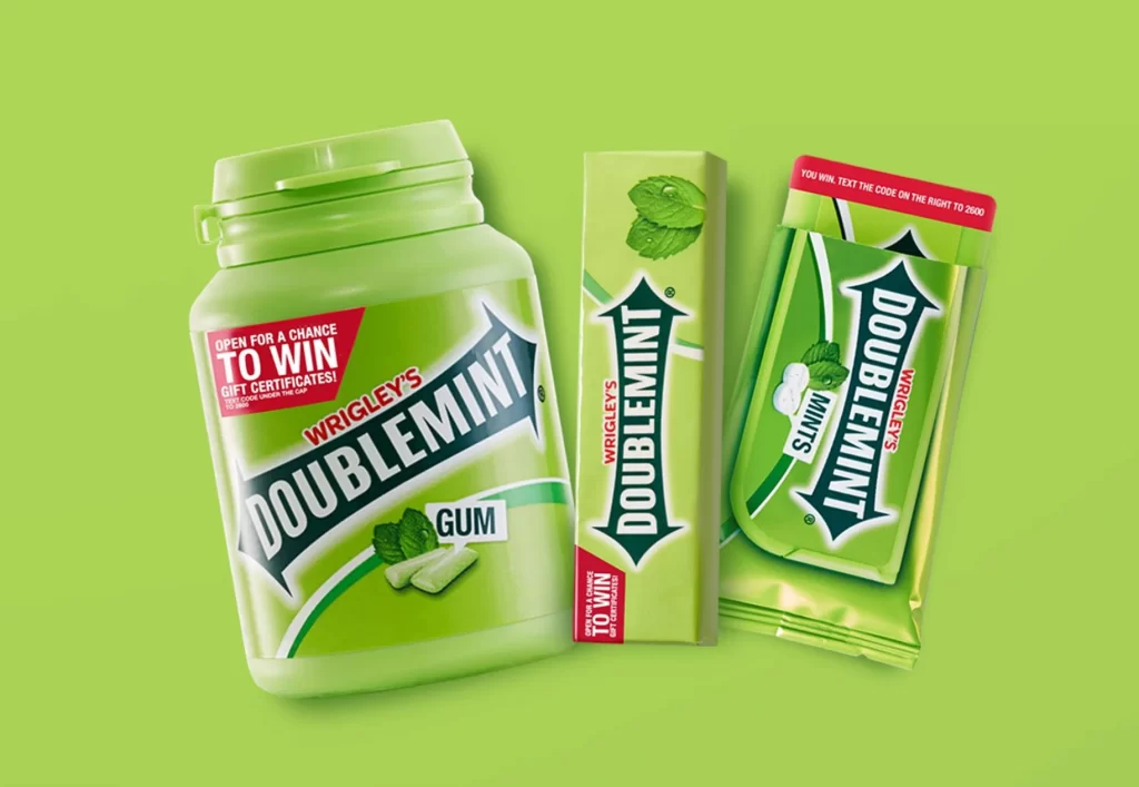
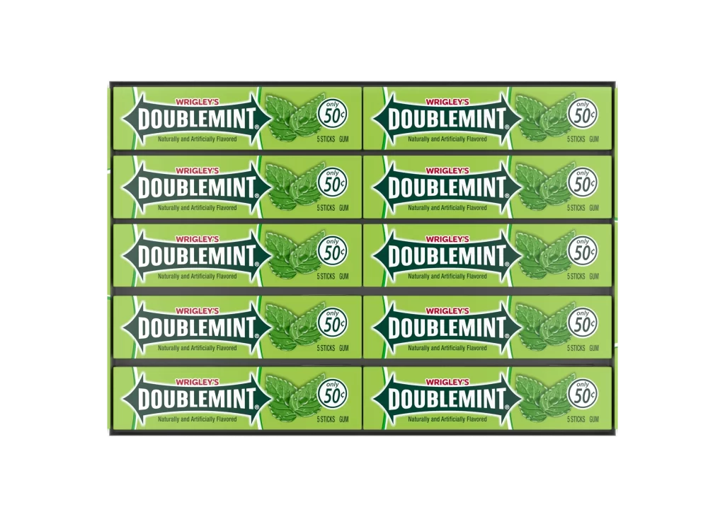
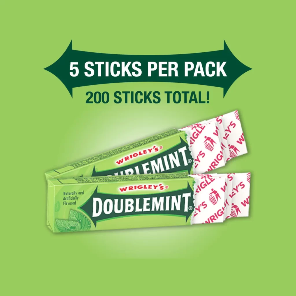
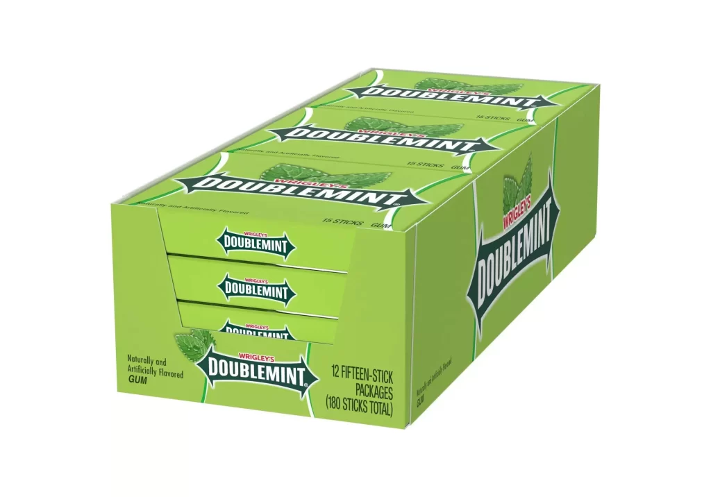
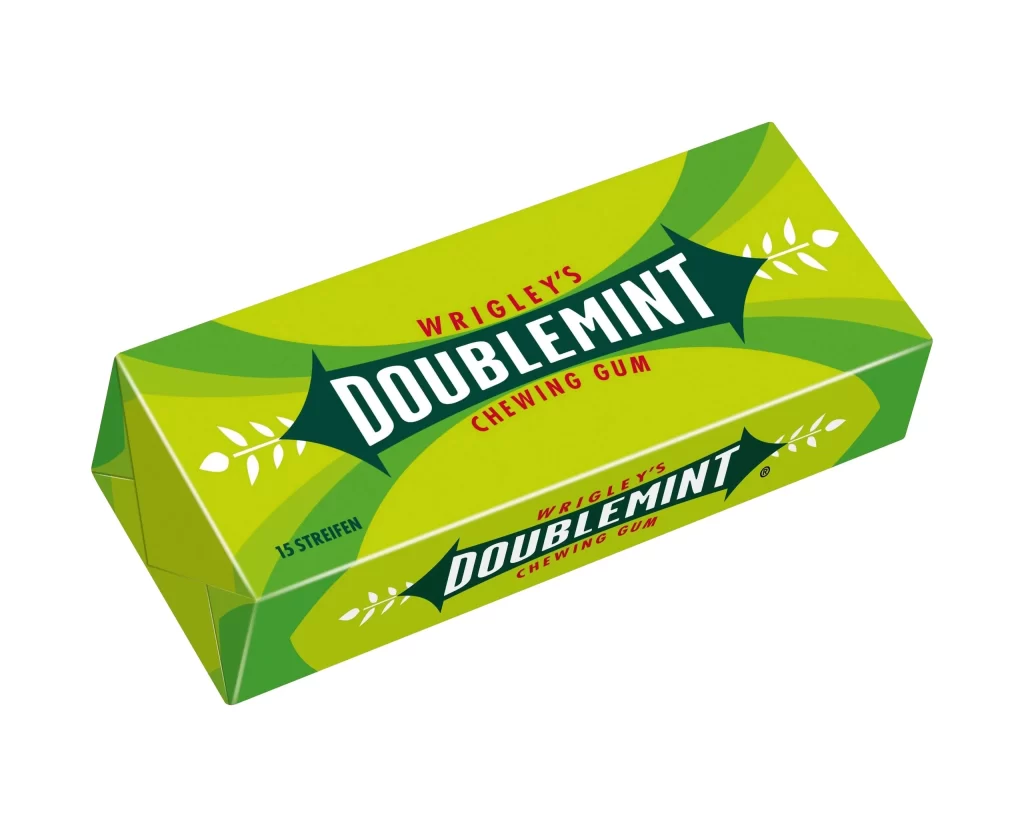
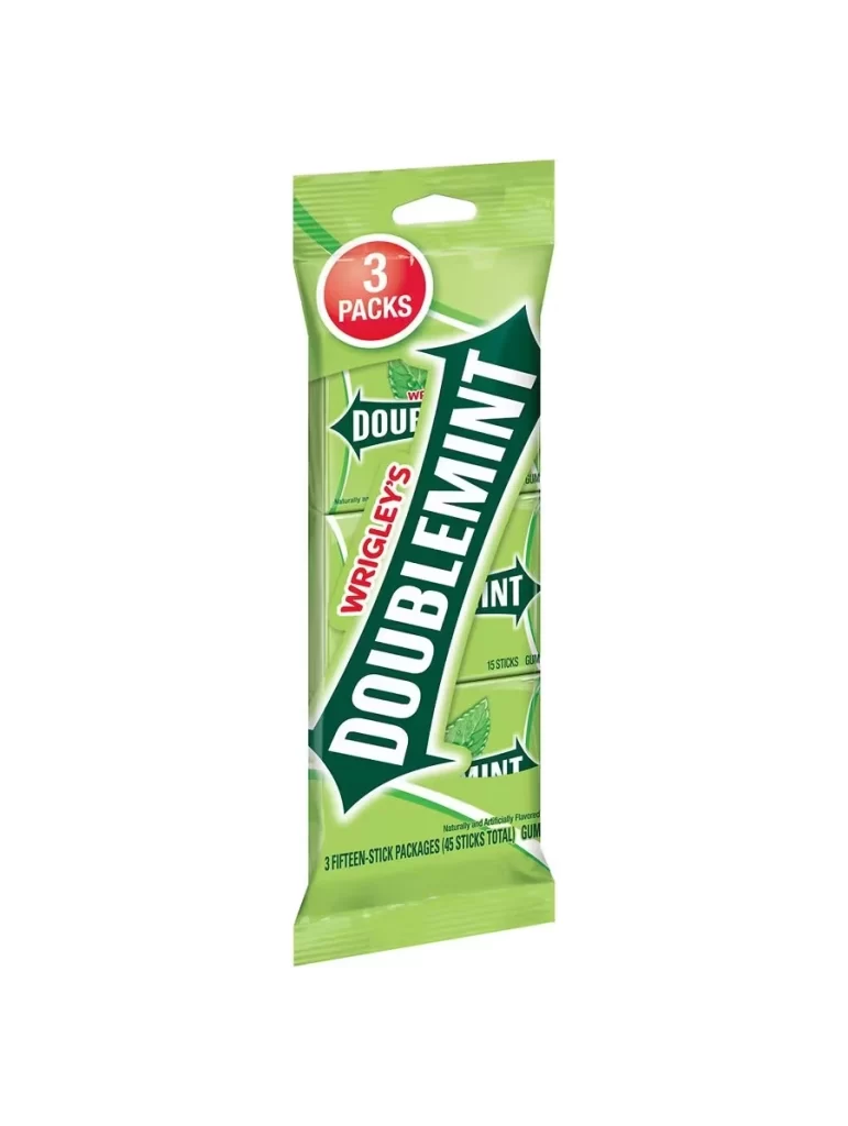
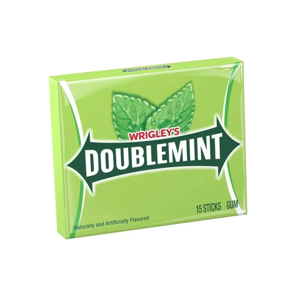
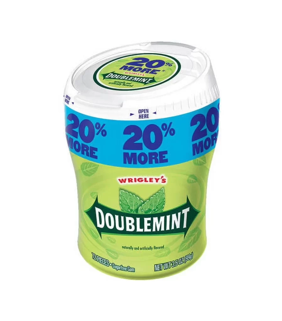
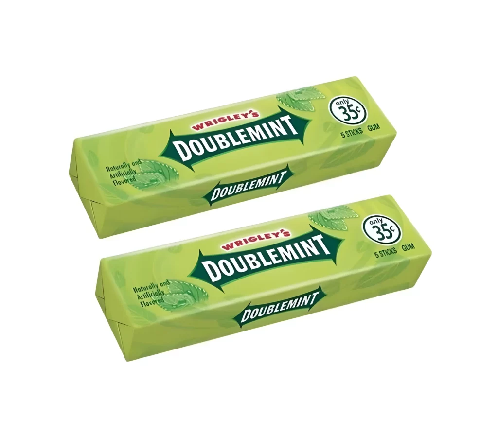
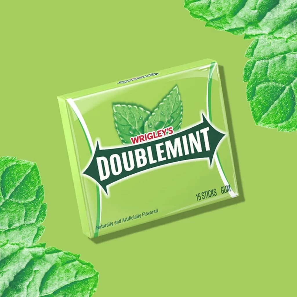
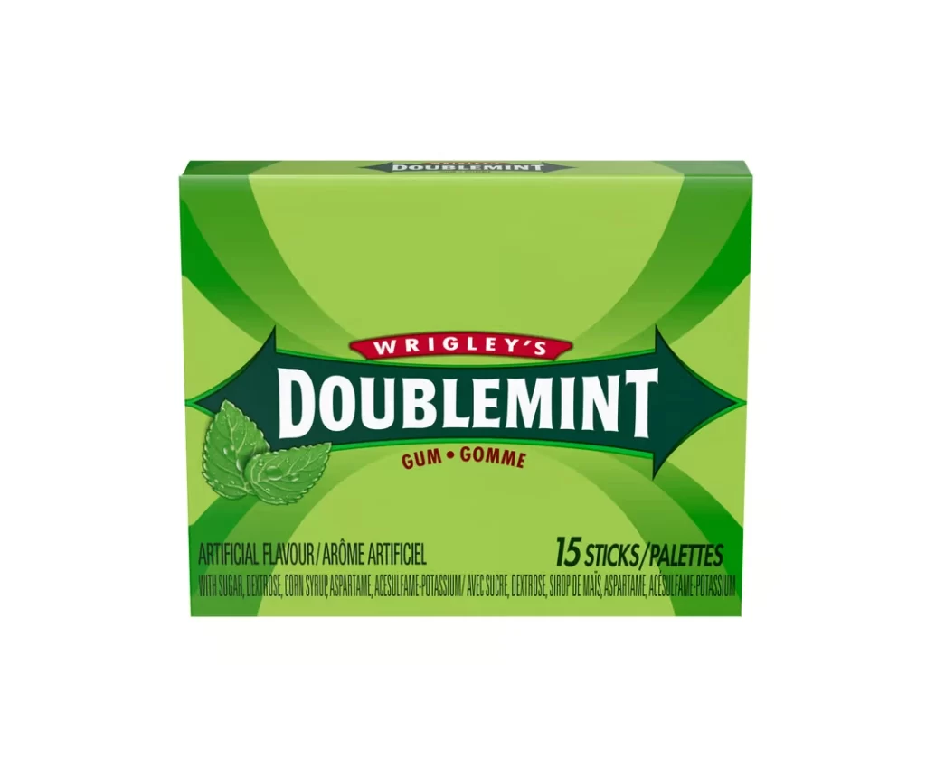
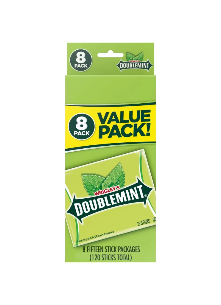
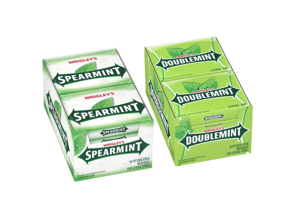
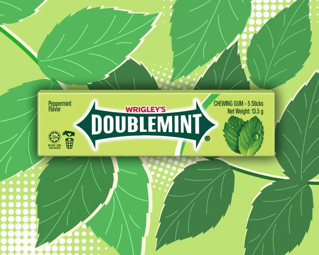
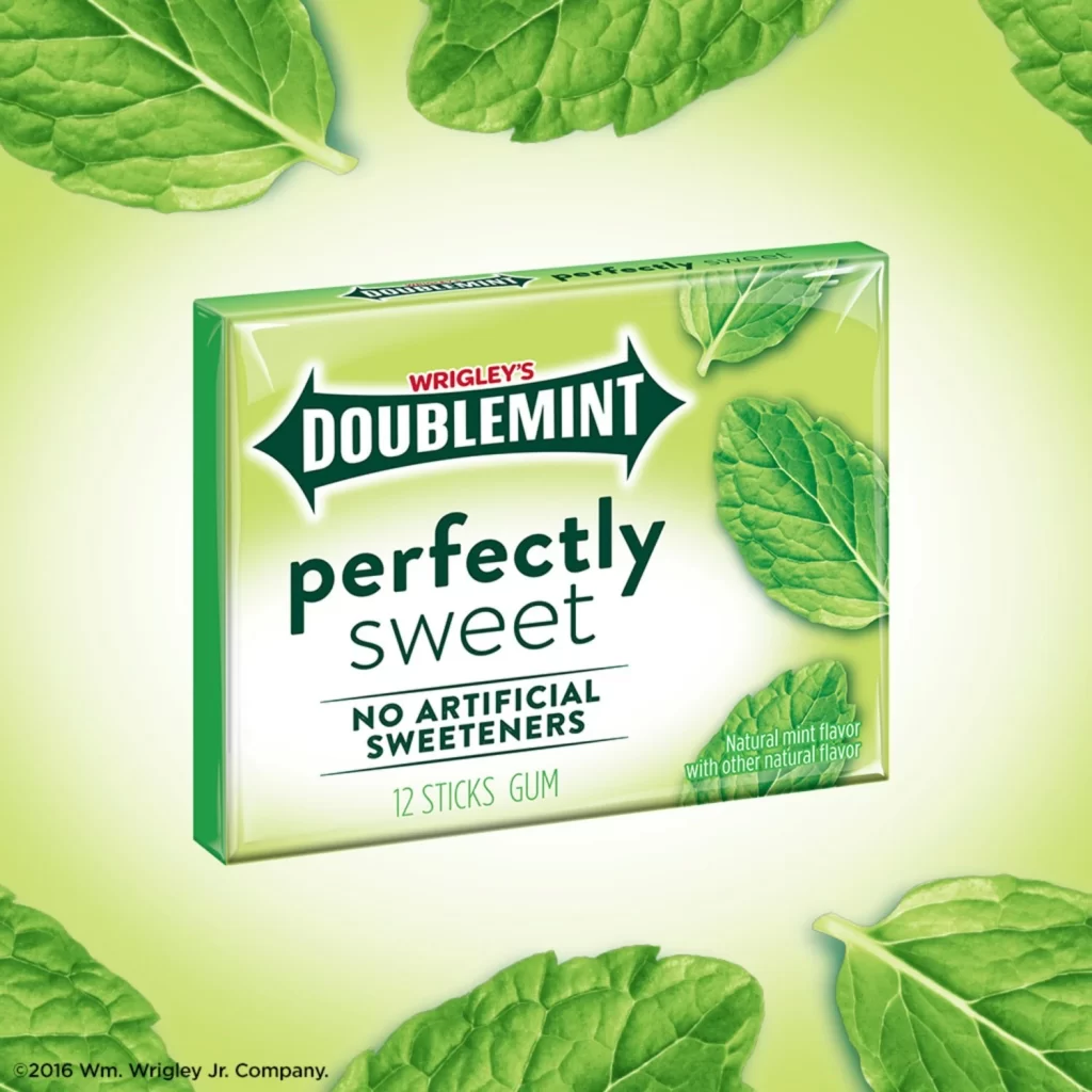
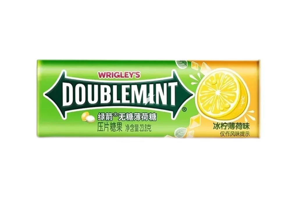
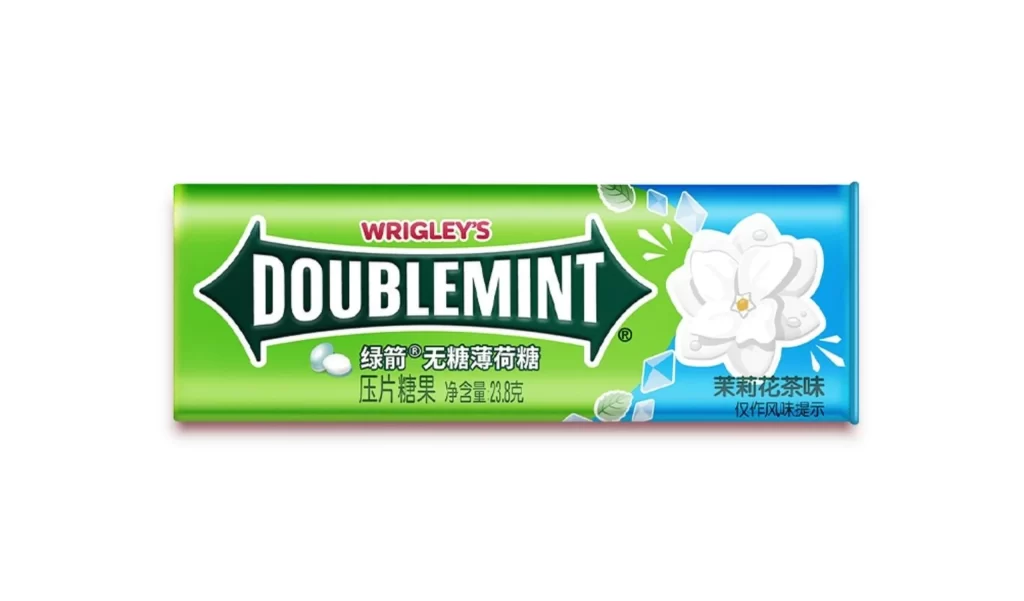
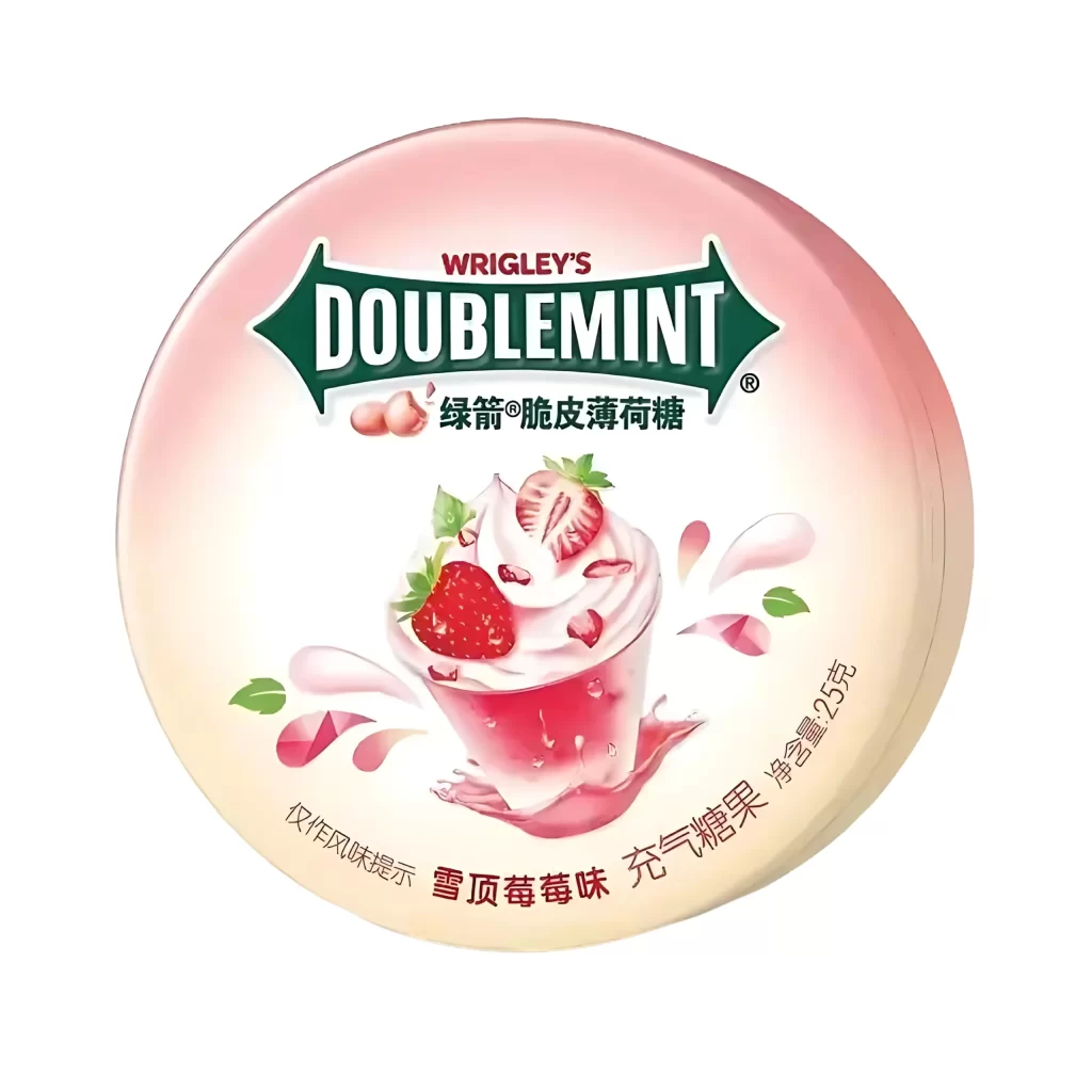
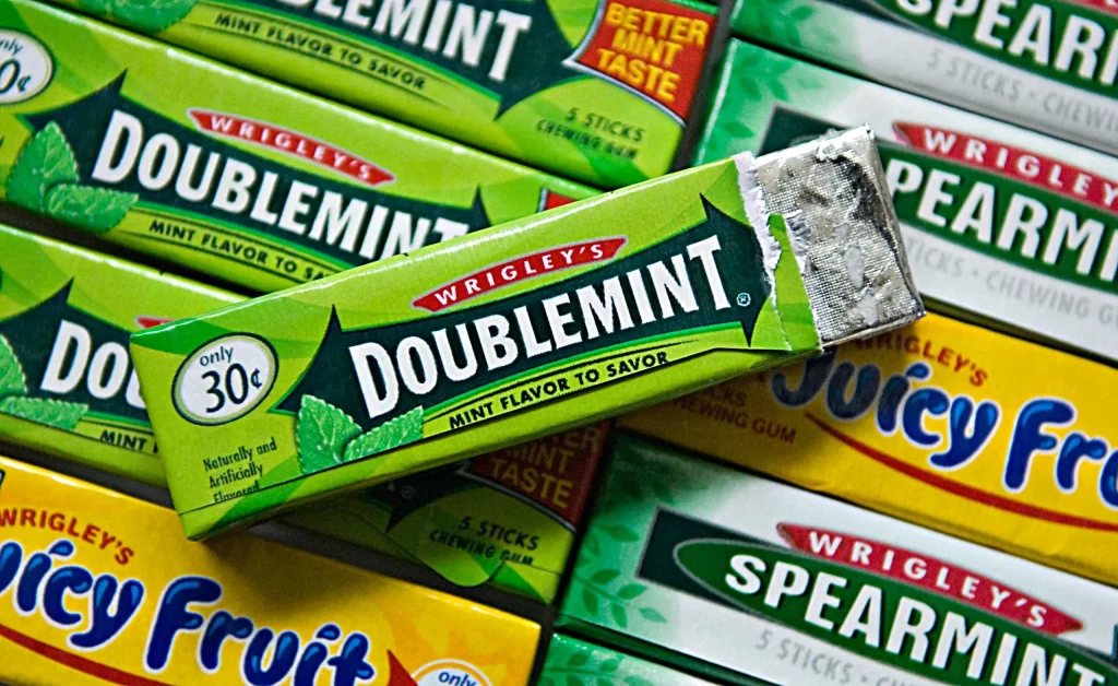
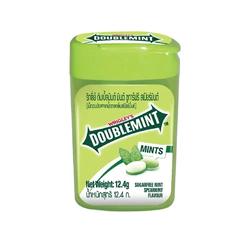
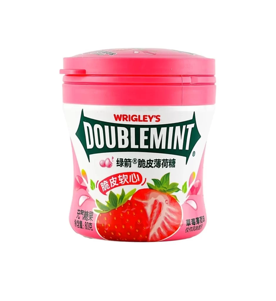
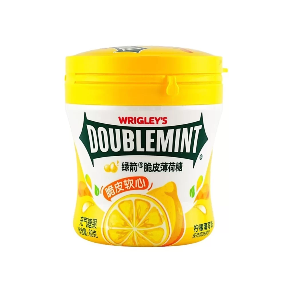
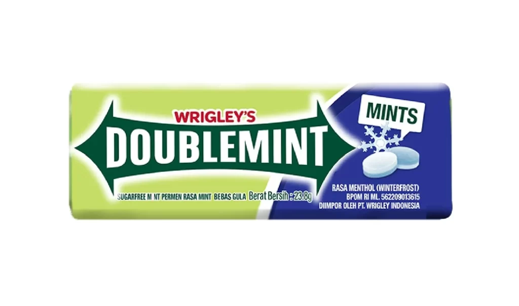
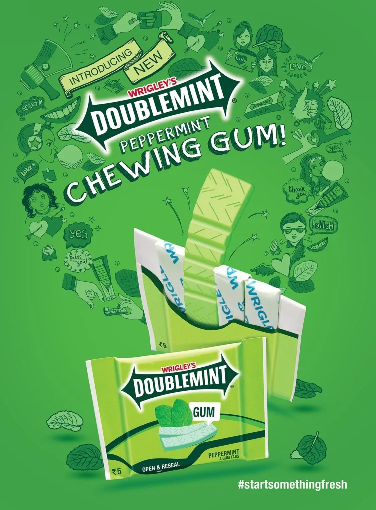
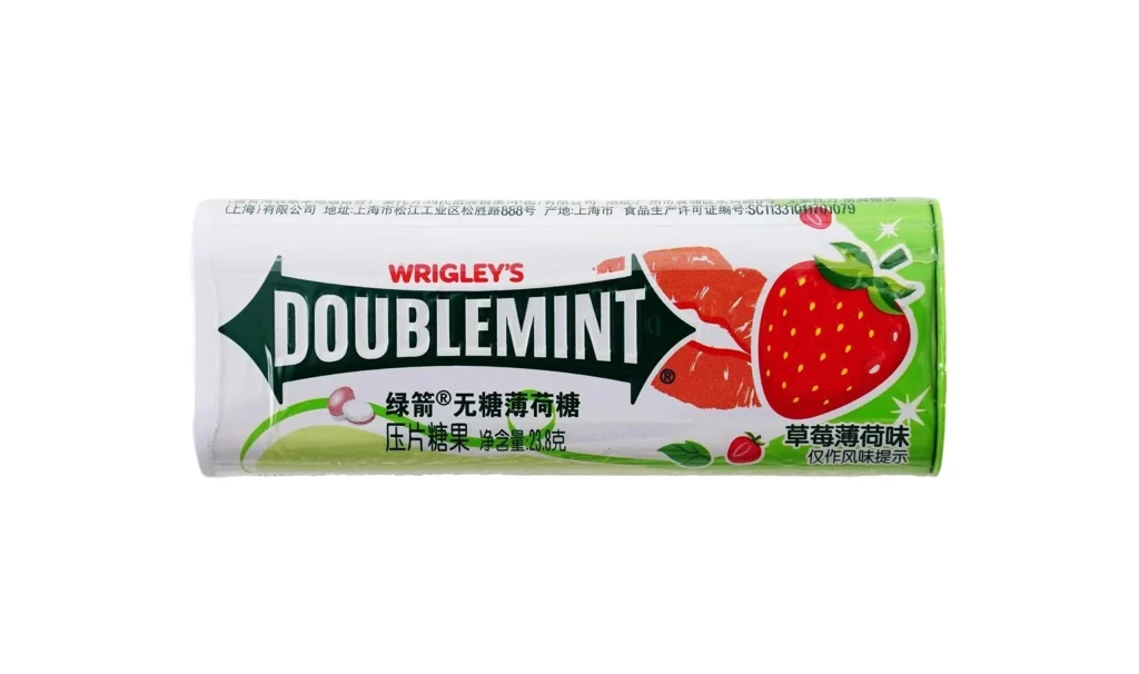
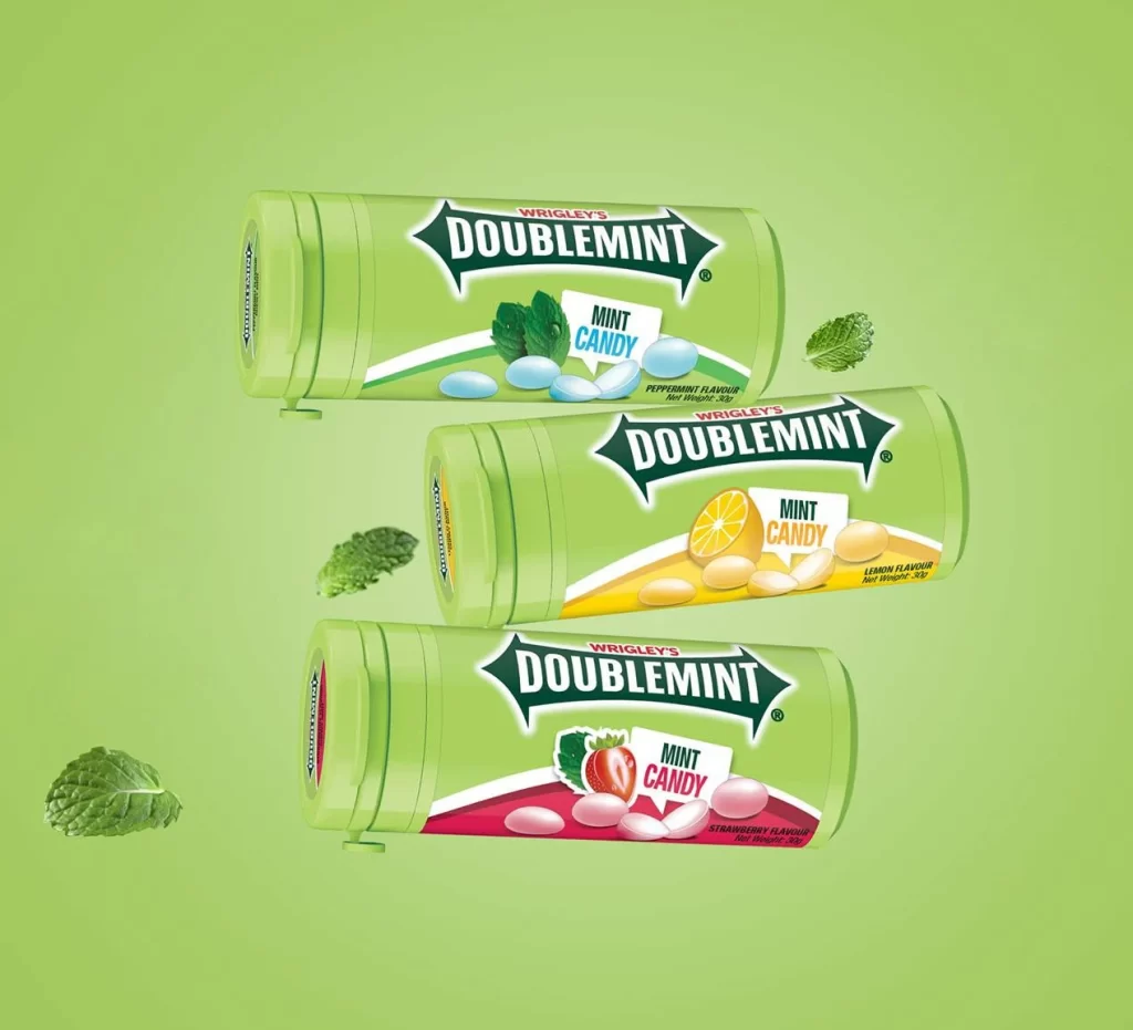
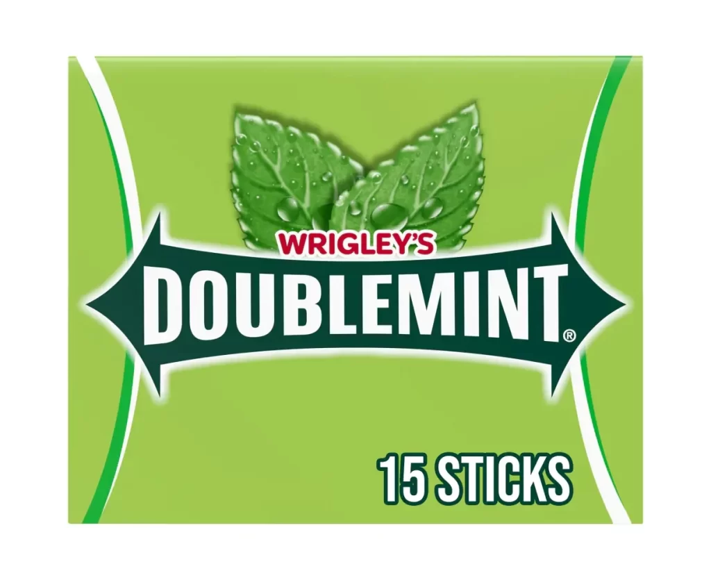
Vibrant lime green dominates the packaging of this Wrigley's Doublemint gum box, featuring a glossy finish that catches the light across its rectangular surfaces. The composition displays a ten-pack arrangement stacked neatly, with each individual fifteen-stick package showing the iconic white 'DOUBLEMINT' text set within dark green arrow-shaped banners. Fresh mint leaf graphics appear above the brand name, while smaller red 'WRIGLEY'S' lettering anchors the top of the main logo, all photographed from a three-quarter angle against a clean white background with soft, even studio lighting.
Visual hierarchy in this design relies on the bold contrast between the saturated green field and the crisp white typography, creating immediate shelf presence through color psychology associated with freshness. The repeating arrow motif surrounding the product name adds directional energy that guides the eye, while the consistent placement of flavor indicators and stick counts maintains readability across multiple package faces. Layered depth emerges from how the individual packs nest within the outer carton, demonstrating efficient retail display architecture that maximizes branding visibility.
Packaging engineers studying confectionery retail formats can analyze the structural efficiency of this multi-pack configuration for space optimization on store shelves. Brand identity researchers examining legacy product lines will find value in documenting how classic visual elements like the mint leaf iconography persist across contemporary iterations. Marketing teams developing point-of-sale materials could reference the typographic scale relationships and color saturation levels used here to ensure consistency across complementary promotional collateral.