Wrigley’s Extra Polar Ice Gum Advertisement
Topics
Details
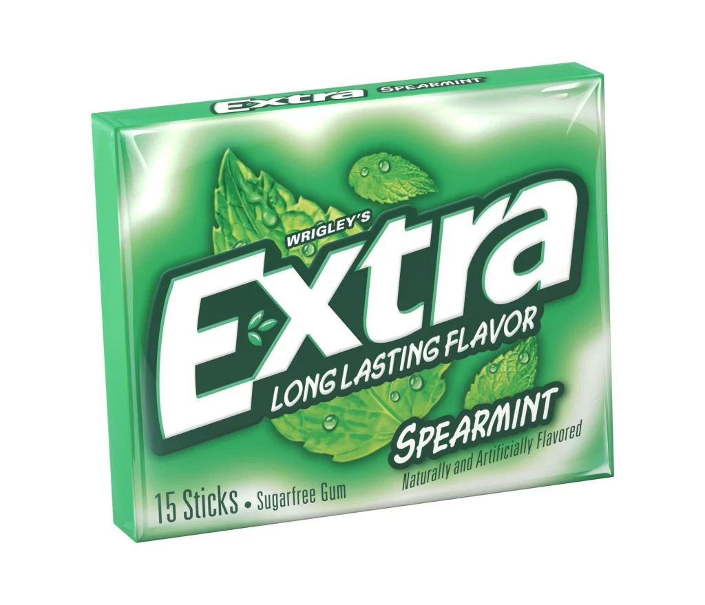
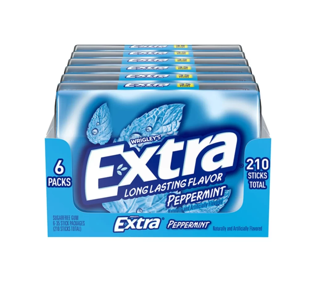
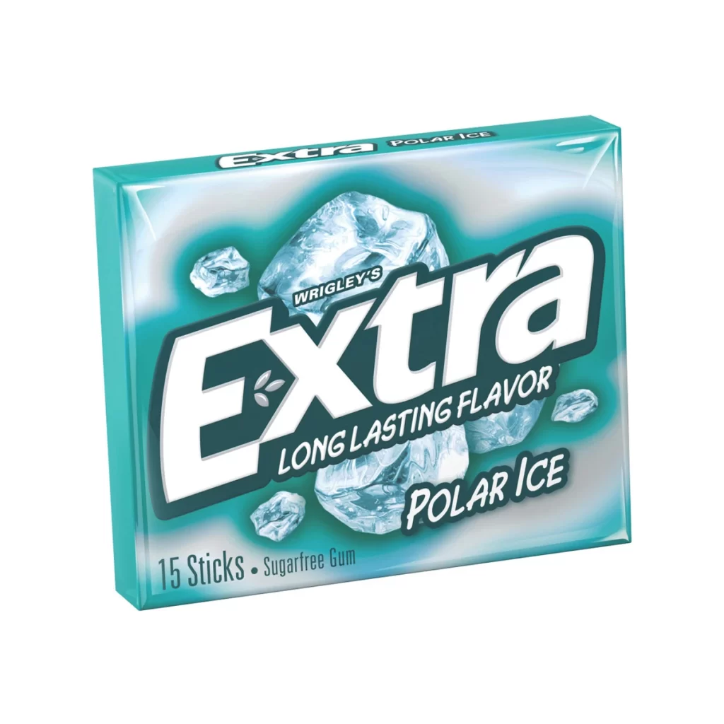
The advertising shot features a box of Extra Polar Ice sugarfree gum set against a light blue gradient background that mimics the look of ice. Large, crystalline ice cubes are scattered around the packaging to visually reinforce the freezing temperature of the product. This composition uses cool color palettes and sharp textures to immediately signal a refreshing sensory experience to the viewer.
Positioned within Wrigley’s extensive portfolio, this specific variant emphasizes a ‘long lasting flavor’ promise that appeals to consumers seeking durability. The ‘Polar Ice’ branding suggests an intense cooling sensation that goes beyond standard mint offerings. Such messaging helps the product stand out in a crowded market by focusing on extreme freshness and sustained taste.
Marketers can study this campaign to understand how visual metaphors like ice effectively communicate abstract benefits like breath freshness. The clear typography and uncluttered layout ensure that key selling points are read quickly by potential buyers. Analyzing these elements reveals how successful gum advertising combines aesthetic appeal with functional claims.