Wrigley’s Doublemint Sugarfree Mints Box Packaging
Topics
Details
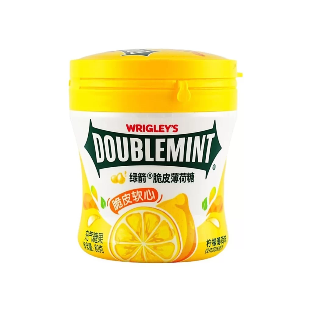
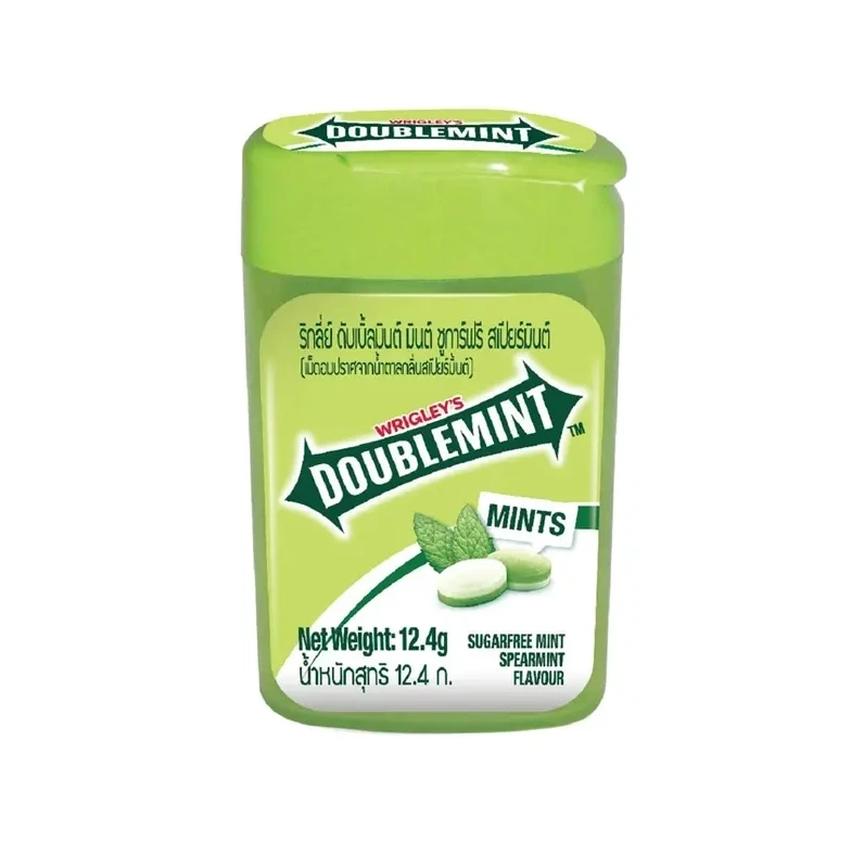
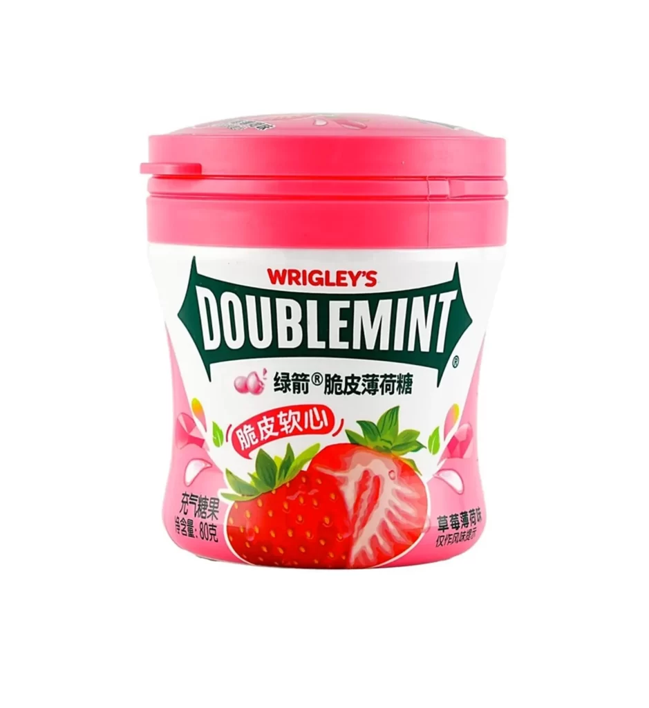
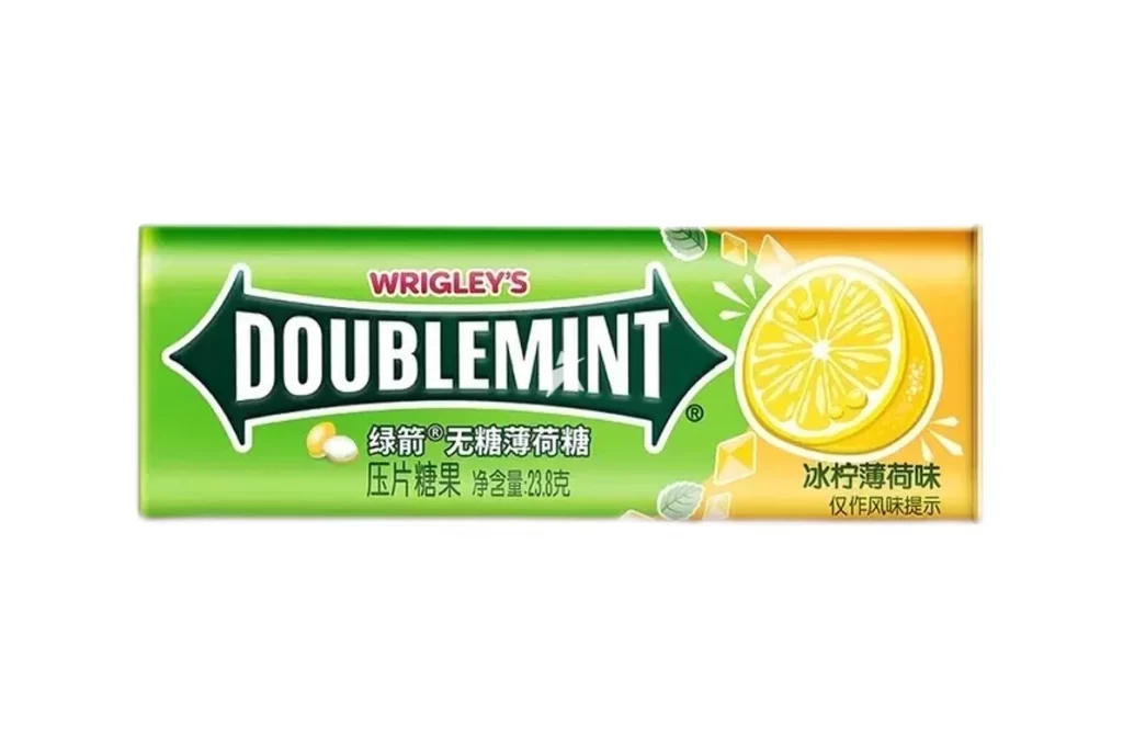
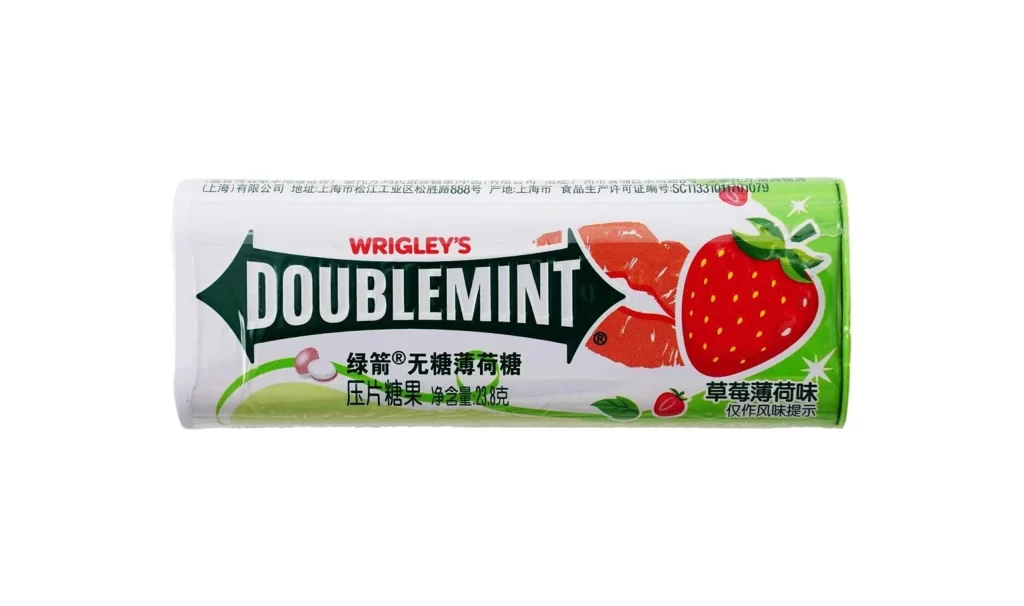
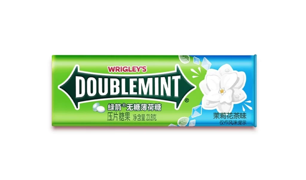
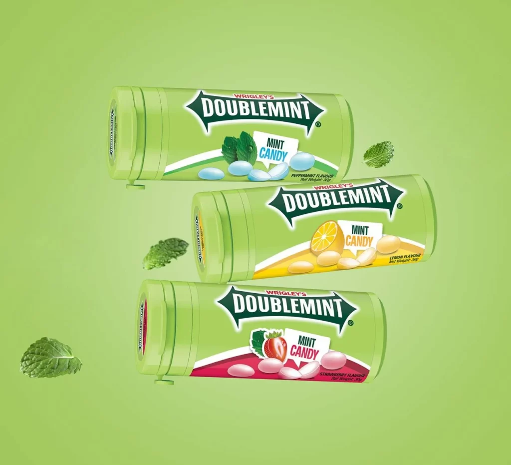
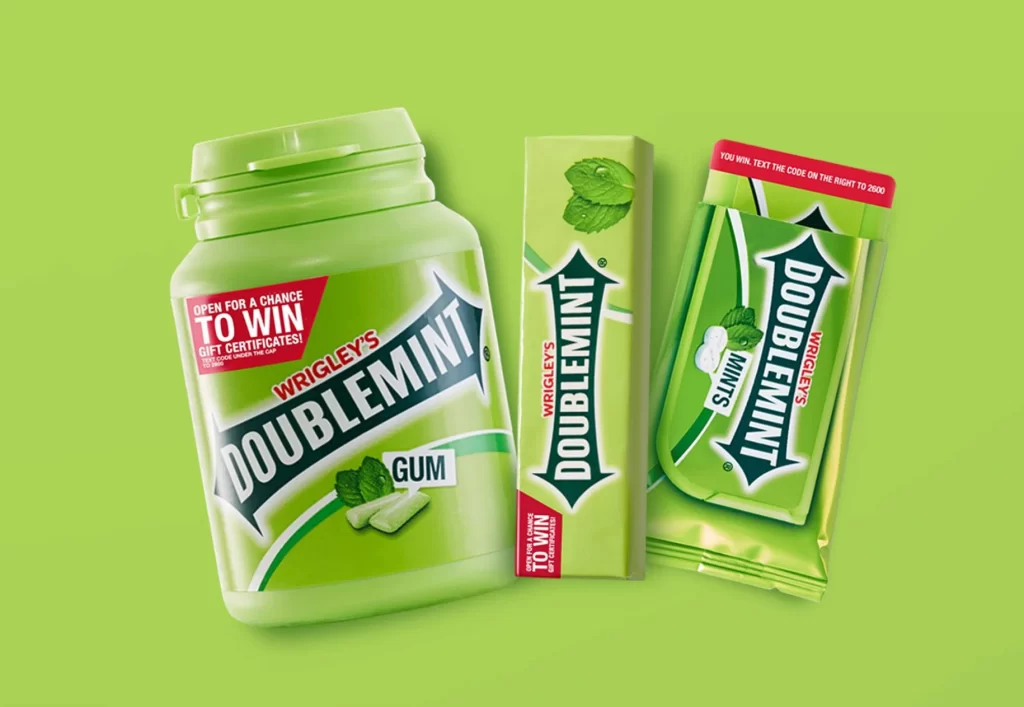
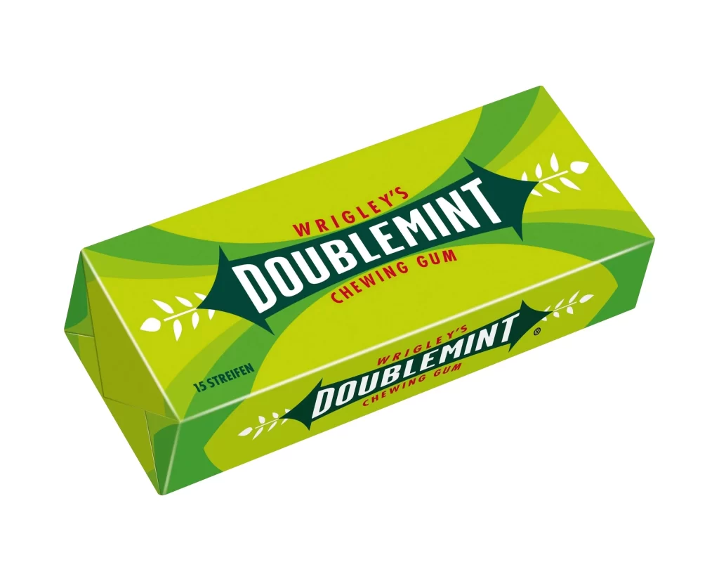
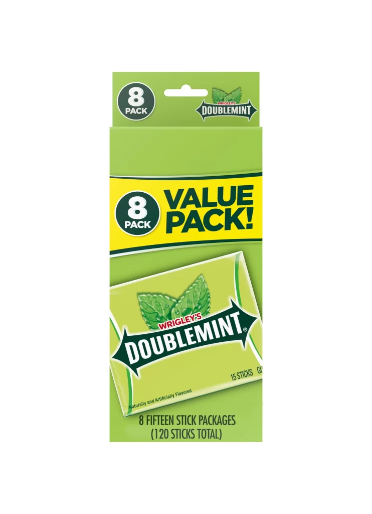
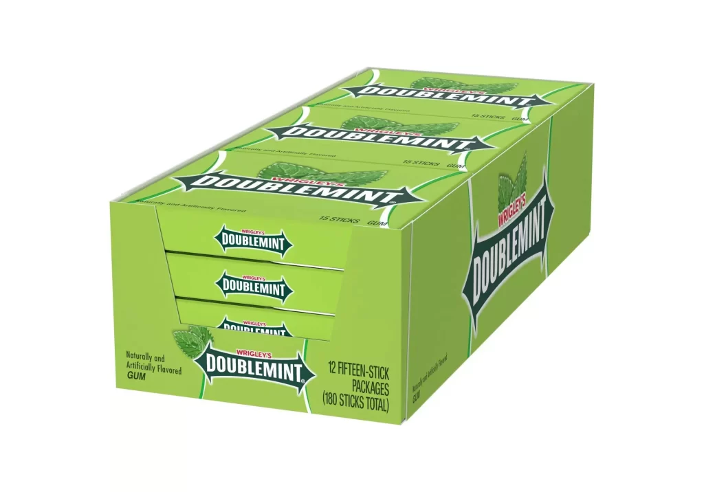
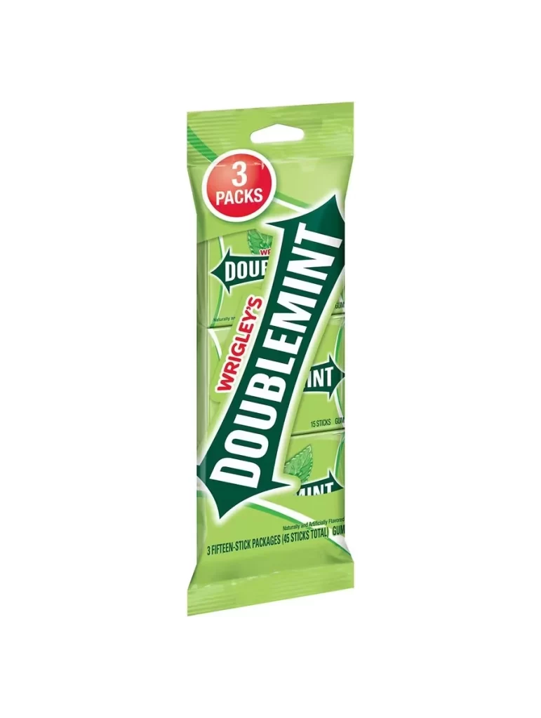
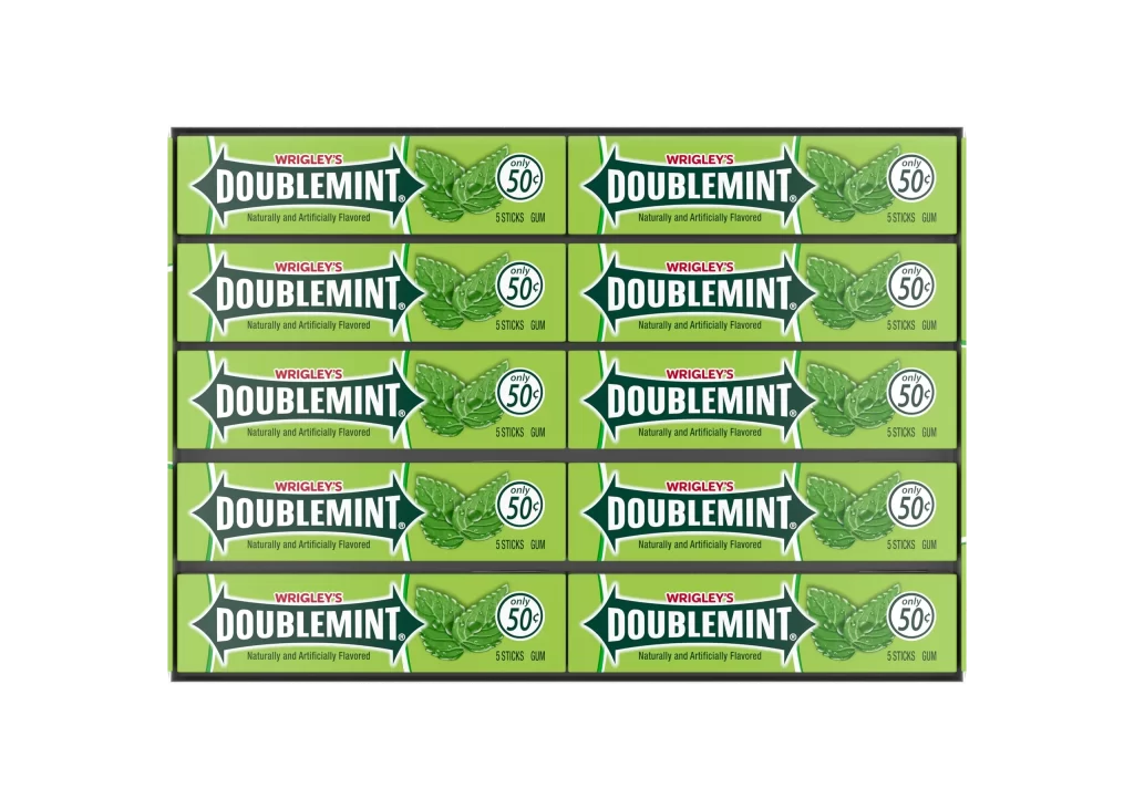
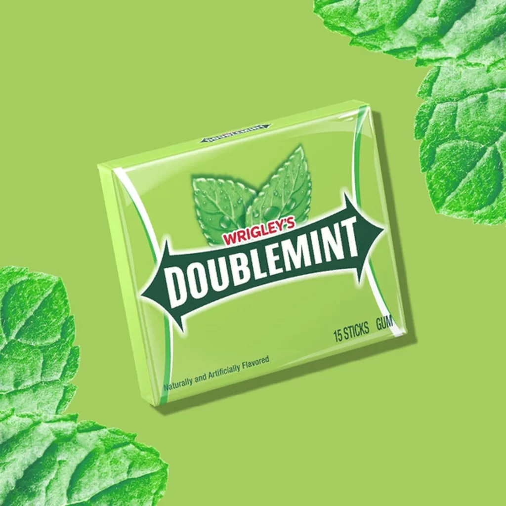
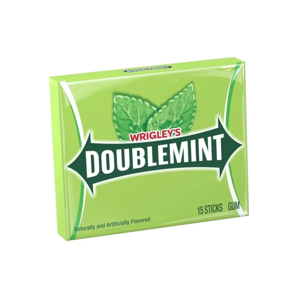
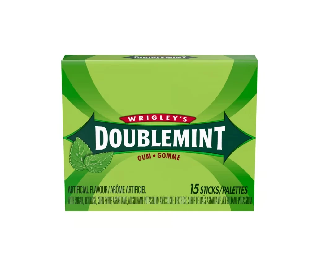
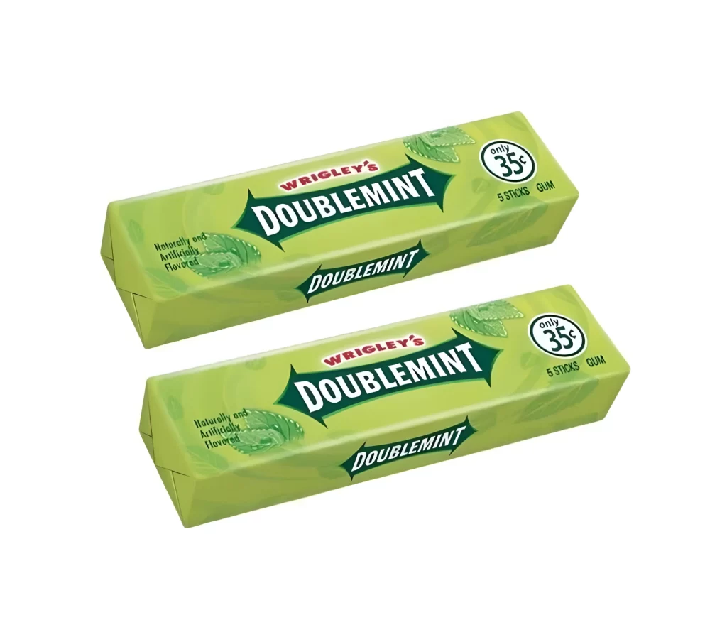
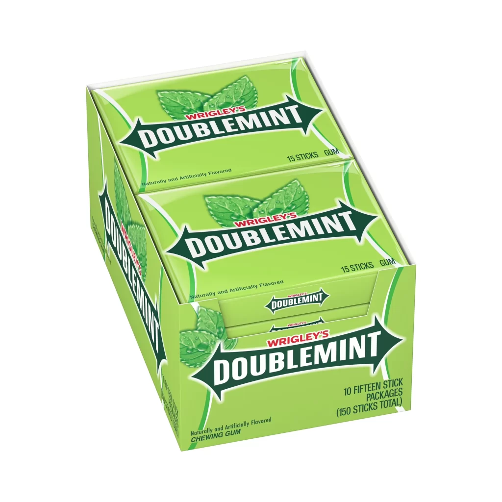
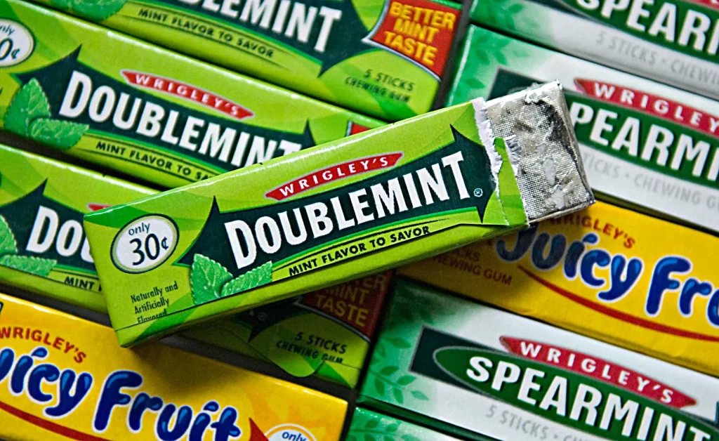
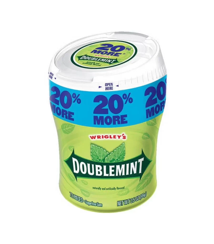
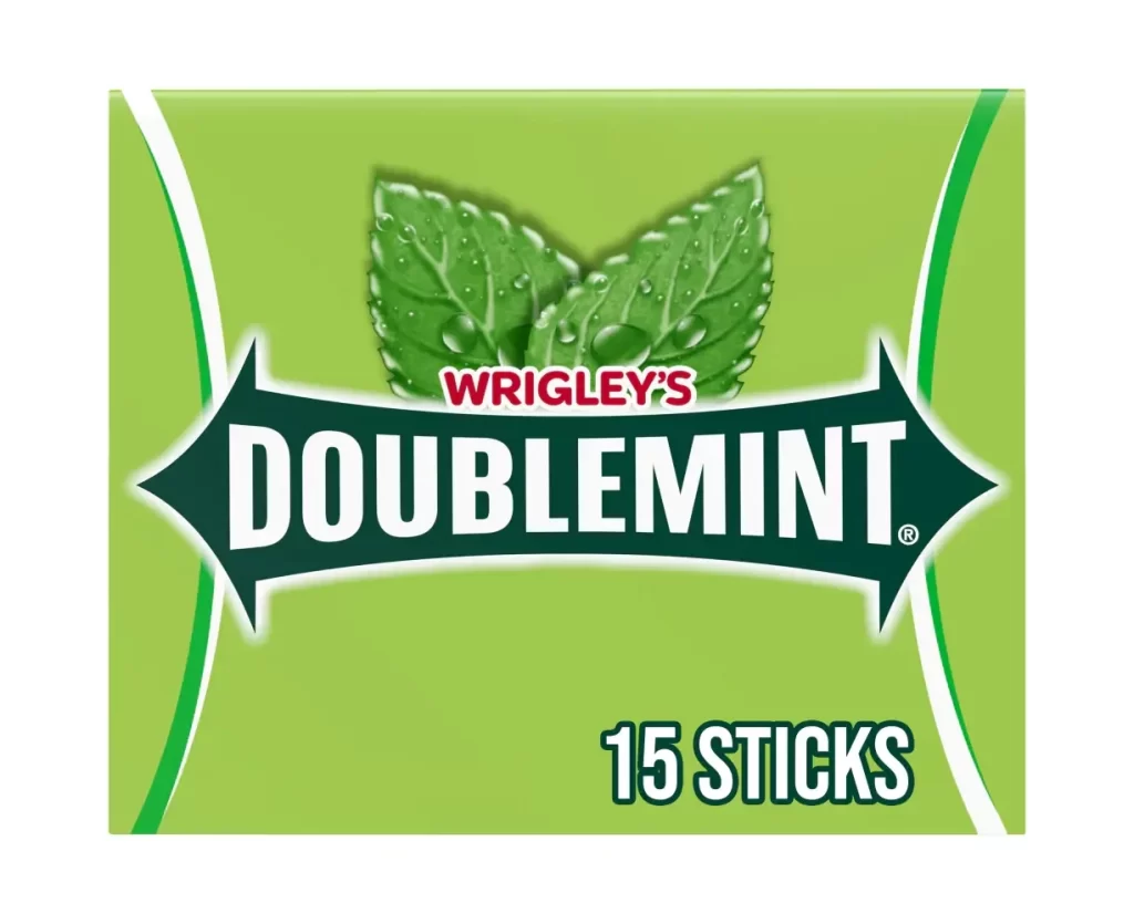
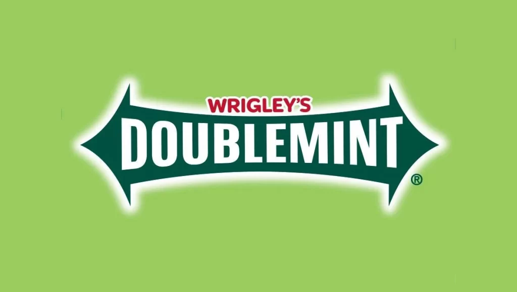
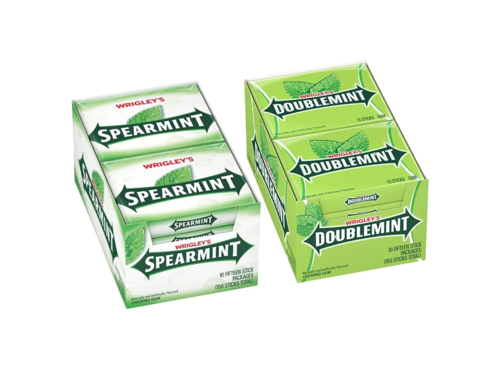
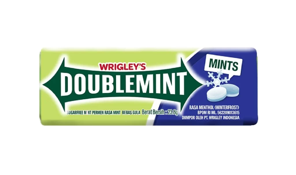
The packaging features a rectangular box with a distinctive split-color design, utilizing a vibrant lime green on the left and a deep royal blue on the right. A prominent dark green arrow shape spans the center, housing the bold white ‘DOUBLEMINT’ brand name in a classic sans-serif typeface. Small graphical elements, such as the ‘MINTS’ label and two white pill-shaped mints, clearly communicate the product’s form and flavor profile.
Positioned within Wrigley’s extensive portfolio of confectionery goods, this sugarfree mint format offers a convenient alternative to traditional chewing gum. The compact box is designed for easy storage in pockets or purses, catering to consumers seeking a quick breath freshener. It represents a strategic expansion of the iconic Doublemint brand into the hard candy and tablet market.
Designers can observe how high-contrast color blocking effectively separates branding information from regulatory text on a small surface area. The layout demonstrates an efficient use of space, balancing large-scale typography with necessary legal details like net weight and manufacturing origin. Such clean product photography against a white background ensures that the packaging colors remain the focal point for potential buyers.