Wrigley’s Doublemint Gum 40 Pack Box Packaging
Topics
Details
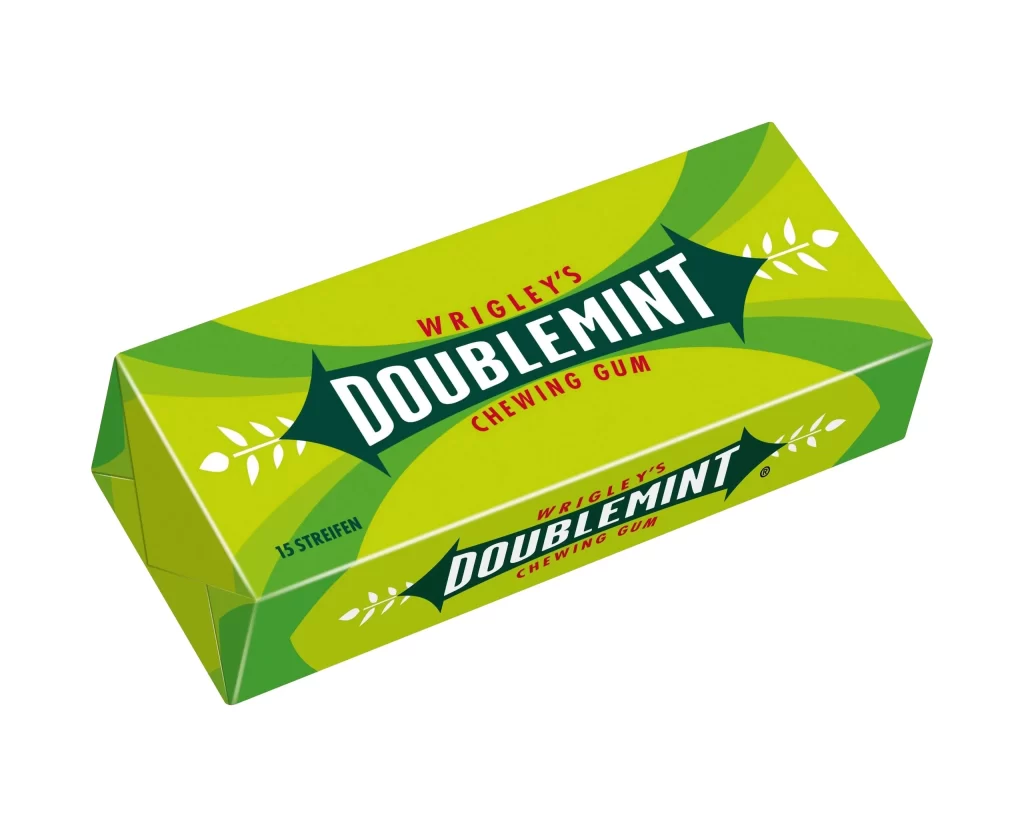
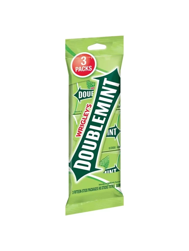
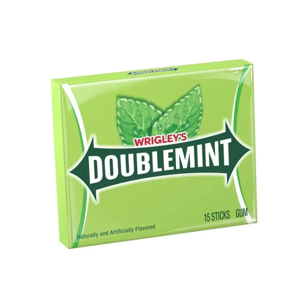
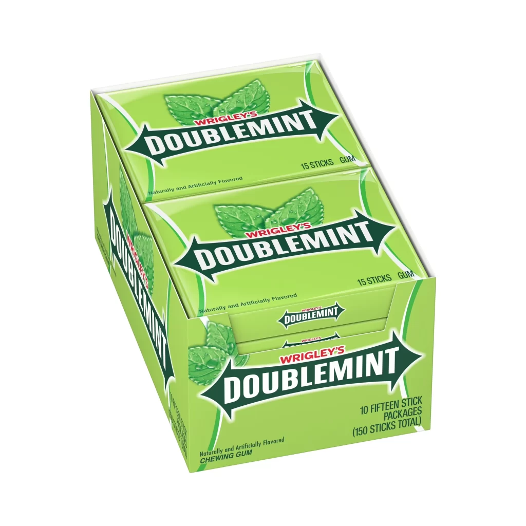
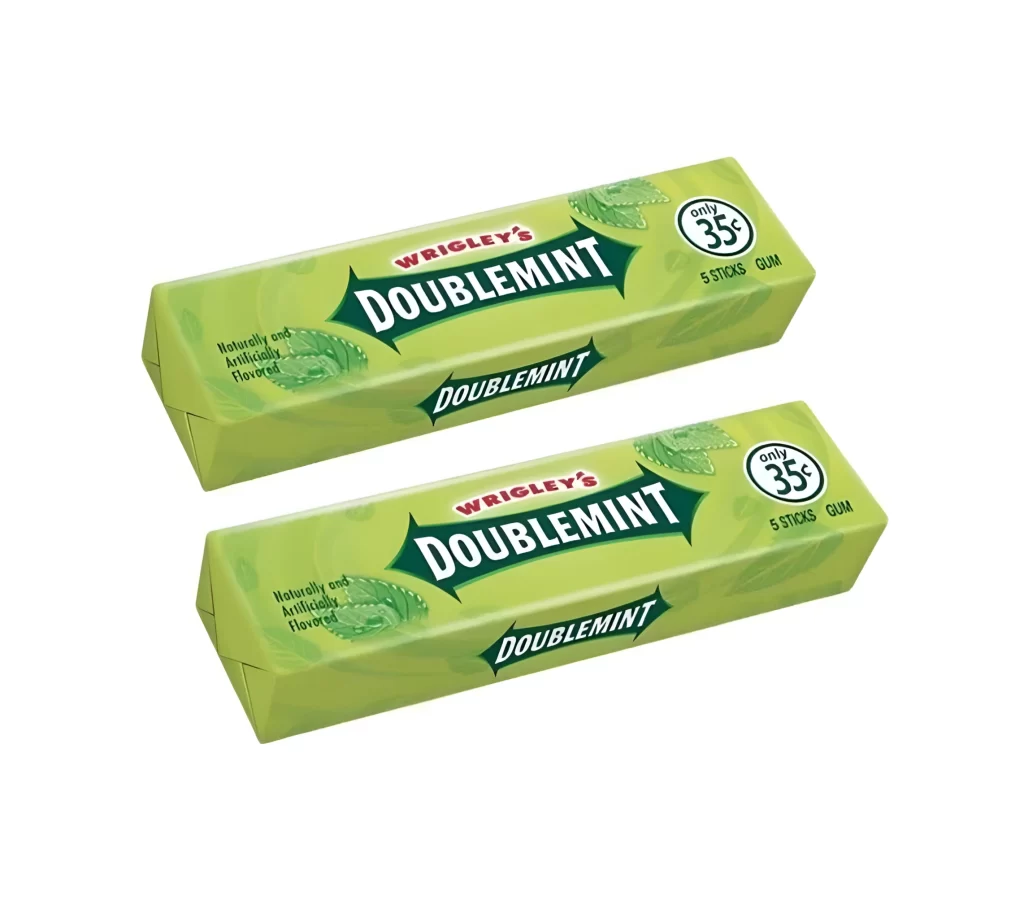
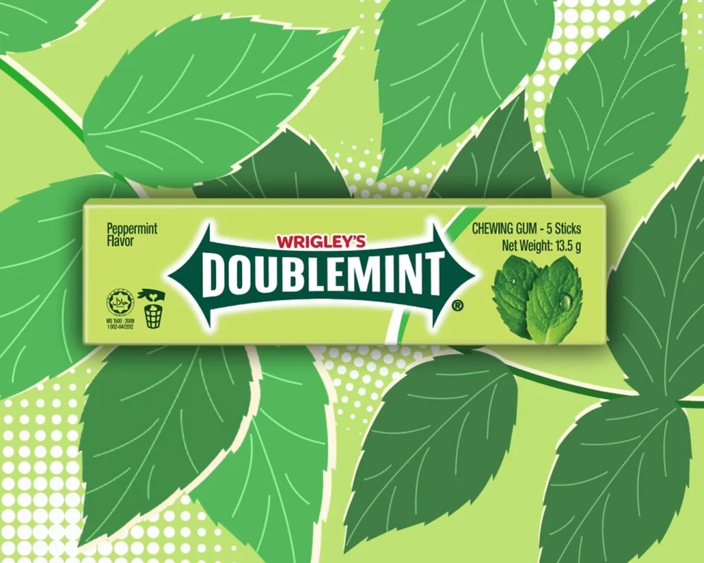
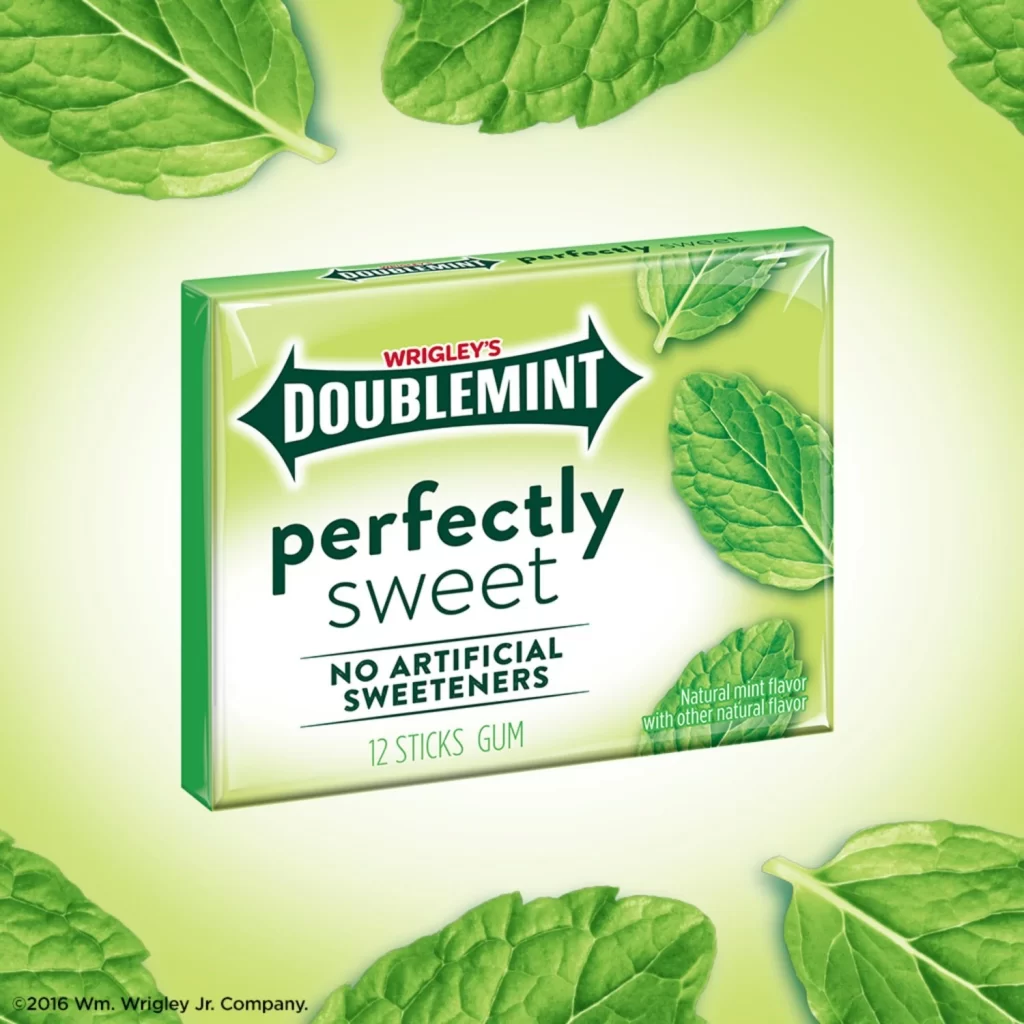
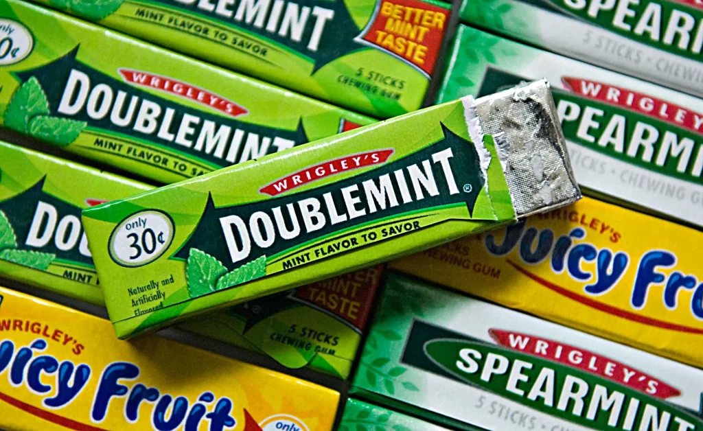
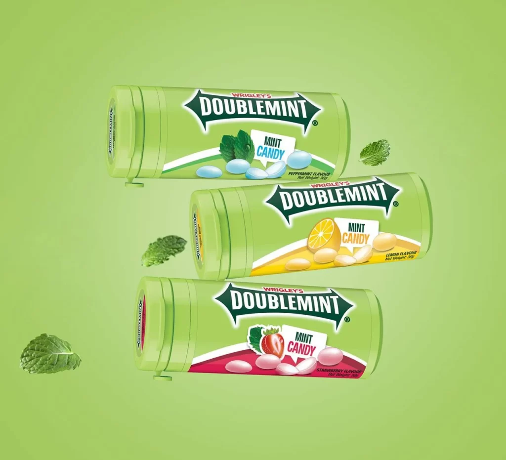
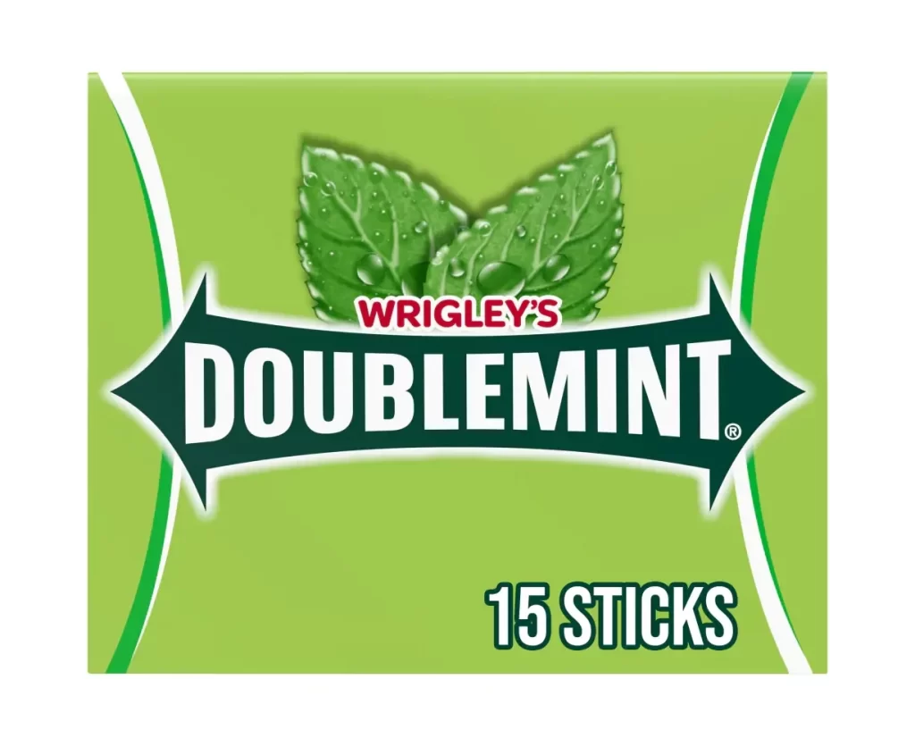
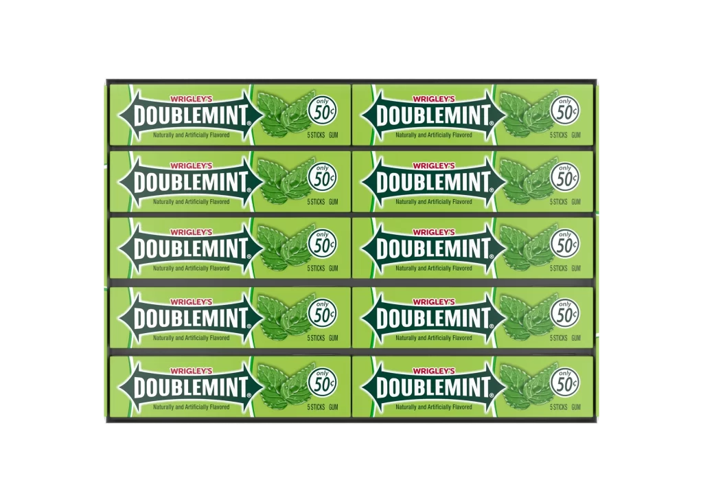
Arranged in a precise five-by-two grid, ten individual packs of Wrigley's Doublemint gum sit against a stark white background. Each rectangular pack features a vibrant lime-green surface dominated by the brand's signature dark green shield logo, which contains the word 'DOUBLEMINT' in bold white serif lettering. To the right of the central branding, a circular badge advertises a price of 'only 50¢' above the text '5 STICKS GUM', while realistic mint leaves add organic texture to the right side of every unit.
Visual repetition creates a compelling rhythmic pattern across the composition, emphasizing the product's mass-market accessibility through uniform design language. The high-contrast palette of bright green against deep forest tones ensures immediate shelf recognition, while the consistent placement of pricing and quantity information communicates value at a glance. Subtle shadows beneath each pack suggest physical depth without distracting from the clean, graphic quality of the packaging artwork.
Retail merchandising teams might study this arrangement to optimize planogram layouts for maximum visual impact in convenience store environments. Packaging engineers could analyze the spatial efficiency of this forty-pack configuration for logistics and shipping container optimization. Brand historians or trademark researchers may also find value in documenting the specific typographic treatments and color codes used during this production era.