Wrigley’s Doublemint Gum Box Variety Packaging
Topics
Details
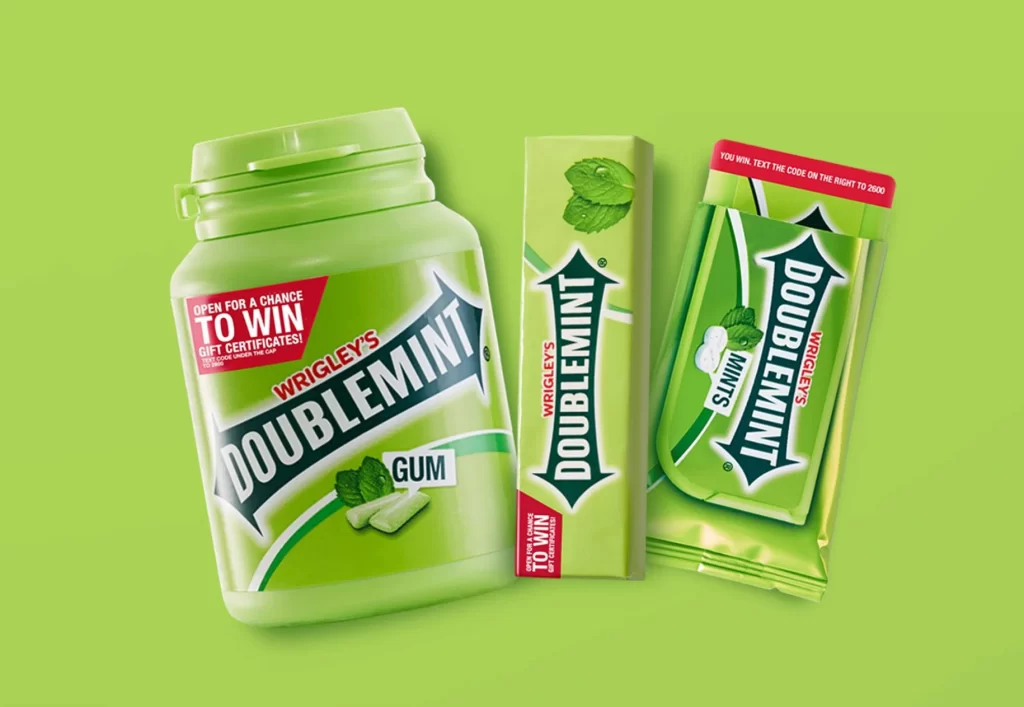
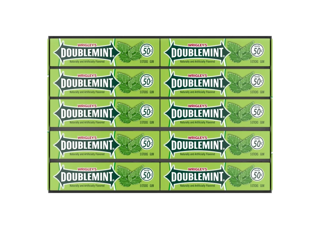
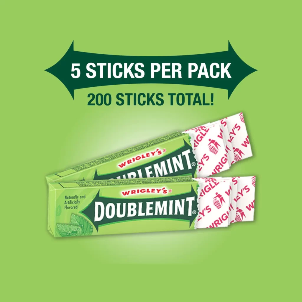
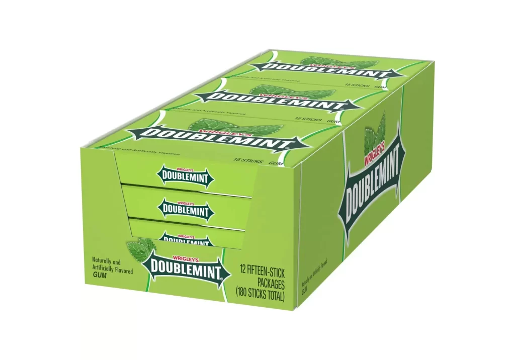
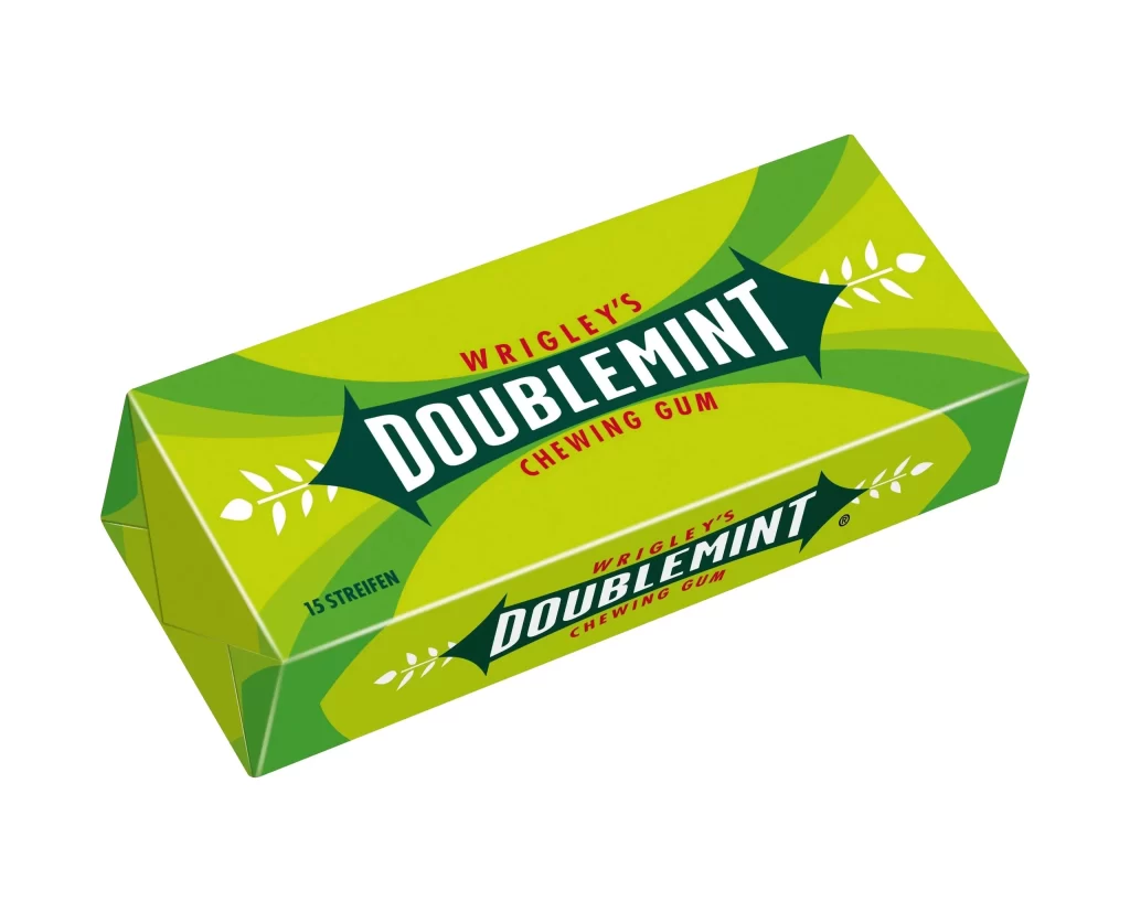
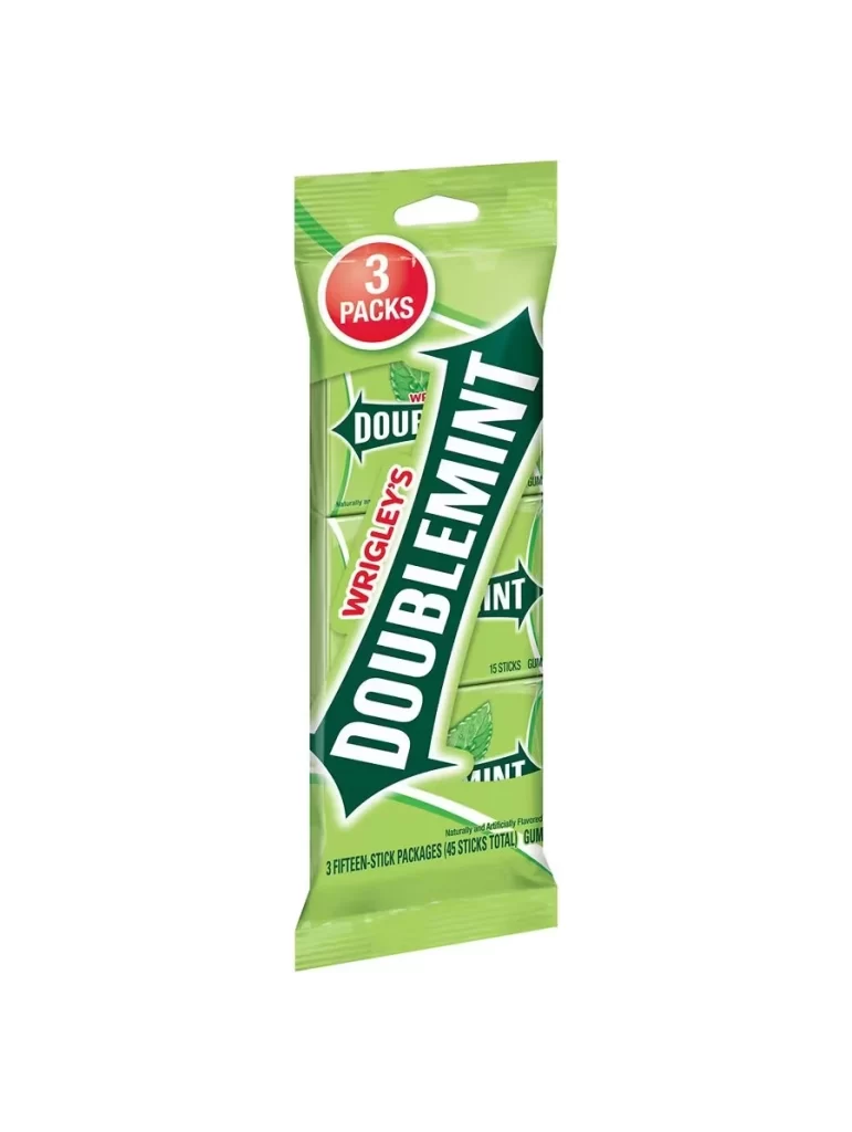
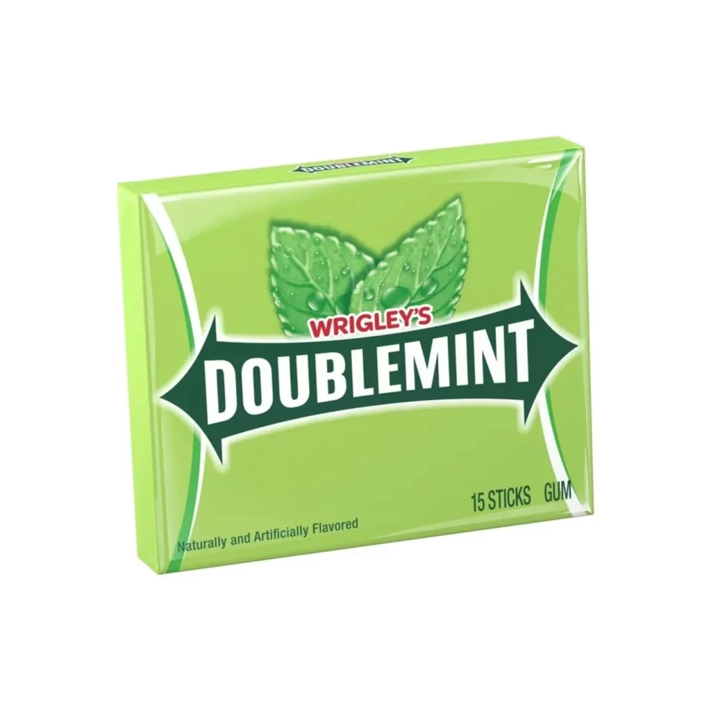
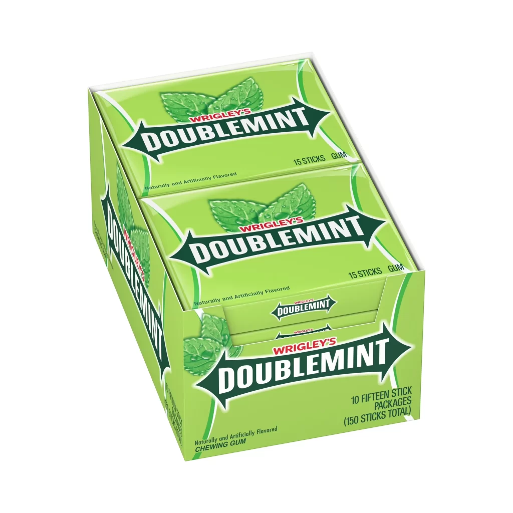
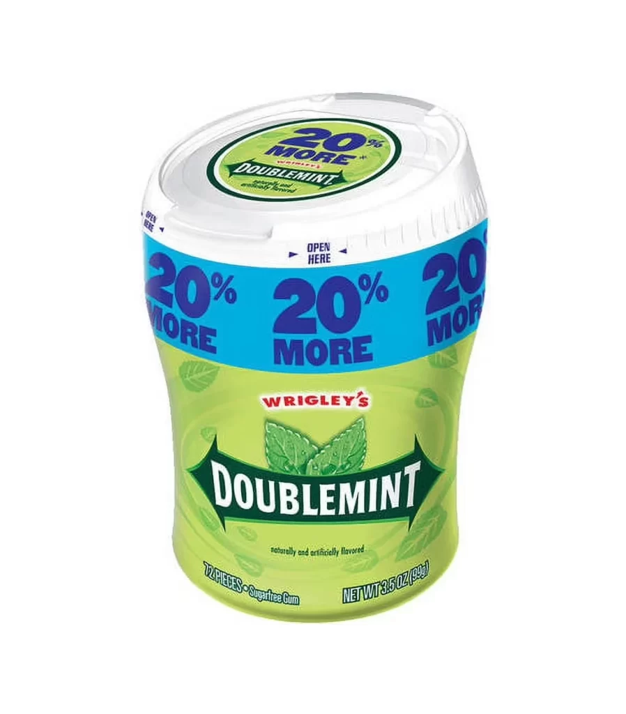
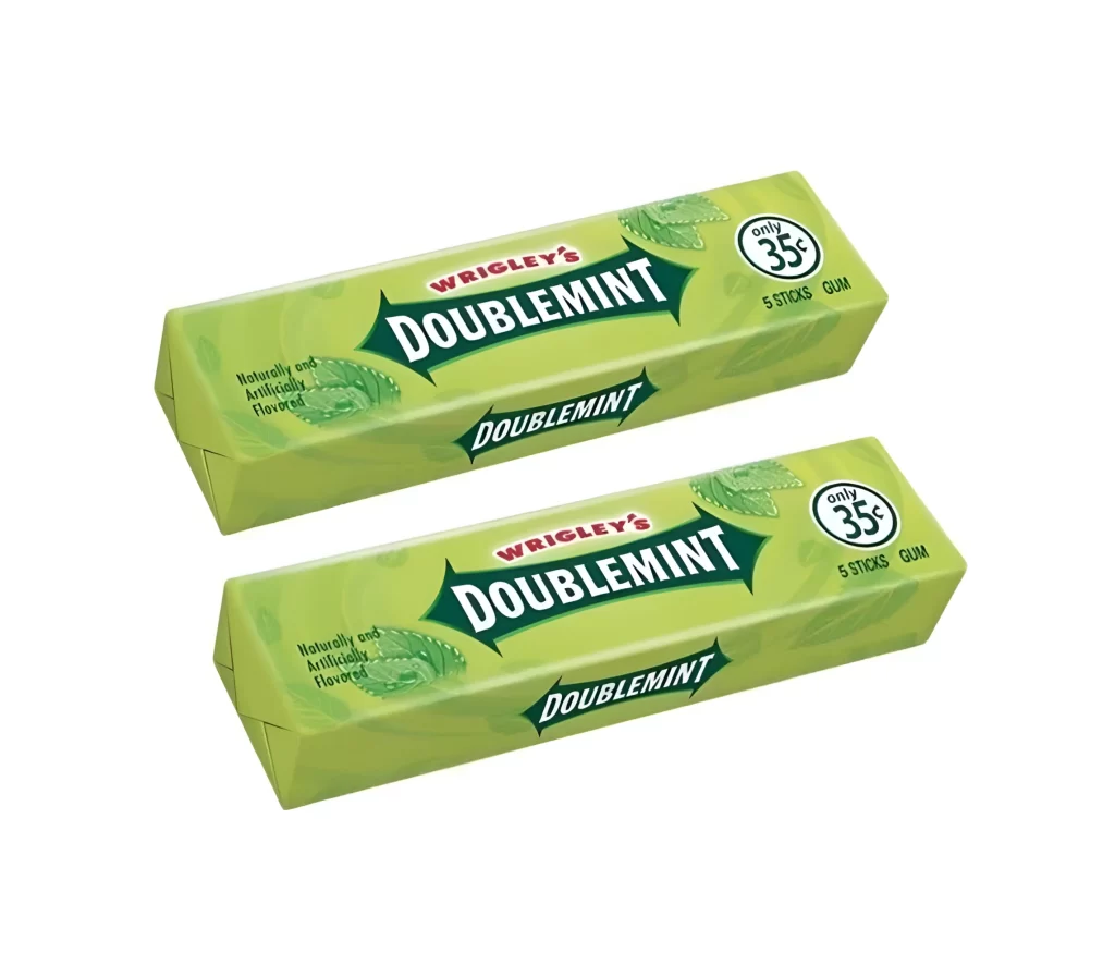
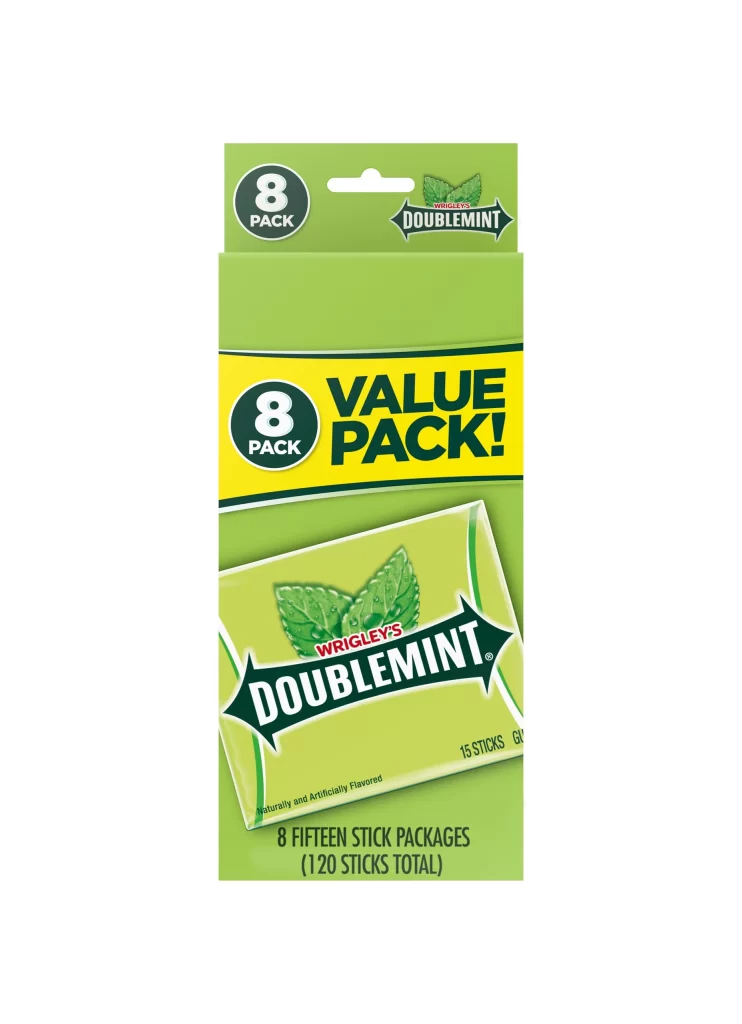
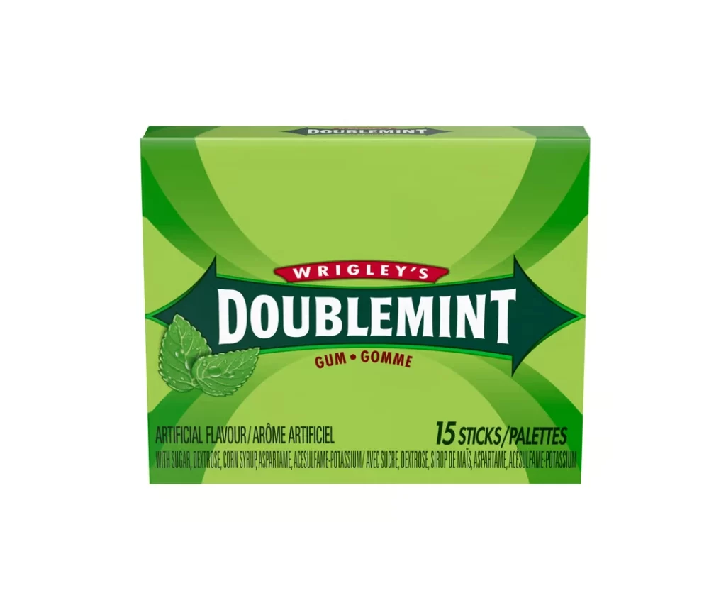
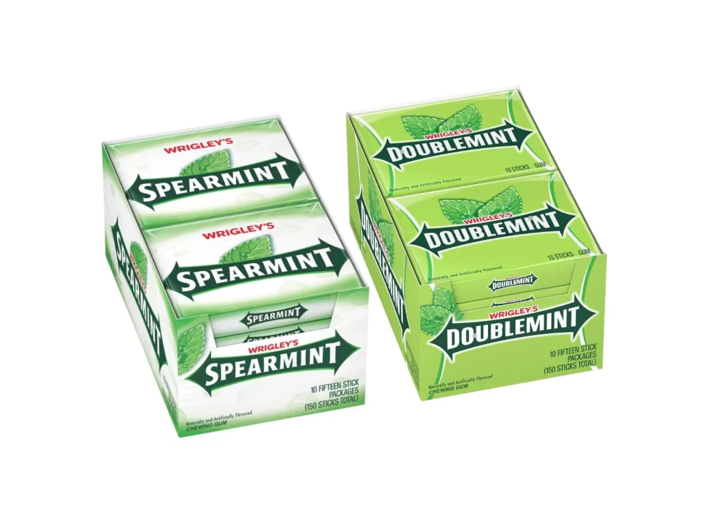
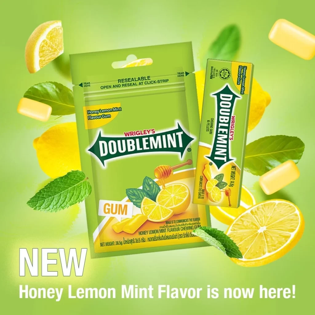
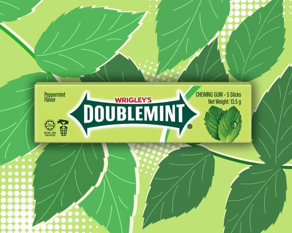
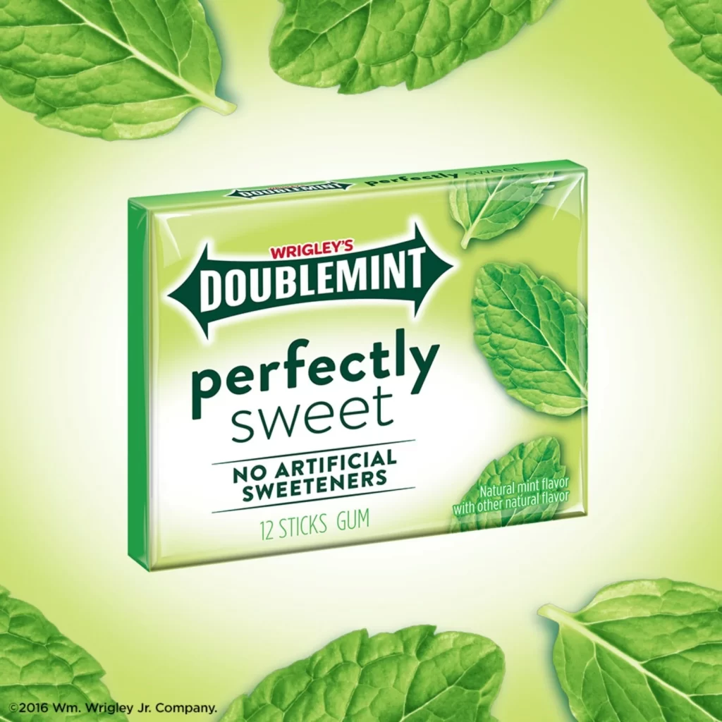
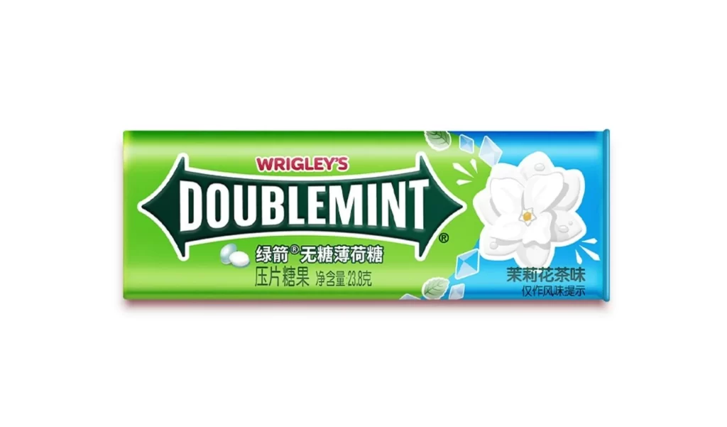
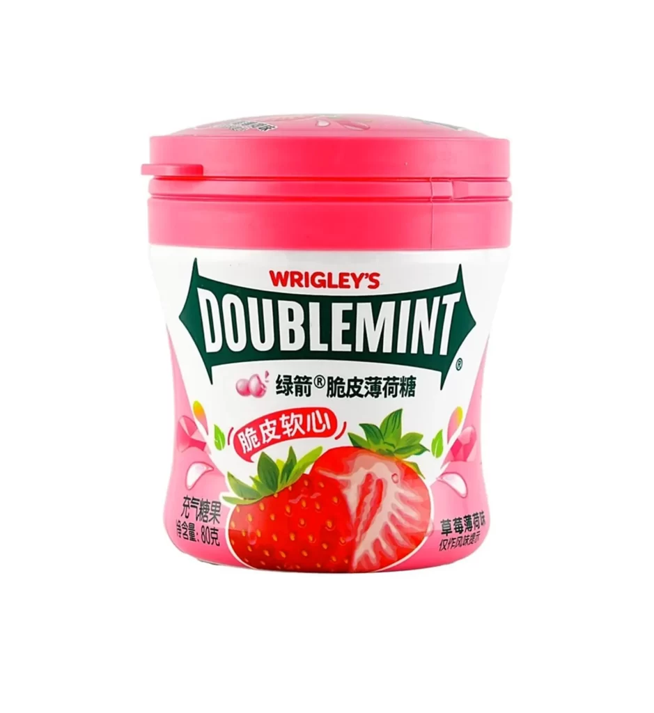
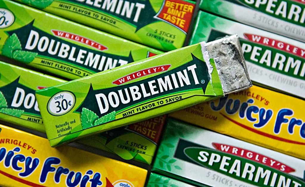
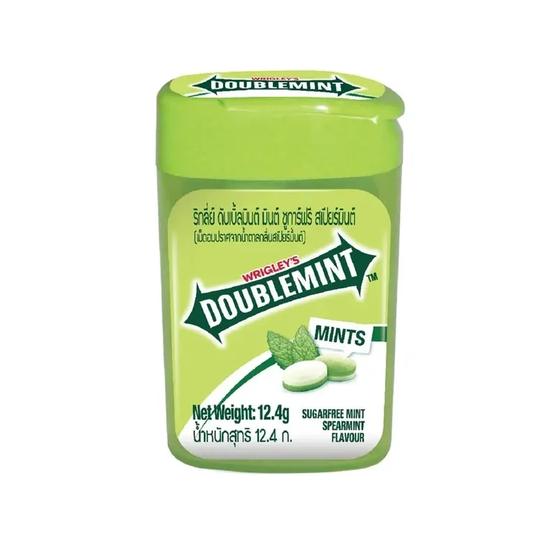
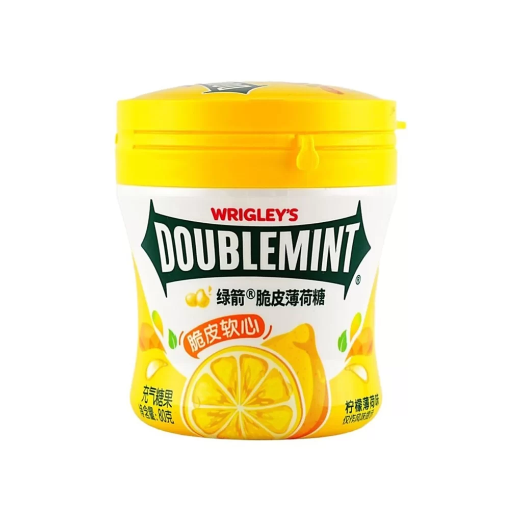
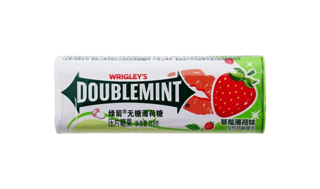
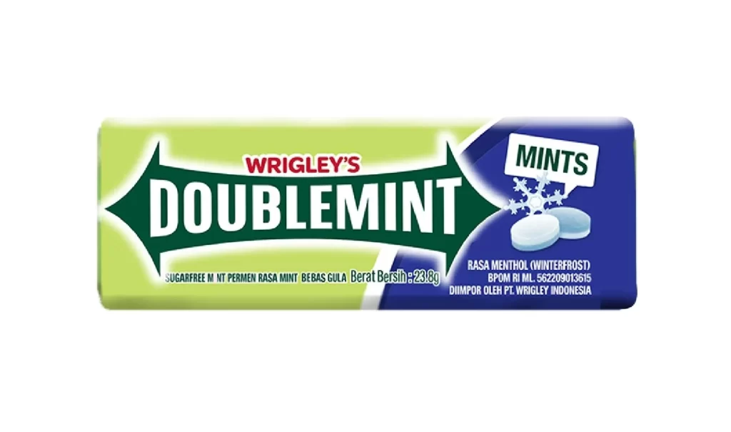
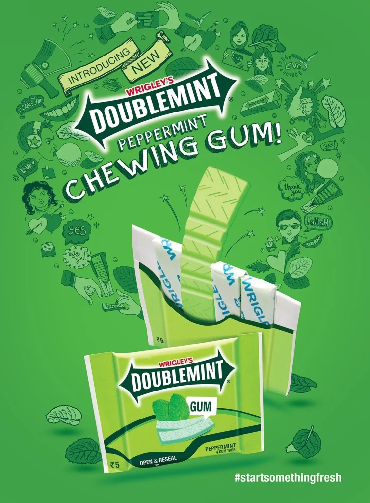
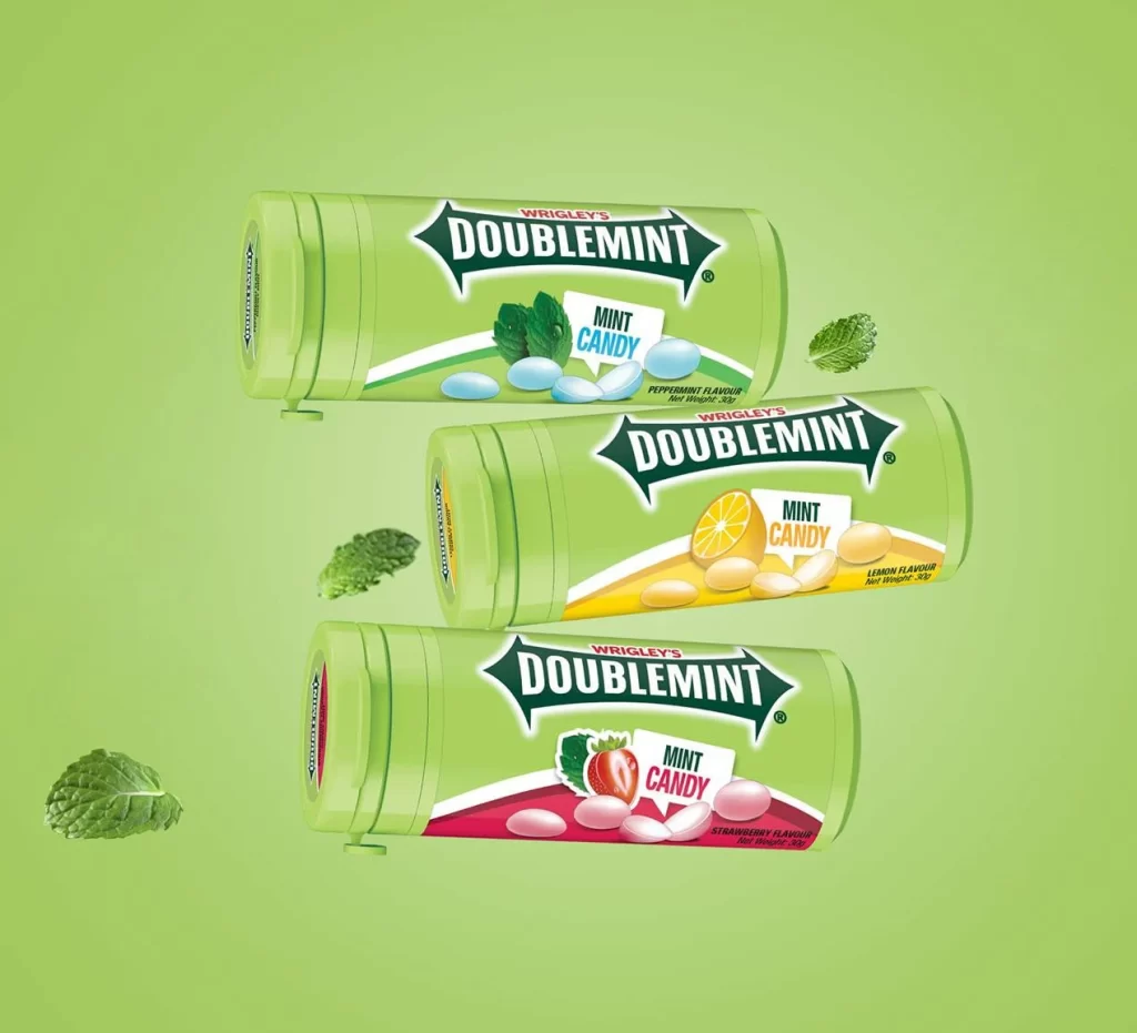
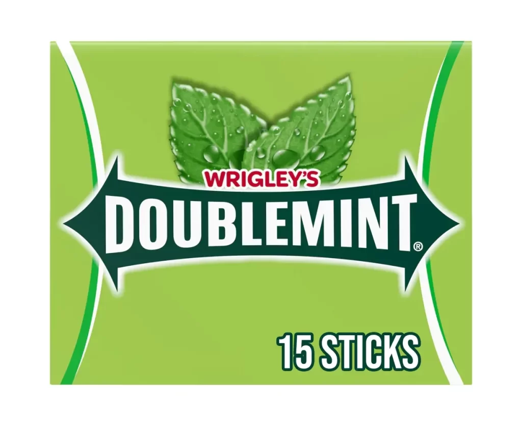
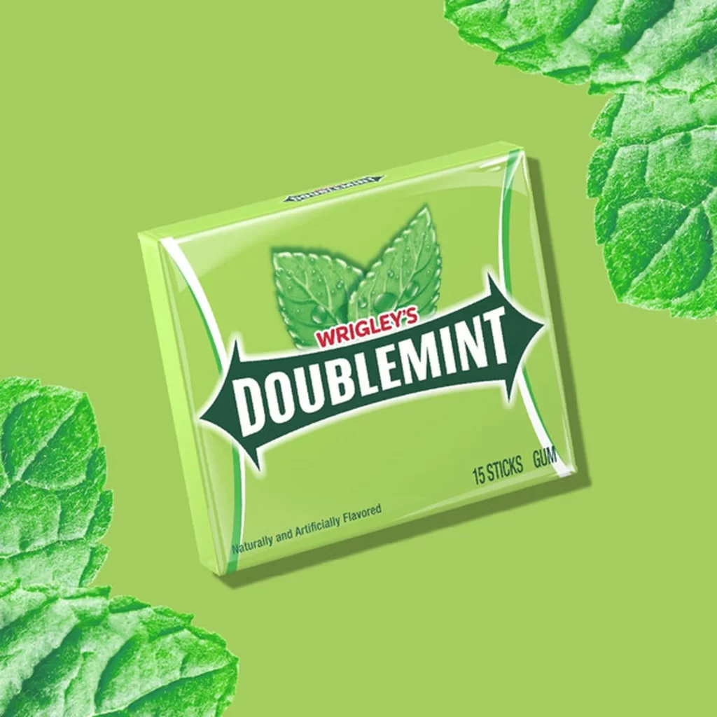
A single pack of Wrigley's Doublemint gum sits at a slight three-quarter angle, revealing its glossy, light-green cardboard surface against a vibrant lime-green backdrop. The iconic branding features the word 'DOUBLEMINT' in bold white serif font inside a dark green arrow-shaped banner, with 'WRIGLEY'S' appearing in smaller red text just above it. Fresh mint leaves with visible veins and water droplets frame the packaging, emphasizing the product's naturally and artificially flavored 15-stick gum contents.
What makes this particular presentation stand out is the seamless integration of product photography with botanical elements that reinforce the mint flavor profile without feeling forced. The color palette relies on varying shades of green—from the pale packaging to the deeper leaf tones—creating visual cohesion while the glossy finish suggests freshness and quality. Subtle lighting highlights the box’s rectangular geometry and the textured surface of the surrounding leaves, demonstrating how complementary props can enhance brand storytelling in commercial photography.
Product photographers studying food and beverage packaging will find this composition useful for understanding how to style gum or mint-related products with natural elements. Brand designers working on refreshment categories could reference the arrow-logo treatment and color hierarchy when developing their own identity systems. Art directors planning e-commerce shoots might adapt this layout for showcasing oral care items or herbal products where botanical context strengthens consumer appeal.