Wrigley’s Doublemint Chewing Gum 72 Count Jar Packaging
Topics
Details
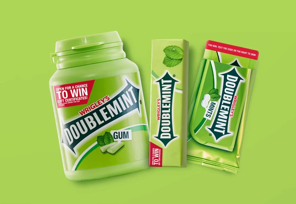
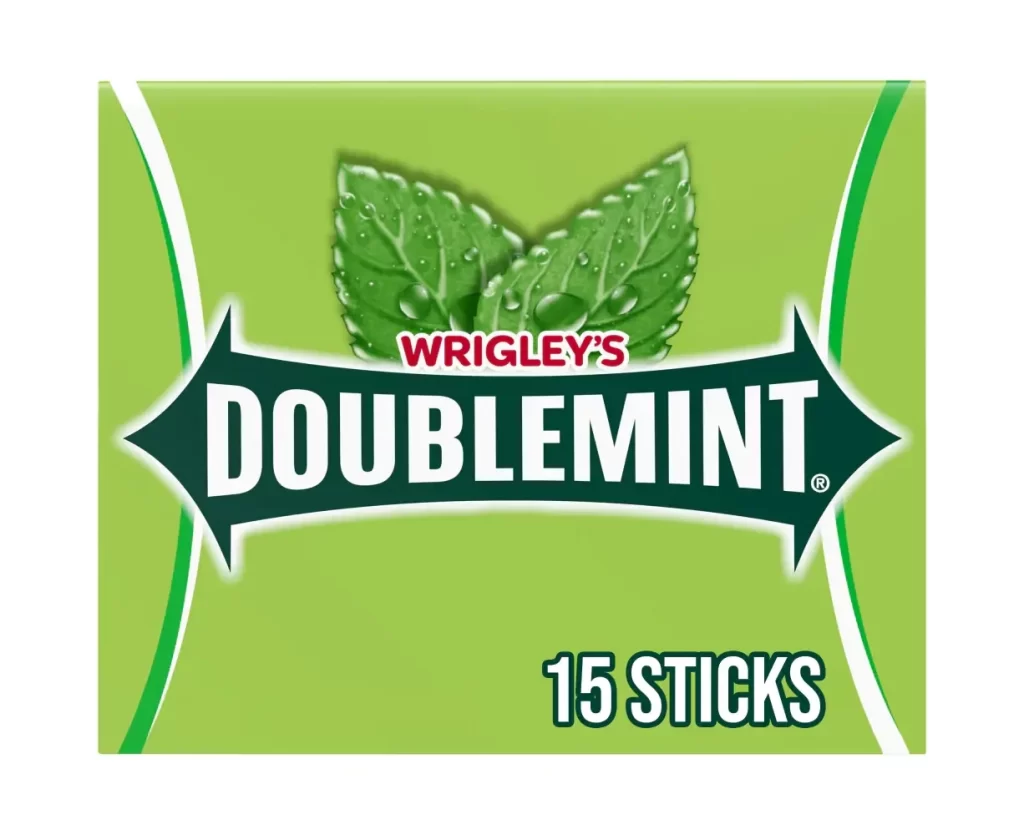
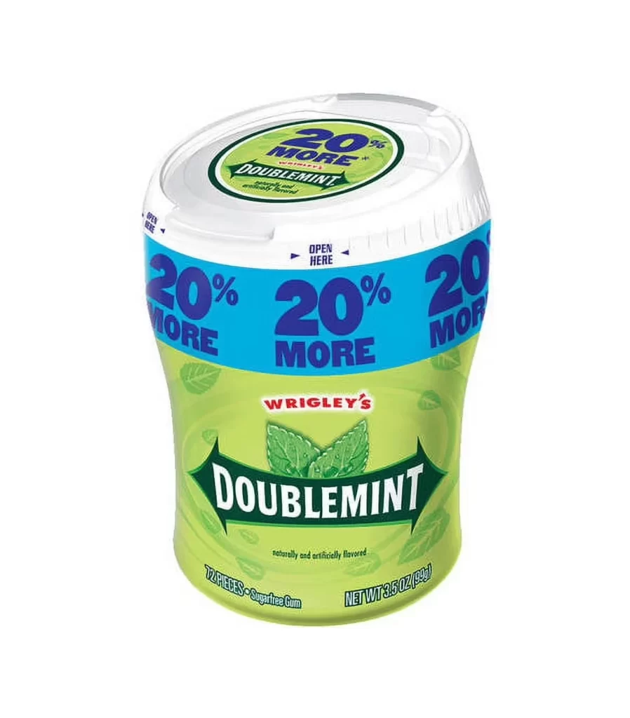
A curved, translucent green plastic body forms the main structure of the Wrigley's Doublemint 72-count jar, tapering upward to a ribbed white screw-top lid. A bright cyan band encircles the upper circumference of the container, repeating the promotional text '20% MORE' in bold purple lettering three times around its surface. The white lid features a circular green sticker that echoes the same '20% MORE' claim above the brand name, while the green body displays the red Wrigley's logo and a prominent green Doublemint banner with mint leaf graphics.
Visual interest is driven by the aggressive repetition of the value proposition across multiple surfaces of the vessel. The transition from the cool cyan band to the lime-green base creates a distinct color-blocking effect that draws the eye downward to the brand mark. Furthermore, the integration of photorealistic botanical elements within the geometric arrow frame adds a tactile quality to the otherwise flat graphic design, emphasizing the product’s flavor profile through visual cues rather than text alone.
Product photographers might utilize this composition to master lighting techniques for reflective plastic surfaces and semi-translucent materials. Packaging engineers could analyze the spatial arrangement of the ‘OPEN HERE’ indicators and the structural flow of the lid’s grip texture. Additionally, color theorists will find the specific hex values of the cyan-to-green gradient useful for studying how complementary colors influence consumer perception in retail environments.