Wrigley’s Doublemint Gum Jar Packaging
Topics
Details
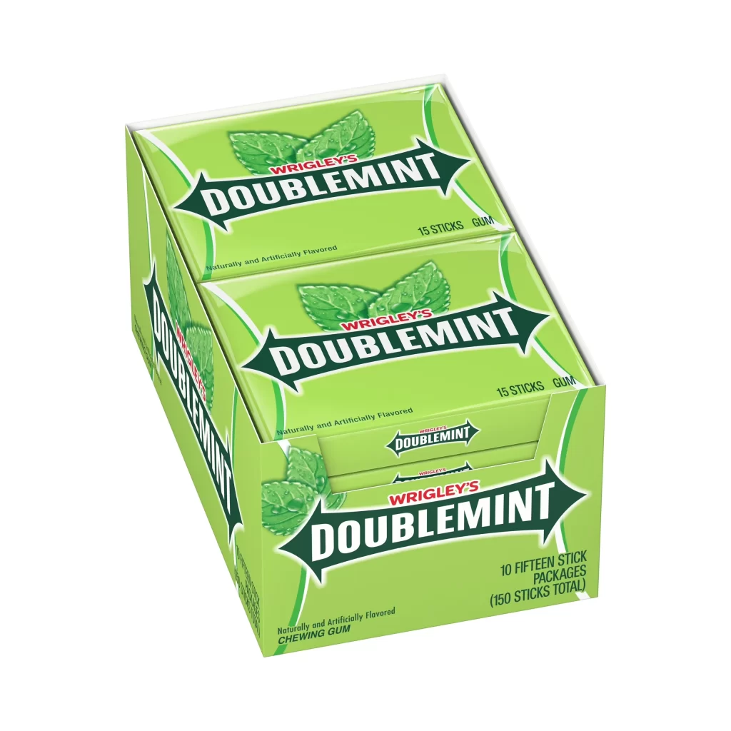
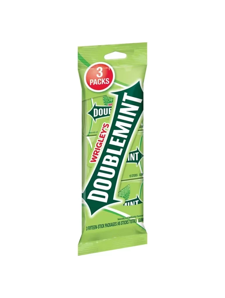
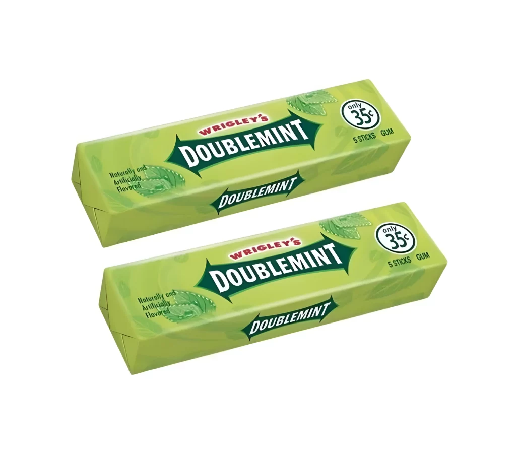
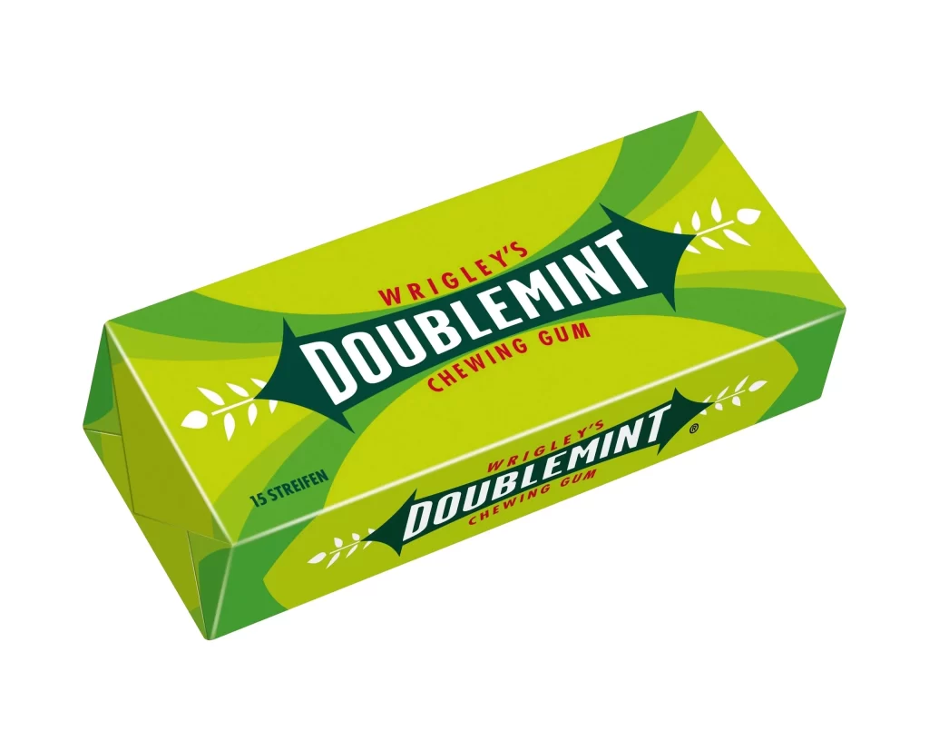
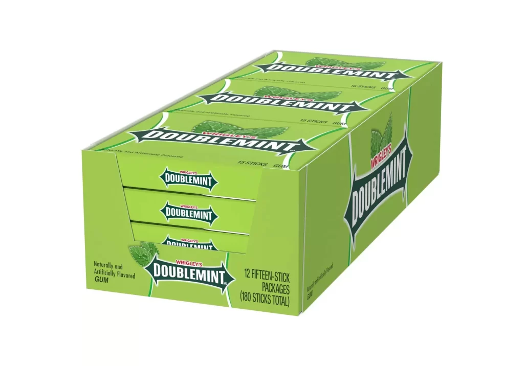
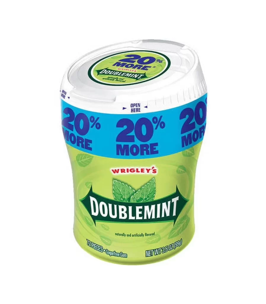
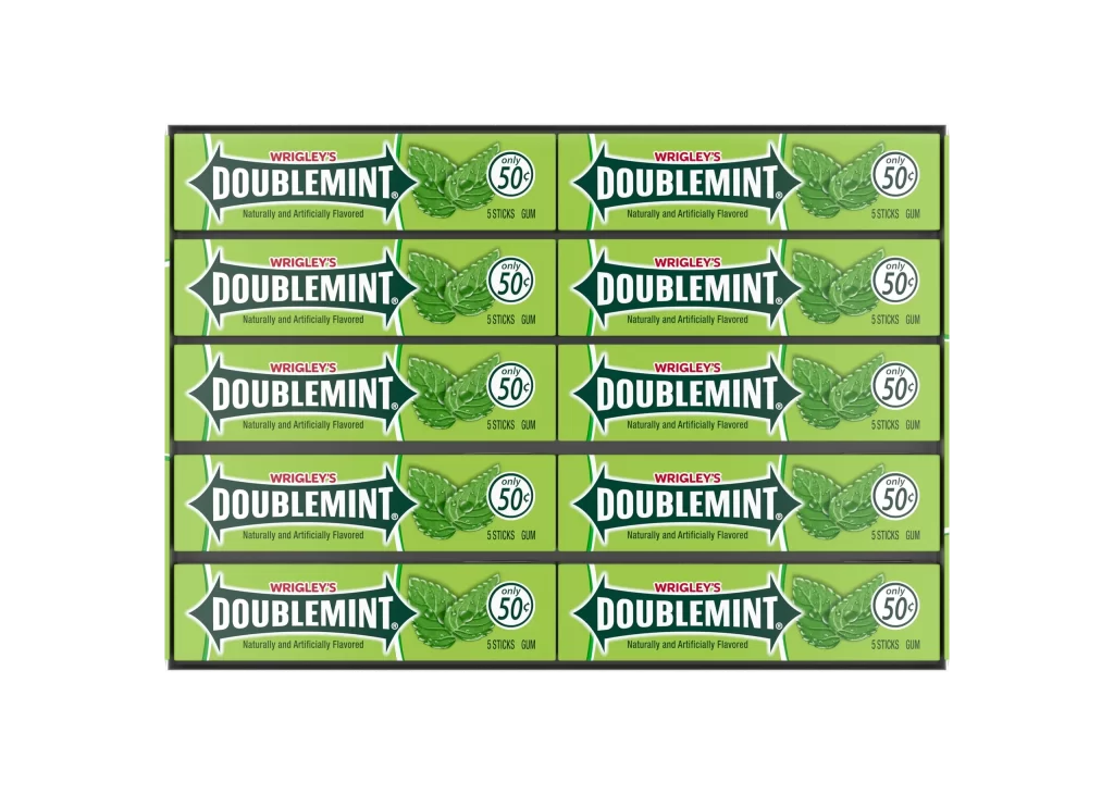
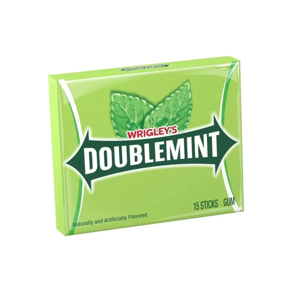
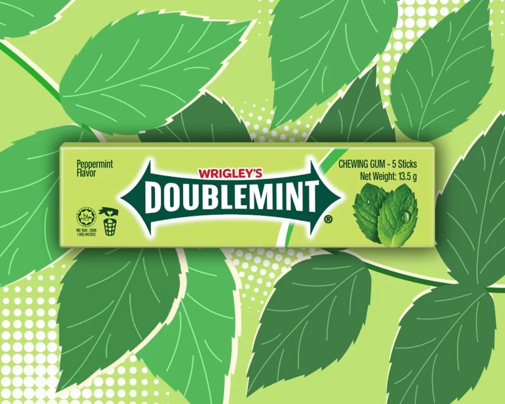
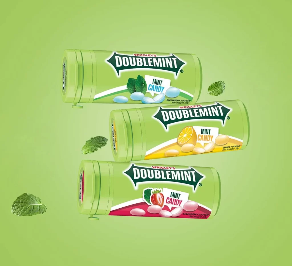
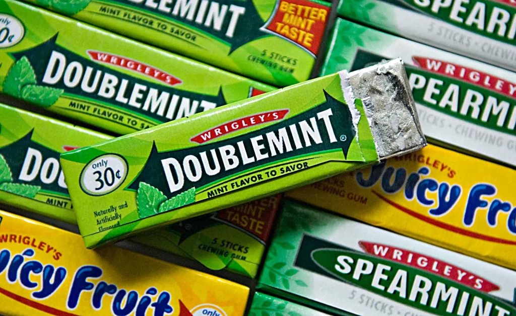
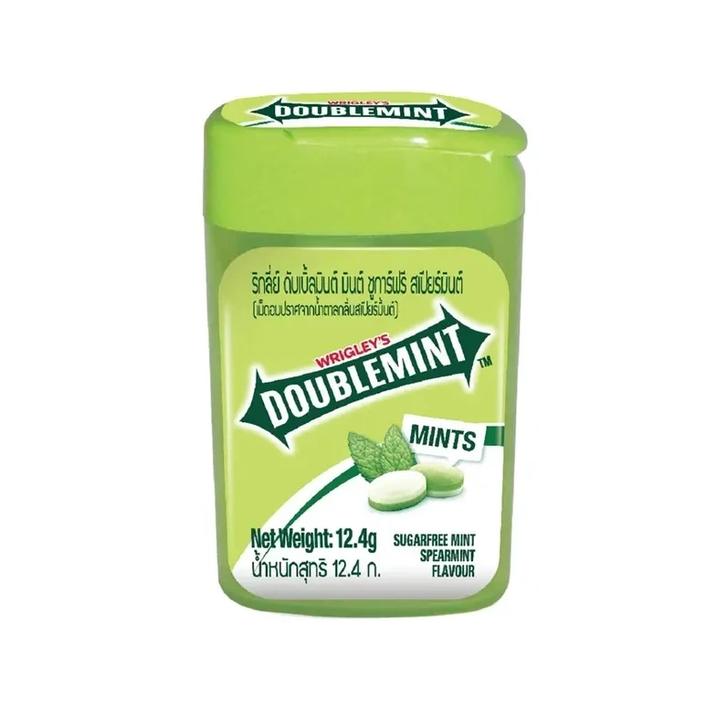
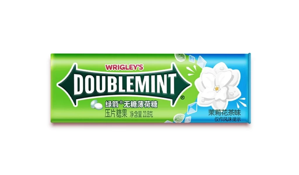
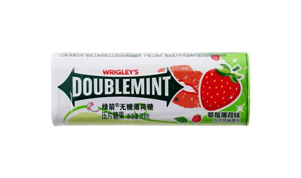
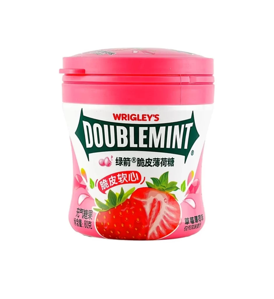
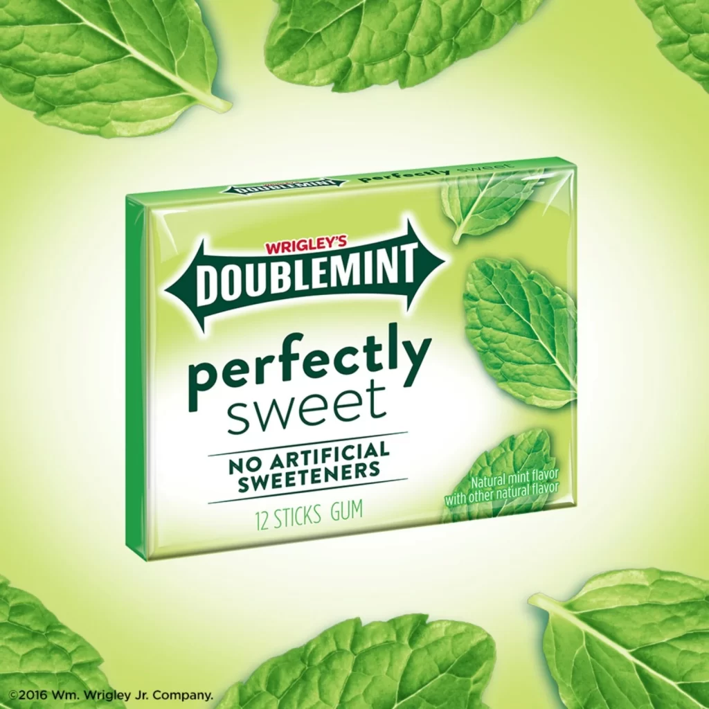
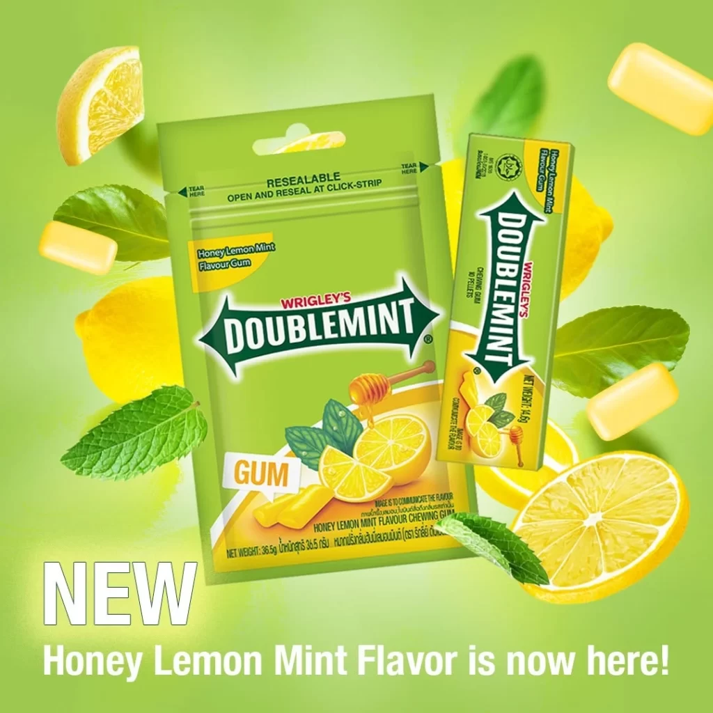
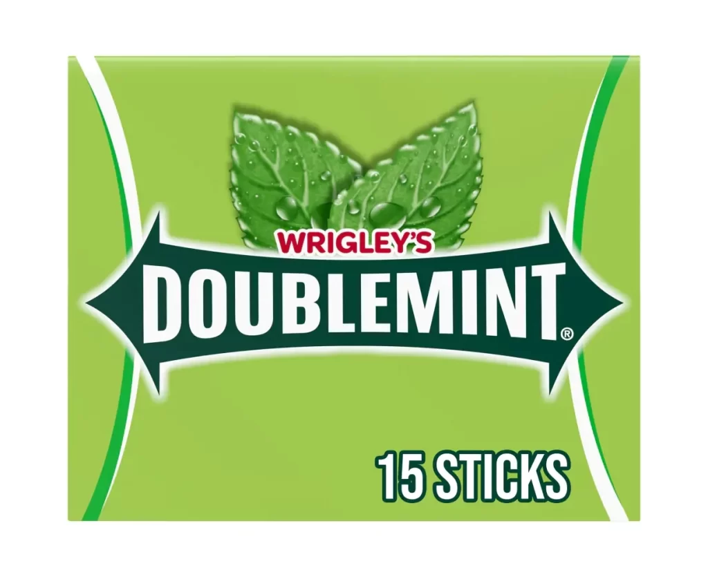
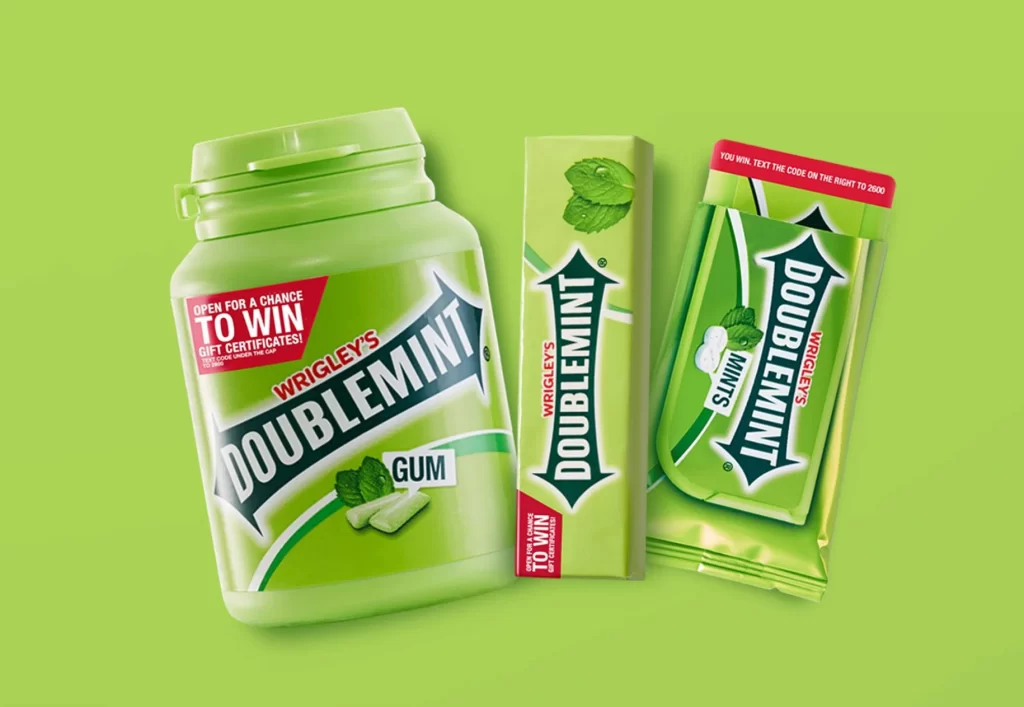
Three Wrigley's Doublemint products—a large translucent plastic jar with a white flip-top lid, a slim cardboard box, and a metallic foil packet—stand in a staggered formation on a vibrant lime-green surface. The jar dominates the left side with bold dark teal typography, while the box and packet to its right echo the signature green color scheme and feature red promotional banners advertising a chance to win gift certificates. Each package displays the iconic Doublemint logo with its distinctive arrow-shaped design and mint leaf imagery.
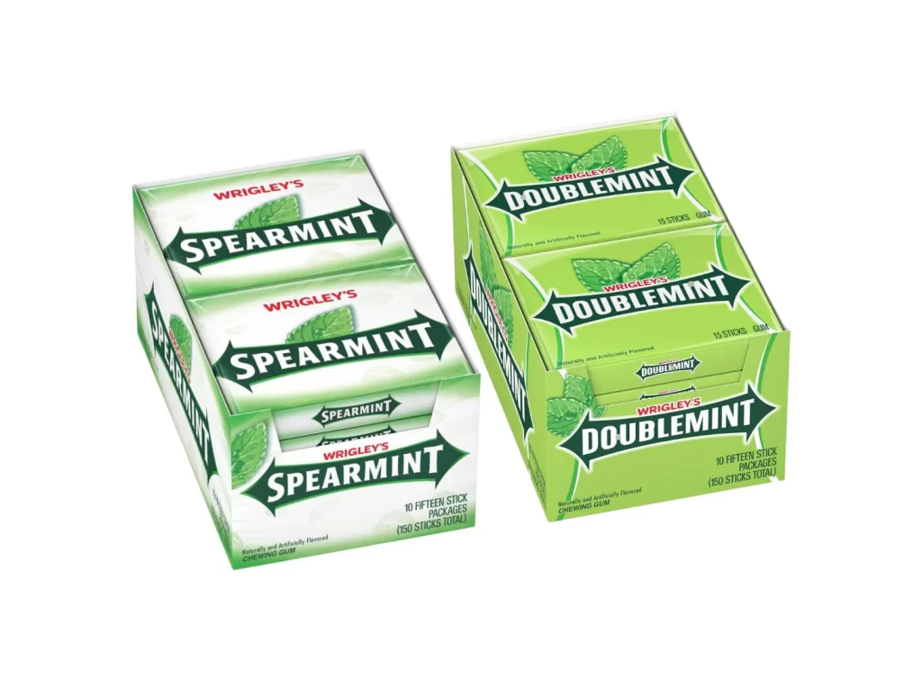
What makes this particular lineup visually compelling is the way the brand identity adapts across different physical formats while maintaining strict consistency. The iconic double-arrow logo remains the anchor of every design, yet the textures shift from the matte finish of the paper box to the glossy sheen of the foil pack and the soft translucency of the bottle. This variety allows designers to study how lighting interacts with disparate materials under identical studio conditions.
Product photographers and packaging students often turn to such compositions to practice color matching across varied substrates. Marketing teams might utilize this arrangement to analyze effective promotional placement, specifically noting how the red call-to-action banners pop against the dominant green scheme. Furthermore, 3D artists can use these specific geometric forms—cylindrical, rectangular prismatic, and flexible pouch—as foundational meshes for rendering realistic consumer goods.