Doublemint Gum Cool Berry Flavor Wrigley’S
Topics
Details
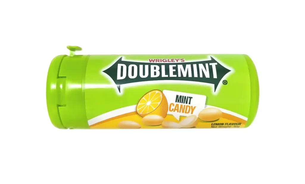
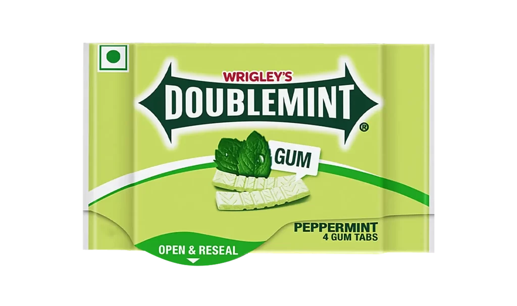
A cylindrical plastic bottle of Wrigley's Doublemint gum features a vibrant lime-green body and matching flip-top cap, with a bold magenta band wrapping around the lower portion. The brand name appears in white serif lettering within a dark green arrow-shaped field, while two pale rectangular pieces of gum rest in the foreground near an illustration of dark berries on the label.
Visual interest arises from the high-contrast pairing of acidic green and deep pink, which deviates from the classic monochromatic Doublemint identity. The dynamic diagonal sweep of the main logo creates movement across the curved surface, while the photographic realism of the product samples provides tangible texture. This specific ‘Cool Berry’ variant utilizes fruit imagery to signal flavor, distinguishing it from standard mint packaging through its saturated color palette.
Packaging analysts might examine this object to study how established brands adapt their visual language for limited-edition flavors. Industrial designers could reference the bottle’s ergonomic contours and closure mechanism for similar consumer goods. Marketing teams may utilize such examples to evaluate color psychology in impulse-buy retail environments.