Doublemint Chewing Gum Packaging
Topics
Details
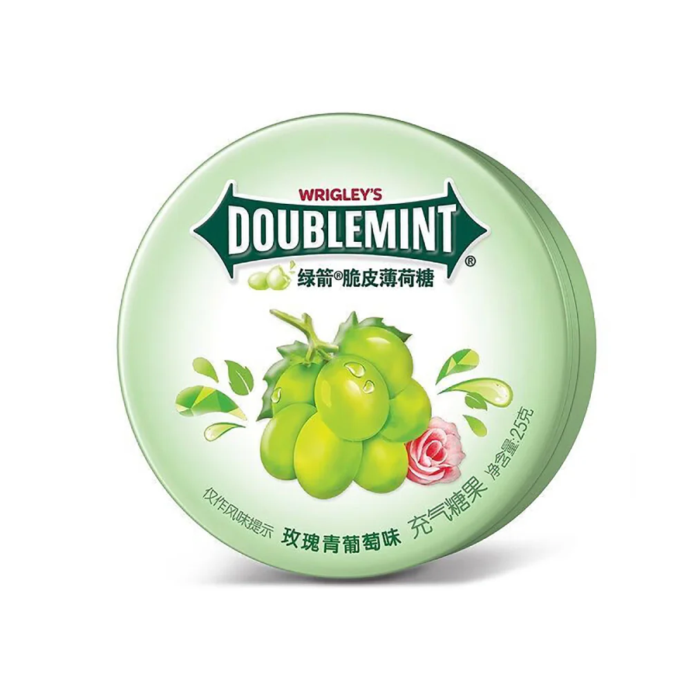
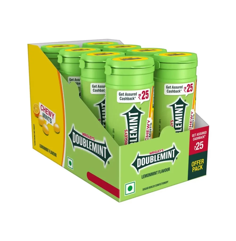
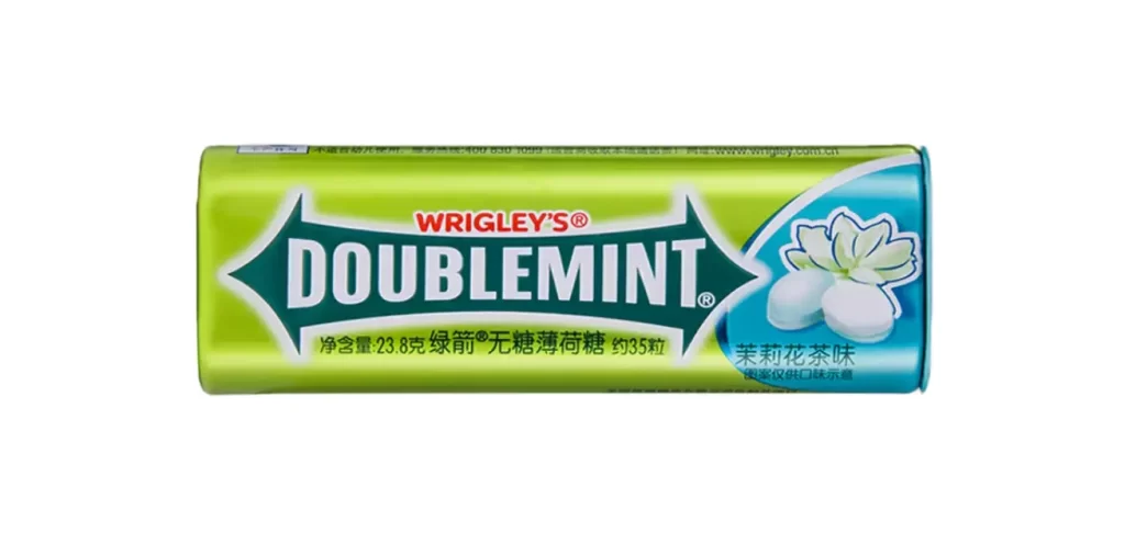
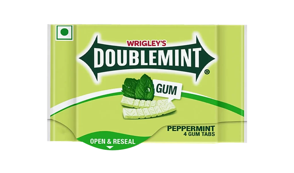
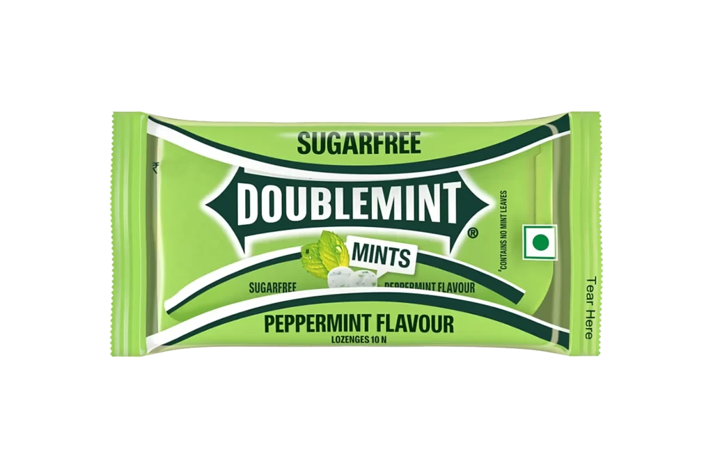
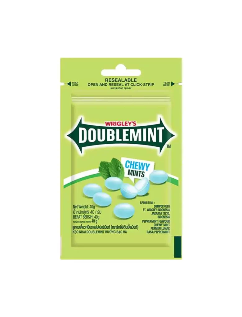
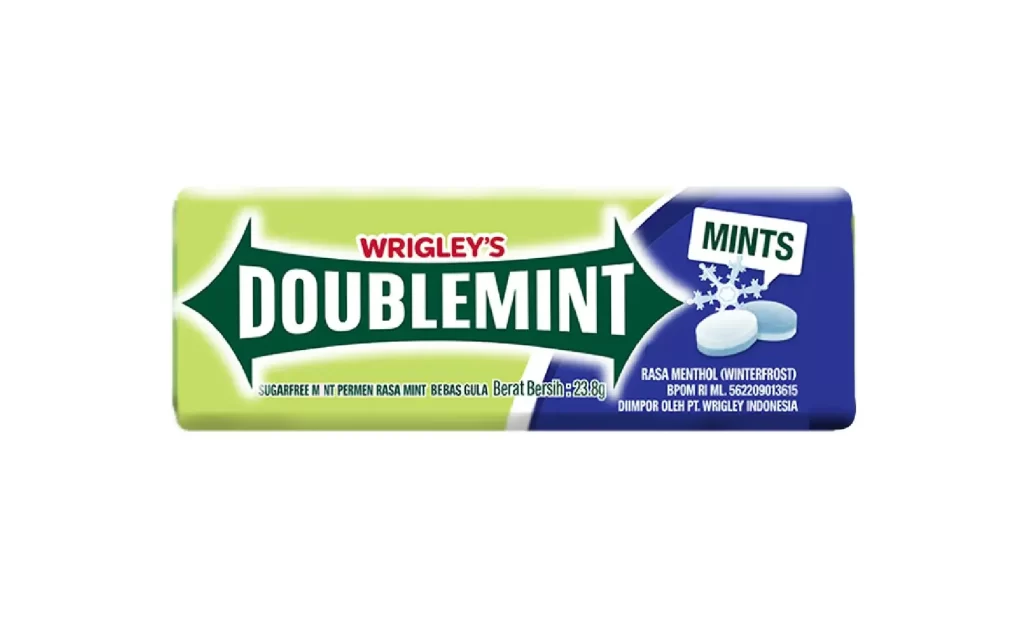
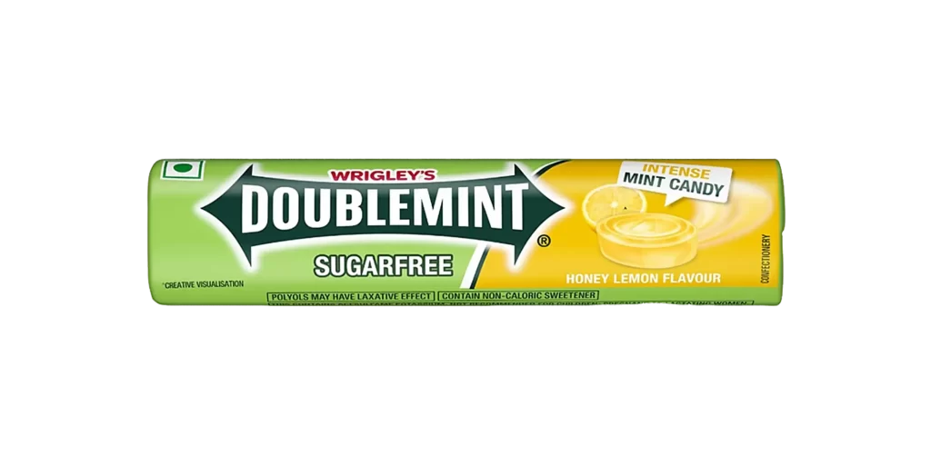
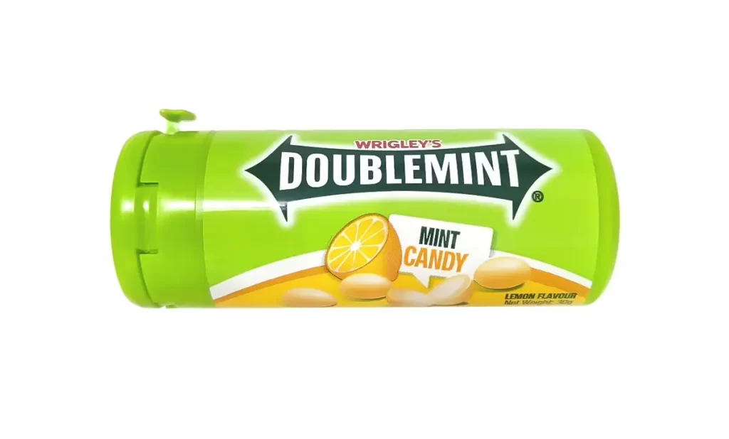
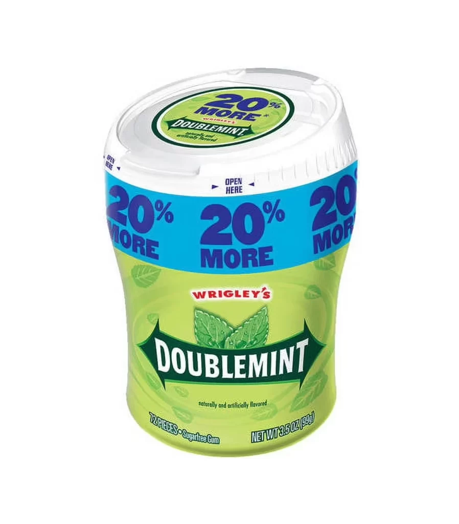
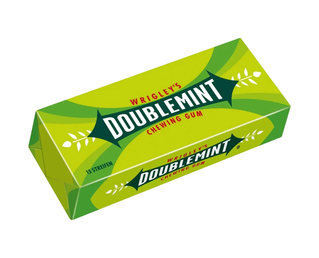
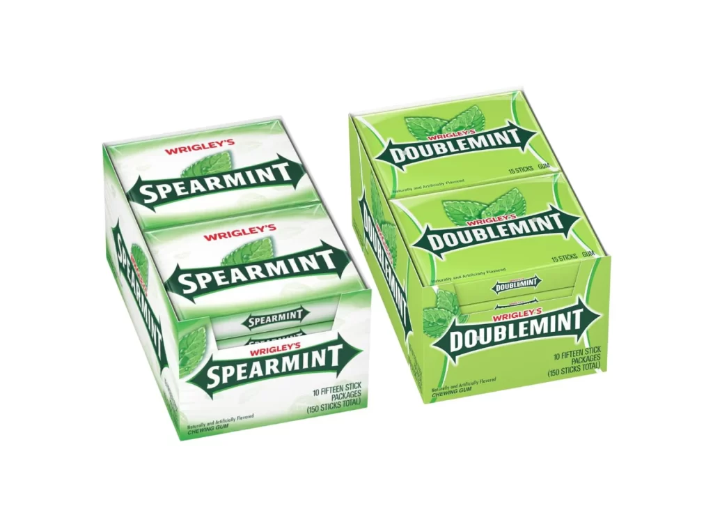
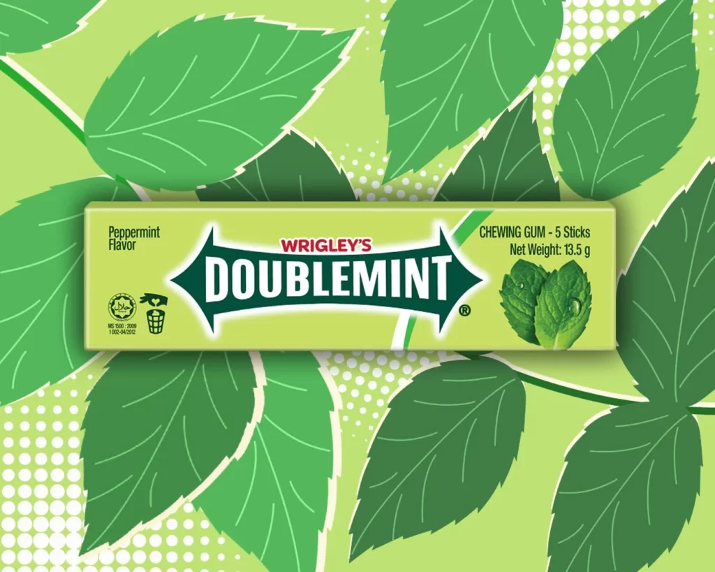
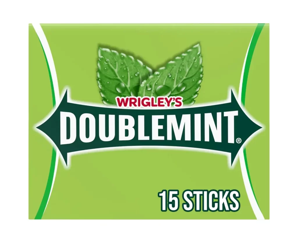
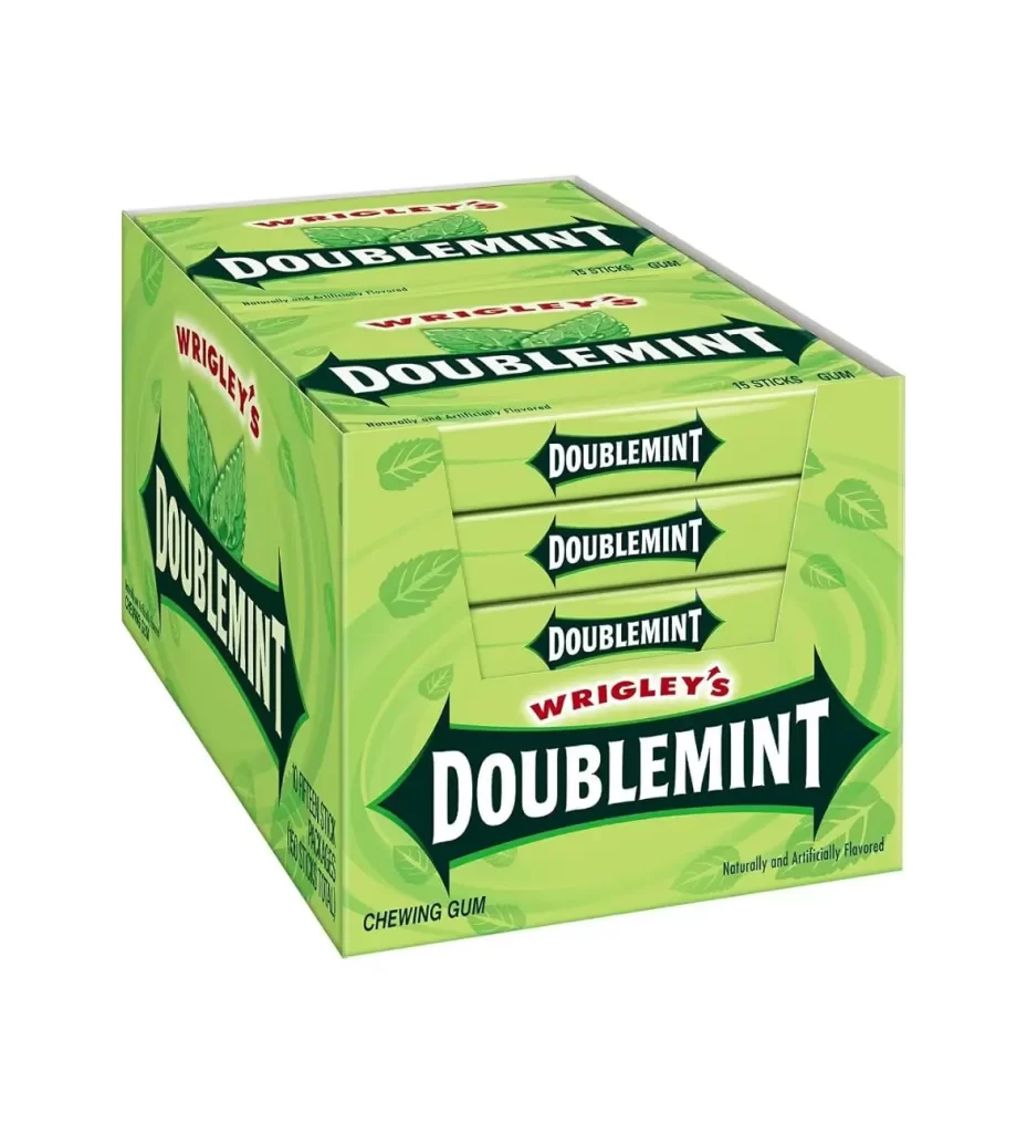
Rendered in a vibrant lime green, the packaging features a multi-pack box of Wrigley's Doublemint gum set against a clean white background. The front face displays three individual pack slots, each labeled with the brand name in bold white serif lettering inside a dark green arrow-shaped banner. Soft studio lighting illuminates the box from an elevated three-quarter angle, revealing subtle mint leaf patterns and the text 'Naturally and Artificially Flavored' near the bottom edge.
What stands out here is the consistent repetition of the iconic arrow logo across every visible surface, creating a strong rhythmic visual that reinforces brand recognition. The contrast between the bright green field and the deep forest-green banners gives the design its characteristic pop, while the red 'WRIGLEY'S' text adds a complementary accent that draws the eye upward. This particular bulk configuration also offers an interesting study in how individual unit branding integrates into a larger retail display format.
Product photographers might study this shot to understand how to effectively stage consumer goods for e-commerce catalogs without distracting shadows. Packaging students could analyze the typographic hierarchy and color psychology at play in this classic confectionery design. Even 3D modelers looking to recreate everyday objects would find the clear view of edges, folds, and material textures particularly useful for their asset libraries.