Kolaz Wine Packaging D
Topics
Details
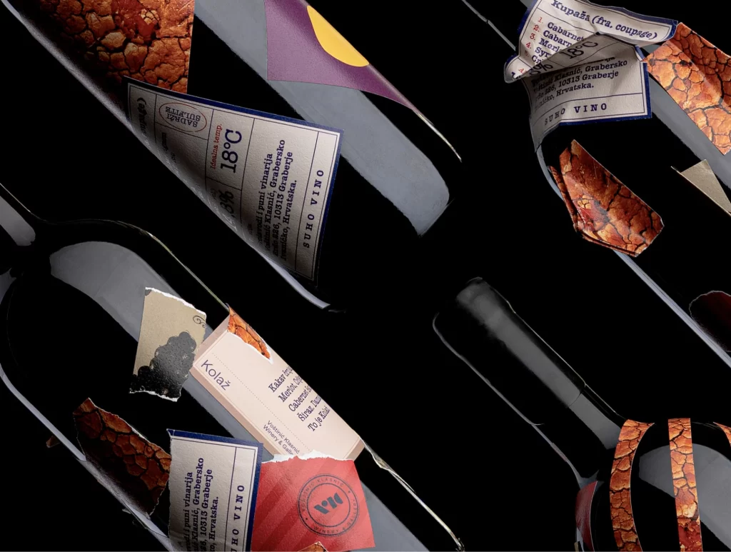
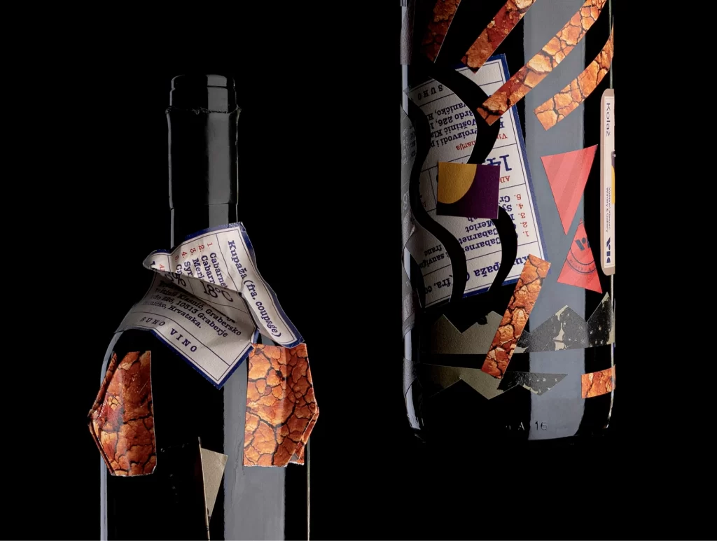
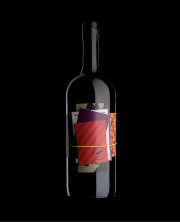
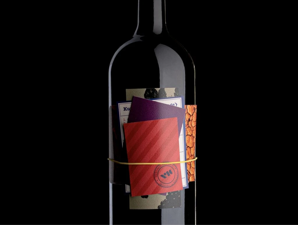
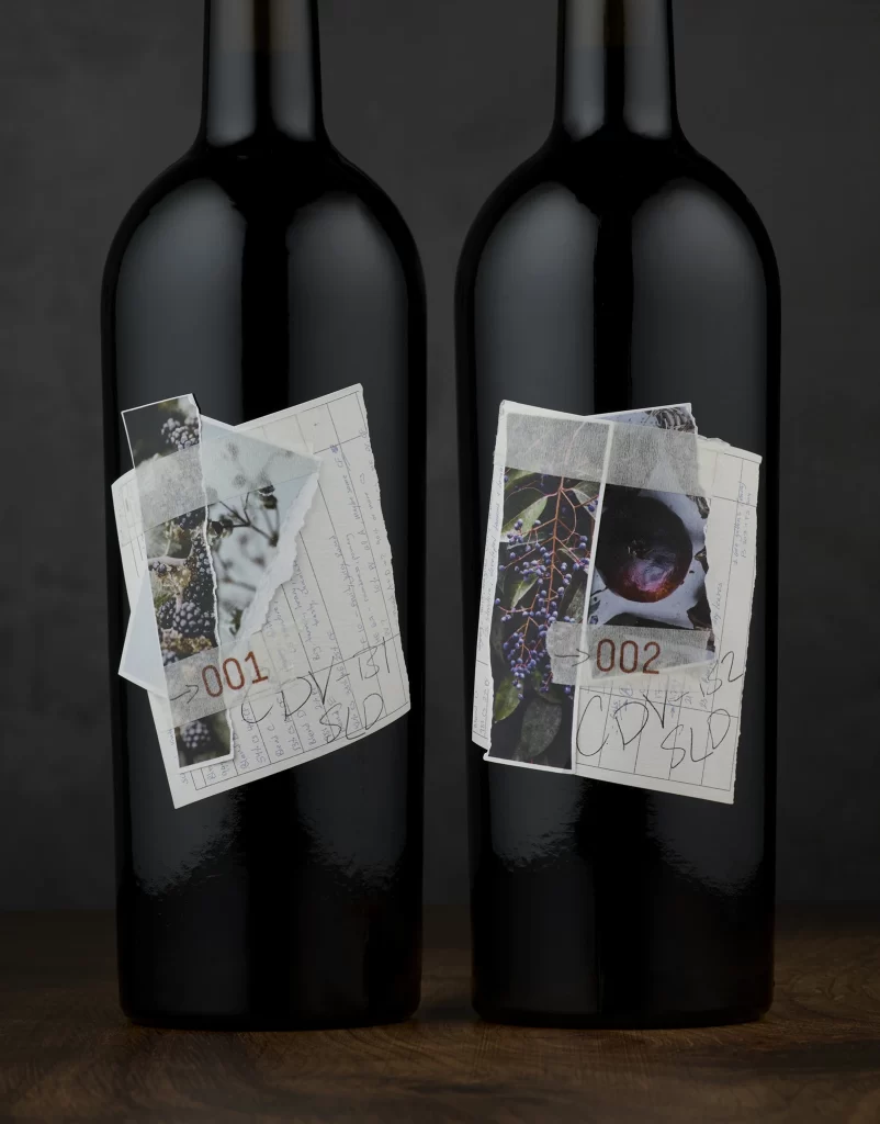
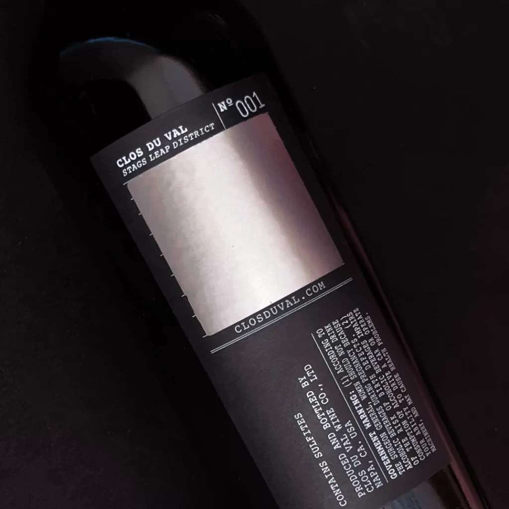
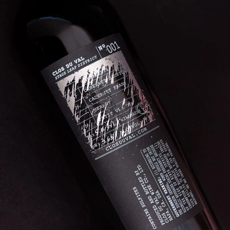
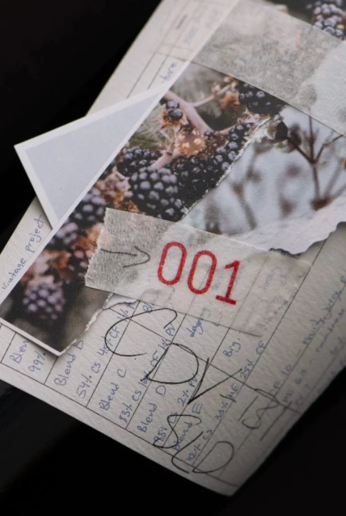
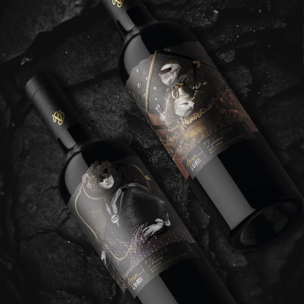
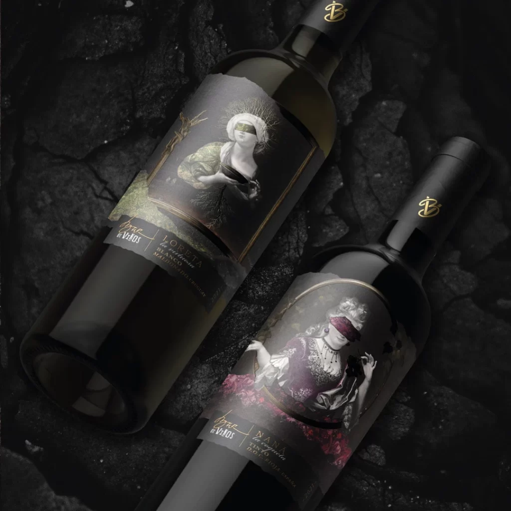
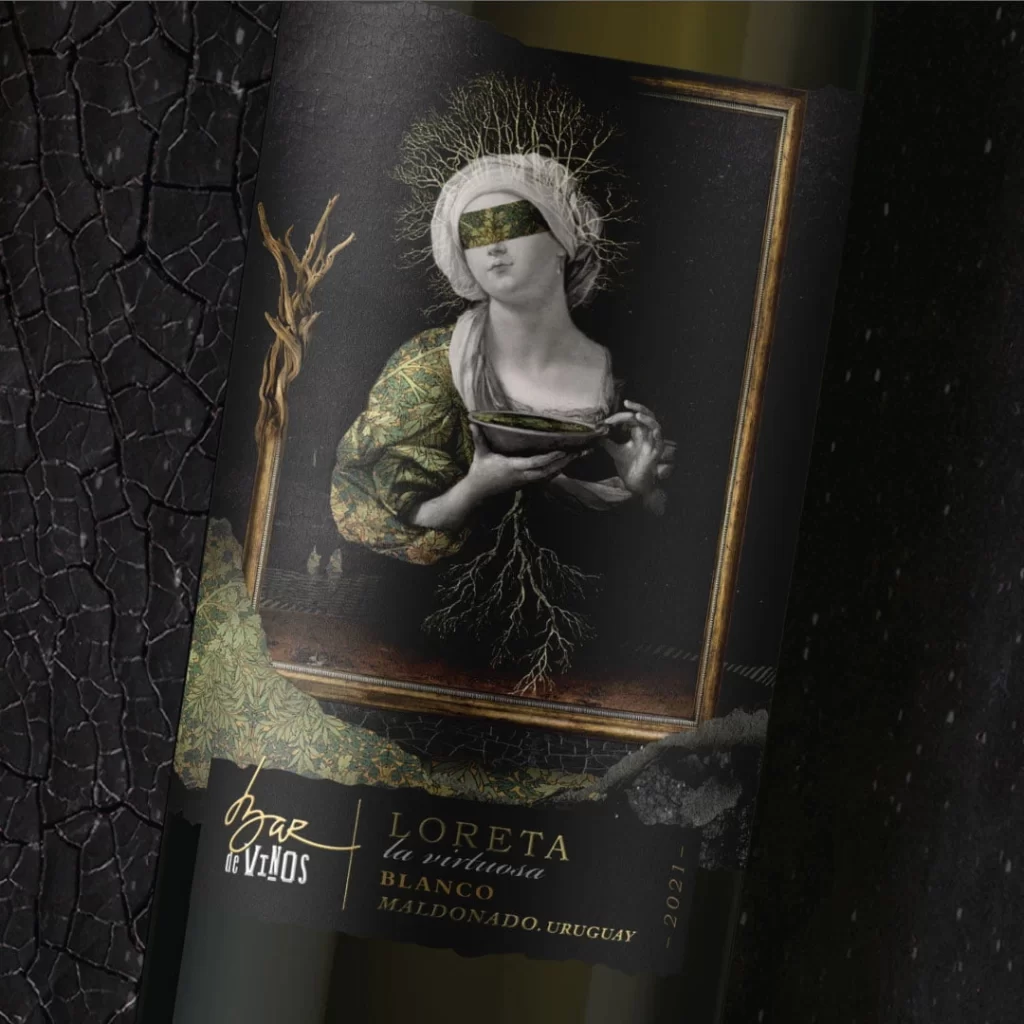
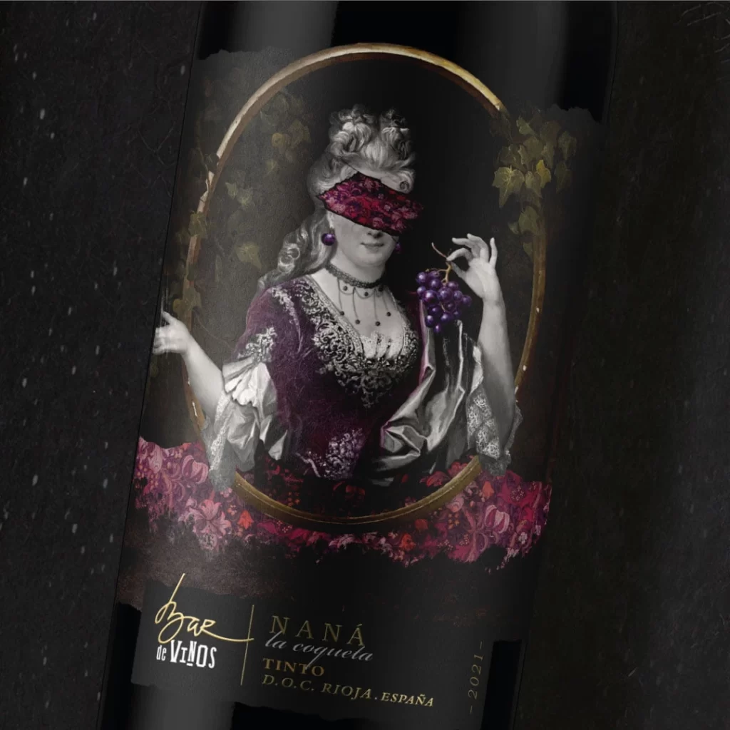
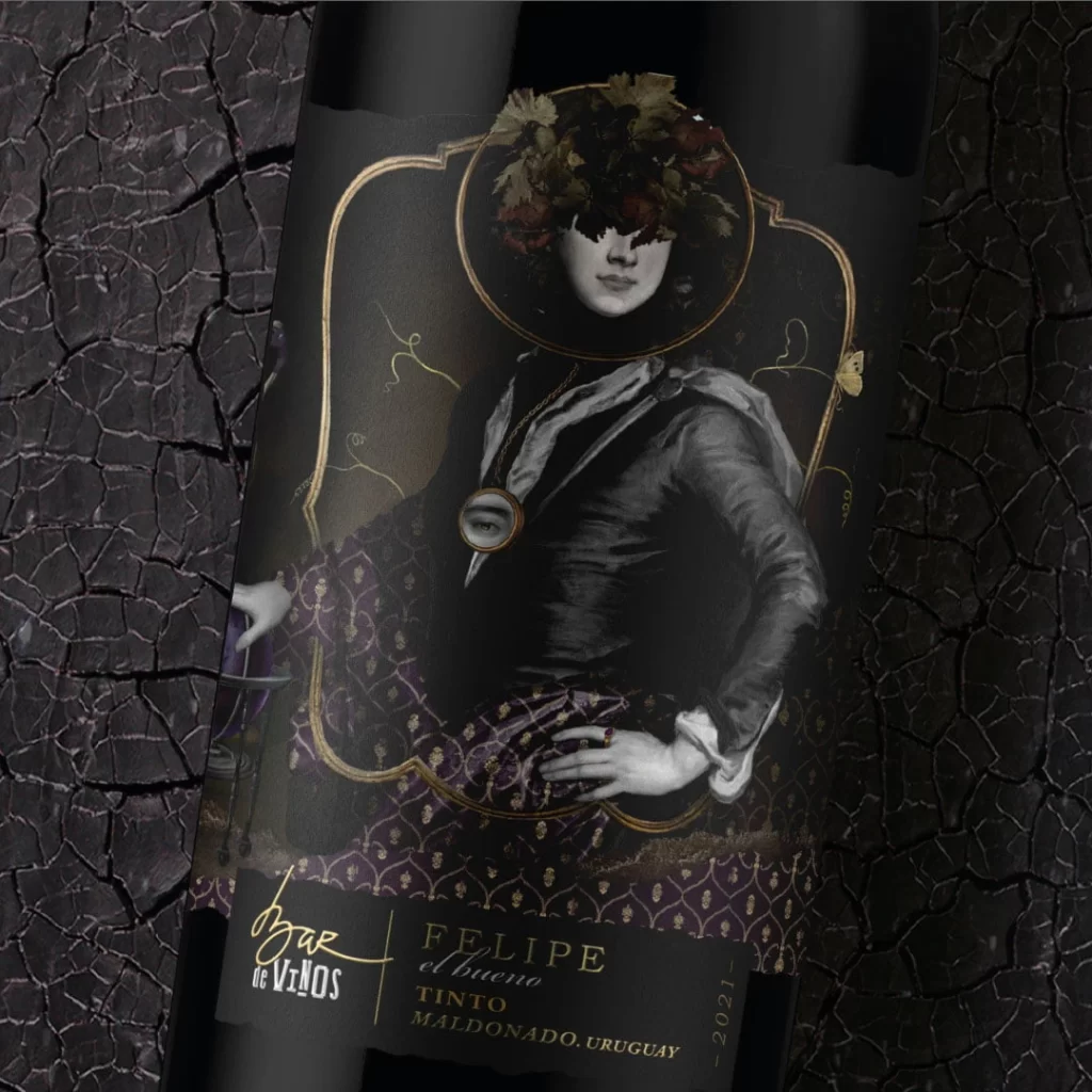
Dark glass bottles lie scattered at dynamic angles across a deep black void, their surfaces adorned with a chaotic yet intentional collage of torn paper labels and textured earthy patches. Rich browns of cracked soil textures, the white of paper stock, and bold accents of crimson, violet, and golden yellow dominate the color palette. Visible text includes 'SUHO VINO' and 'Kolaž' among other typographic elements printed on the fragmented labels.
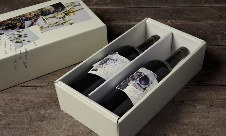
What sets this packaging apart is its deliberate embrace of imperfection through the ‘wabi-sabi’ aesthetic of torn edges and overlapping layers. Rather than a single unified label, the design utilizes a patchwork approach where information is fragmented across different paper stocks and textures, creating a tactile, handmade quality that feels both rustic and avant-garde. The interplay between the sleek, reflective glass and the matte, rough surfaces of the labels generates a compelling visual tension that draws the eye to every irregular edge and typographic detail.
Art directors developing artisanal brands will find this composition invaluable for exploring how deconstructed labeling can convey authenticity and terroir. Packaging engineers studying material interactions can analyze how different paper weights and finishes behave when applied in non-traditional layouts. Meanwhile, photographers looking to capture luxury consumables might study the dramatic chiaroscuro lighting setup used here to make the bottles pop against the negative space while highlighting the intricate surface textures.