Kolaz Wine Packaging A
Topics
Details
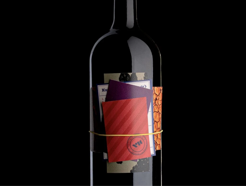
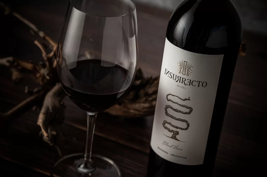
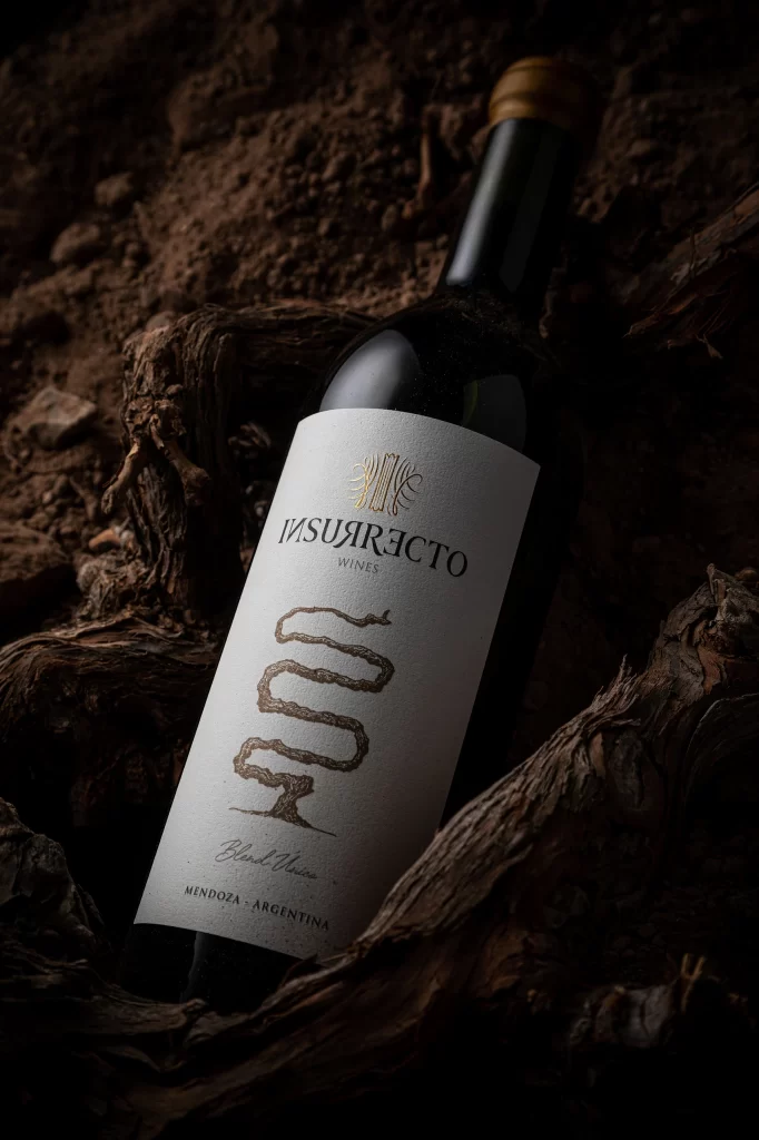
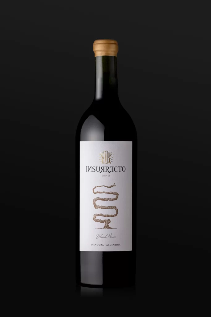
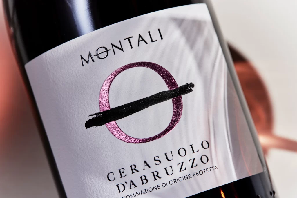
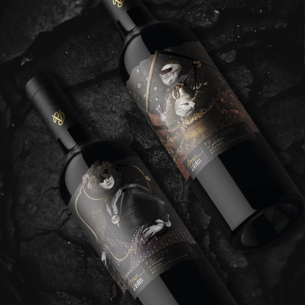
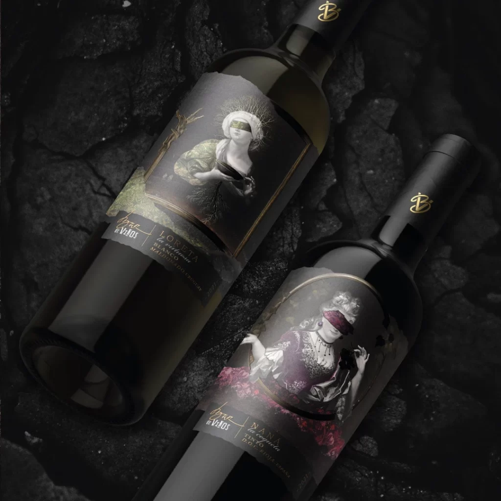
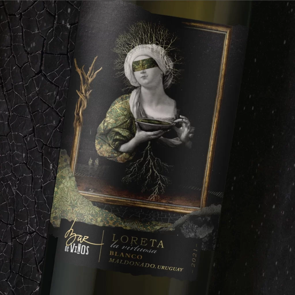
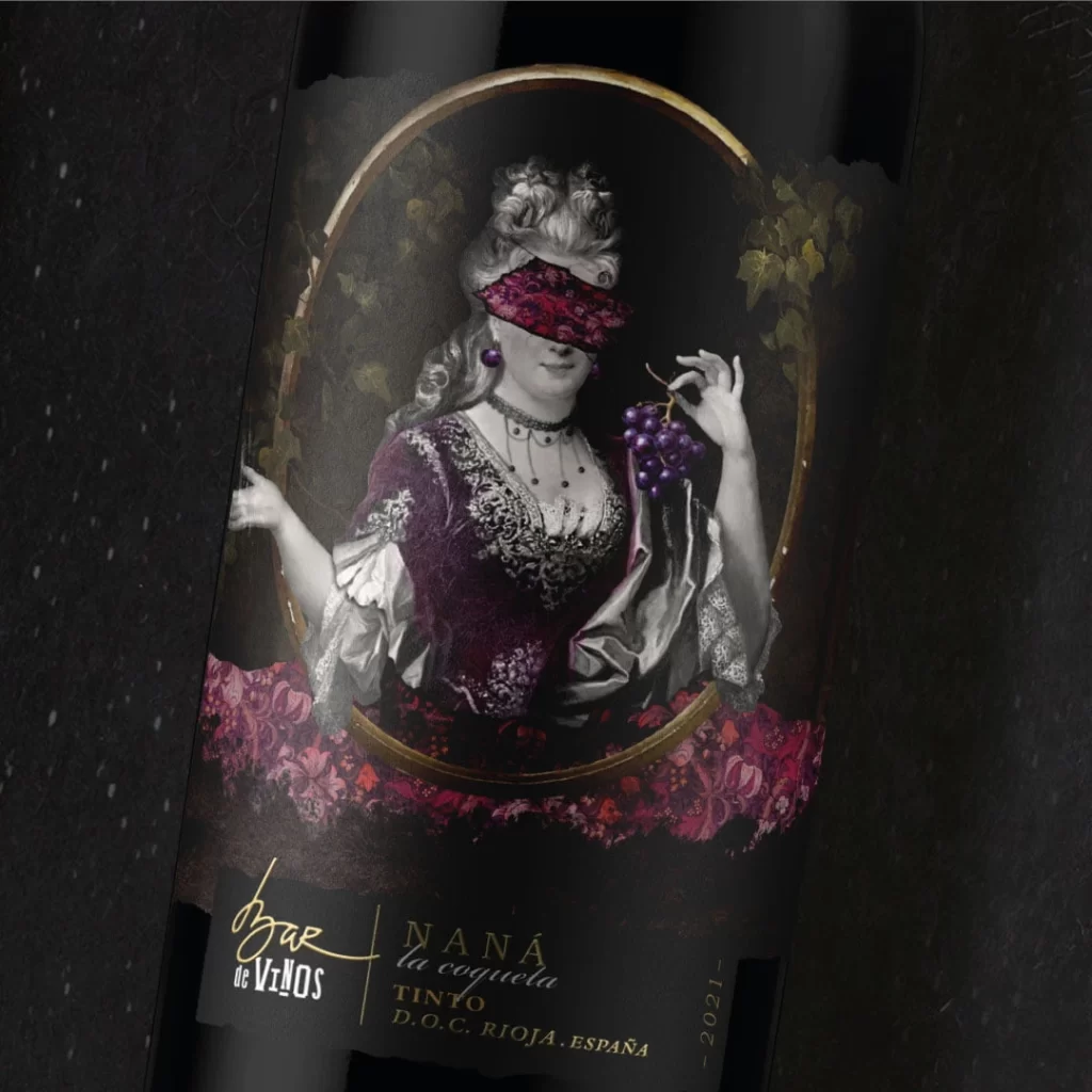
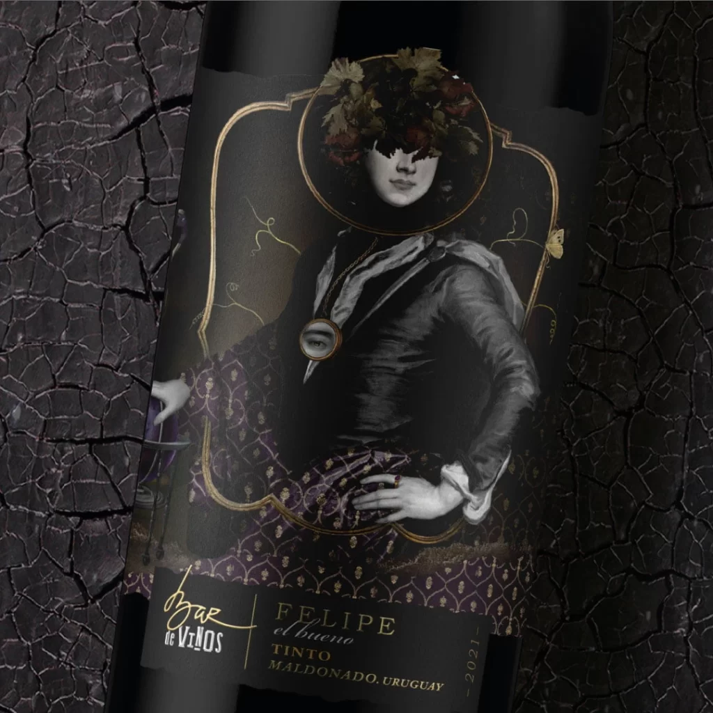
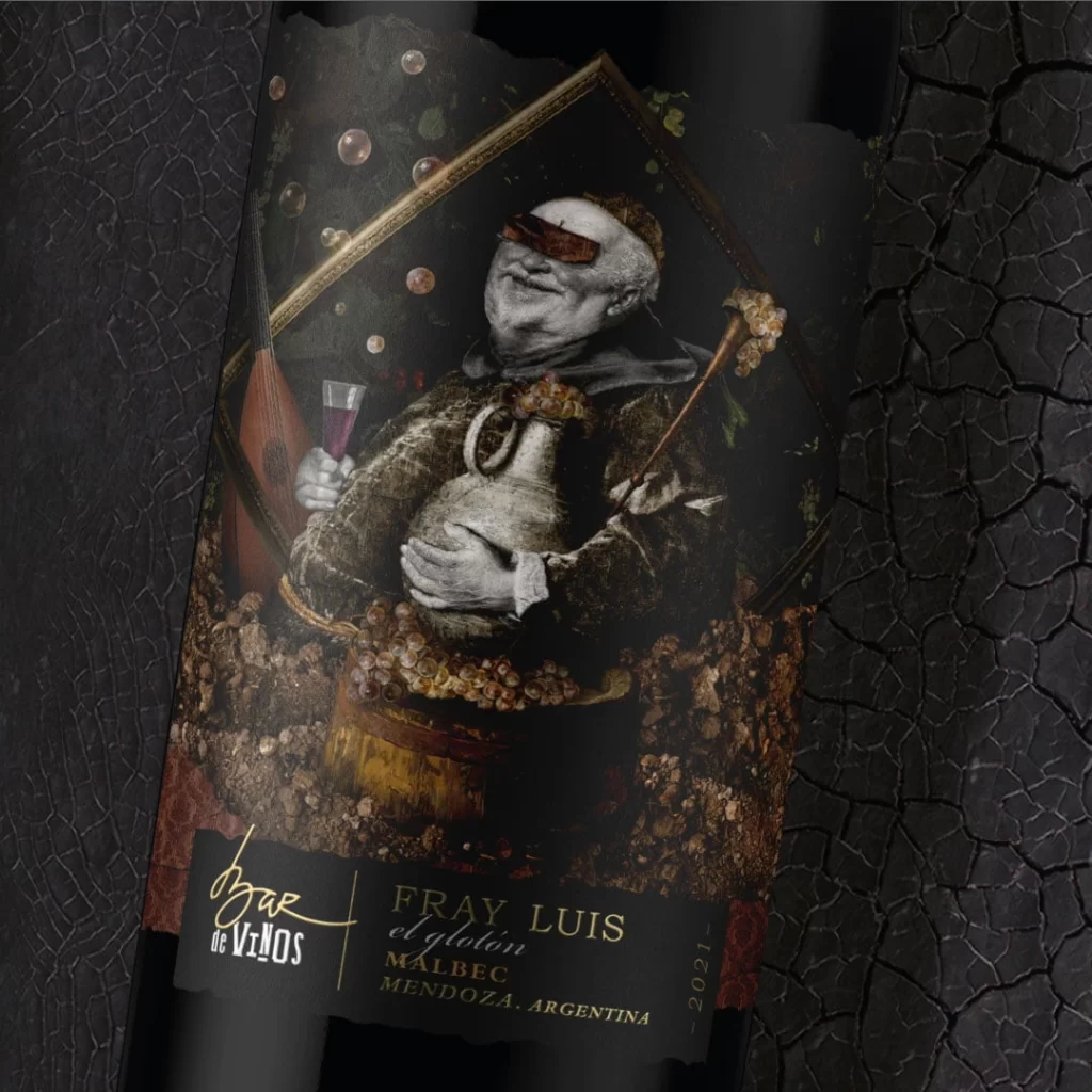
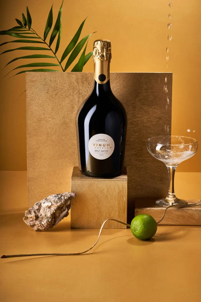
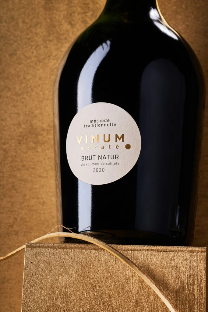
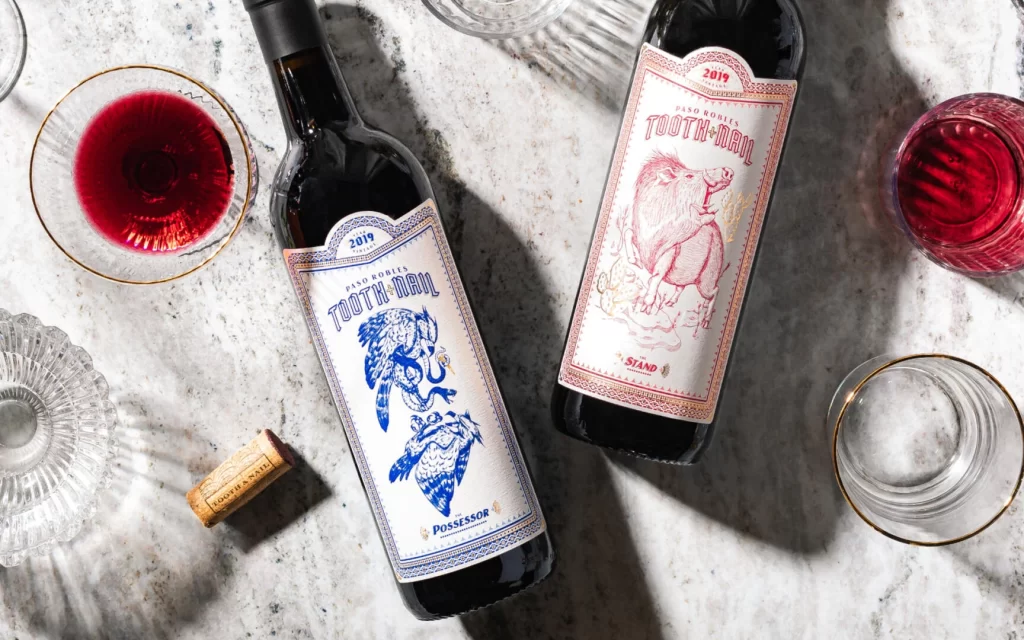
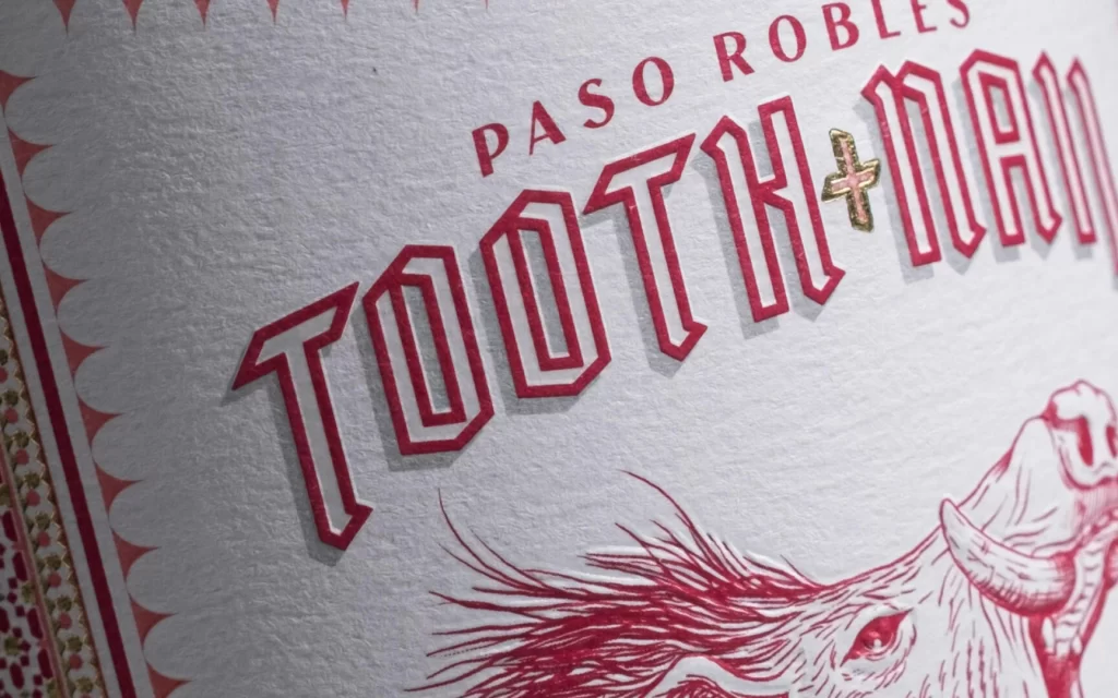
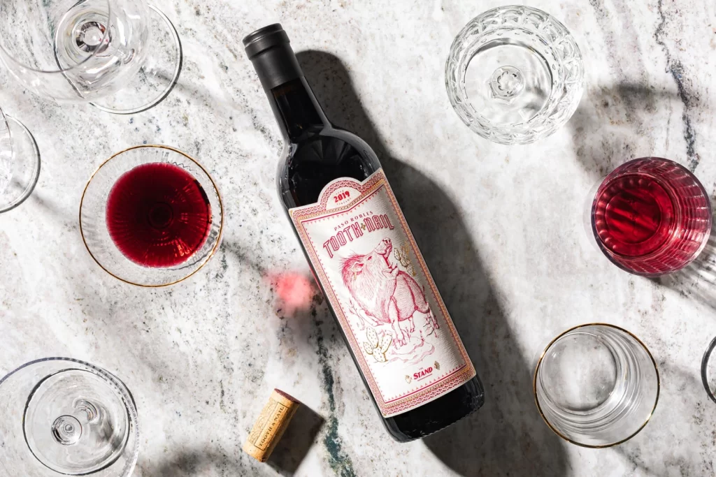
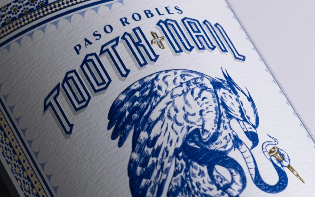
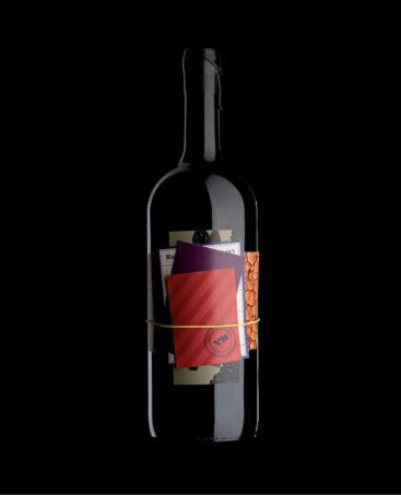
A dark glass wine bottle stands centered, its cylindrical form defined by sharp highlights on the surface. The label area features a layered collage of paper textures, dominated by a bold red rectangle with diagonal hatching that is partially obscured by a deep purple sheet and a sliver of orange patterned material. A thin, pale yellow string binds these elements together against an absolute black background.
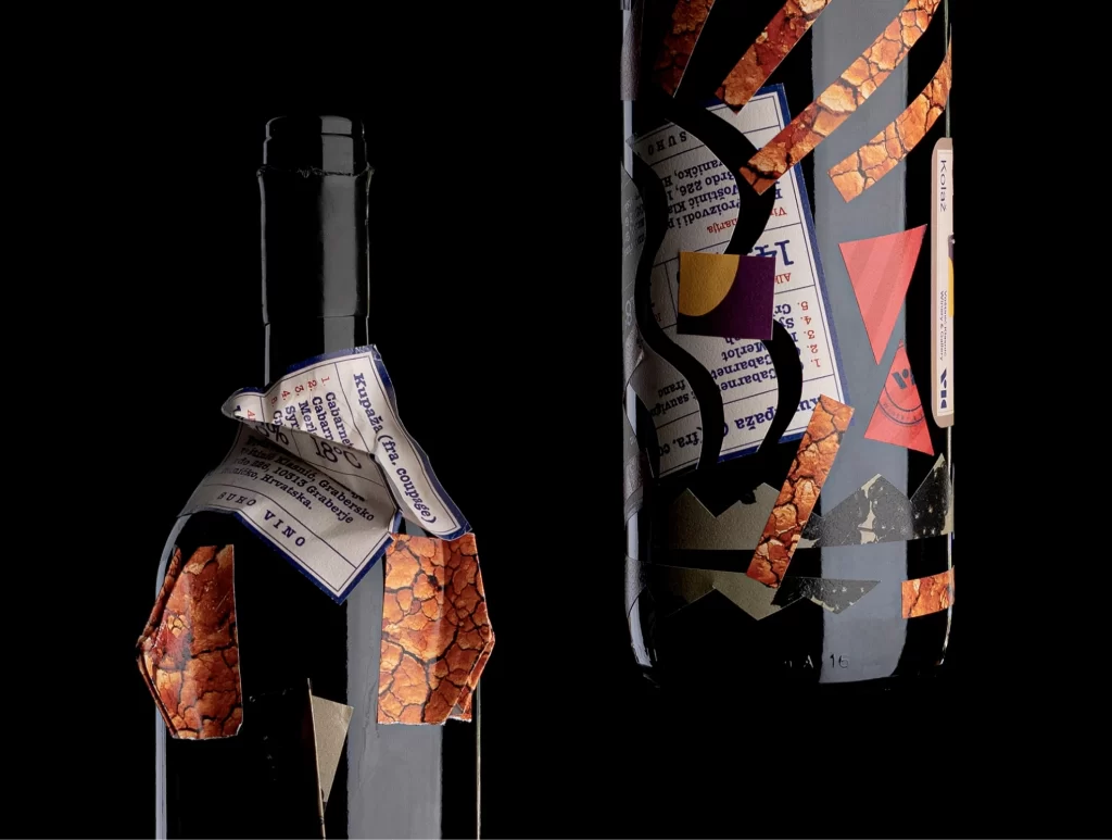
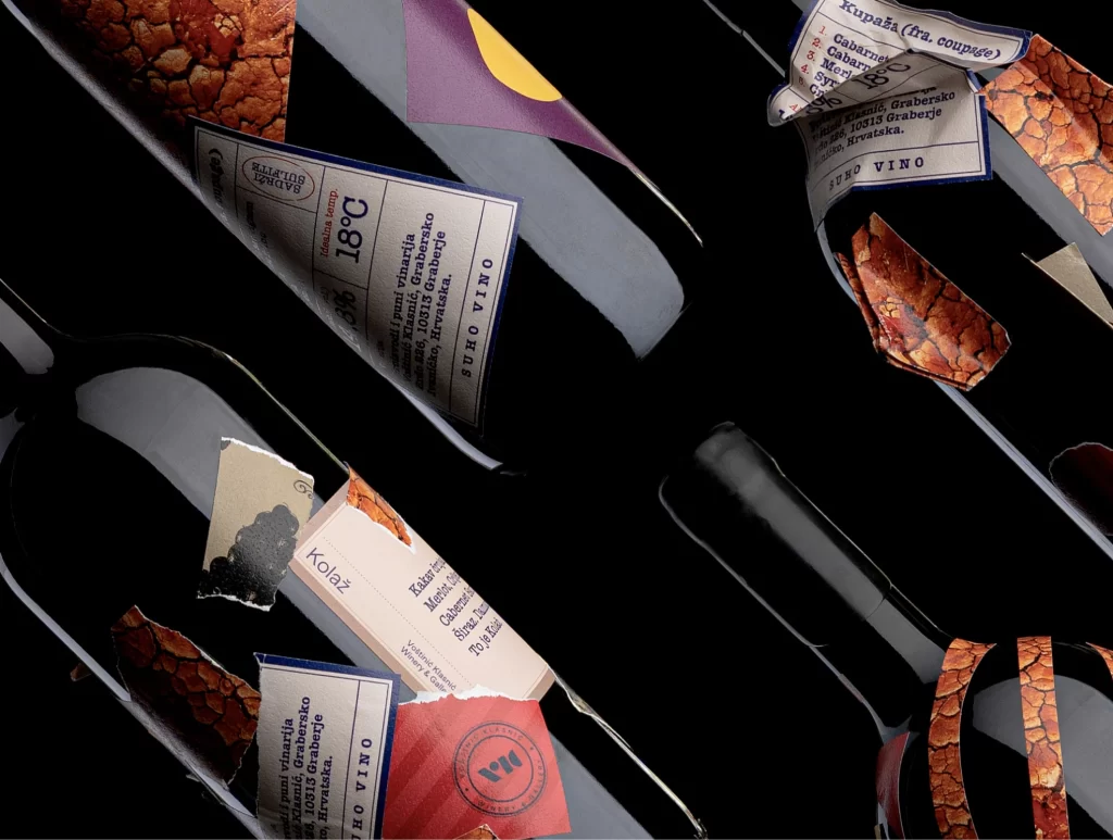
What sets this packaging apart is its rejection of traditional sleekness in favor of a raw, tactile assemblage that feels both handmade and intentionally chaotic. The interplay between the rigid glass vessel and the soft, irregular paper edges creates a compelling visual tension, suggesting a narrative of curation and craft. By using simple binding and layered colors, the design achieves a distinctive identity that feels more like an art object than a standard commercial product.
Art directors exploring unconventional branding for boutique beverages could study this approach to understand how mixed-media elements can elevate a product’s perceived value. Packaging designers looking to break away from minimalist trends might use this as a case study in incorporating texture and physical depth into label design. Additionally, anyone working on editorial layouts or event collateral could draw inspiration from the way disparate materials are unified through color and simple fastening techniques.