Kolaz Wine Packaging B
Topics
Details
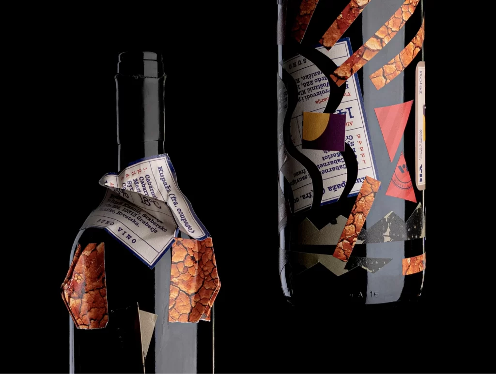
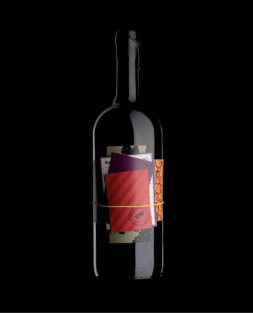
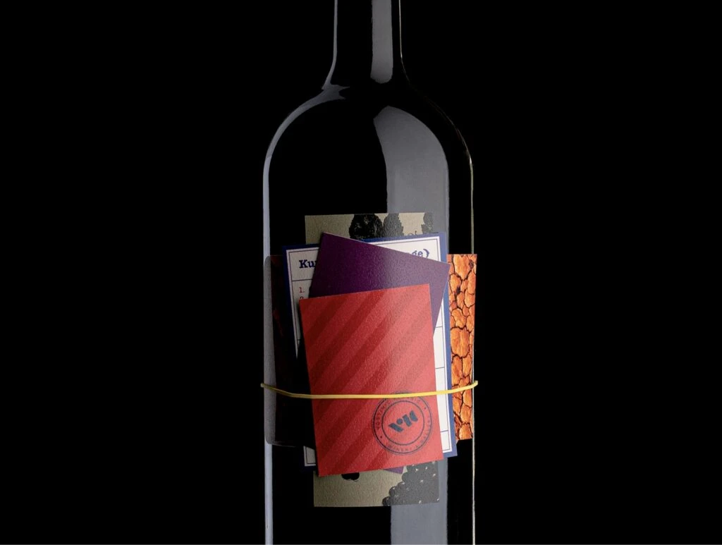
A dark glass bottle stands in absolute black, its shoulder and neck catching a sharp highlight. A chaotic collage of materials encircles the vessel's midsection, bound tightly by a single yellow rubber band that cuts horizontally across the composition. Visible within this layered assemblage are a deep crimson card with diagonal ribbing, a ma
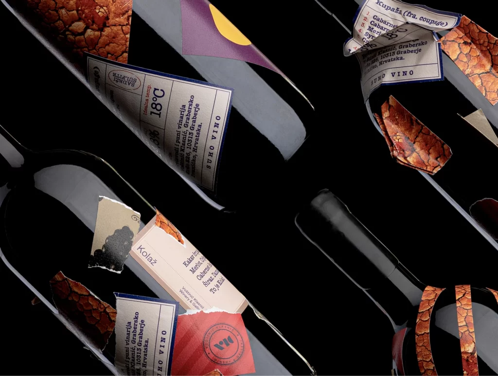
What distinguishes this particular iteration is its deliberate embrace of imperfection and the tactile qualities of raw stationery. Rather than a traditional printed label, the design relies on the physical layering of disparate textures—paper, cardstock, and synthetic bands—to create a sense of handmade authenticity. The circular blue stamp overlapping the red card adds an institutional or archival feel, suggesting this is a curated object rather than a mass-produced commodity.
Art directors developing concepts for artisanal spirits or boutique retail packaging will find value in studying how these loose elements interact with a cylindrical form. Students of material design can analyze the contrast between the rigid glass and the flexible, multi-textured wrap to understand how mixed media conveys craftsmanship. Furthermore, photographers interested in product styling might examine the lighting setup used to emphasize the varying sheens of paper against a light-absorbing background.