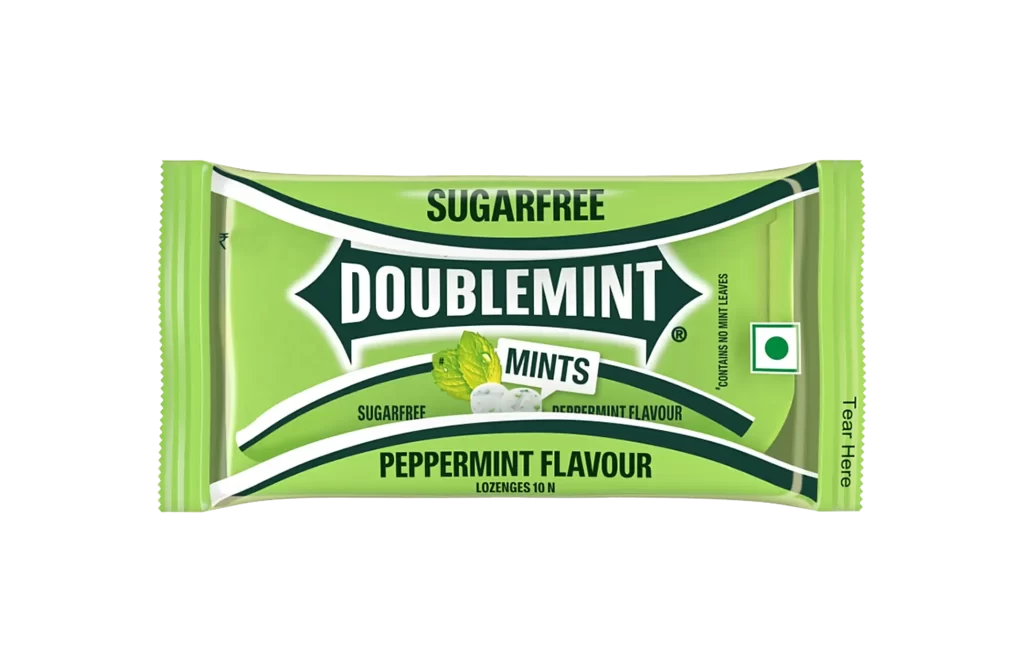
Doublemint Peppermint Mints Sugarfree Packaging
Topics
Details
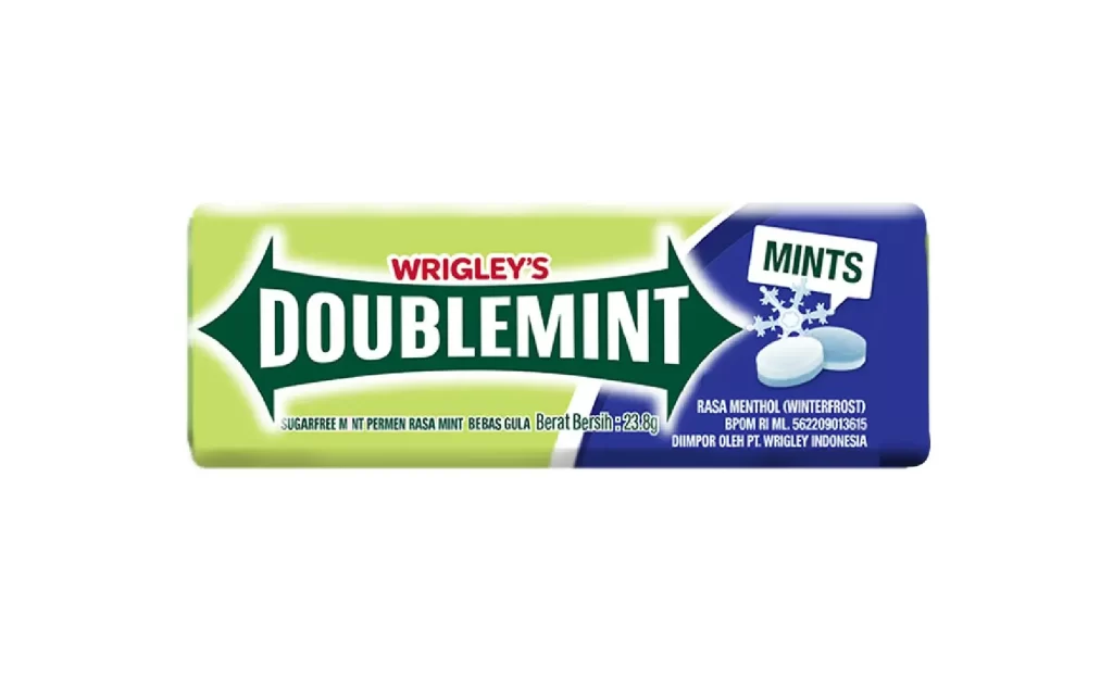
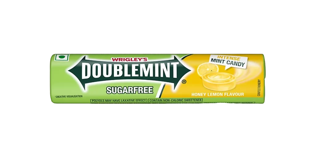
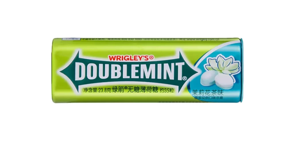
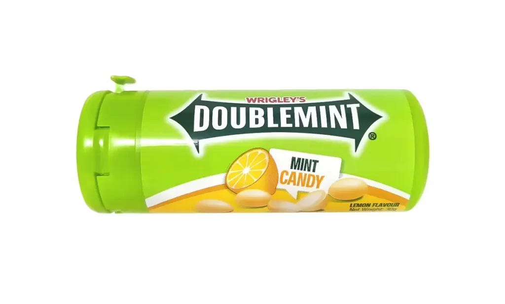
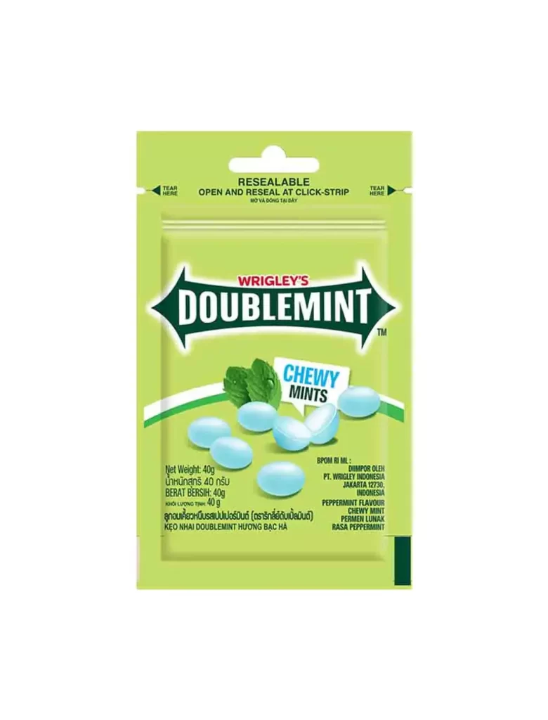
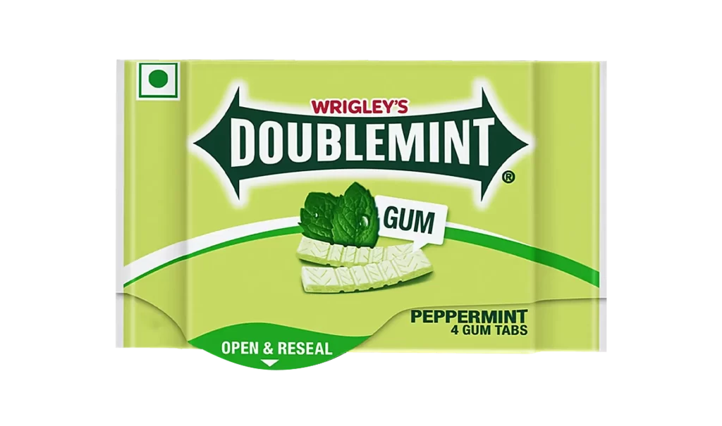
Rendered in a vibrant lime green, the Doublemint package sits centered against a stark white void, its crinkled edges suggesting a flexible foil material. Bold black and white typography dominates the composition, with the brand name 'DOUBLEMINT' encased in a sharp, arrow-like graphic that cuts across the horizontal plane. Below this central emblem, a small cluster of mint leaves and a single white lozenge provide a tactile visual cue for the peppermint flavor promised in the text beneath.
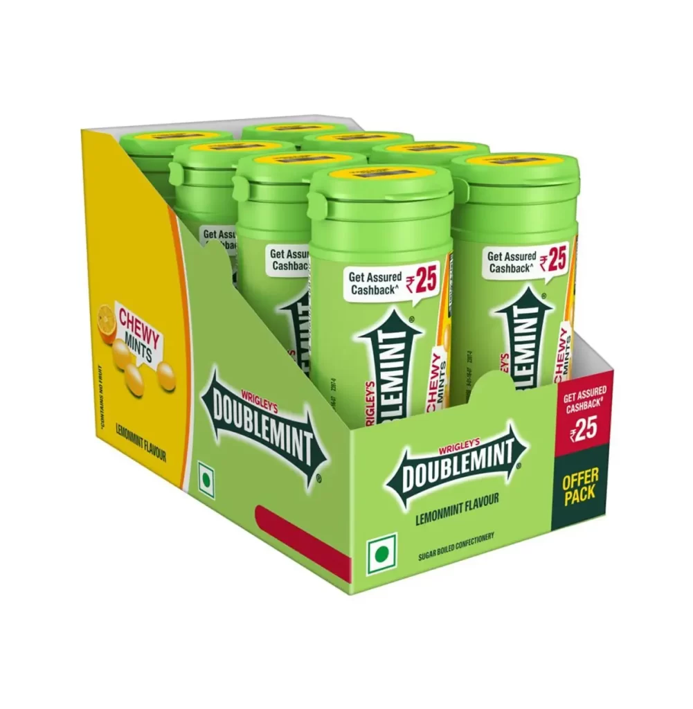
Visual hierarchy is established through the clever use of contrasting geometric shapes, where sweeping dark green curves frame the lighter background to guide the eye toward the product name. The inclusion of the Indian regulatory mark on the right side adds a specific regional context that distinguishes this variant from global counterparts. Such packaging relies on high-contrast legibility to communicate 'sugarfree' attributes instantly to consumers scanning retail shelves.
Brand historians might analyze this specific layout to understand how confectionery companies adapt their identity for different international markets. Packaging engineers could study the placement of the 'Tear Here' instruction to optimize user experience for flow-wrapped items. Marketing teams looking to refresh legacy brands would find value in examining how classic color palettes are maintained while updating typographic styles for modern audiences.