Doublemint Green Grape Mint Candy Packaging
Topics
Details
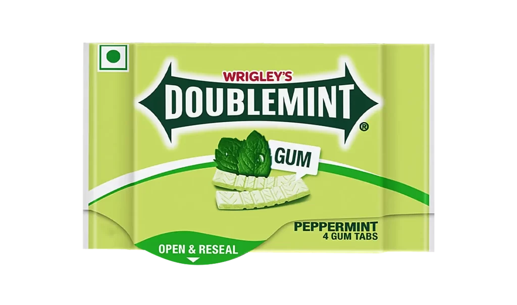
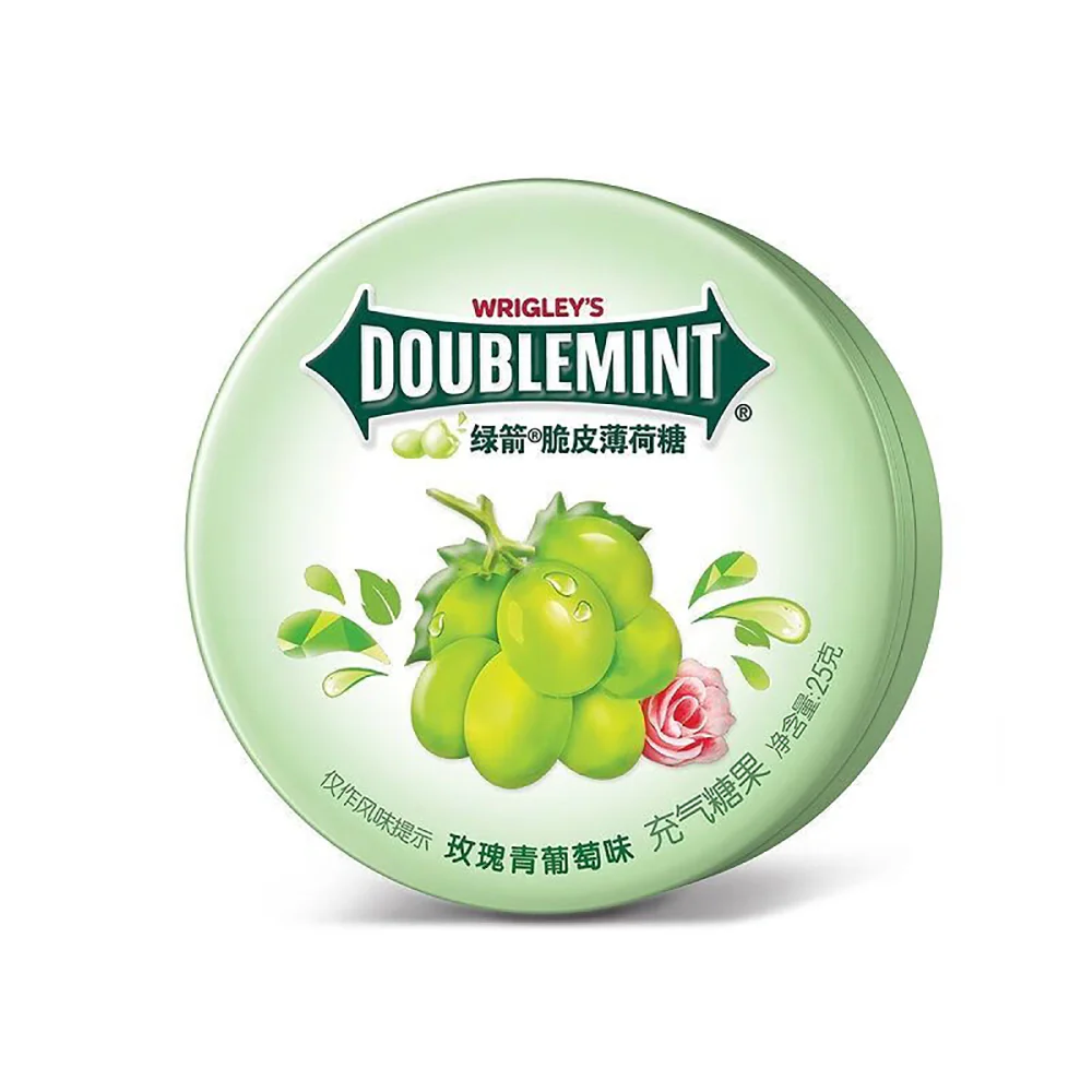
A circular mint tin in pale green gradients displays the iconic Wrigley's Doublemint logo in bold white serif lettering, framed by a dark green banner with the Chinese text 绿箭脆皮薄荷糖 beneath it. Photorealistic jade-green grapes glistening with water droplets dominate the center, accompanied by a single pink rose and stylized leaf splashes, while curved text at the bottom indicates 玫瑰青葡萄味 充气糖果 with a net weight of 25 grams on a white surface.
Visual interest derives from the sophisticated interplay between industrial typography and organic illustration. The soft, matte finish of the tin contrasts sharply with the glossy, saturated fruit rendering, creating a tactile illusion even in a two-dimensional format. By integrating floral elements with the traditional grape motif, the composition signals a complex flavor profile that transcends standard mint packaging conventions. This specific iteration balances corporate identity with fresh, appetizing aesthetics through careful color harmony.
Product photographers might analyze the lighting setup used to achieve those specular highlights on the fruit skin without washing out the pastel background. Brand strategists could examine how localized text integrates with global iconography to maintain visual cohesion across markets. Packaging engineers may reference the structural proportions and lid curvature when developing similar round-container concepts for confectionery lines.