Doublemint Gum Packaging 2
Topics
Details
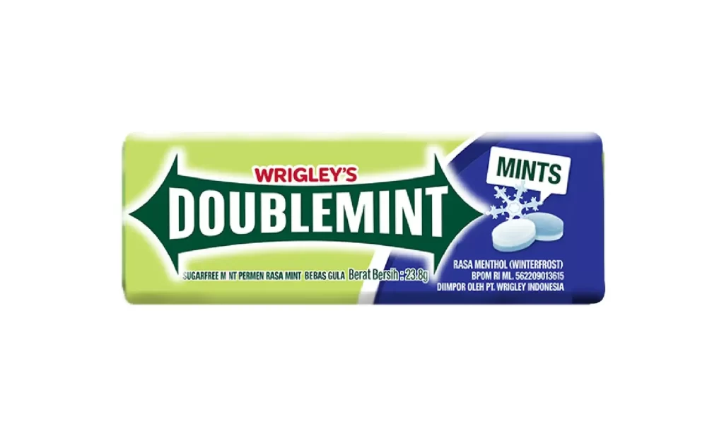
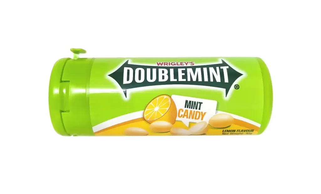
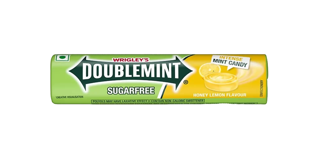
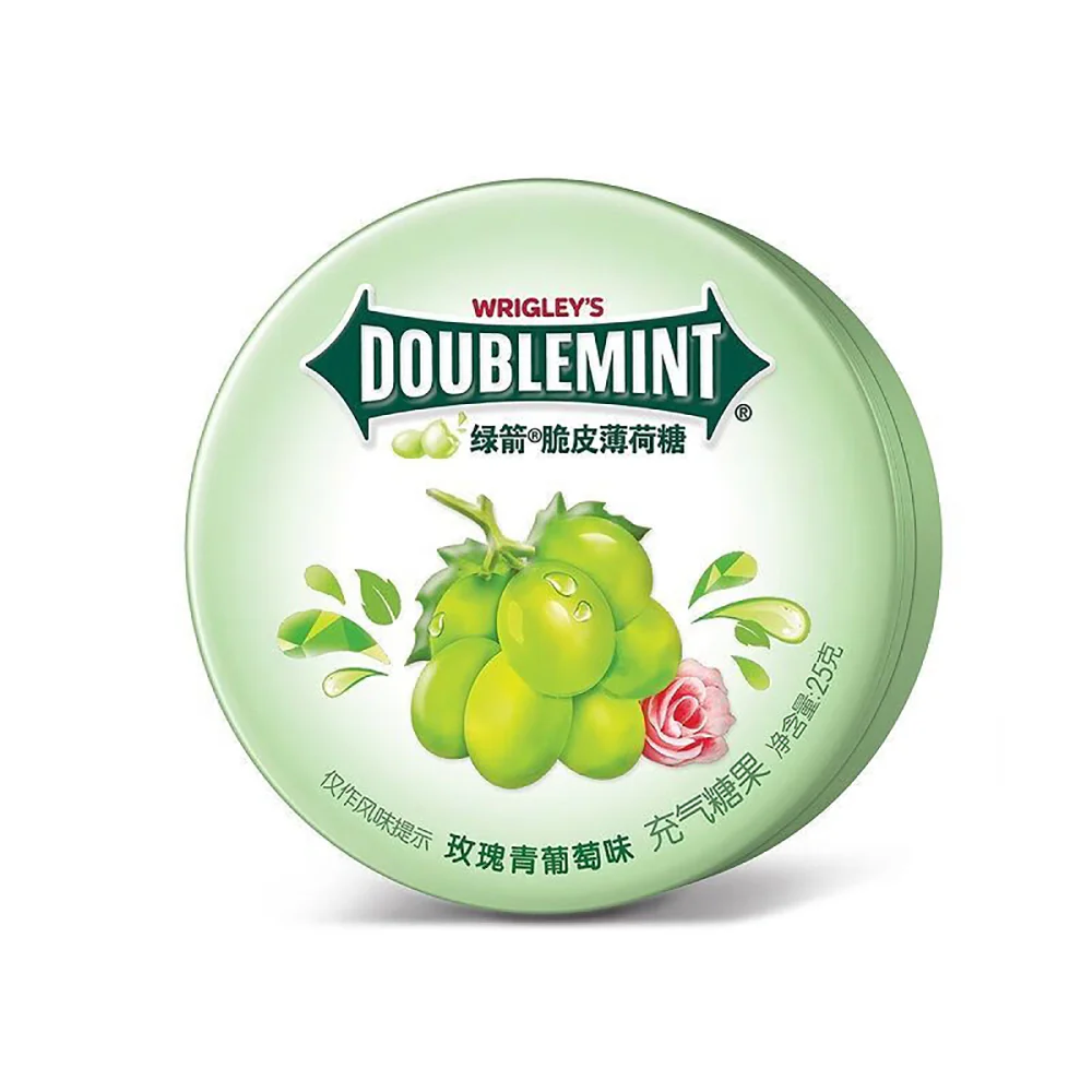
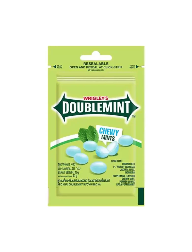
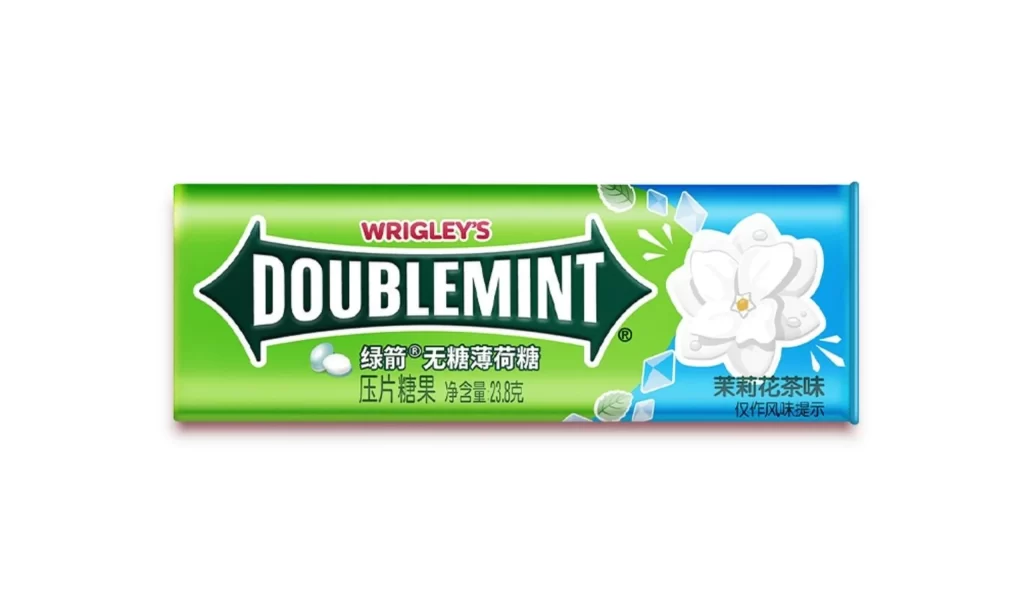
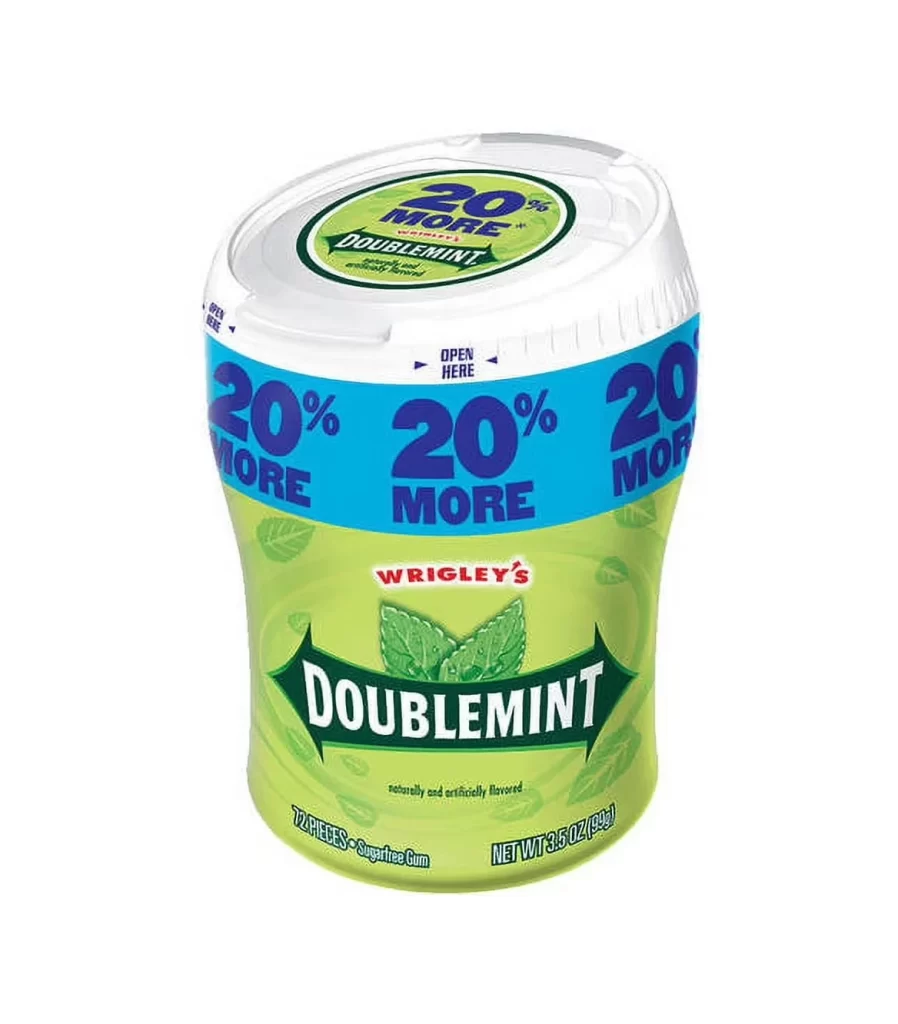
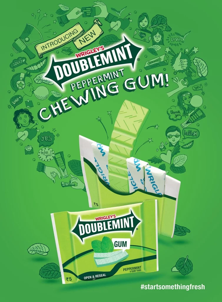
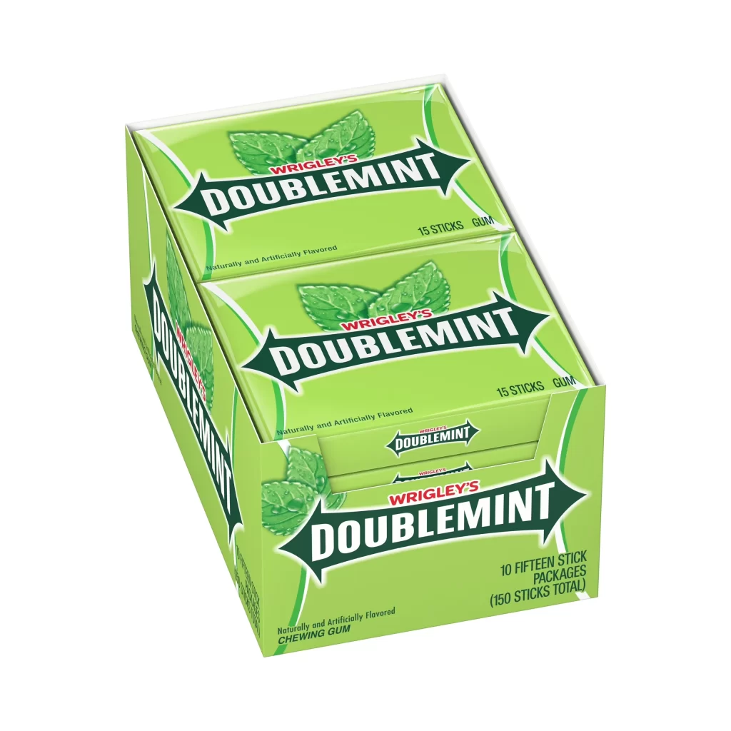
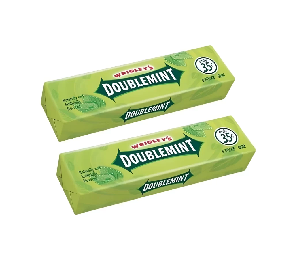
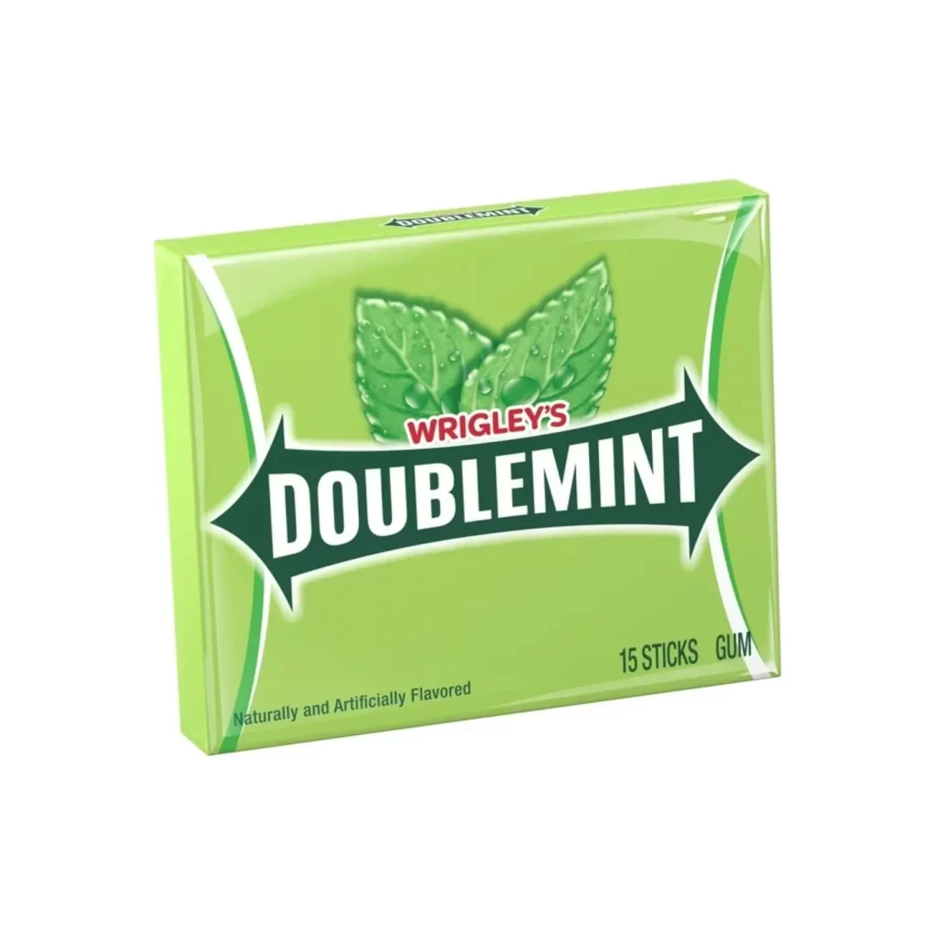
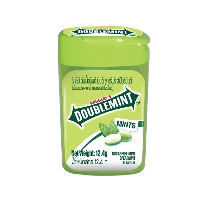
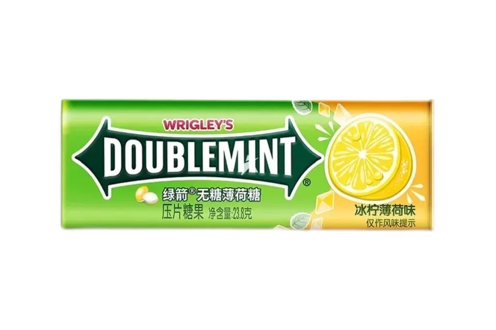
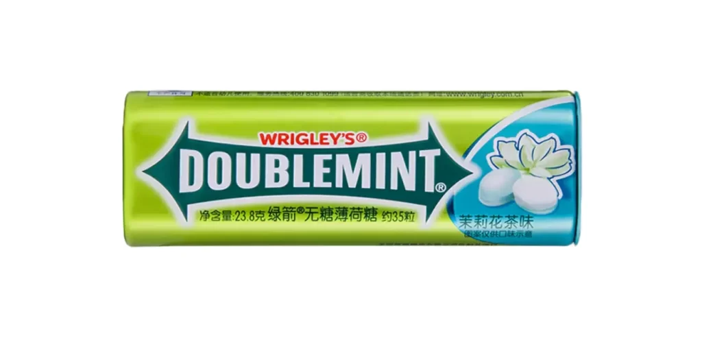
A cylindrical tin of Wrigley's Doublemint gum presents a direct frontal view with no visible shadows or distortion, its surface dominated by a vibrant lime-green gradient that transitions into a cool cyan-blue field on the right side. A delicate white jasmine flower blooms beside two oval-shaped mints within the blue section, while bold white sans-serif lettering spells out the brand name across a dark green arrow-shaped banner.
Visual interest here stems from the sharp juxtaposition of the energetic green palette against the calming blue accent, creating a fresh, botanical aesthetic that signals the specific jasmine tea flavor. The arrow motif enclosing the brand name injects a sense of dynamic movement into an otherwise static, rectangular composition, while the realistic illustration of the flower adds an organic softness to the industrial metal packaging. Such a layout effectively balances dense typographic information with generous negative space, ensuring the flavor variant remains the focal point for the consumer.
Brand historians or packaging analysts might utilize this visual to study how multinational companies adapt their iconic color schemes for regional flavor variations in Asian markets. Industrial designers could examine the curvature of the tin and the placement of informational text to understand efficient use of limited surface area on small consumer goods. Furthermore, color theorists will find value in dissecting how the specific transition from yellow-green to cyan evokes freshness and herbal notes without relying on literal imagery of tea leaves.