Wrigley’s Doublemint Gum Pouch Packaging
Topics
Details
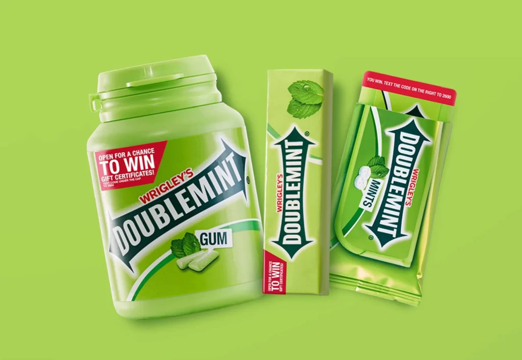
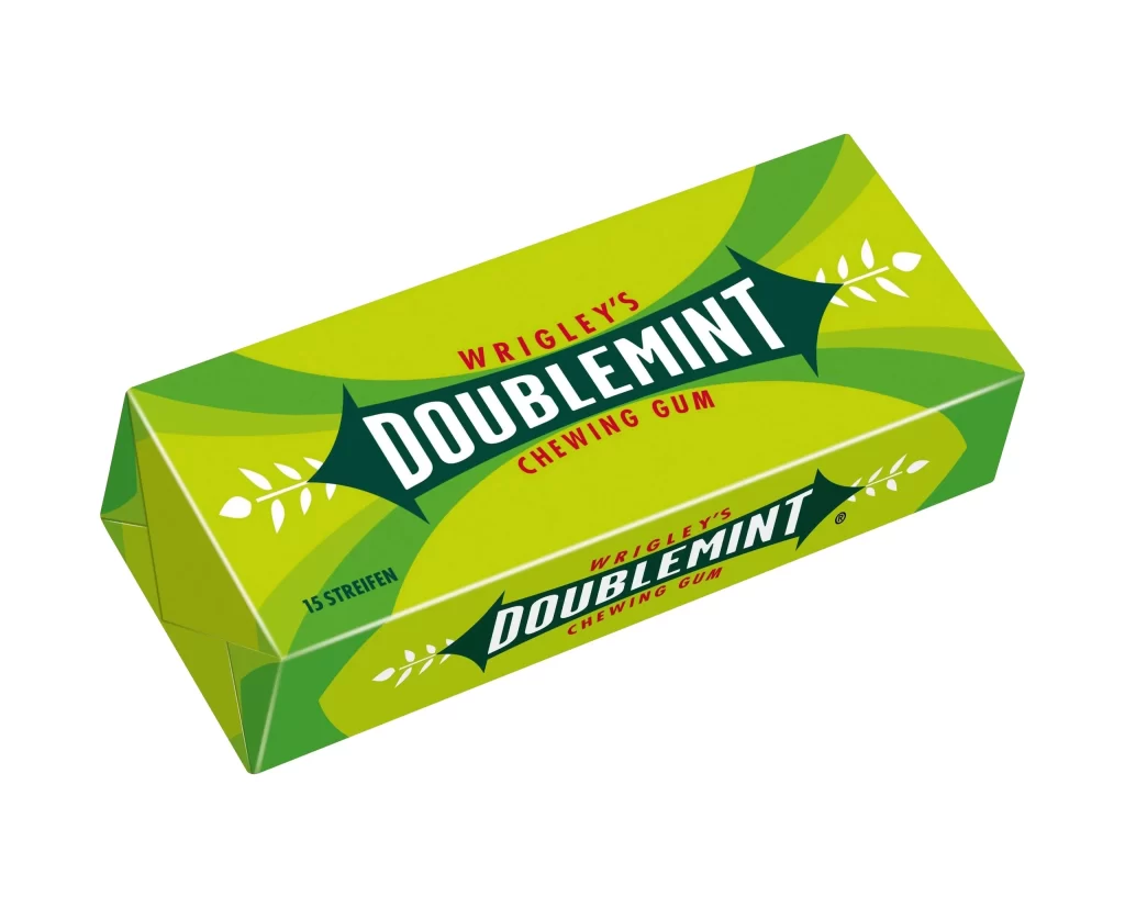
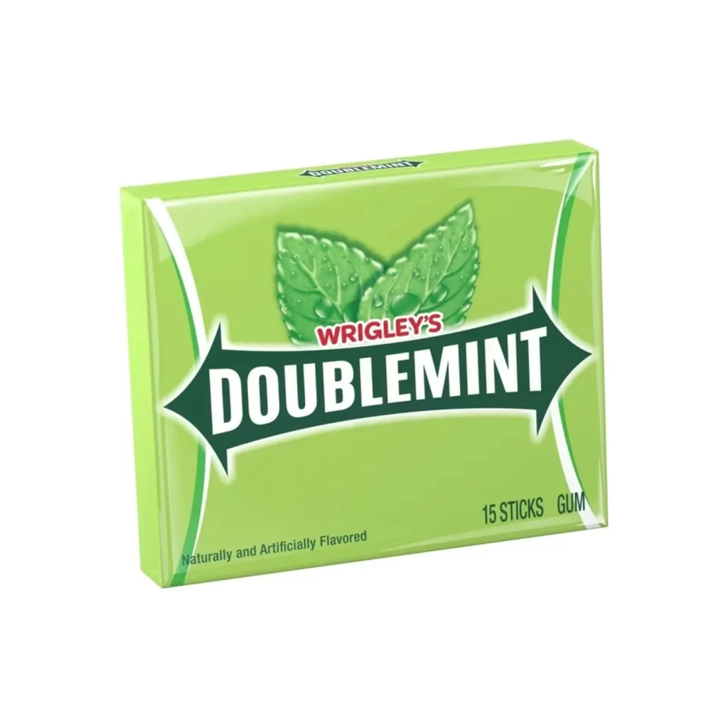
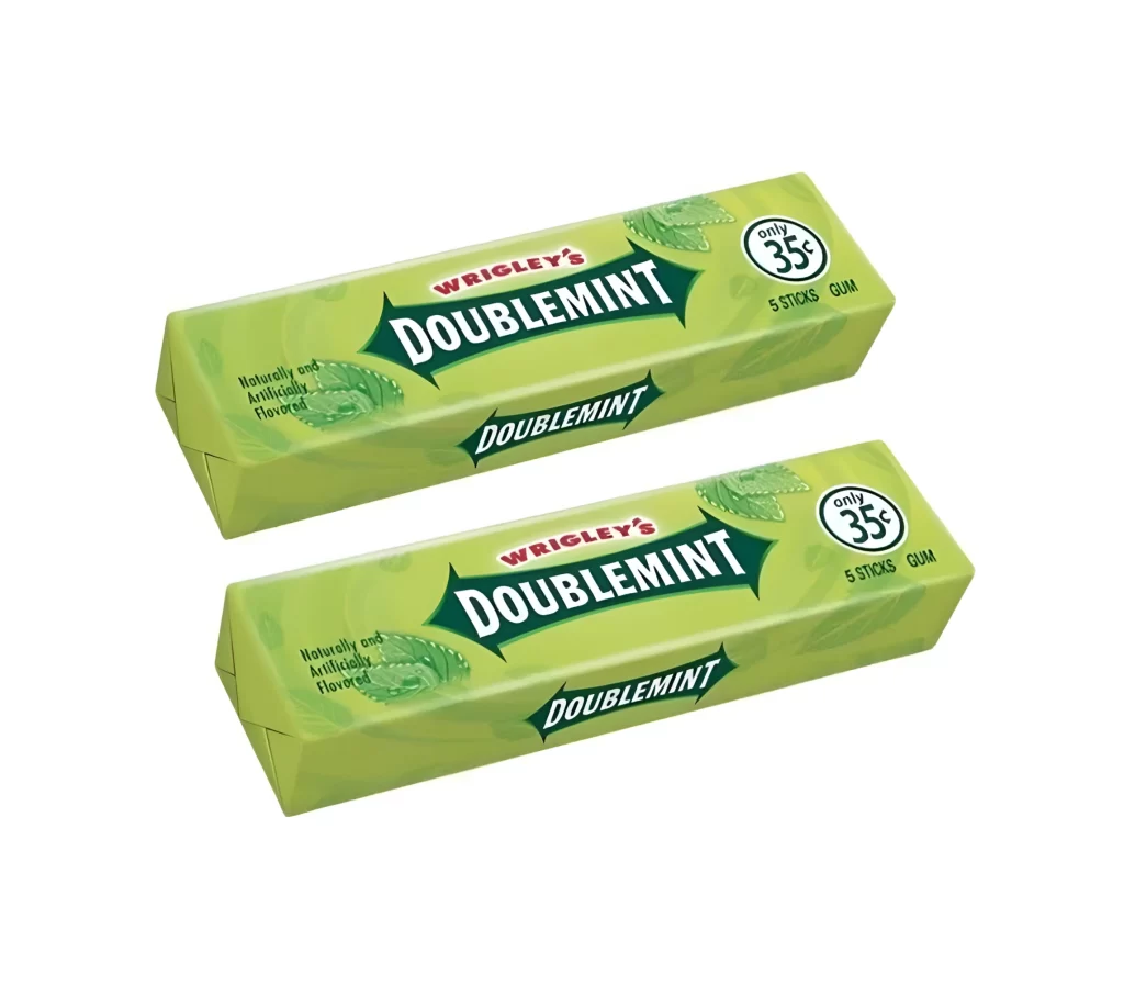
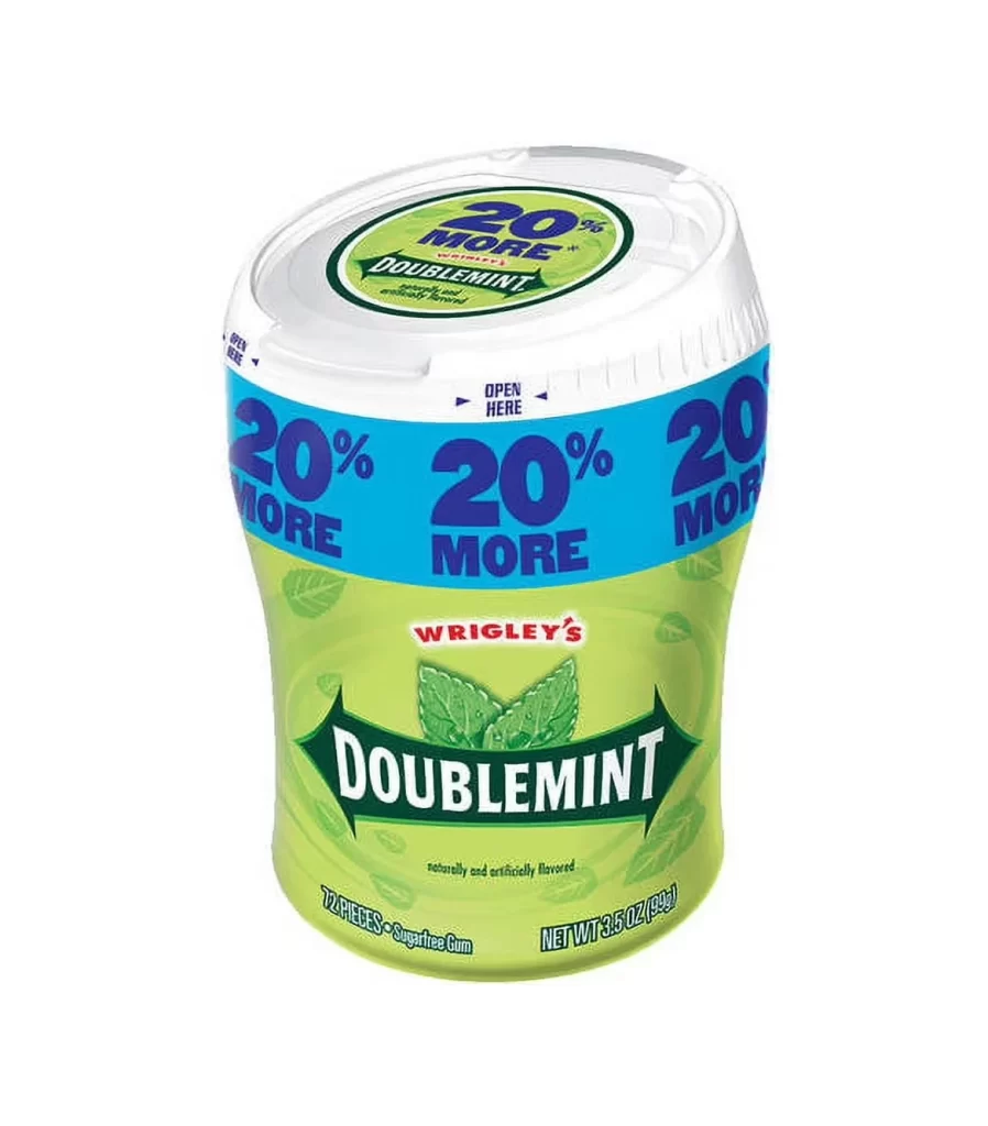
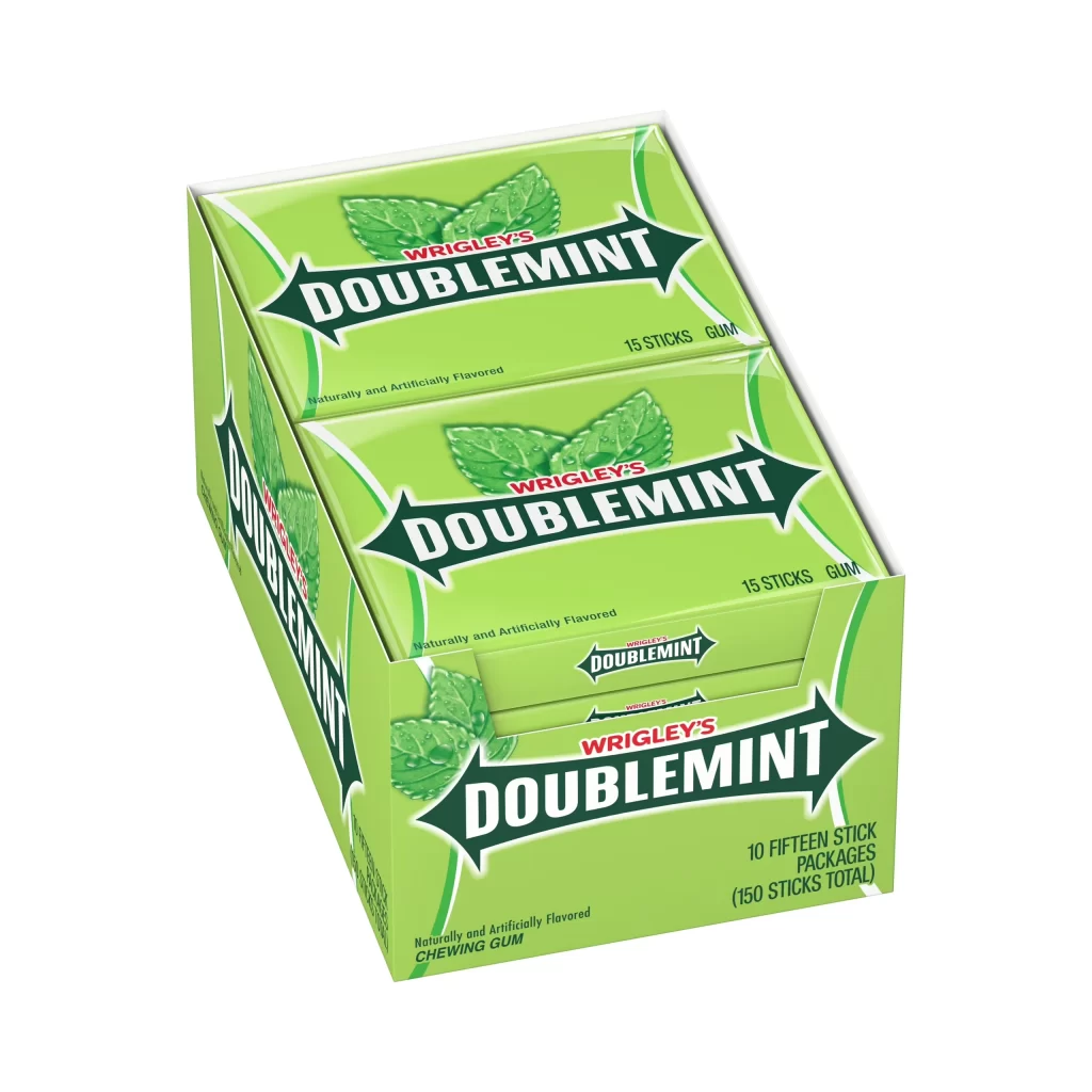
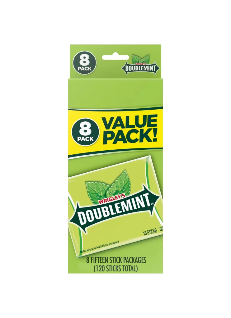
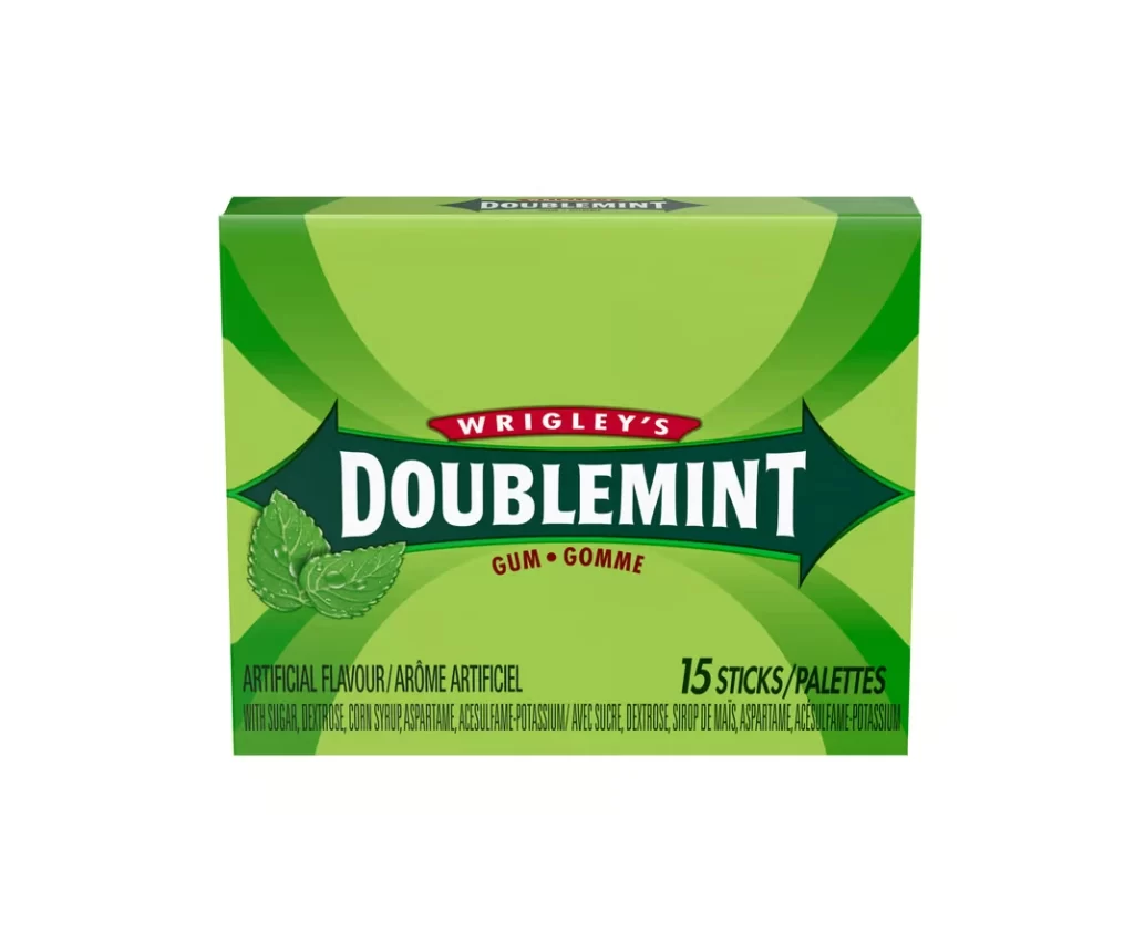
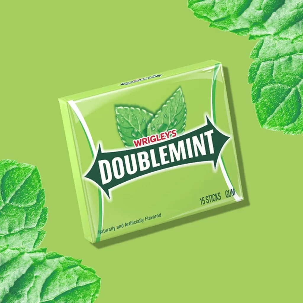
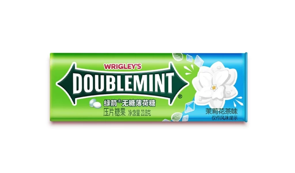
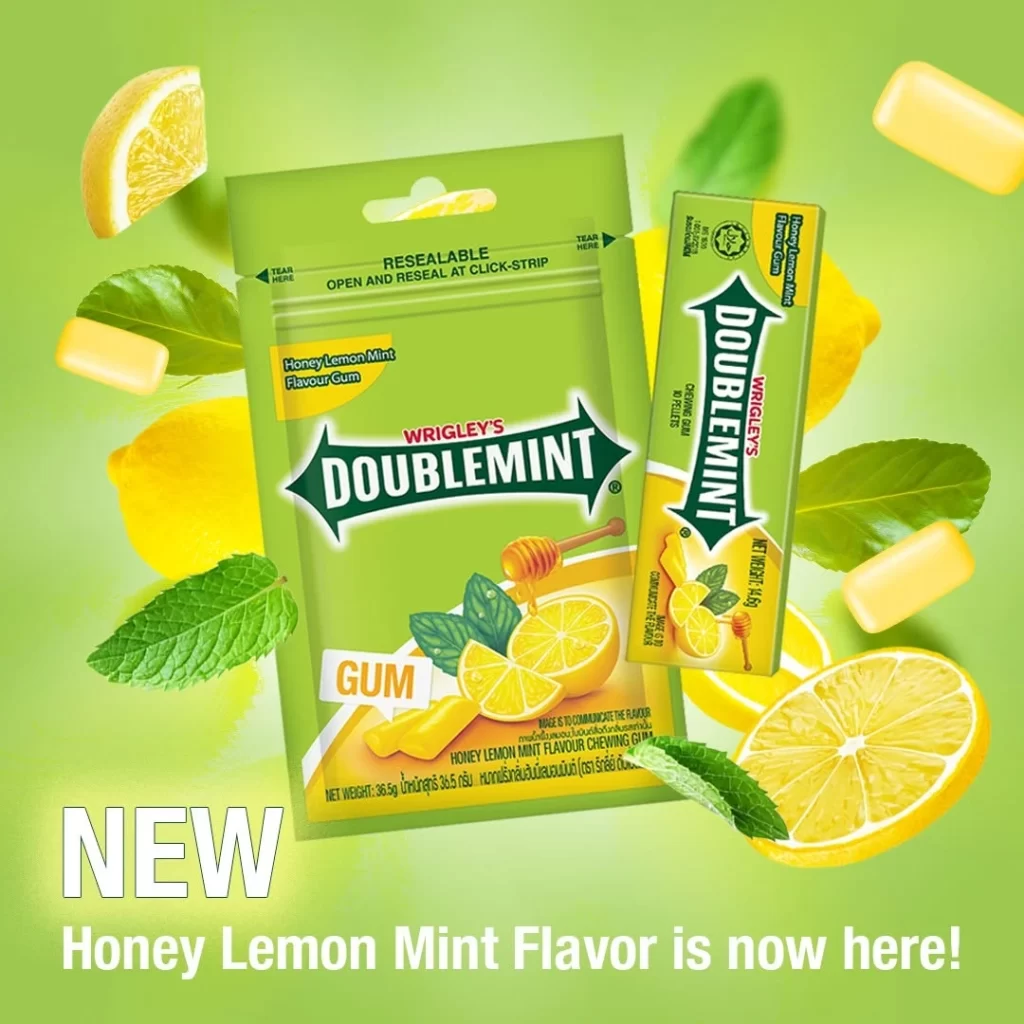
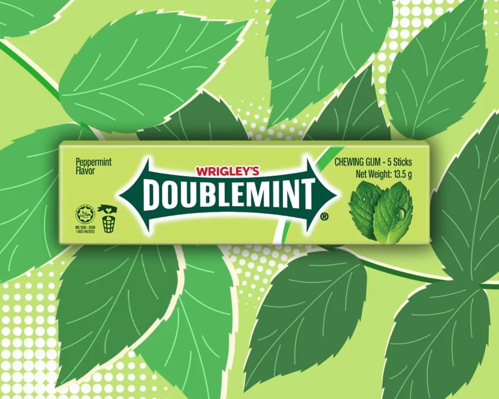
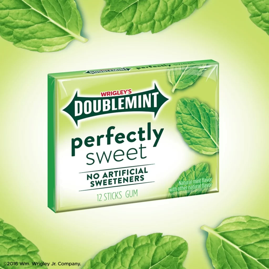
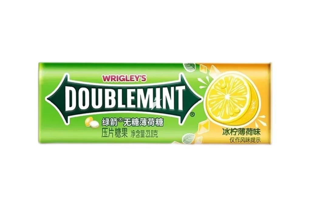
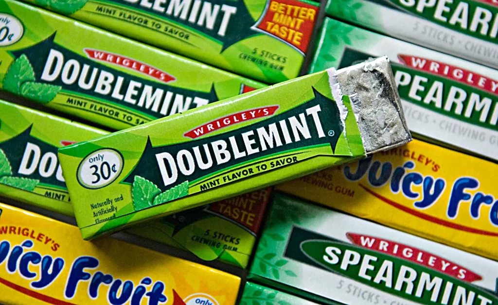
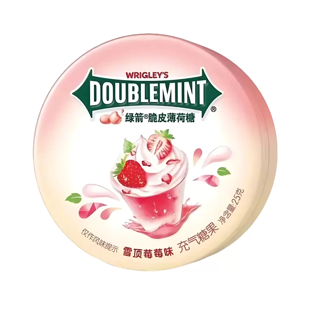
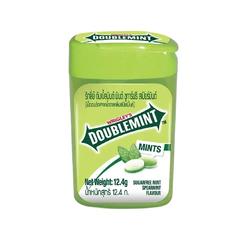
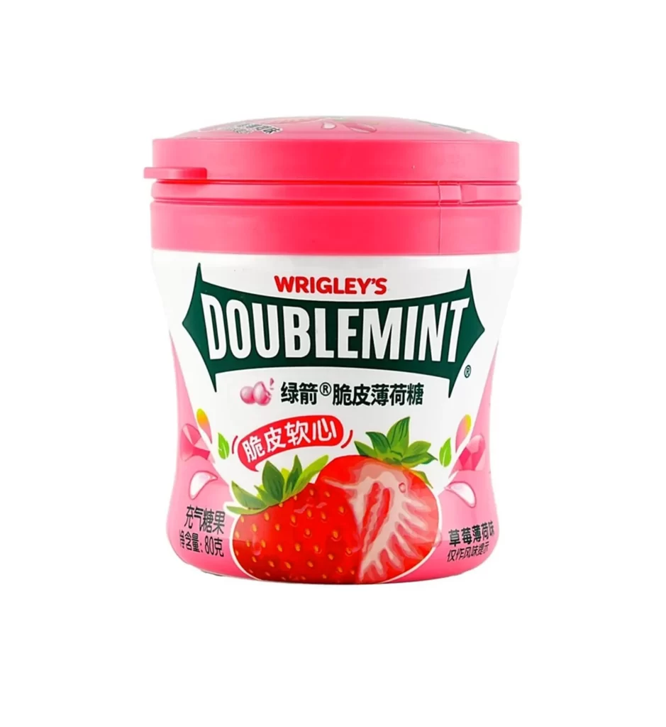
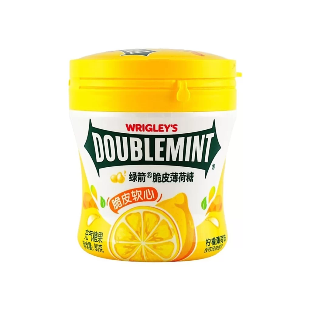
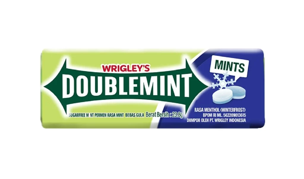
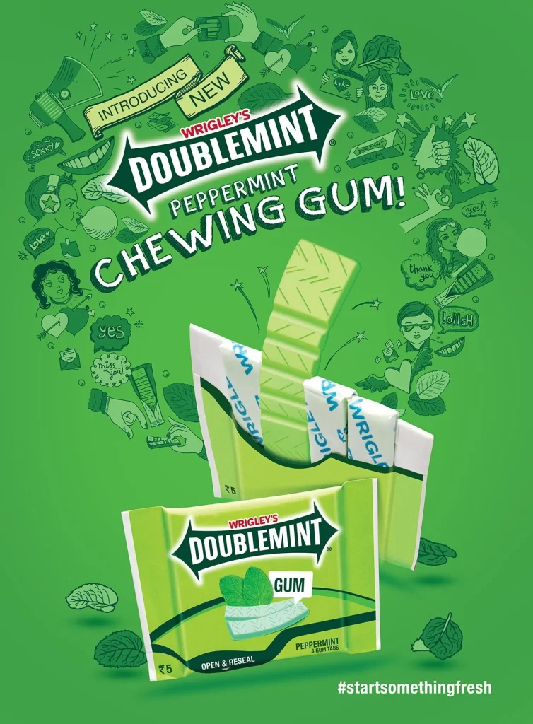
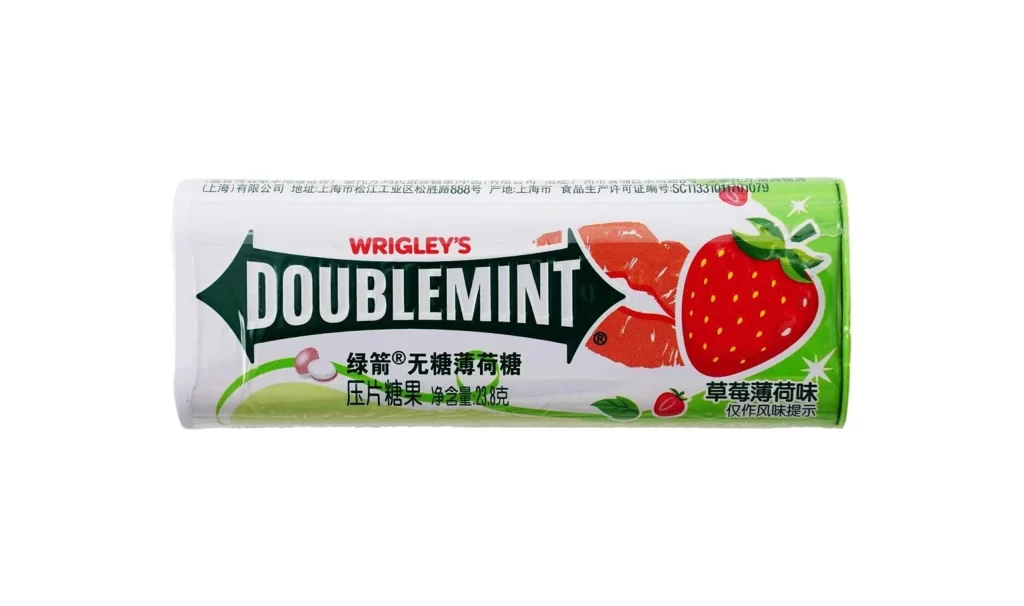
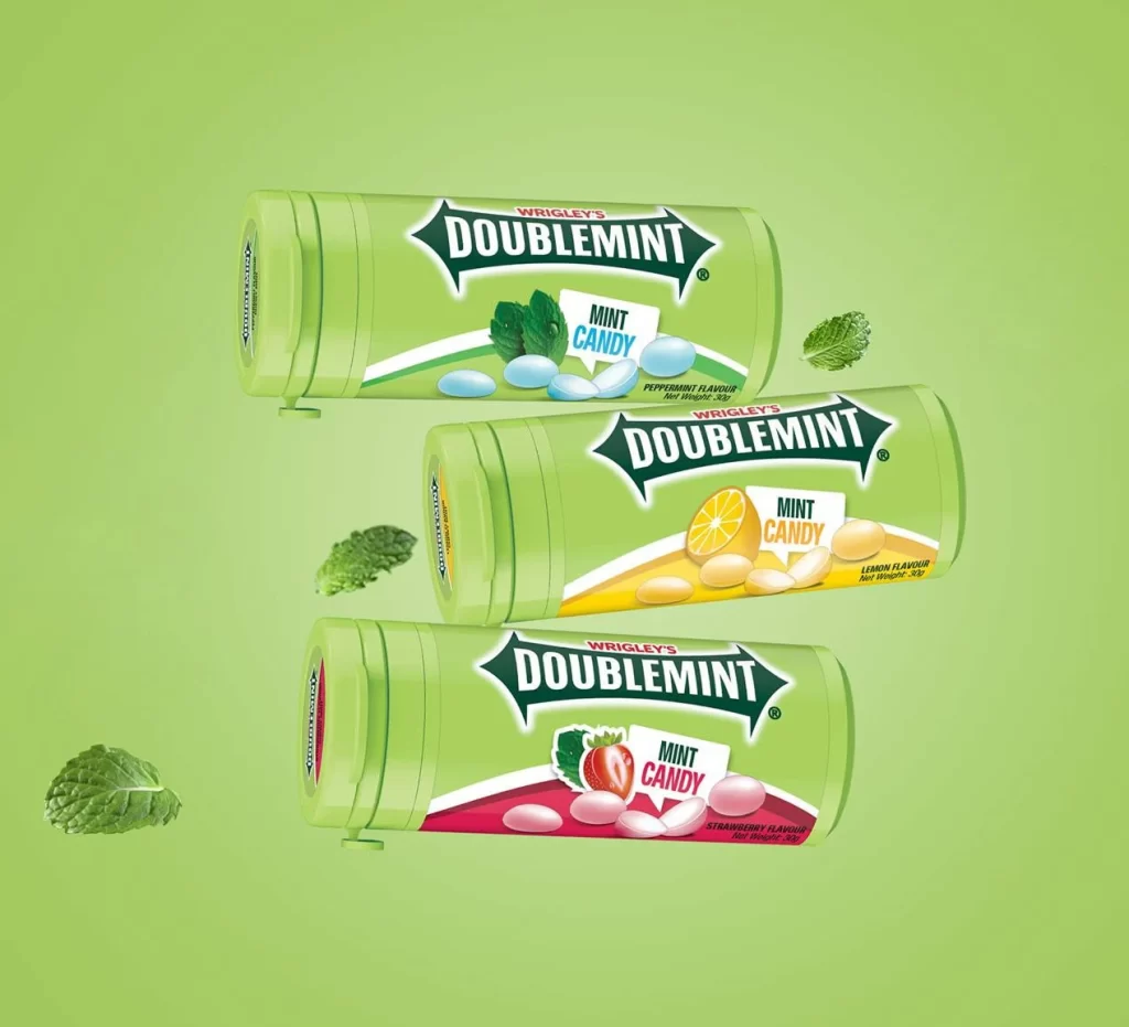
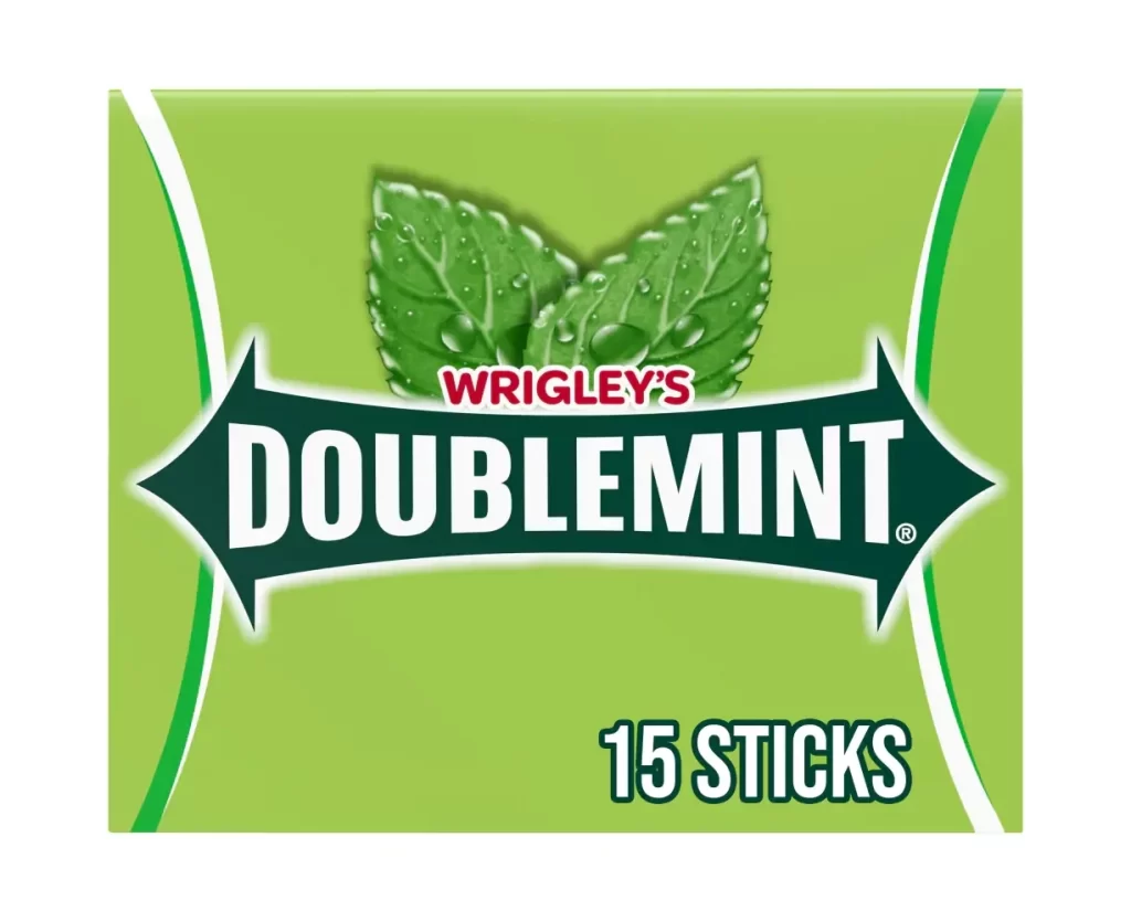
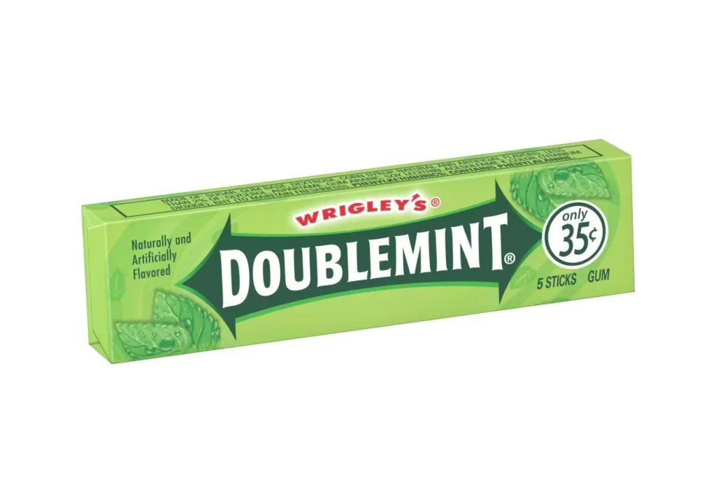
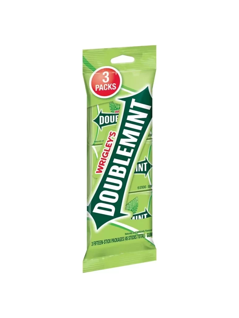
A vertical pouch of Wrigley's Doublemint gum commands attention with its signature lime-green hue, featuring the iconic dark green arrow logo emblazoned with 'DOUBLEMINT' in bold white sans-serif lettering. A red circular badge in the upper left corner announces a multipack of three, while soft, even lighting eliminates harsh shadows on the white surface beneath.
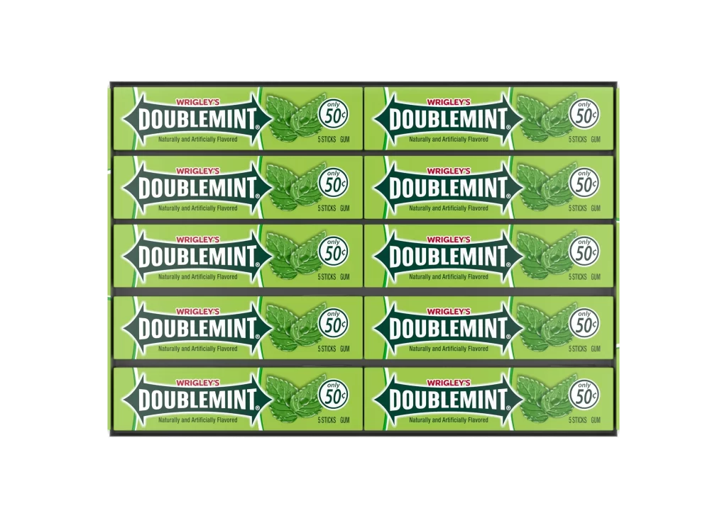
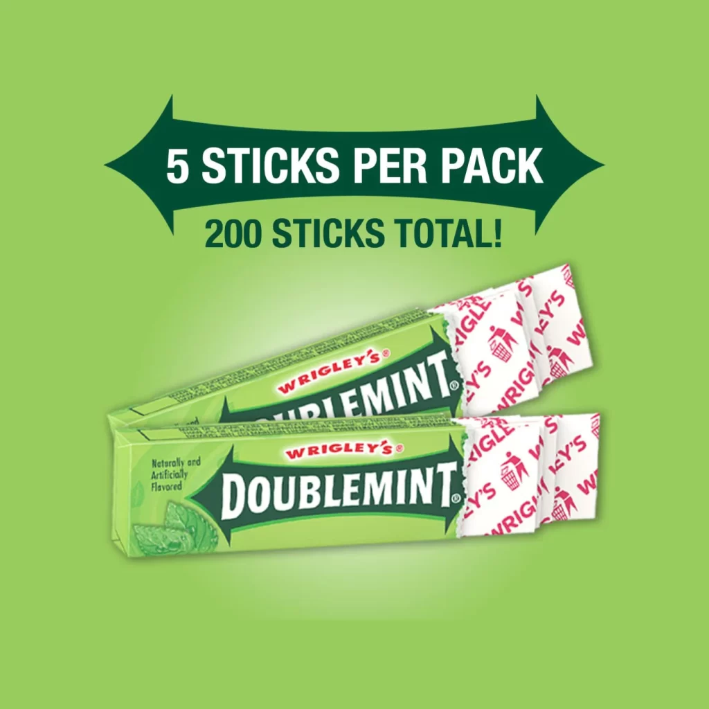
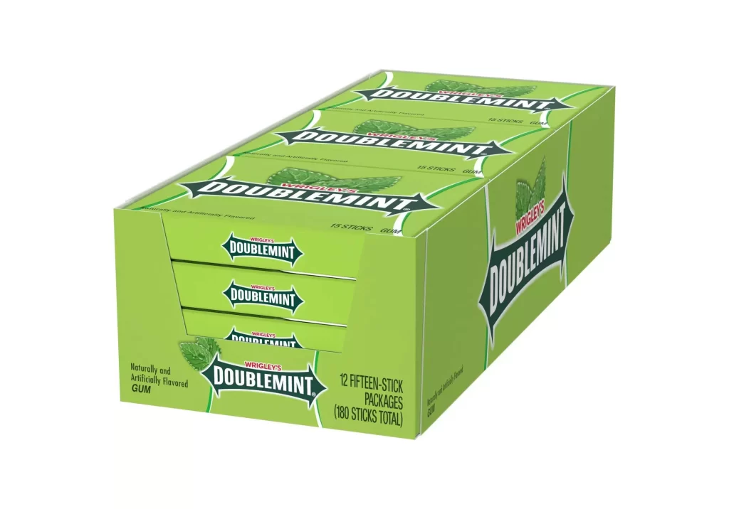
Visual hierarchy is masterfully controlled through the diagonal thrust of the brand arrow, which cuts across the static vertical lines of the pouch to create dynamic movement. The high-contrast palette of vibrant green, deep forest tones, and urgent red ensures immediate shelf recognition, while the clean typography maintains a sense of classic reliability. Such packaging design effectively balances information density with breathable white space, making the product details legible from a distance.
Brand historians and packaging analysts might utilize this specific configuration to study the evolution of Wrigley’s multi-pack strategies and color consistency over decades. Industrial designers could examine the structural engineering of the resealable top and the way graphics wrap around a flexible 3D form. Furthermore, marketing teams assessing retail presence often look at such examples to understand how bold geometric shapes influence consumer perception of flavor intensity and freshness.