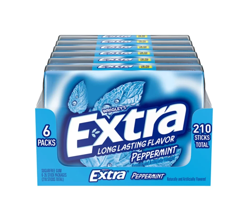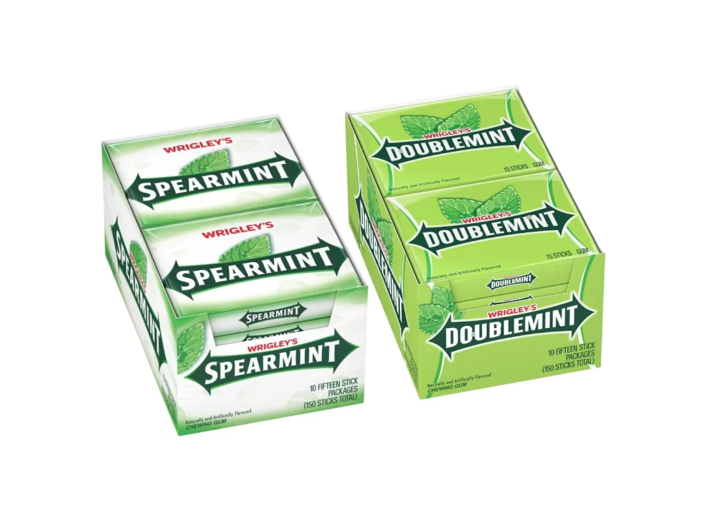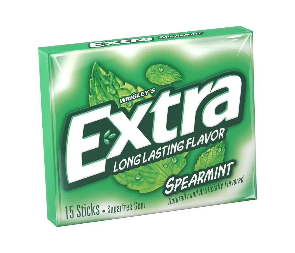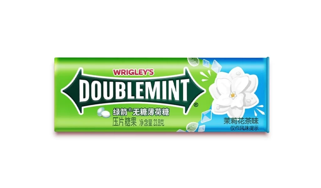
Wrigley’s Doublemint Gum Box Display Packaging
Topics
Details
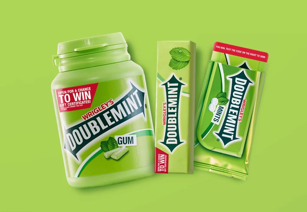
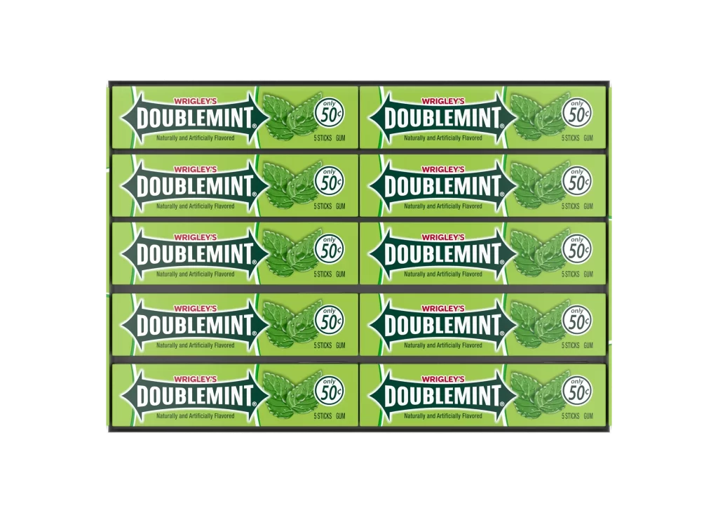
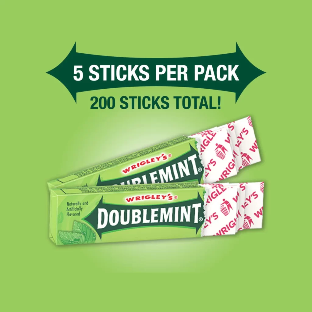
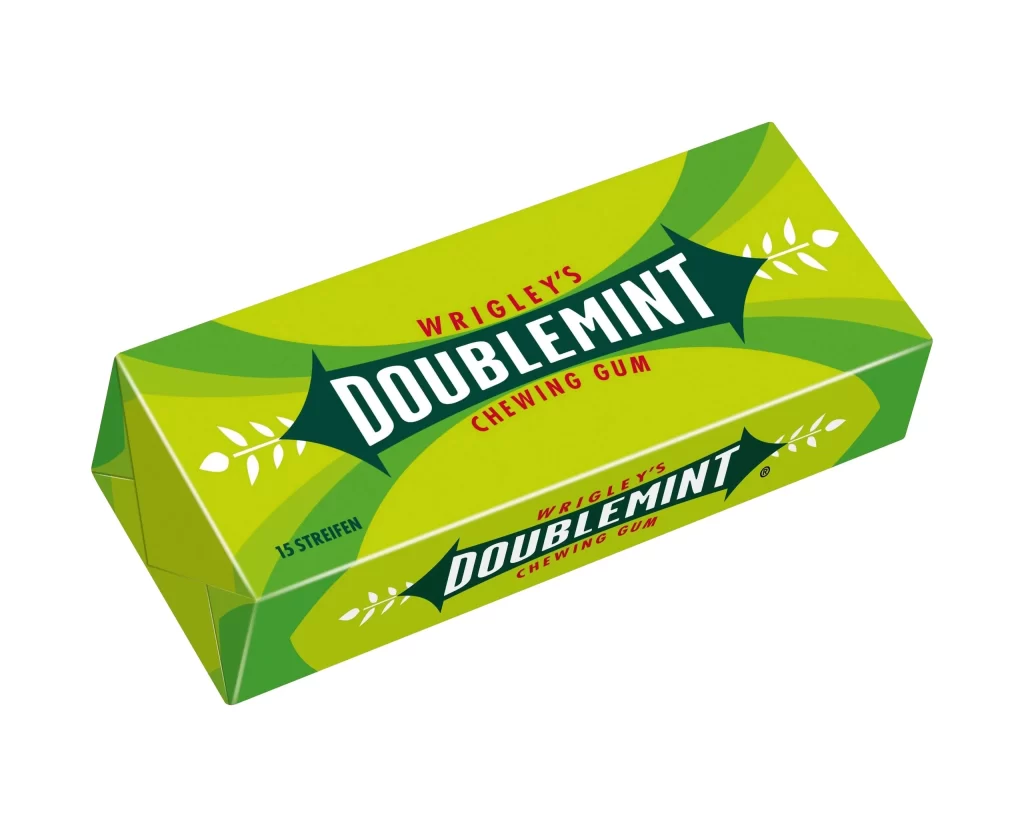
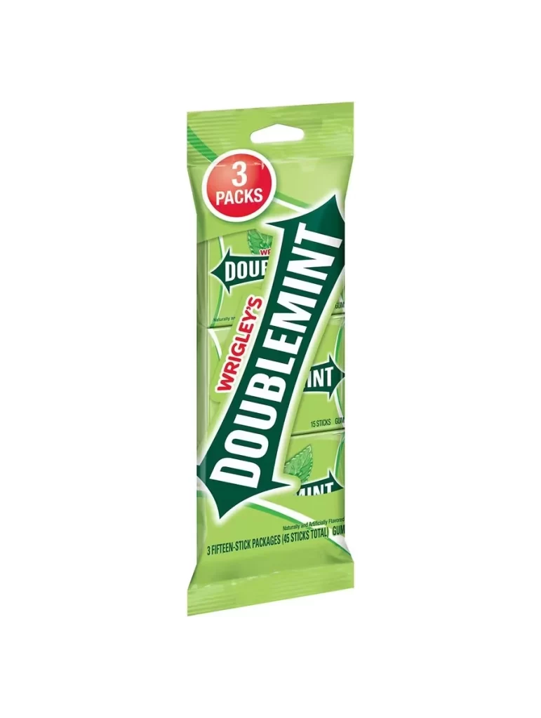
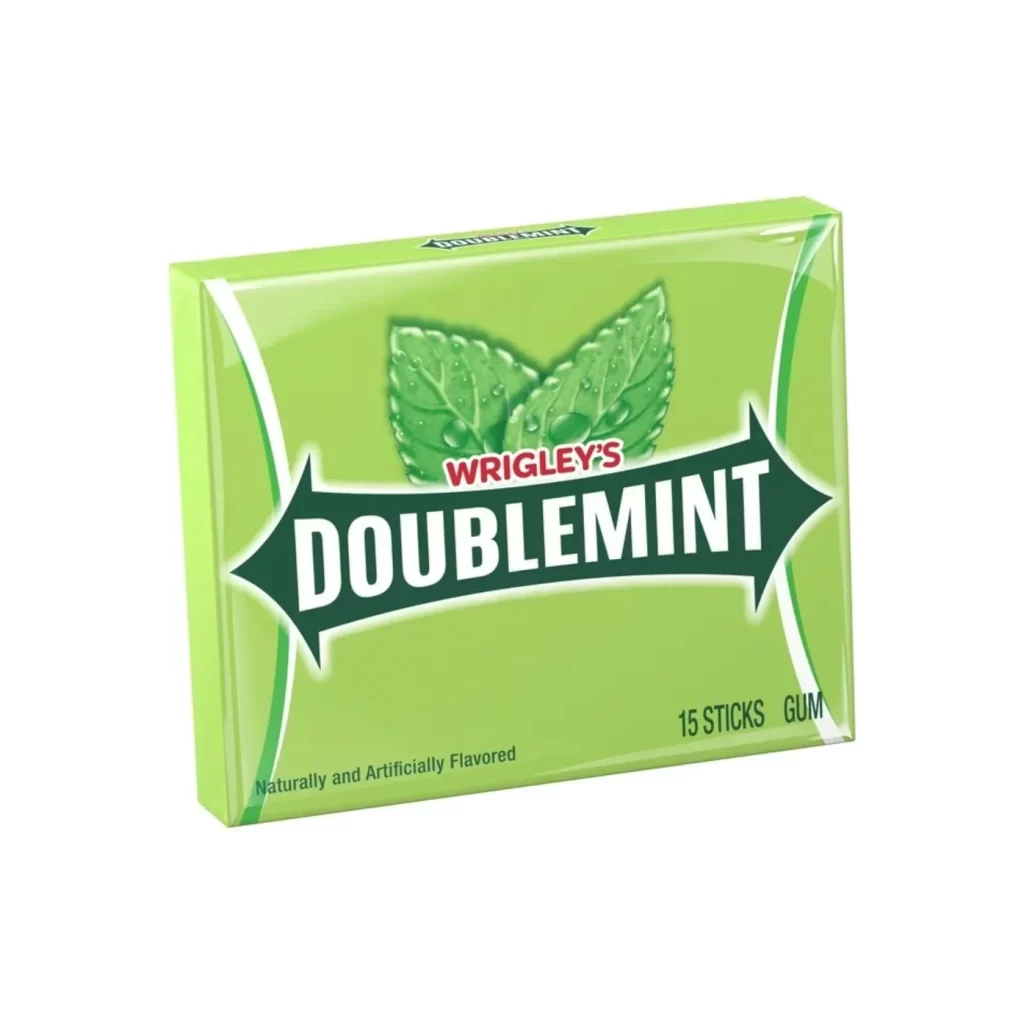
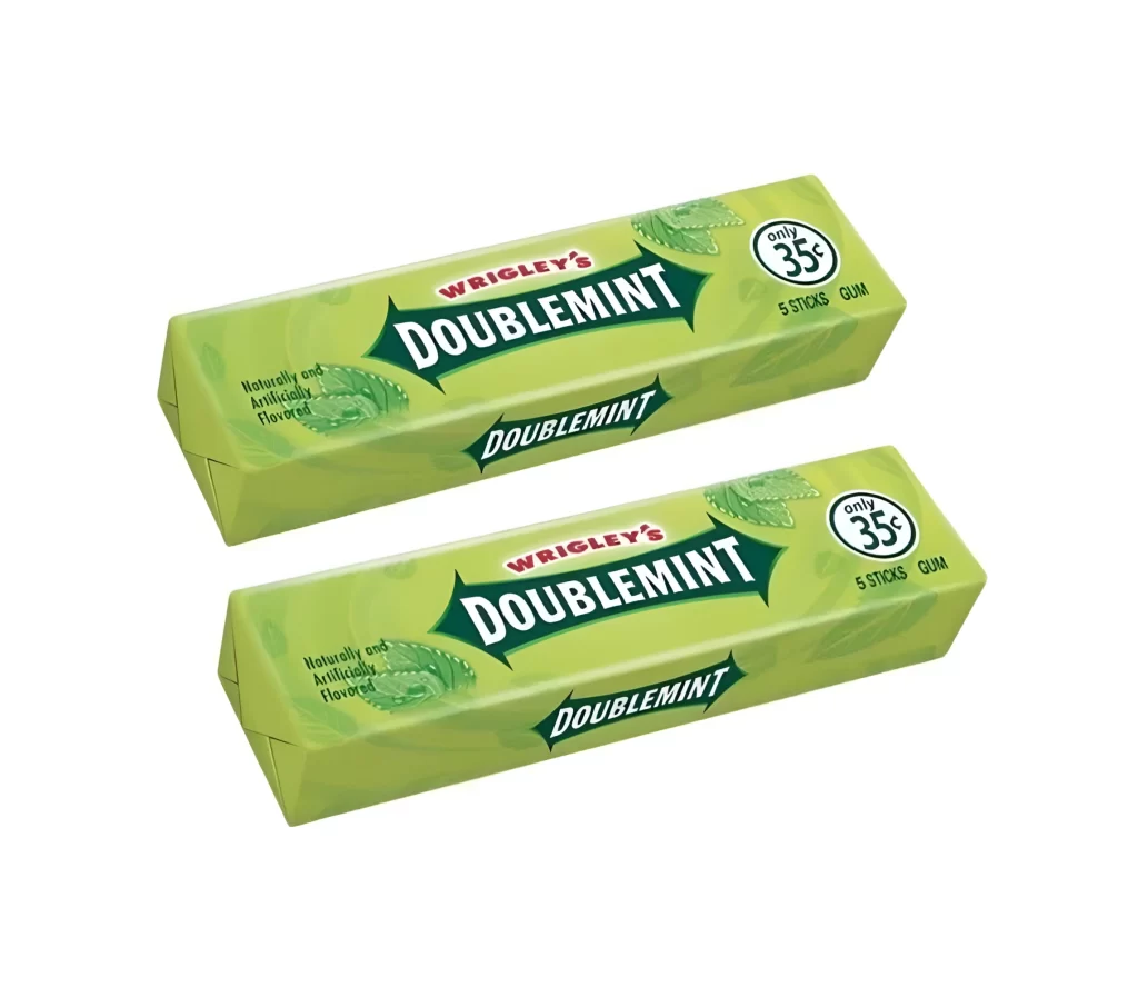
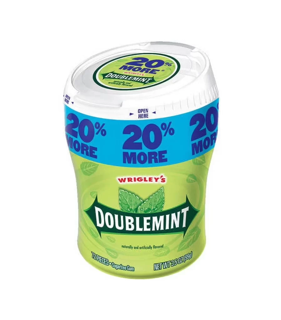
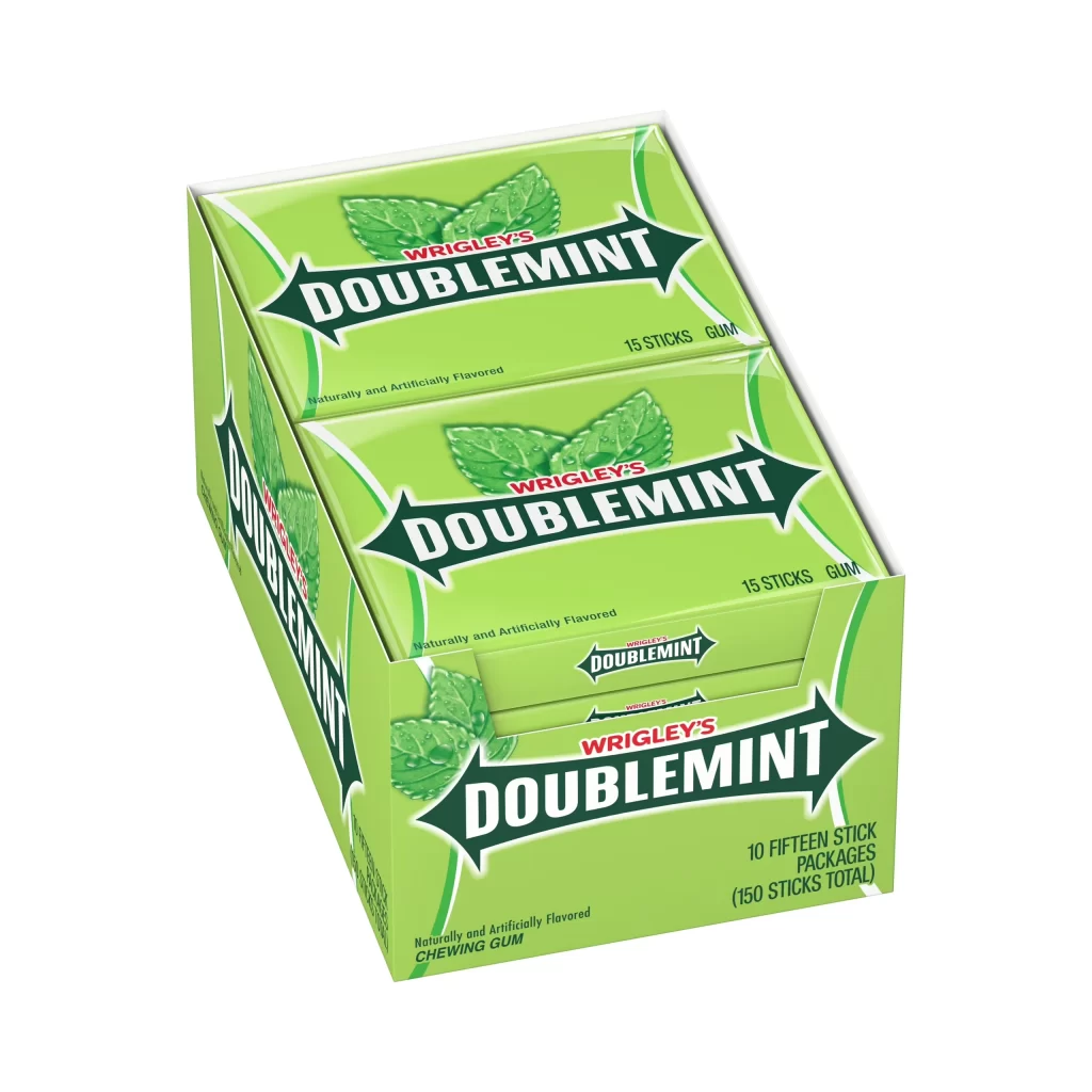
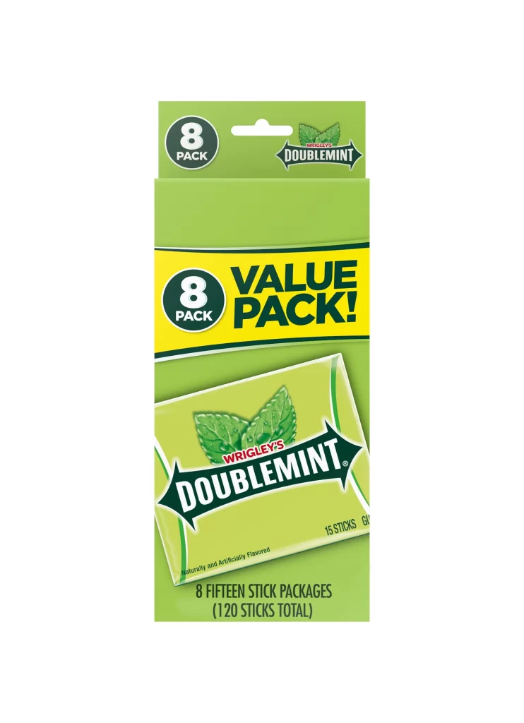
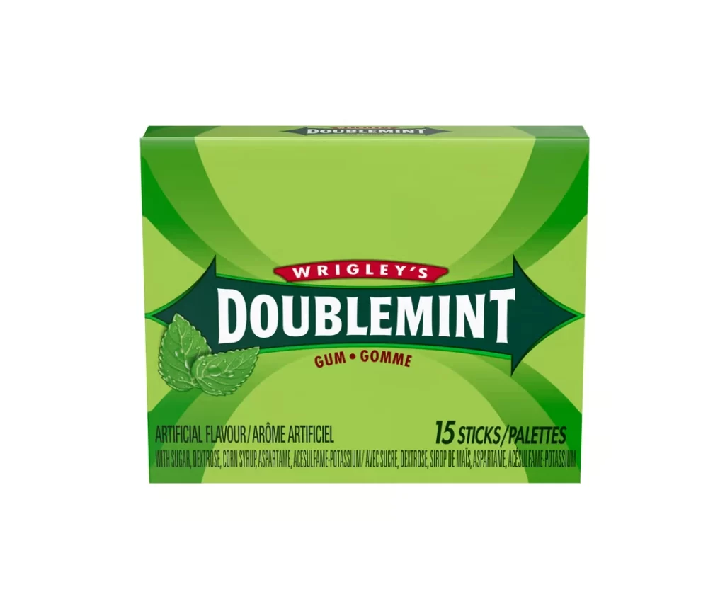
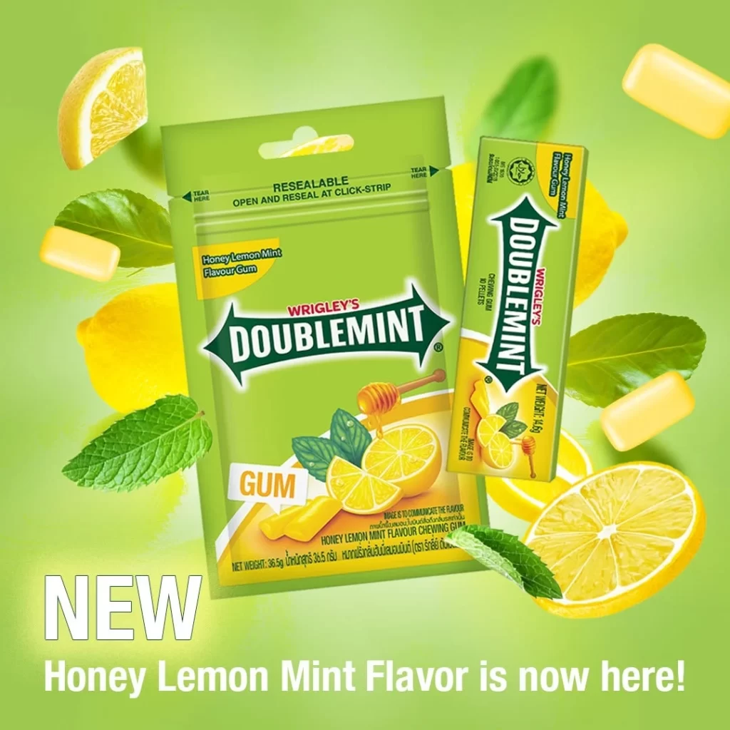
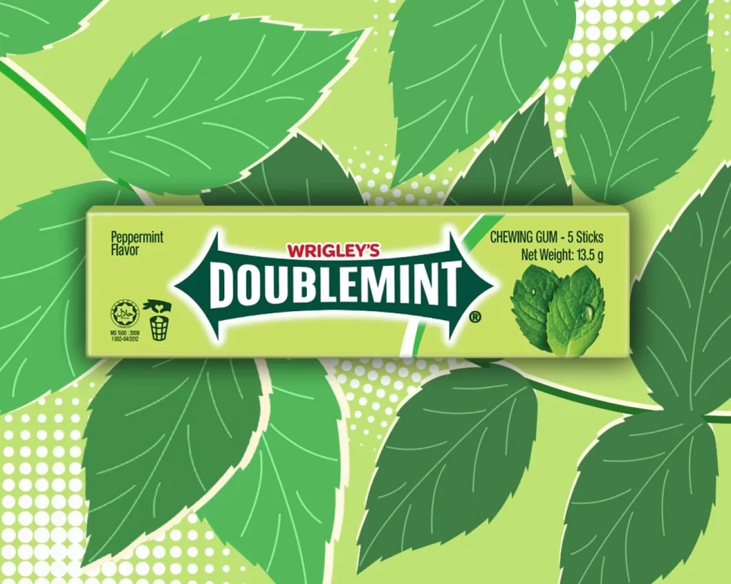
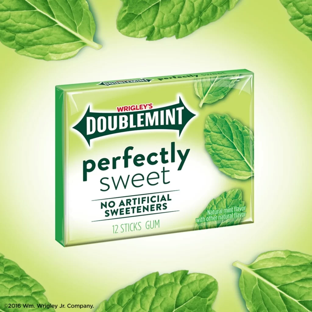
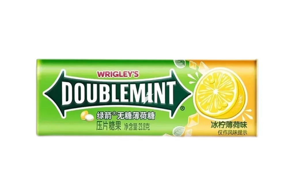
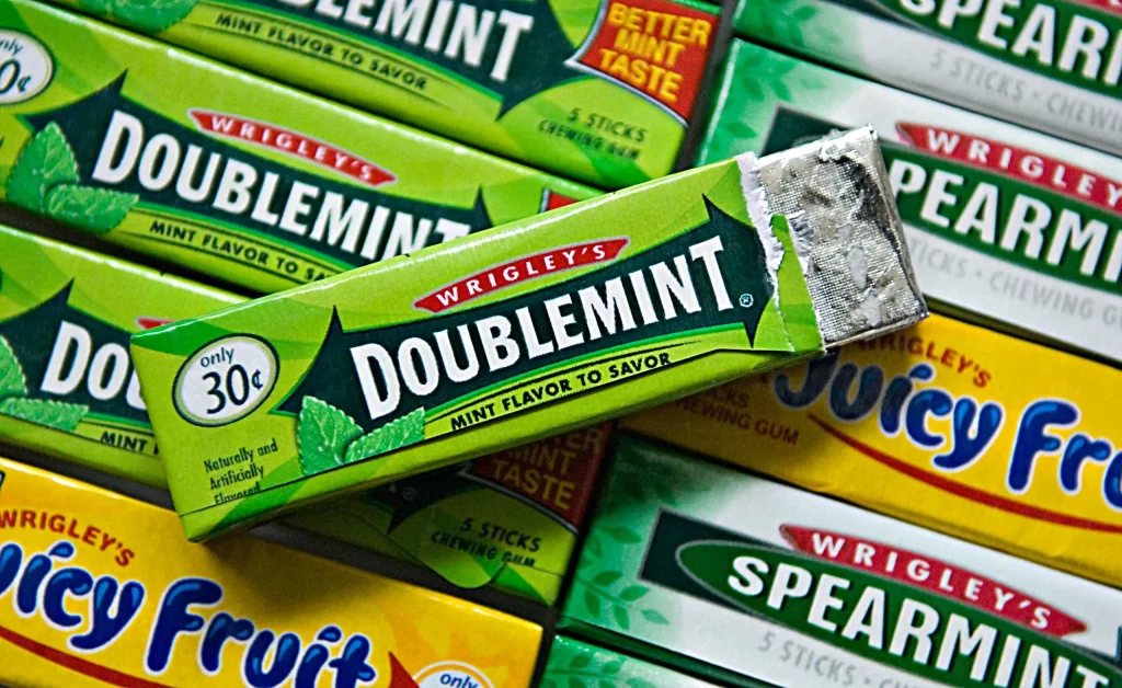
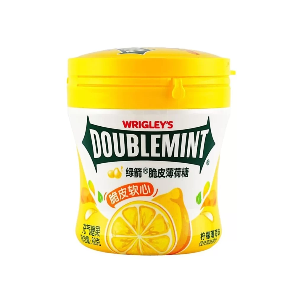
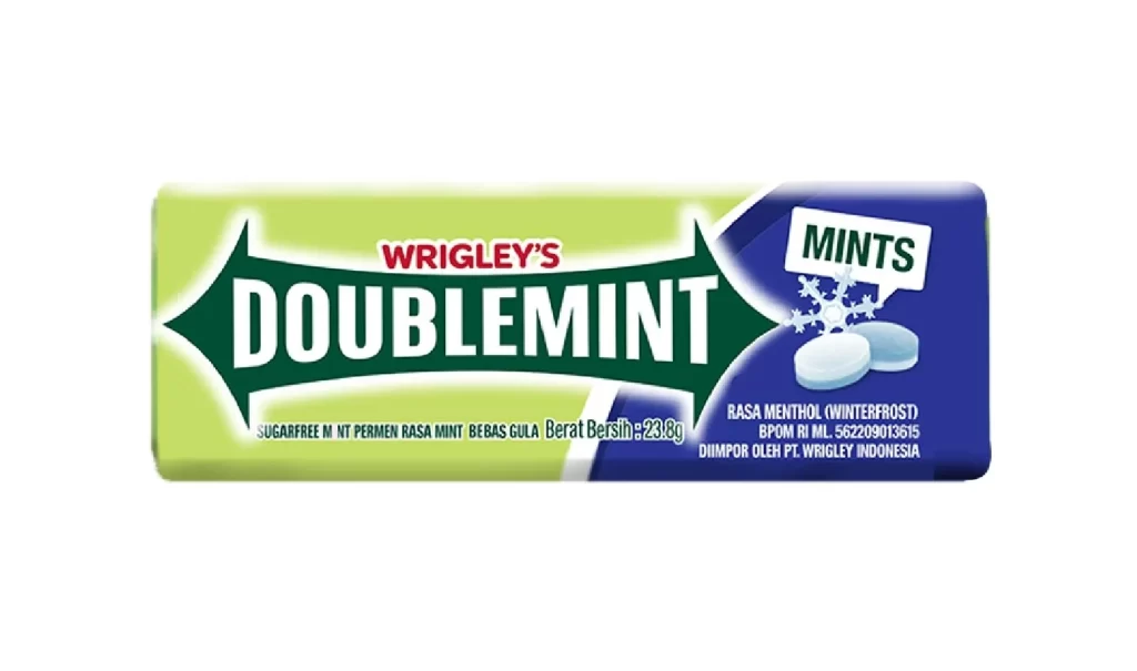
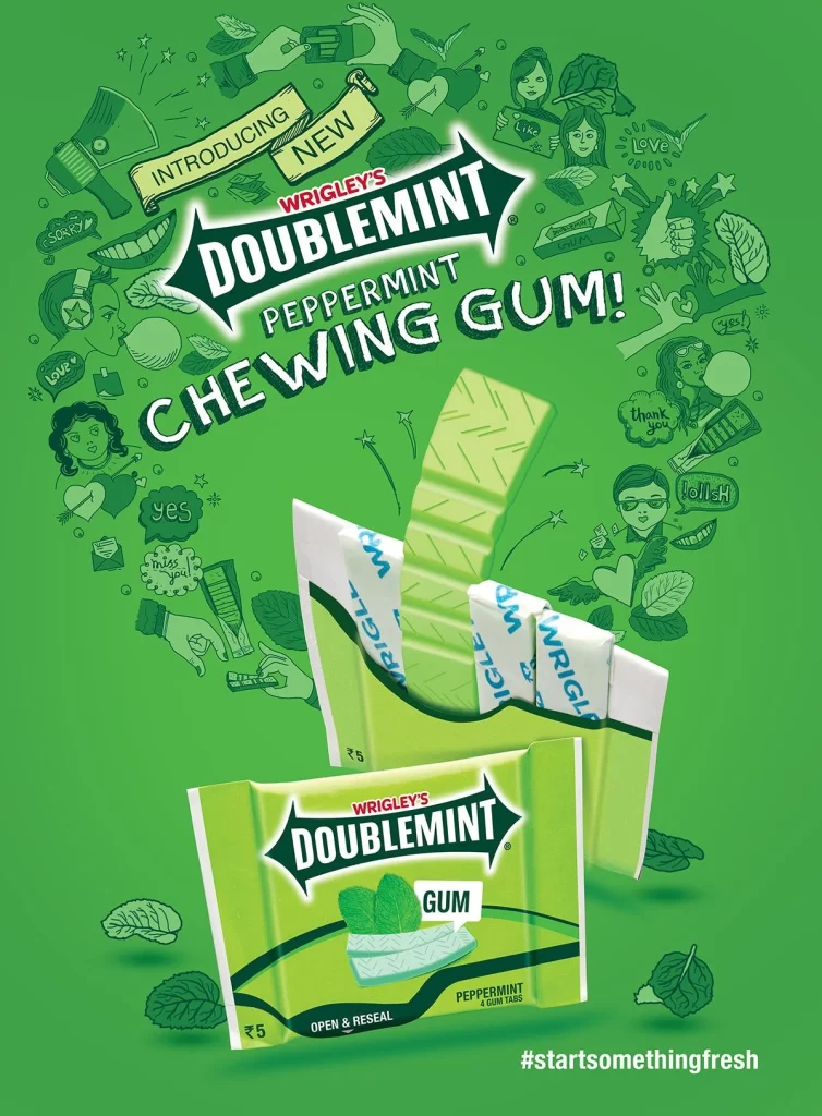
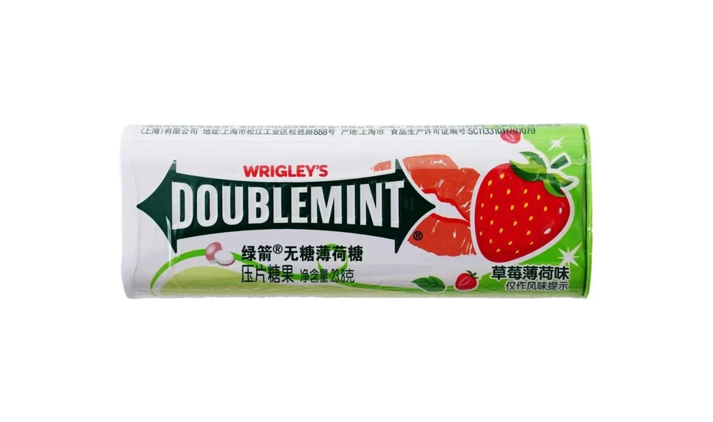
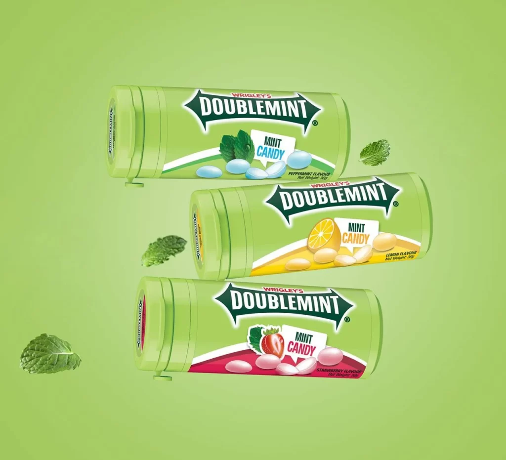
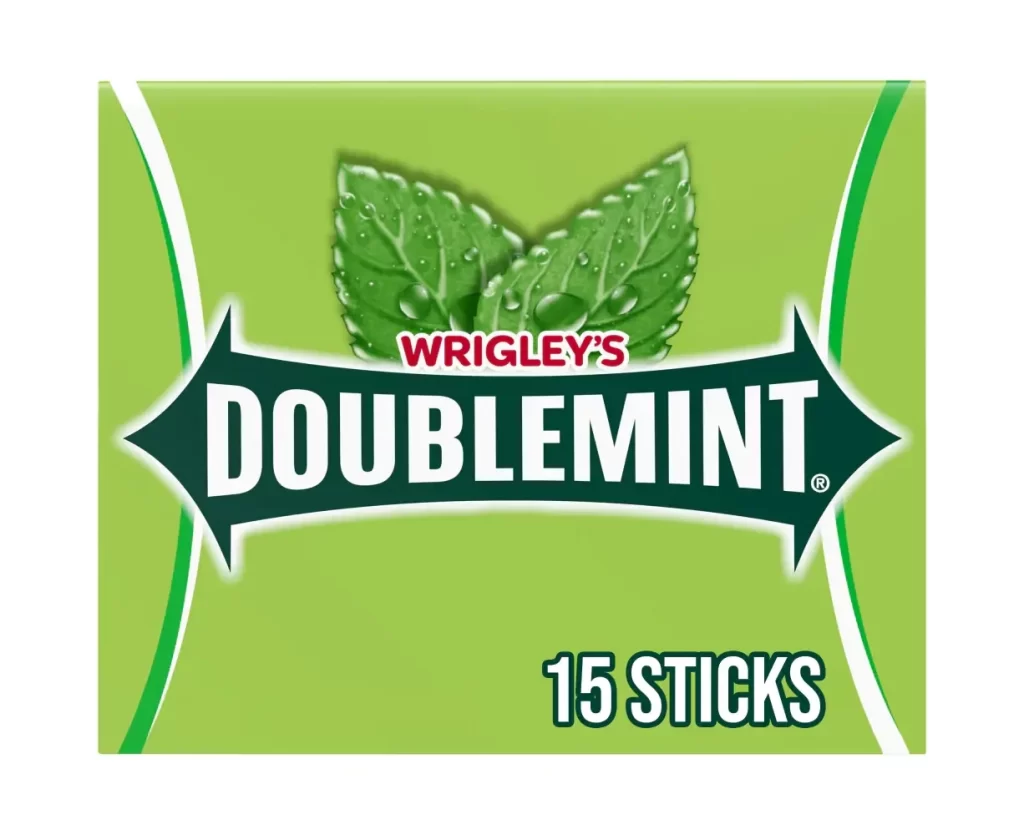
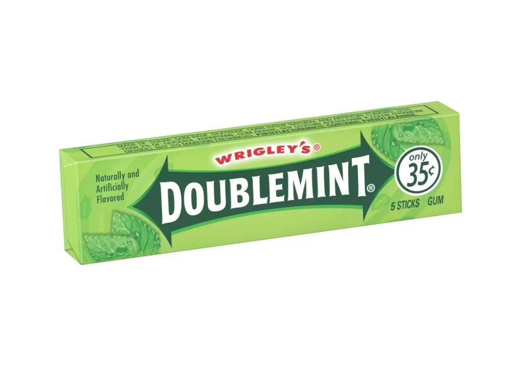
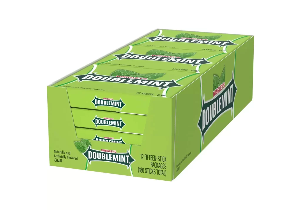
Rendered in a vibrant lime-green hue, this rectangular cardboard display box features twelve individual fifteen-stick packs of Wrigley's Doublemint gum arranged in a three-by-four grid. The packaging is dominated by the iconic 'DOUBLEMINT' logotype in bold white serif lettering, framed by dark green arrow-shaped borders and topped with a smaller red 'WRIGLEY'S' script. A clean white background isolates the product, while soft studio lighting from the upper left casts subtle shadows that emphasize the box's three-dimensional structure and the slight recesses where each slim pack sits.
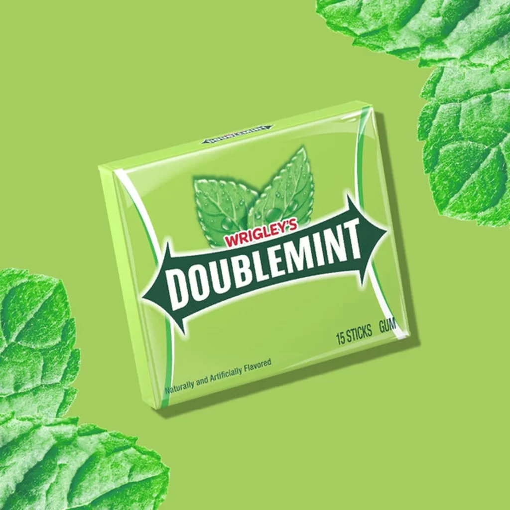
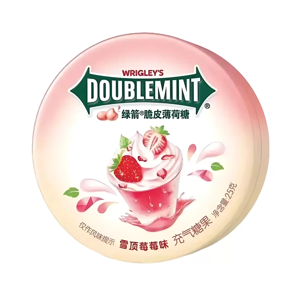
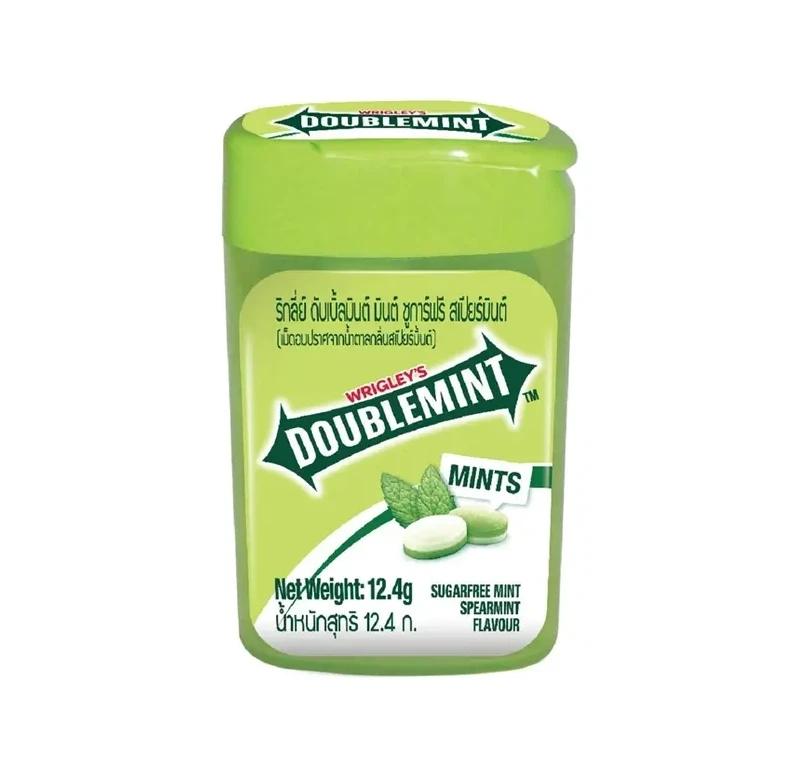
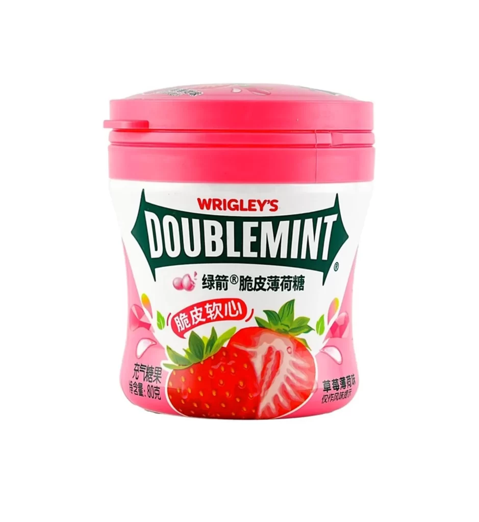
Visual interest stems from the consistent repetition of branding elements across multiple scales, creating a rhythmic pattern that draws the eye across the surface. The contrast between the bright green field and the crisp white typography ensures high legibility, while the inclusion of realistic mint leaf graphics adds organic texture to the otherwise geometric composition. Such systematic arrangement demonstrates effective retail display design, balancing information density with aesthetic clarity to maximize shelf presence.
Packaging engineers and brand managers might study this reference to analyze how color psychology and typographic hierarchy influence consumer recognition in crowded retail environments. 3D artists could utilize the perspective and lighting data to practice rendering translucent materials or simulating cardboard textures for product visualization projects. Marketing teams reviewing historical packaging iterations would find value in documenting the specific layout choices that have maintained brand consistency over time.