Wrigley’s Doublemint Chewing Gum Box Packaging
Topics
Details
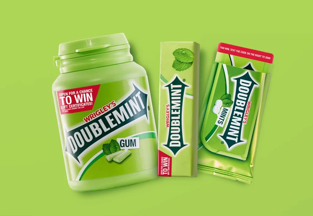
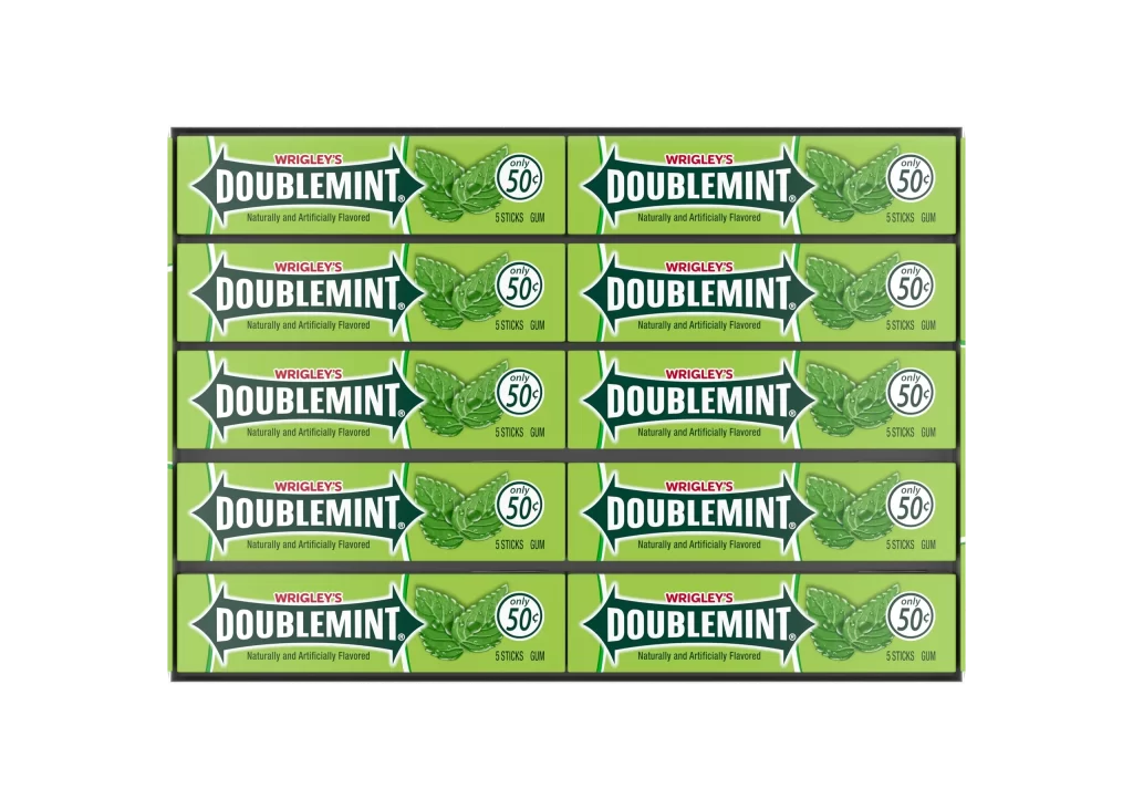
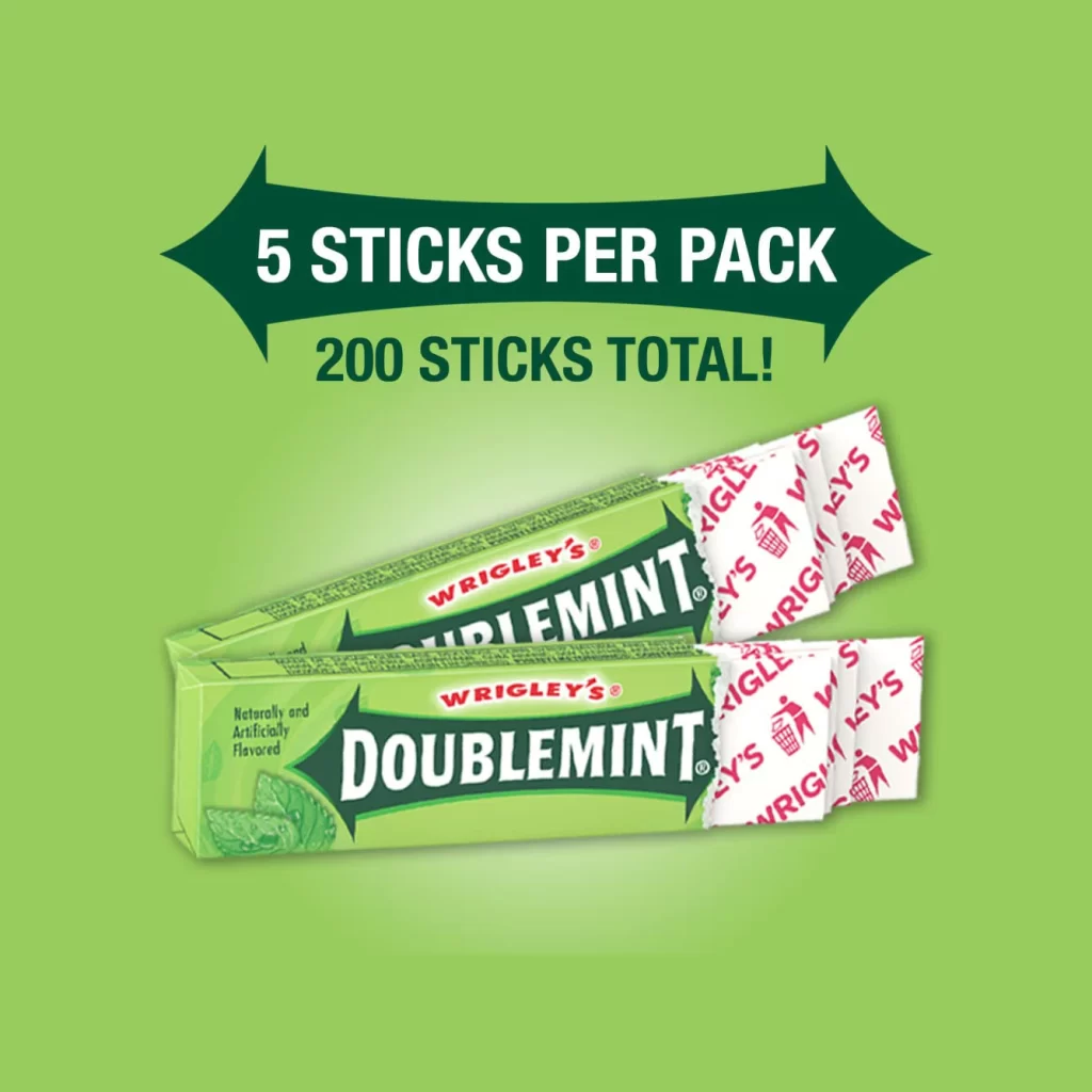
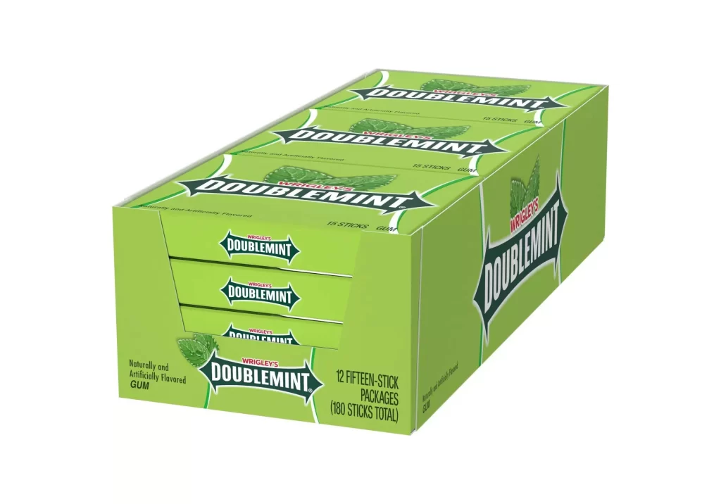
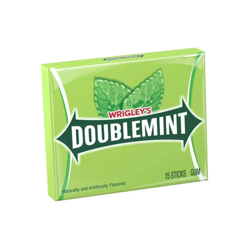
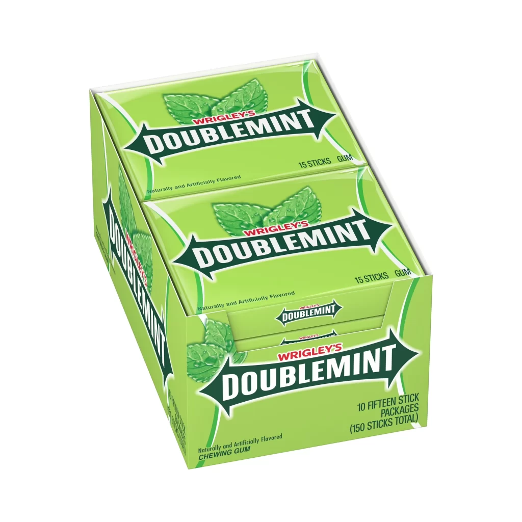
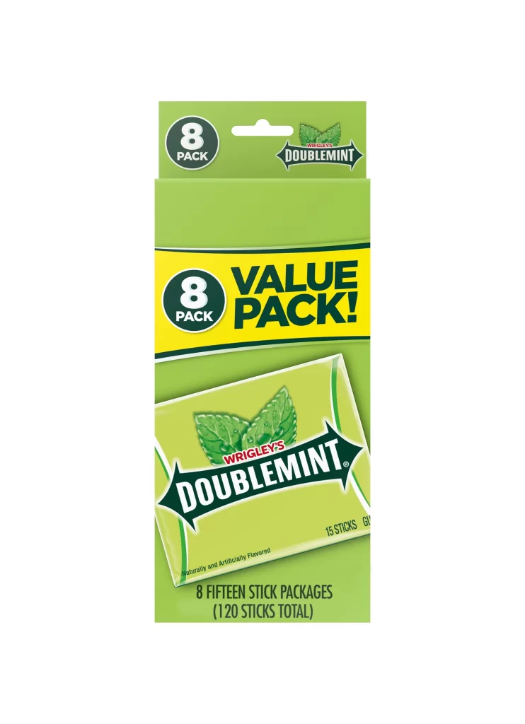
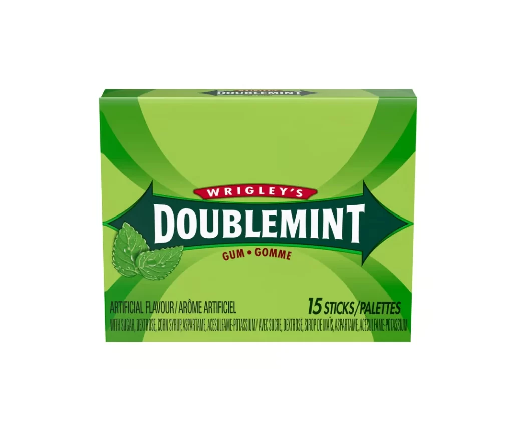
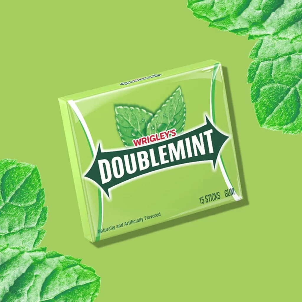
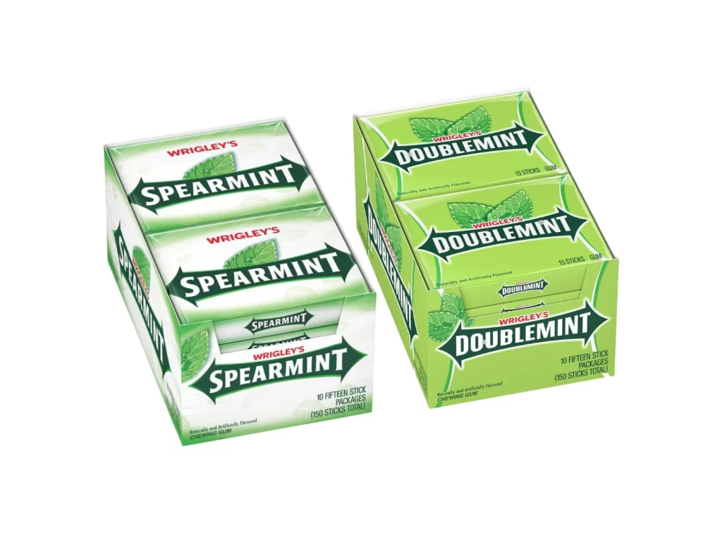
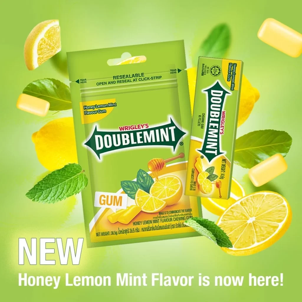
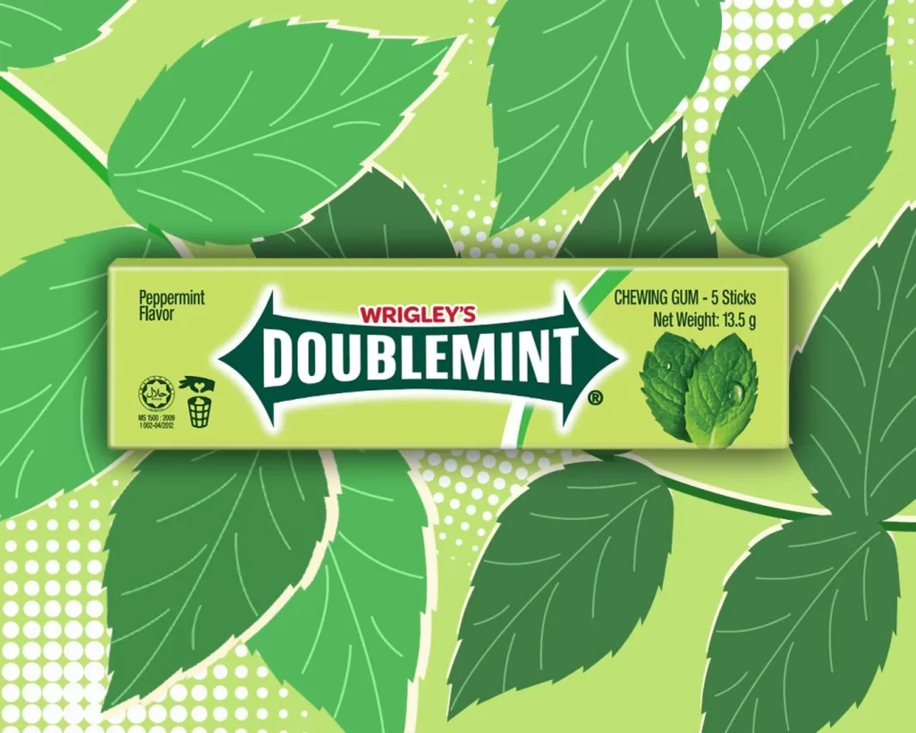
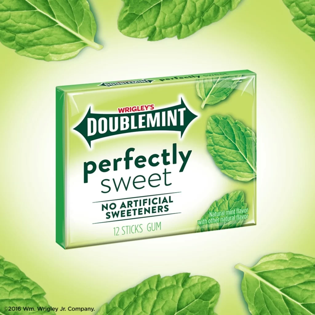
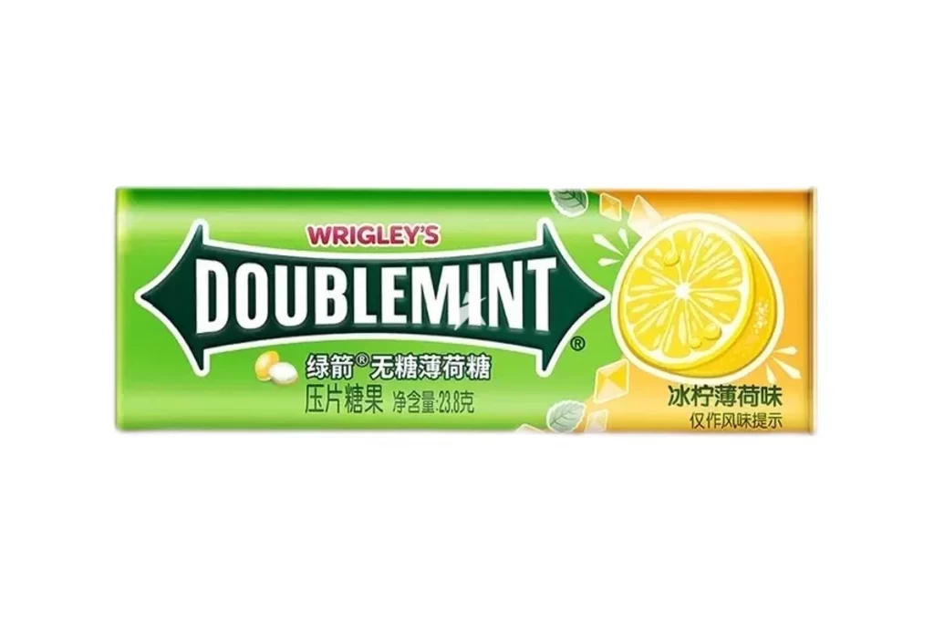
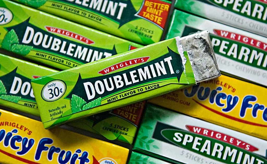
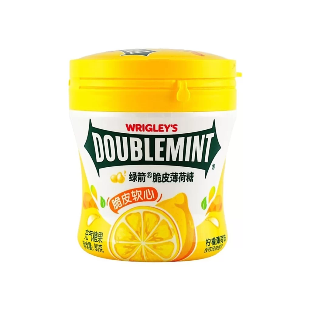
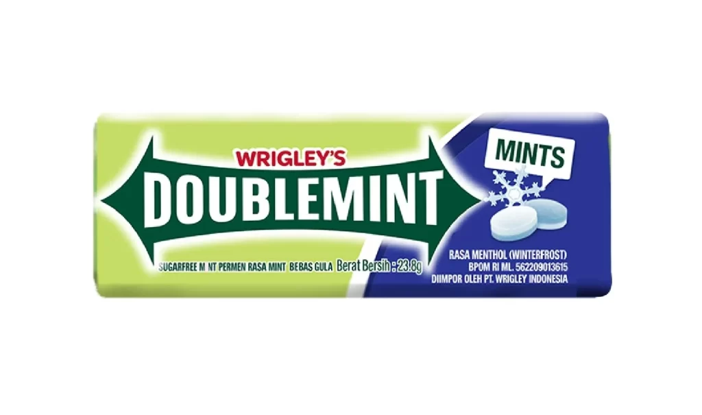
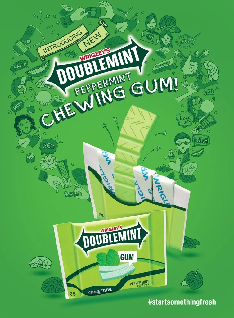
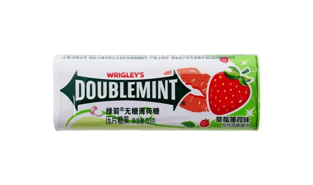
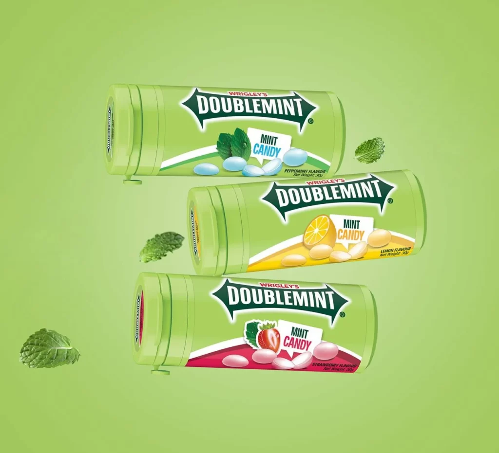
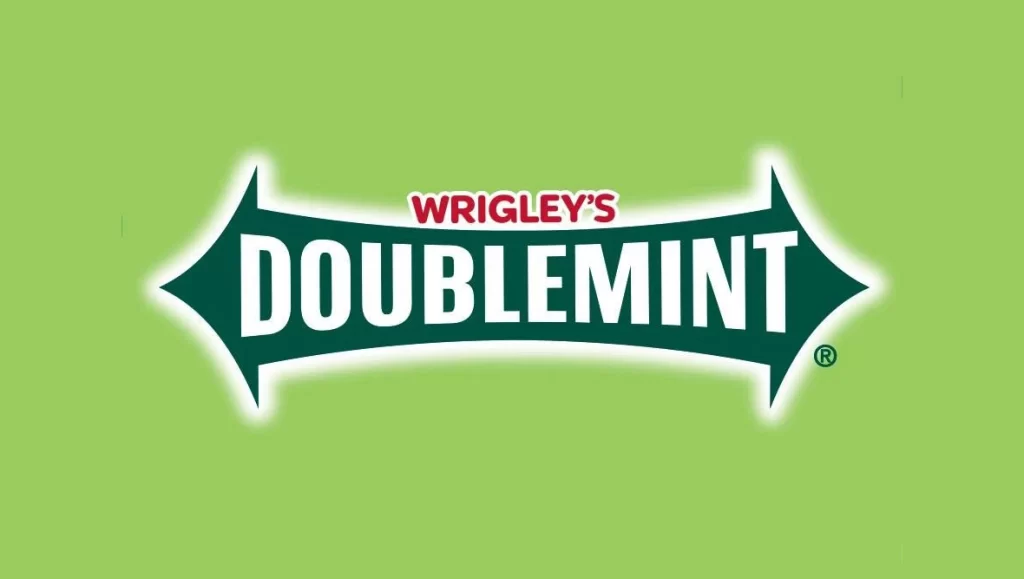
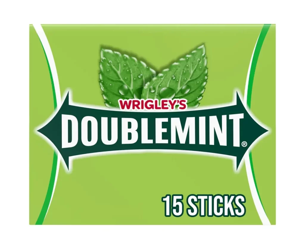
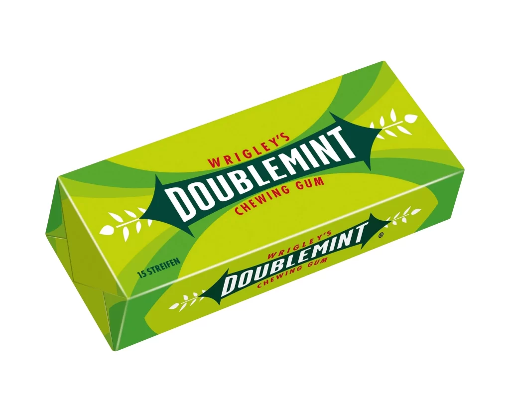
Vibrant lime-green cardboard forms the rectangular package, accented by sweeping curves of darker emerald green that wrap around its surfaces. The brand name ‘WRIGLEY’S’ appears in red uppercase letters above the dominant ‘DOUBLEMINT’ logotype, which is rendered in bold white serif font inside a dark green, arrow-shaped banner flanked by white leaf motifs. Smaller red text reading ‘CHEWING GUM’ sits beneath the main logo, while ’15 STREIFEN’ appears in black on the lower left edge of the box, which rests at a three-quarter angle on a white surface.
Visual interest stems from the dynamic interplay between the bright citrus tones and the deep forest-green swooshes that create a sense of movement across the flat surfaces. The distinctive pointed banner housing the product name acts as a strong focal point, anchoring the composition and providing immediate legibility. Furthermore, the inclusion of botanical motifs adds an organic quality that reinforces the mint flavor profile without cluttering the essential typographic information.
Product photographers might study the lighting setup used to eliminate shadows while maintaining the saturation of the green hues. Packaging designers could analyze the hierarchy of text elements to understand how to balance multiple languages and data points within a limited space. Additionally, 3D artists may utilize this view to practice modeling carton geometry and applying textures that mimic matte paper finishes.