Wrigley’s Doublemint Gum Sticks Packaging
Topics
Details
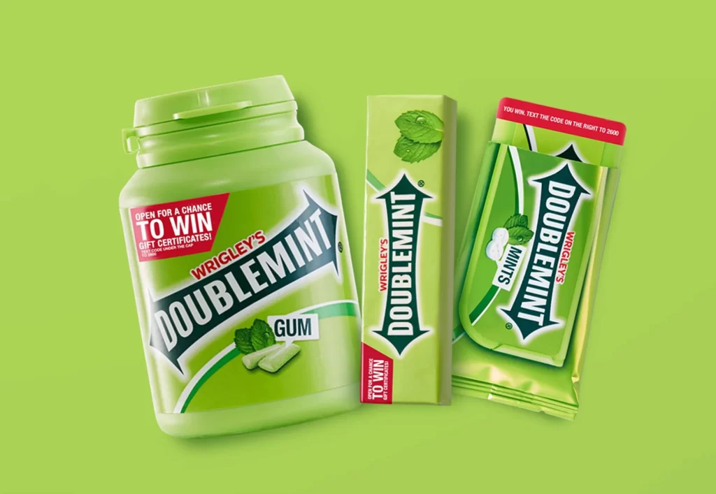
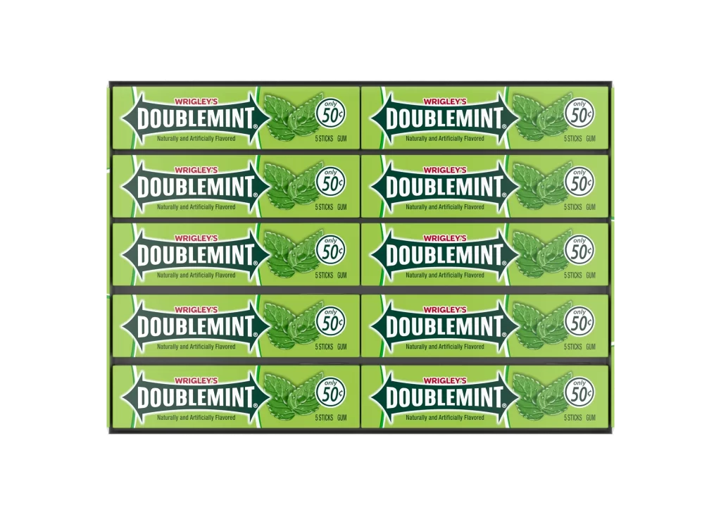
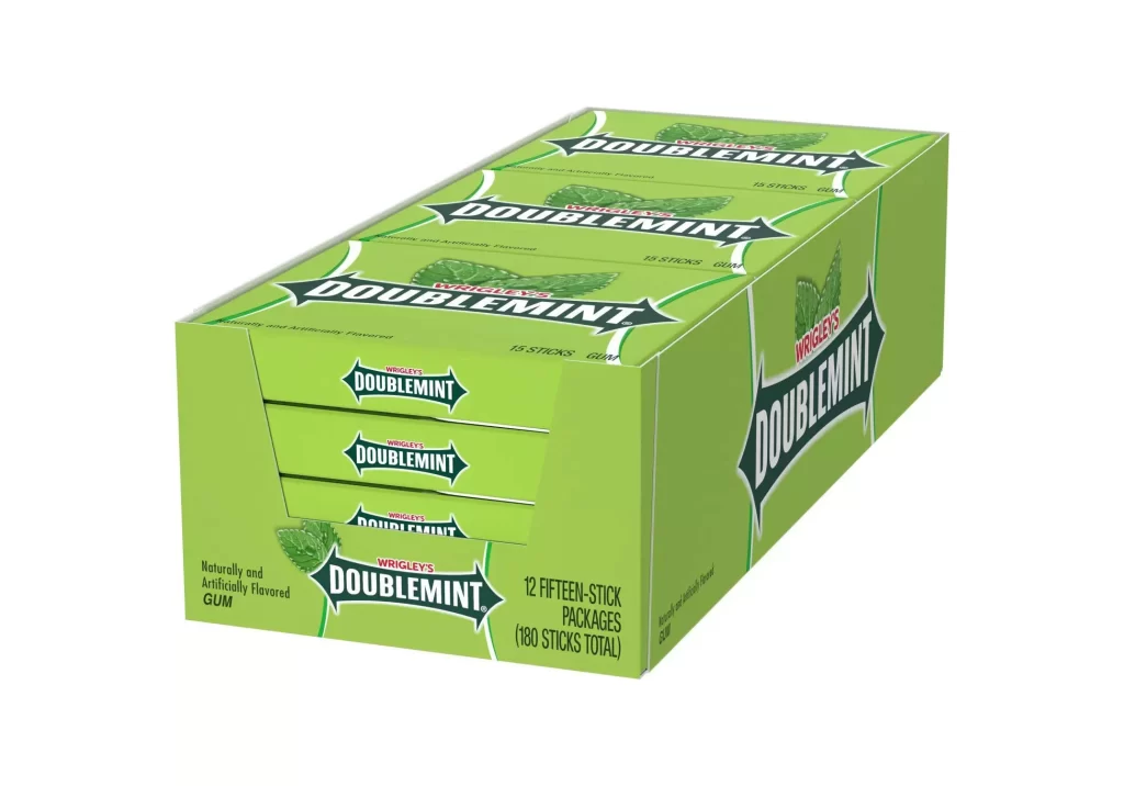
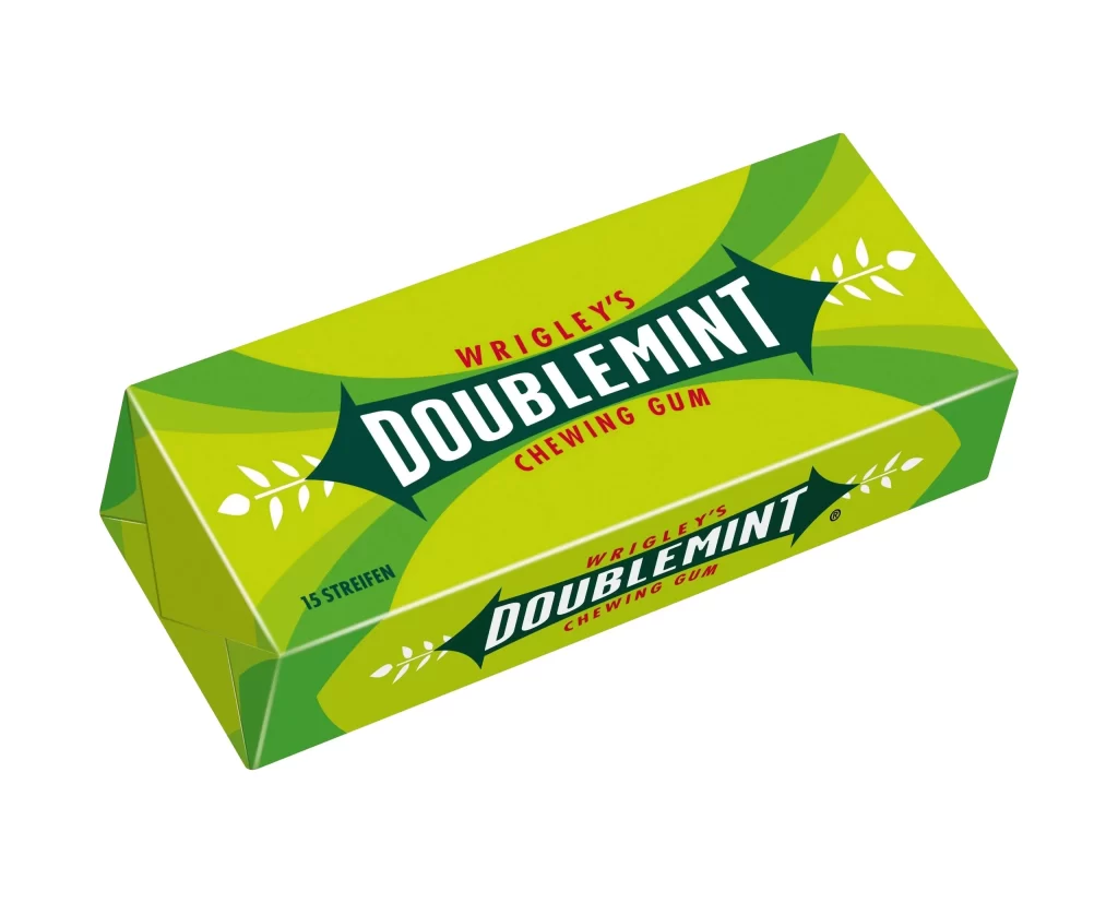
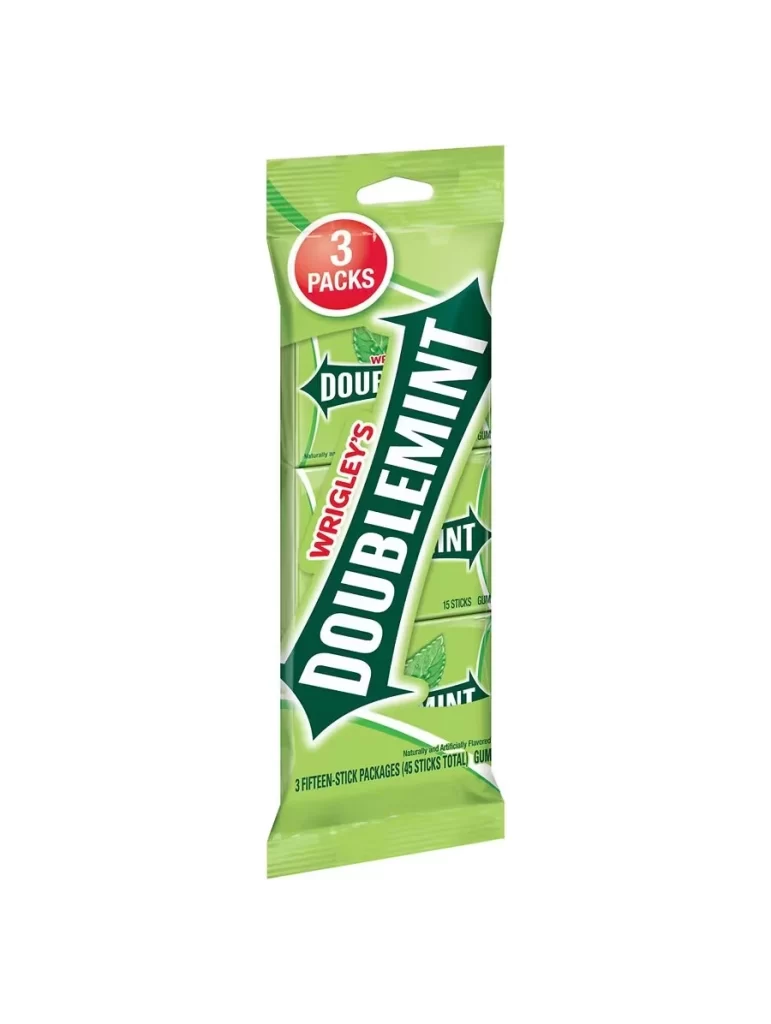
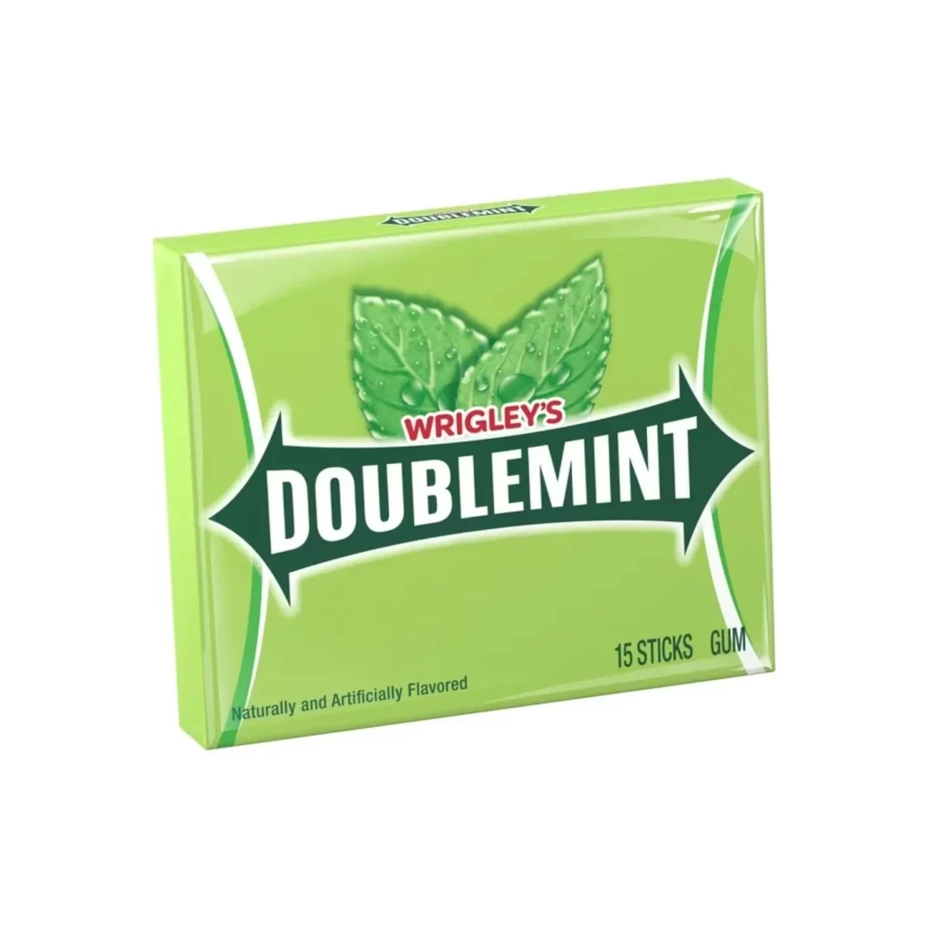
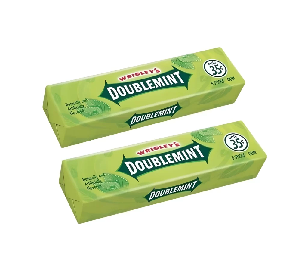
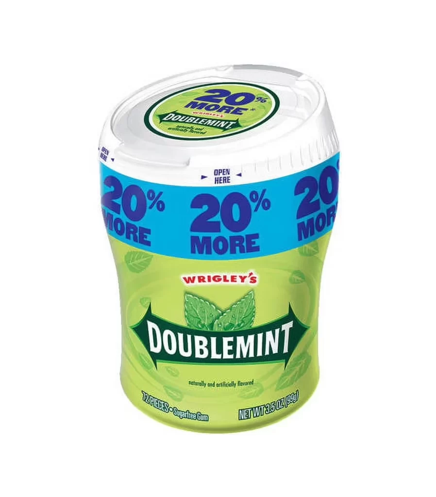
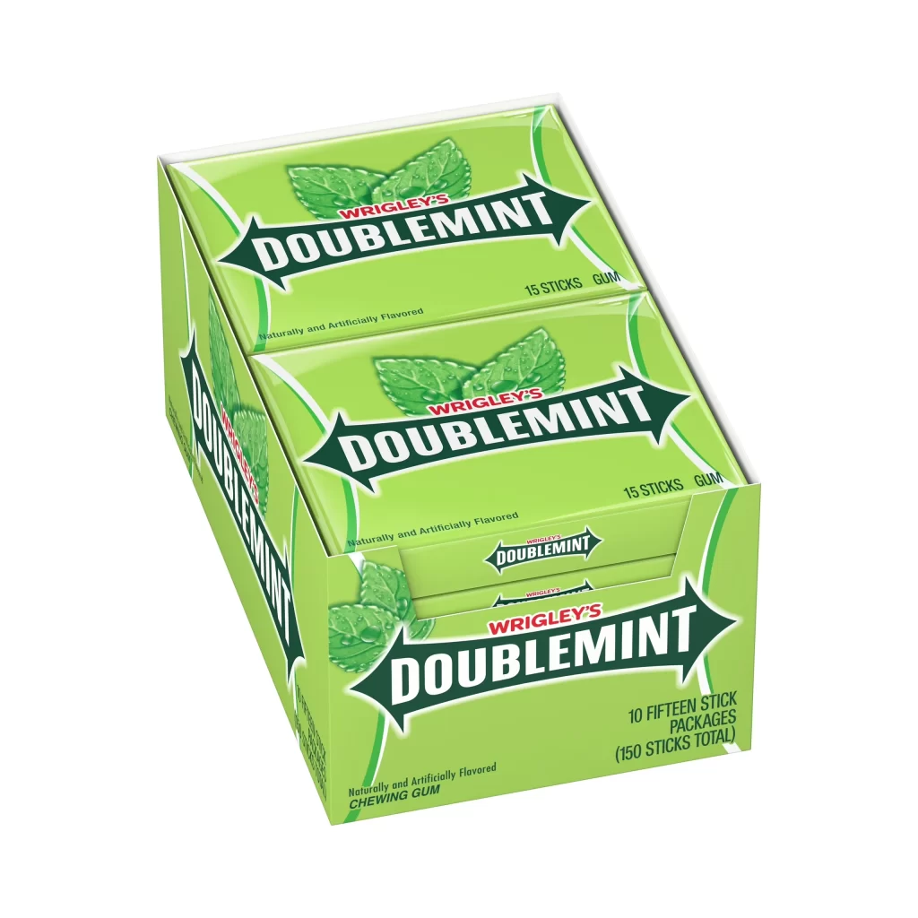
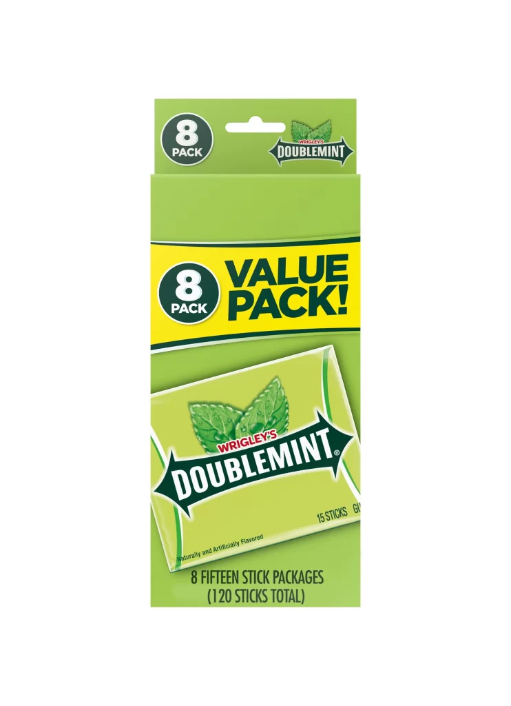
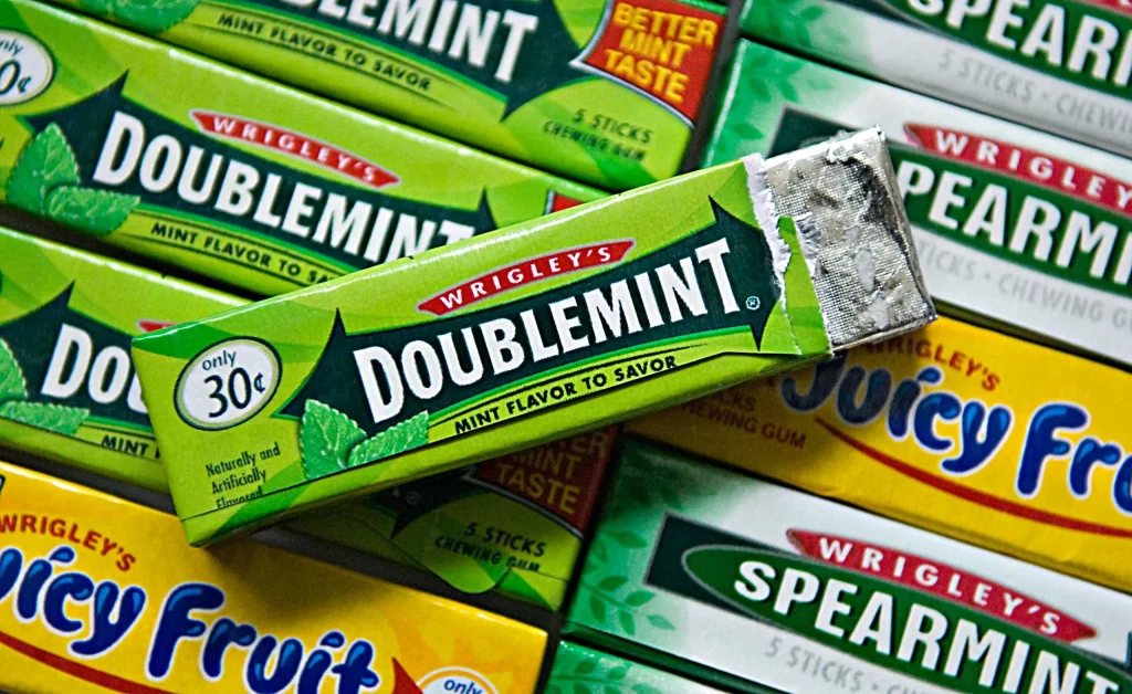
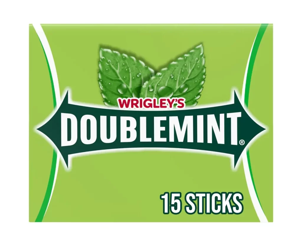
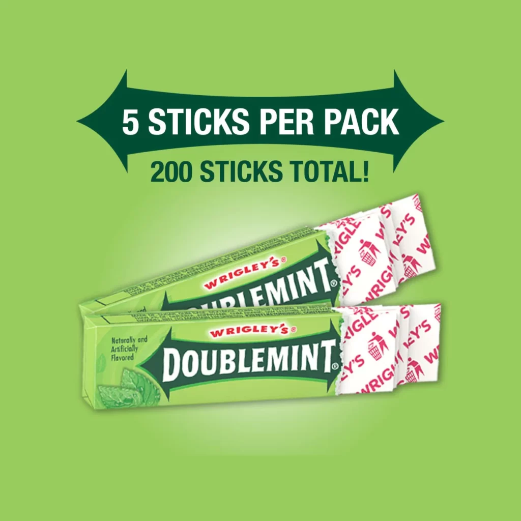
Two packs of Wrigley's Doublemint gum sit at a slight diagonal angle on a solid lime-green surface, their foil wrappers partially peeled back to reveal the white sticks inside. The packaging features the brand's signature palette of pale green, dark forest green, and crisp white, with bold serif typography spelling out 'DOUBLEMINT' across a central chevron-shaped logo. A dark green banner above the product displays '5 STICKS PER PACK' in white capital letters, with '200 STICKS TOTAL!' printed beneath it.
Visual emphasis is placed on the quantity and bulk nature of this specific retail configuration through the prominent placement of the numerical information in the upper graphic element. The contrast between the matte finish of the cardboard packs and the glossy, reflective quality of the individual stick wrappers creates a tactile hierarchy that draws the eye toward the product’s interior. Red repeating logos on the wrapper interiors provide a secondary color accent that breaks up the dominant green scheme while reinforcing brand identity through repetition.
Packaging designers studying confectionery branding might examine this composition to understand how bulk quantities are communicated visually to consumers without cluttering the primary product view. Retail merchandisers could utilize such imagery to plan shelf layouts or promotional displays where volume metrics must be legible from a distance. Students of commercial photography may also find value in analyzing how studio lighting is employed here to minimize glare on the metallic surfaces while maintaining color accuracy across the printed materials.