Wrigley’s Doublemint Gum Single Pack Packaging
Topics
Details
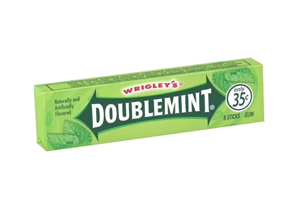
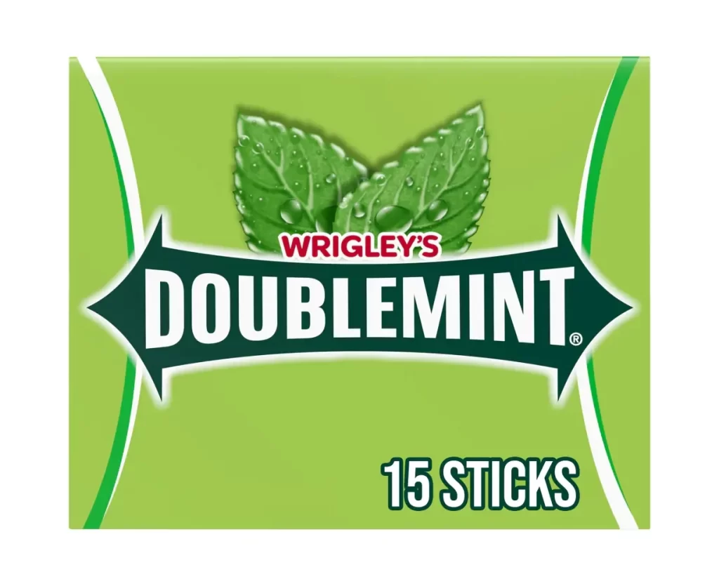
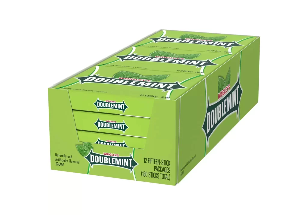
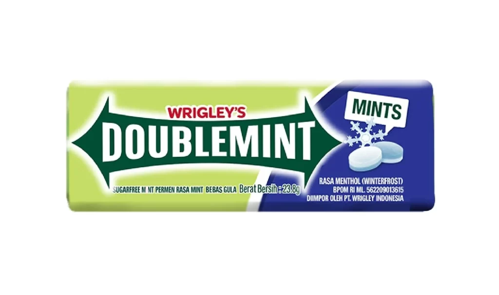
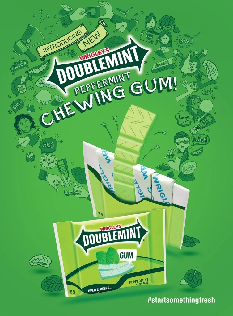
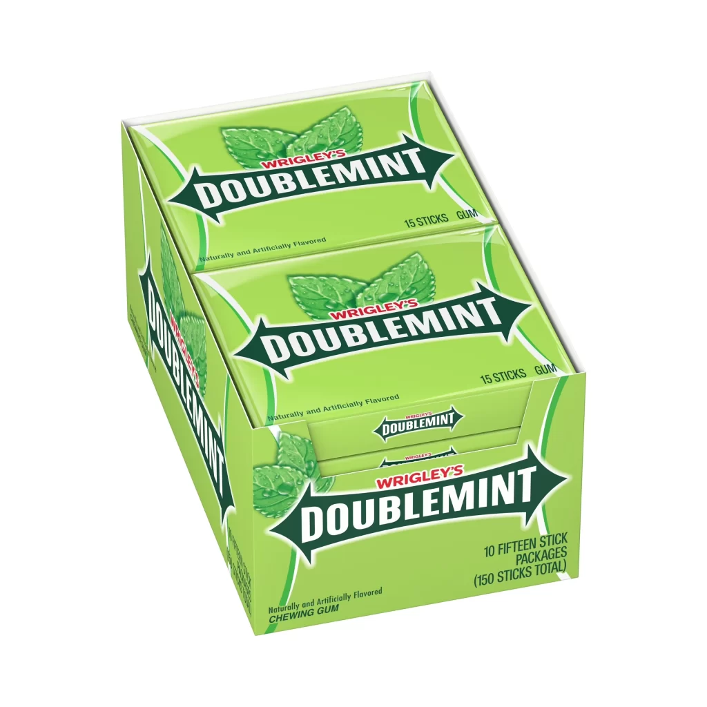
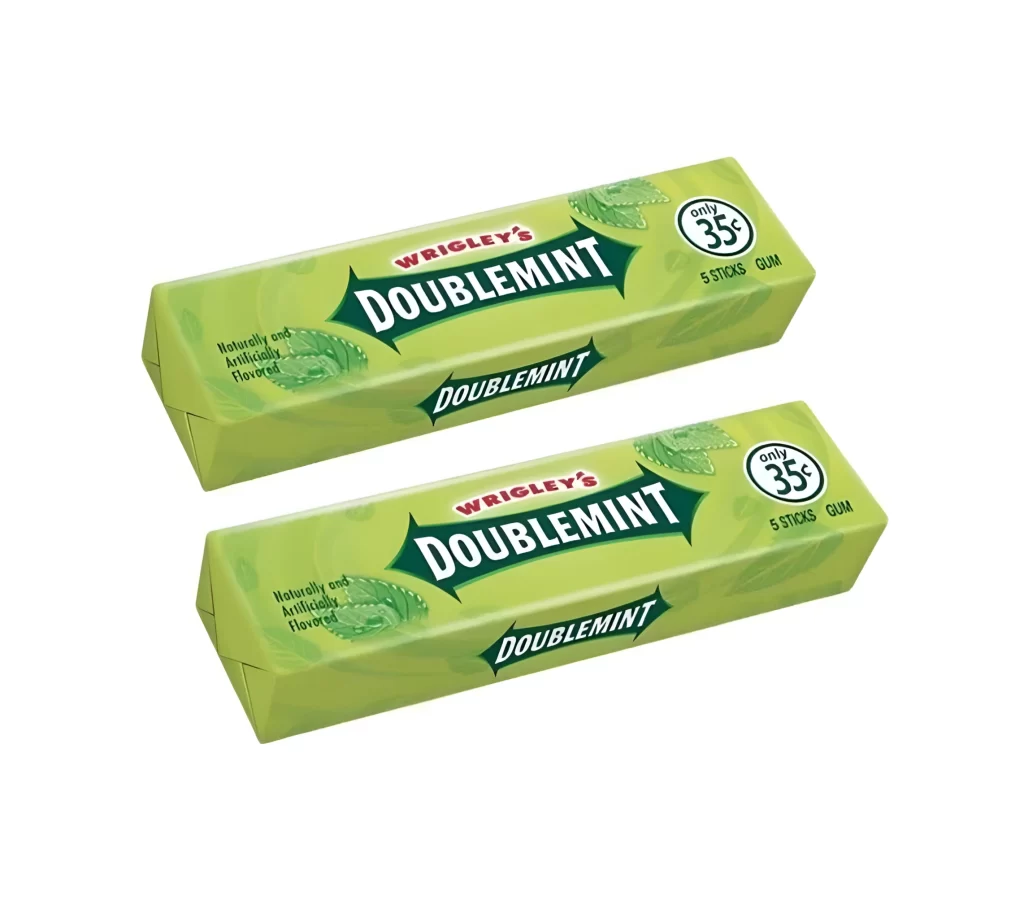
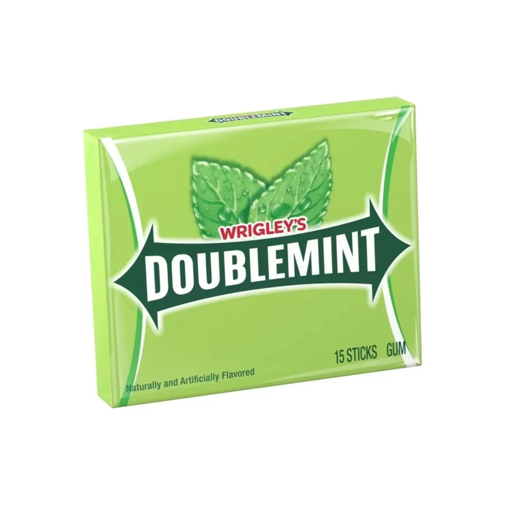
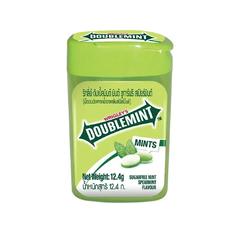
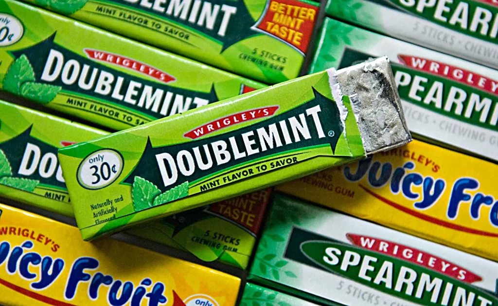
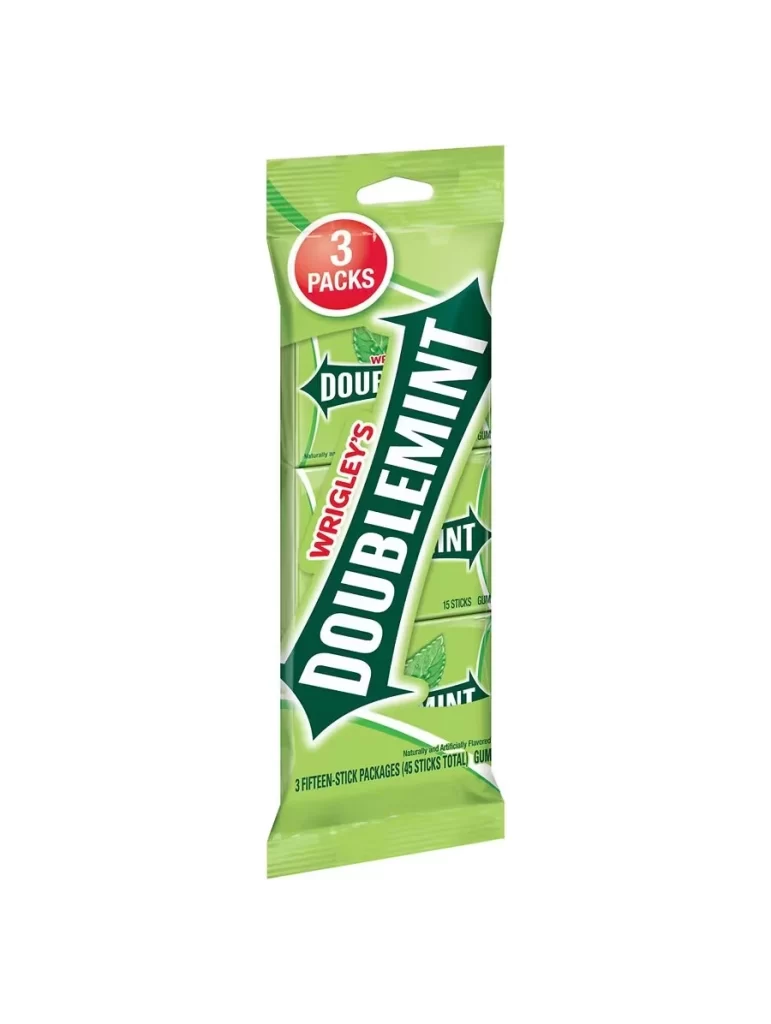
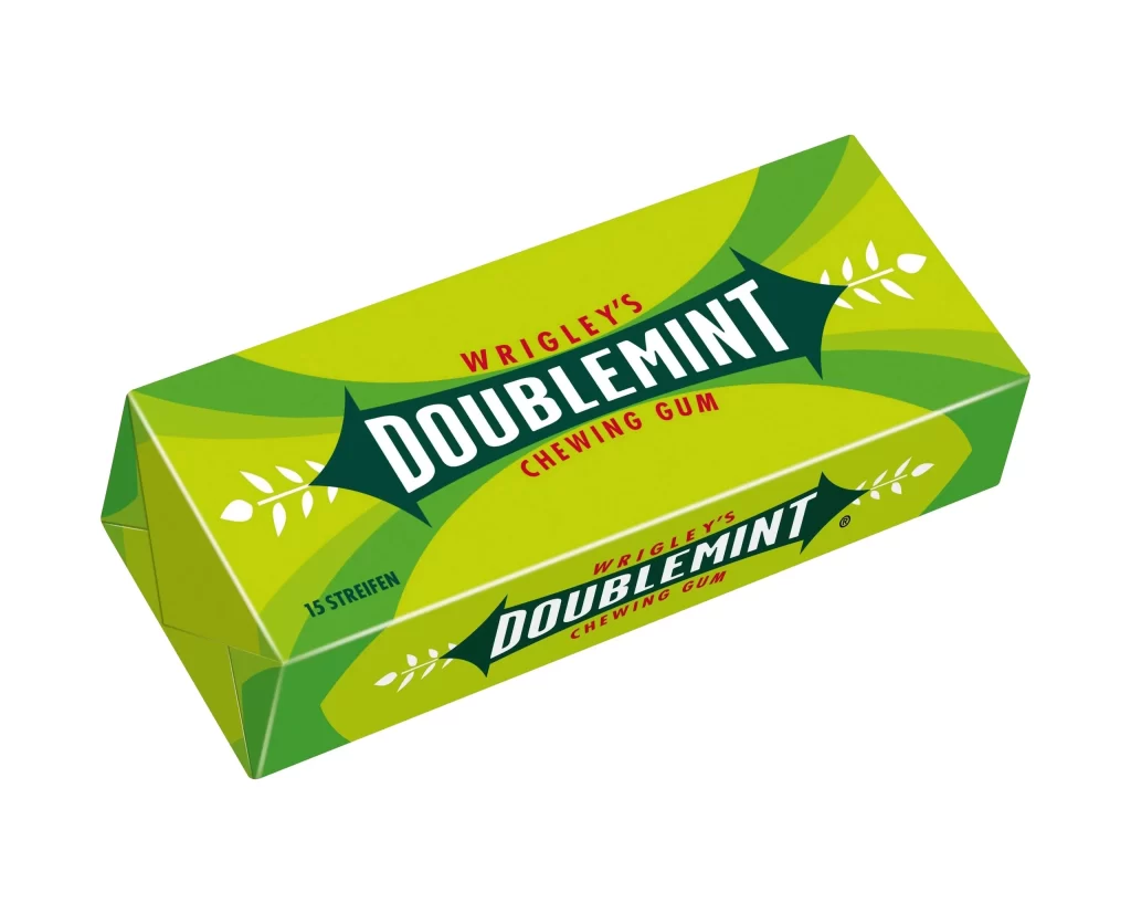
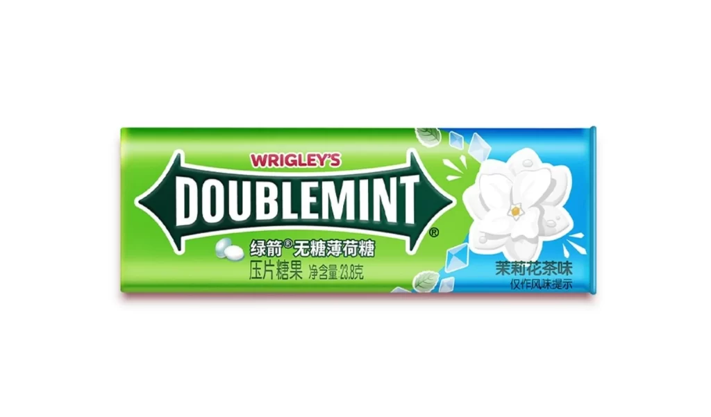
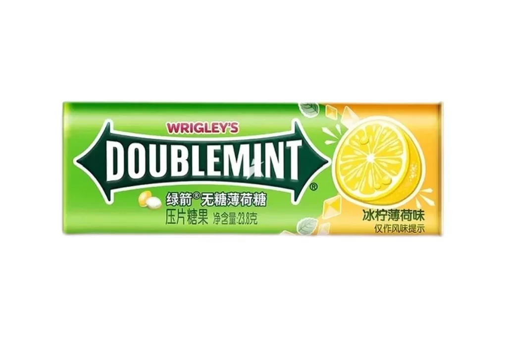
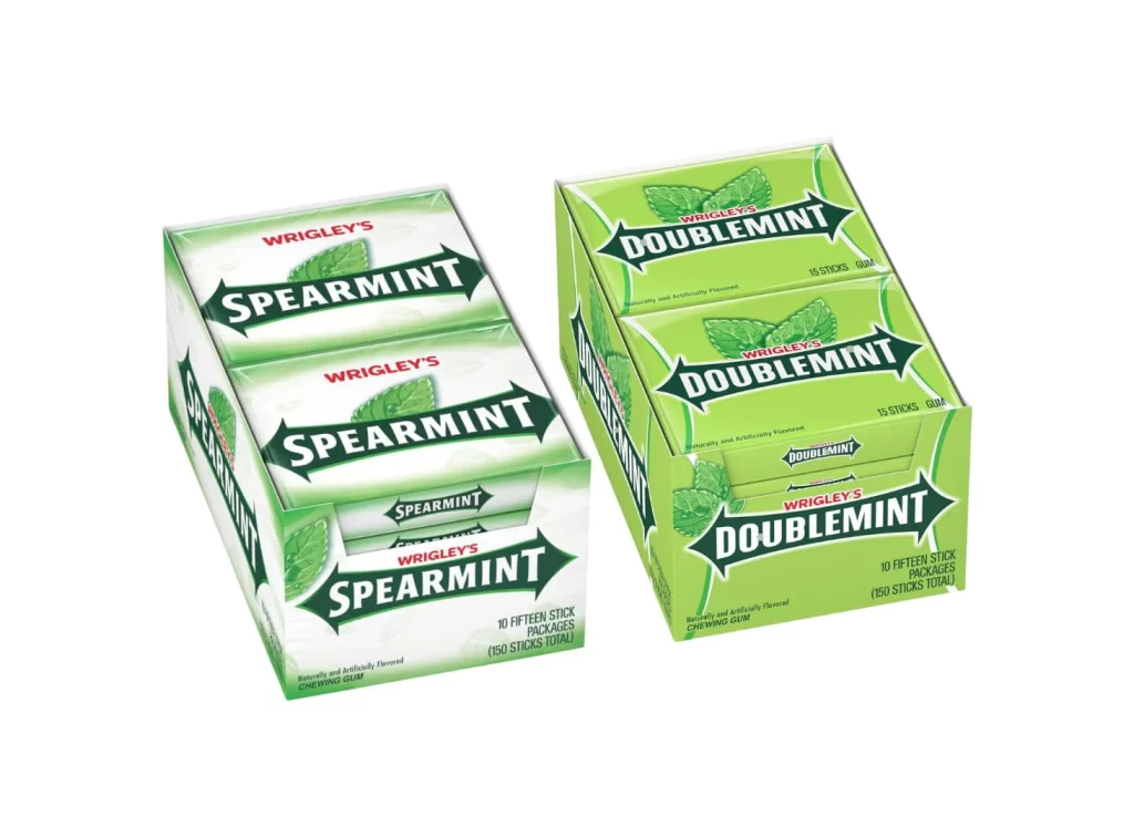
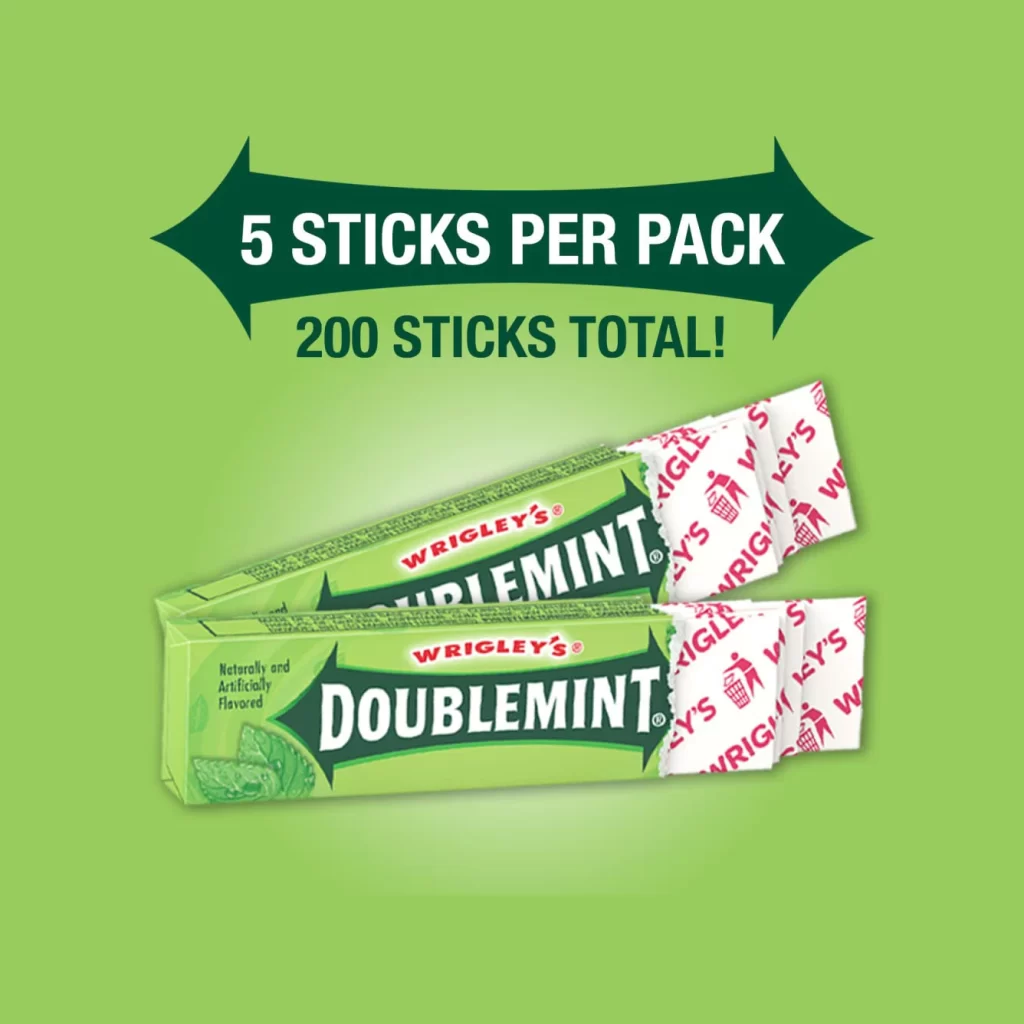
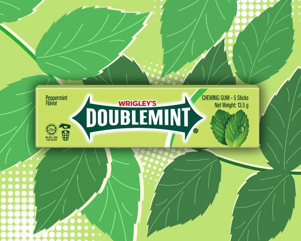
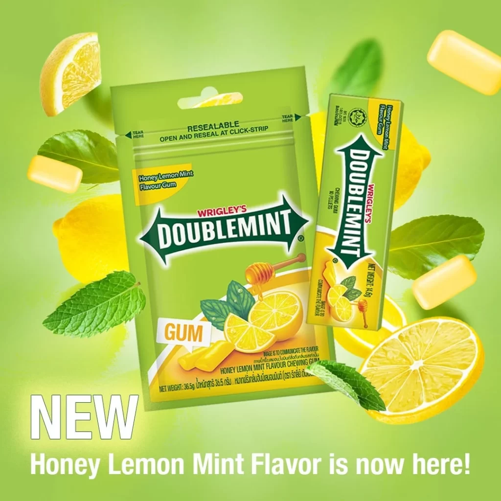
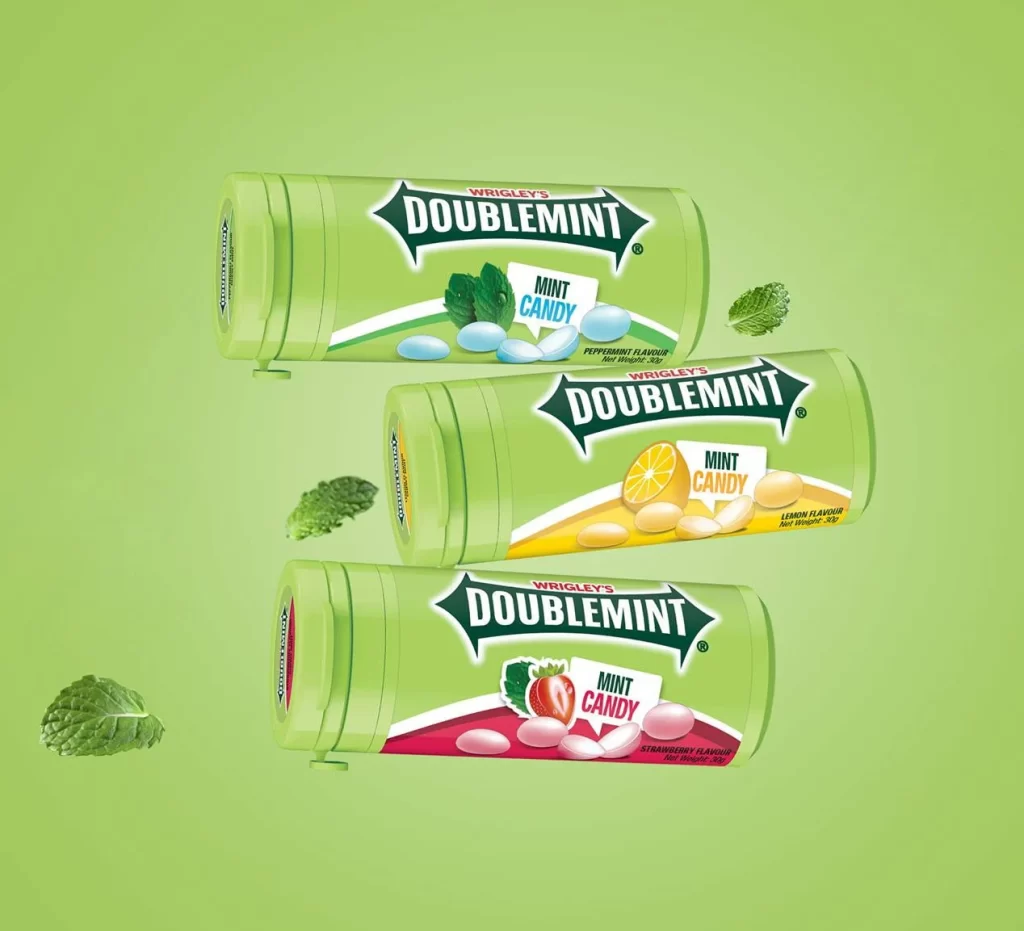
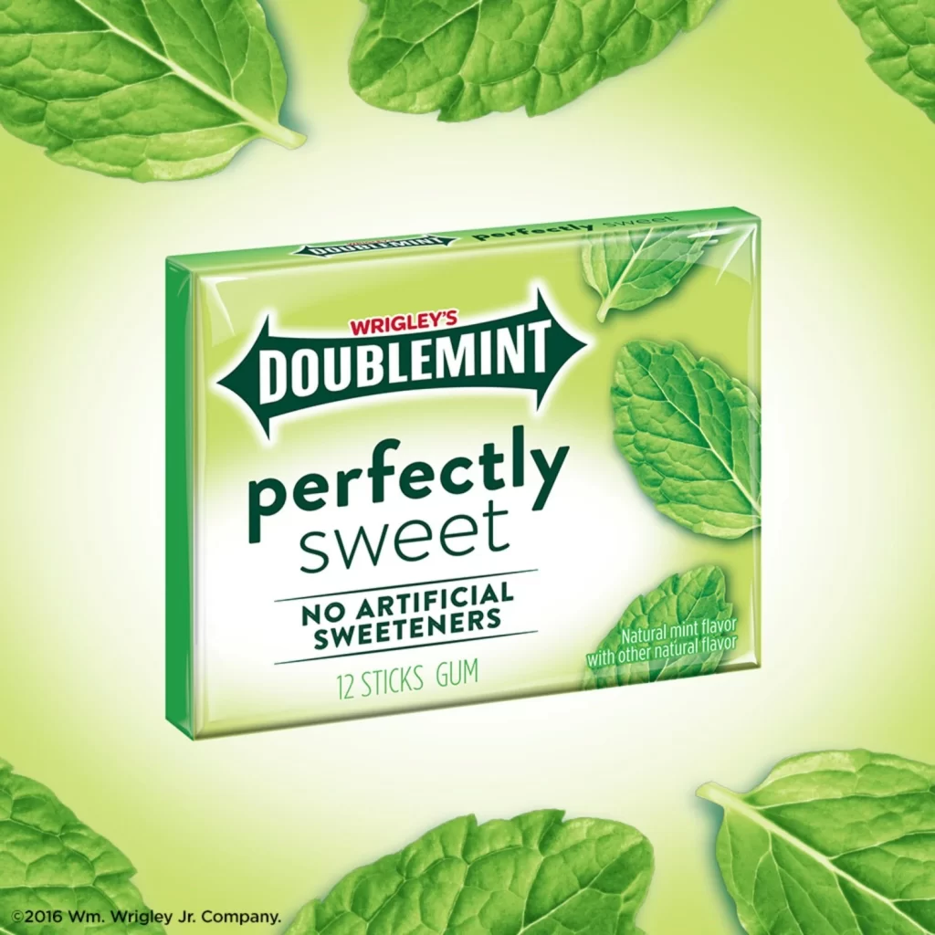
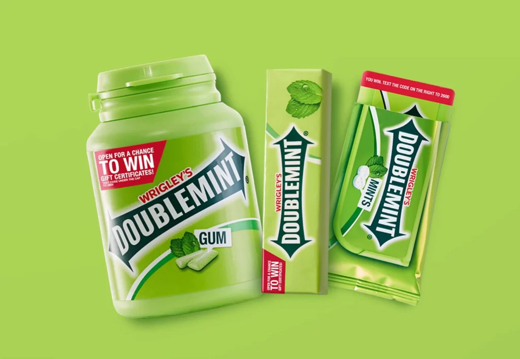
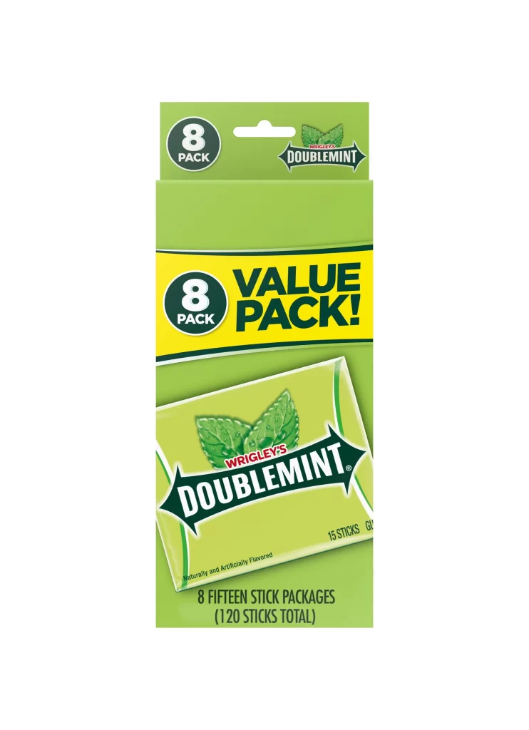
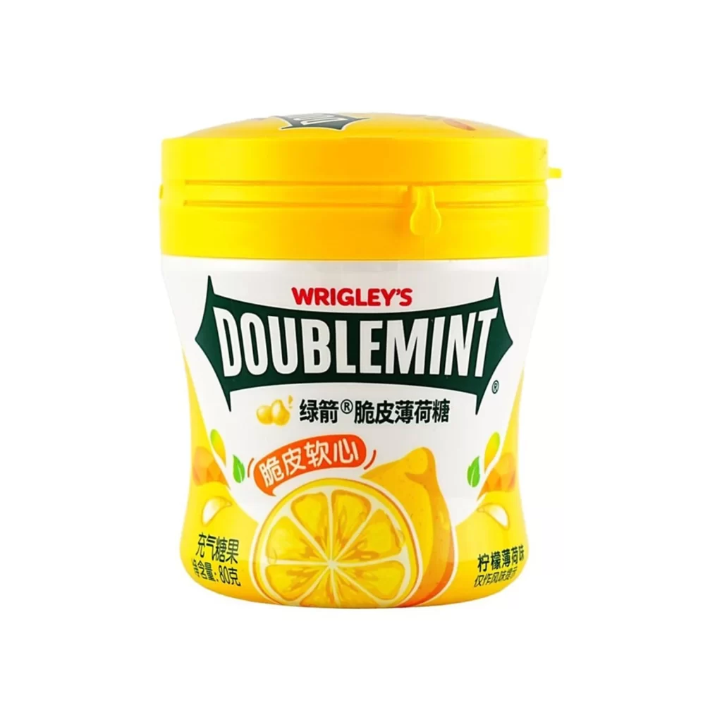
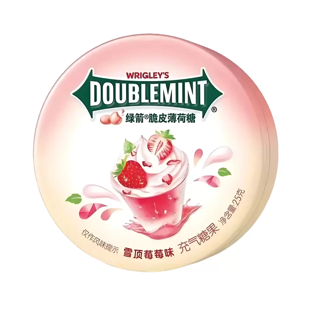
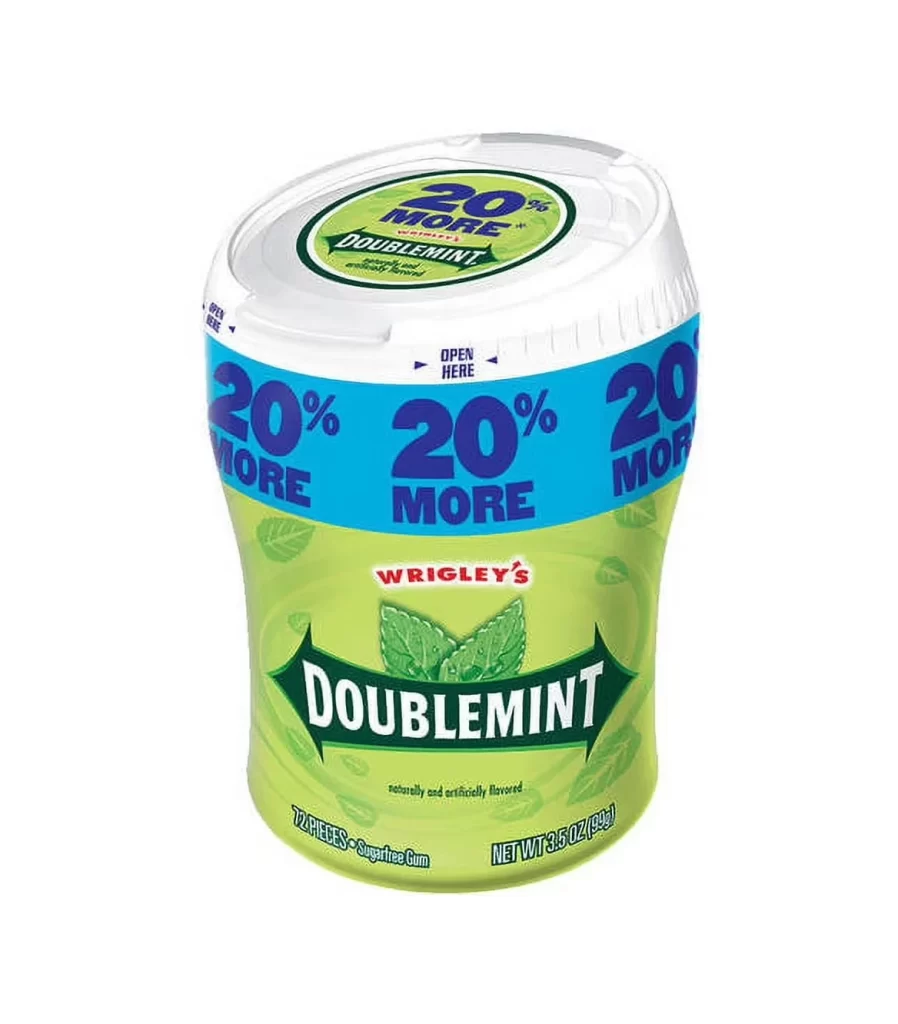
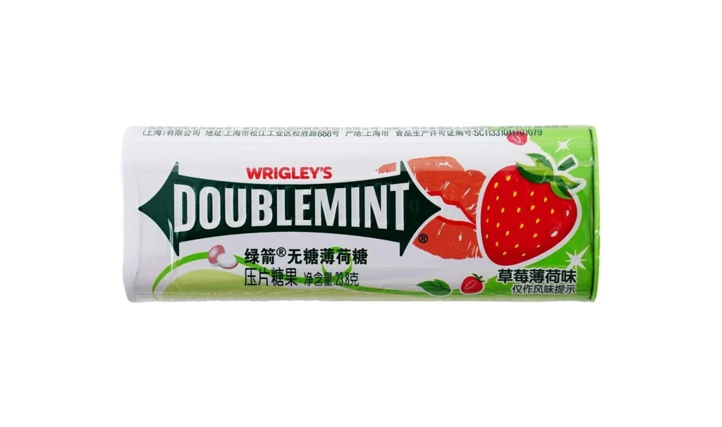
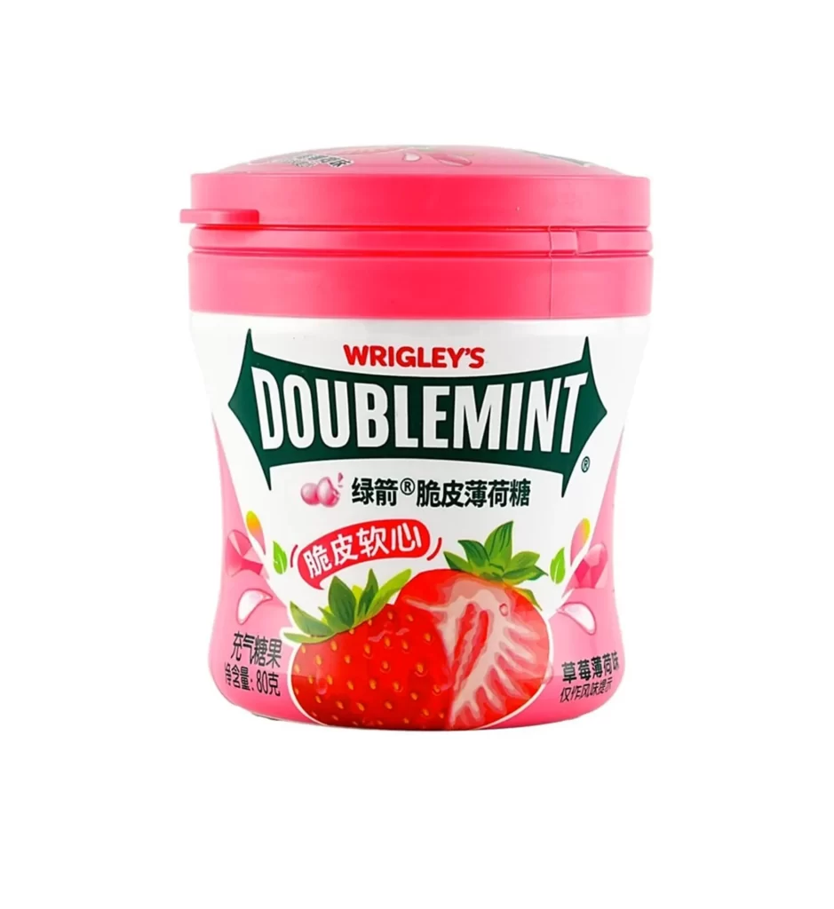
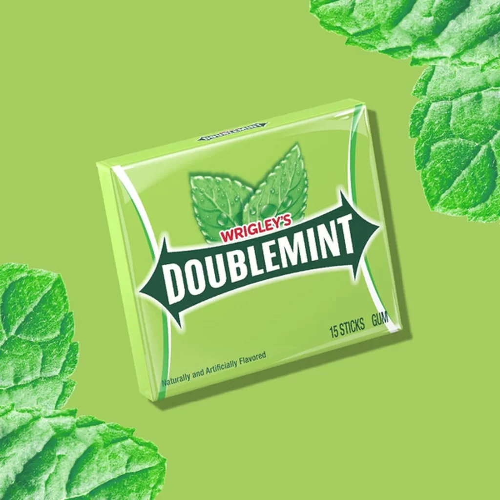
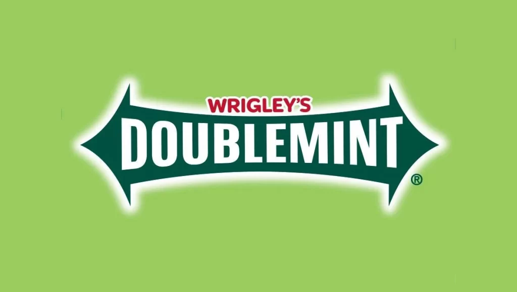
The iconic Wrigley's Doublemint logo dominates the center of the frame, featuring a dark forest-green banner with sharp, arrow-like points extending horizontally to the left and right. A crisp white border outlines this distinctive shape, creating a subtle glowing effect against the solid, vibrant lime-green backdrop. Within the banner, 'WRIGLEY'S' appears in small red letters above the bold white 'DOUBLEMINT' text that spans the width of the design.
Visual distinction in this specific iteration comes from the high-contrast interplay between the deep emerald green and the stark white typography, a combination engineered for maximum legibility on retail shelves. The unique pointed silhouette of the background shape mimics the appearance of a gum stick or a ribbon, giving the brand an unmistakable geometric identity that stands apart from standard rectangular logos. Furthermore, the use of red for the parent brand name creates a necessary visual hierarchy, ensuring that the consumer immediately recognizes the manufacturer before focusing on the product name itself.
Brand historians and packaging analysts might utilize this specific color palette and typographic arrangement to study the evolution of corporate identity over decades. Graphic designers working on retro-inspired confectionery projects could analyze the weight of the lettering and the specific curvature of the banner to understand classic balance in logo construction. Additionally, marketing students could examine how the choice of a solid, bright background color enhances the visibility of the central trademark elements without any distracting textures or photographic elements.