Pasta Beaufords Fresh Organic Colorful Typography
DownloadTopics
Details
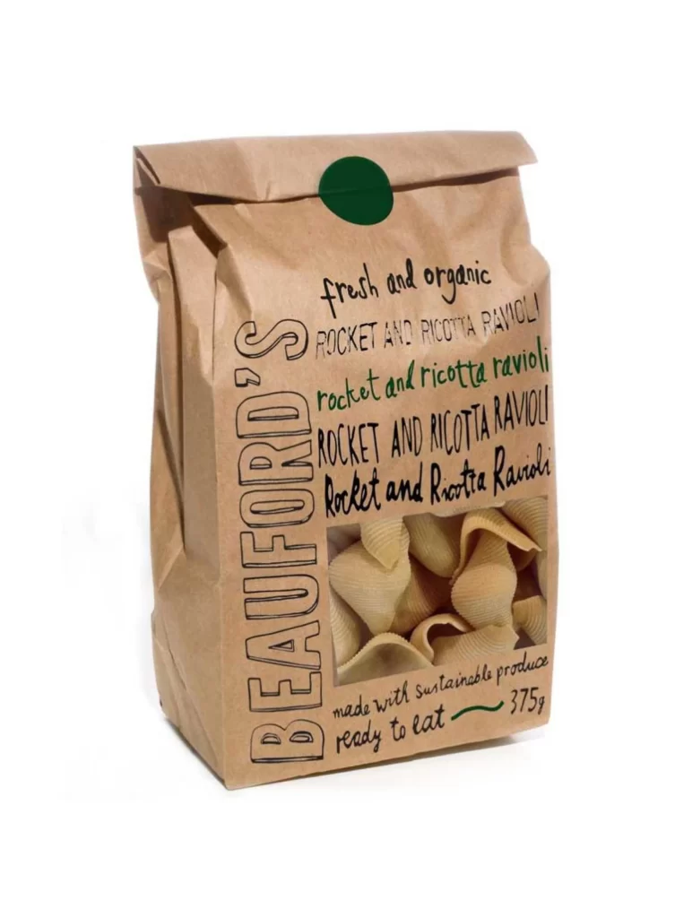
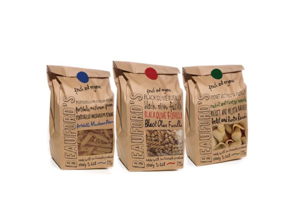
Three kraft paper bags stand in a row, each sealed with a circular sticker—blue on the left, red in the center, and green on the right. The packaging features hand-drawn typography with 'BEAUFORD'S' running vertically in bold black letters, while product names like 'PORTOBELLO MUSHROOM PENNE,' 'BLACK OLIVE FUSILLI,' and 'ROCKET AND RICOTTA RAVIOLI' appear in mixed colors and orientations. Clear windows at the bottom reveal the actual pasta shapes inside, and the entire arrangement sits under even studio lighting that eliminates harsh shadows.
The visual appeal lies in the deliberate contrast between the rustic brown paper texture and the vibrant, varied type treatments applied to each bag. Each package uses a distinct color palette for its text—blues, blacks, and reds—that corresponds to its seal, creating a cohesive yet individualized family look. Designers can grab the full-resolution file to study how handwritten fonts interact with organic materials and transparent packaging elements.
Packaging designers developing artisanal food brands would reference this to balance handmade aesthetics with commercial readability. Art directors planning natural-product photography shoots might use it to scout lighting setups that highlight both texture and color accuracy. Typography enthusiasts examining how casual script fonts function in vertical layouts will find concrete examples of hierarchy and spacing here.