Pasta Colorful Modern Typography Organic
DownloadTopics
Details
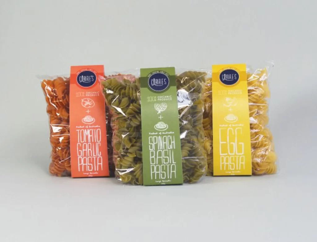
Three transparent plastic bags of rotini pasta stand in a row, each sealed with a vertically oriented label in a distinct hue. The left bag contains orange-red spirals beneath a coral tag reading "TOMATO GARLIC PASTA," the center holds olive-green noodles under a forest-green label for "SPINACH BASIL PASTA," and the right features golden-yellow pasta with a bright yellow "EGG PASTA" marker. All three tags display the "CHARLES" brand name inside a dark blue circle at the top, accompanied by small white icons of ingredients and the text "100% ORGANIC PRODUCT." Soft, even illumination casts minimal shadows across a neutral light-gray surface, while the camera maintains a straight-on perspective that keeps all packaging text fully legible.
Bold sans-serif typography dominates each label, stretching the flavor names vertically to create strong graphic columns that contrast sharply with the organic curves of the pasta shapes. The color-coded system allows instant visual differentiation between varieties while maintaining consistent branding elements like the circular logo and ingredient symbols across the product line. Designers can access the complete high-resolution file at no cost to study how these typographic choices balance readability with aesthetic impact.
Packaging professionals developing organic food lines might examine this composition to understand how transparent materials interact with vibrant product colors and printed graphics. Art directors planning e-commerce photography could reference the arrangement to achieve similar clarity when displaying multiple SKU variations side by side. Students of visual communication will find the hierarchy of information particularly useful for learning how to prioritize brand identity versus descriptive text on limited vertical real estate.