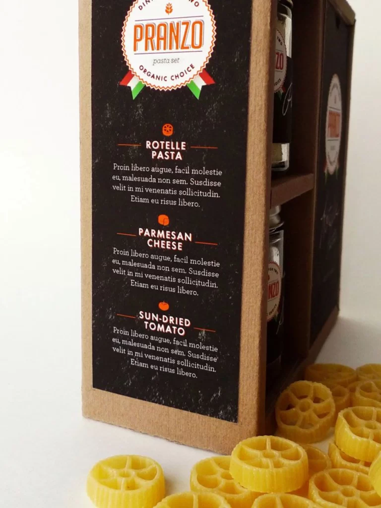
Pasta Set Pranzo Organic Choice Rotelle Parmesan Sun-dried Tomato
DownloadTopics
Details
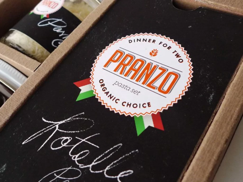
A kraft cardboard box with a dark chalkboard-textured label dominates the frame, displaying the brand name PRANZO in bold orange serif lettering within a scalloped circular badge. Below the main logo, three product categories—Rotelle Pasta, Parmesan Cheese, and Sun-Dried Tomato—appear in white and orange typography, each accompanied by identical placeholder Latin text. The composition includes a partial view of the box's interior compartments holding glass jars, while actual yellow rotelle pasta wheels scatter across the lower right foreground, all captured from a slight three-quarter angle under soft, diffused studio lighting.
The visual tension between the rustic cardboard material and the sophisticated chalkboard aesthetic creates a compelling artisanal identity that bridges traditional Italian food culture with modern packaging sensibilities. The deliberate repetition of placeholder copy across all three product sections suggests this is a template or mockup rather than final retail packaging, offering valuable insight into typographic hierarchy and color contrast strategies for organic food branding. Designers studying this composition can access the full-resolution source file to examine the subtle texture variations in the board material and the precise kerning of the display typeface.
Packaging designers developing premium organic food lines will find the color palette of burnt orange, forest green, and cream particularly instructive for balancing heritage cues with contemporary minimalism. Art directors working on e-commerce photography can analyze how the scattered physical product creates depth without distracting from the primary packaging information. The structured layout provides a clear blueprint for organizing multi-component gift sets where individual ingredients require distinct visual separation within a unified brand system.