Pasta Fusilli Eco Organic Green Yellow Red
DownloadTopics
Details
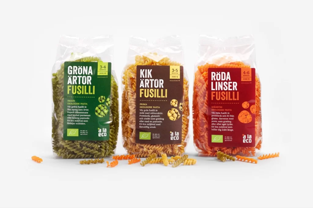
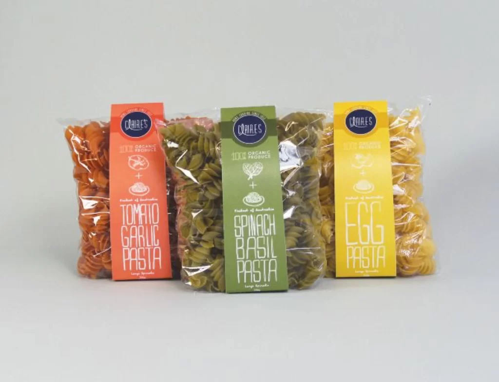
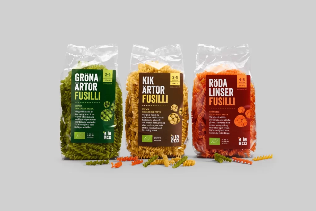
Three transparent plastic bags of fusilli pasta stand in a row, each filled with spirals of a distinct hue: deep forest green on the left, golden yellow in the center, and vibrant orange-red on the right. Bold white Swedish text dominates the labels—GRÖNA ÄRTOR, KIK ÄRTOR, and RÖDA LINSER—all followed by FUSILLI in large capital letters, while the 'å la eco' brand logo anchors the bottom corner of each package. Loose pasta pieces in matching colors scatter across the light gray surface beneath the bags, and soft even lighting illuminates the scene from a straight-on camera angle that keeps every typographic detail crisp.
Color-coded packaging creates an immediate visual taxonomy, letting shoppers distinguish pea-based, chickpea, and lentil varieties at a single glance without reading the fine print. The螺旋形 noodles visible through the clear film reinforce the product's texture and organic quality, while the consistent layout structure builds brand recognition across the flavor range. Anyone studying this composition can grab the full-resolution file for closer inspection of how typography scales against photographic backgrounds.
Food photographers might study the arrangement to understand how loose product elements add dynamism to static packaging shots without cluttering the frame. Brand designers working on organic or health-food lines could analyze how earthy color palettes combine with clean sans-serif type to signal eco-friendly values. Packaging engineers would benefit from examining how the label dimensions balance information density with visual breathing room around the main product name.