Pasta Rigatoni Potamya Orange White Organic
DownloadTopics
Details
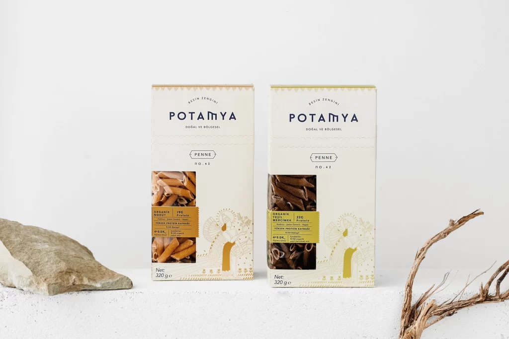
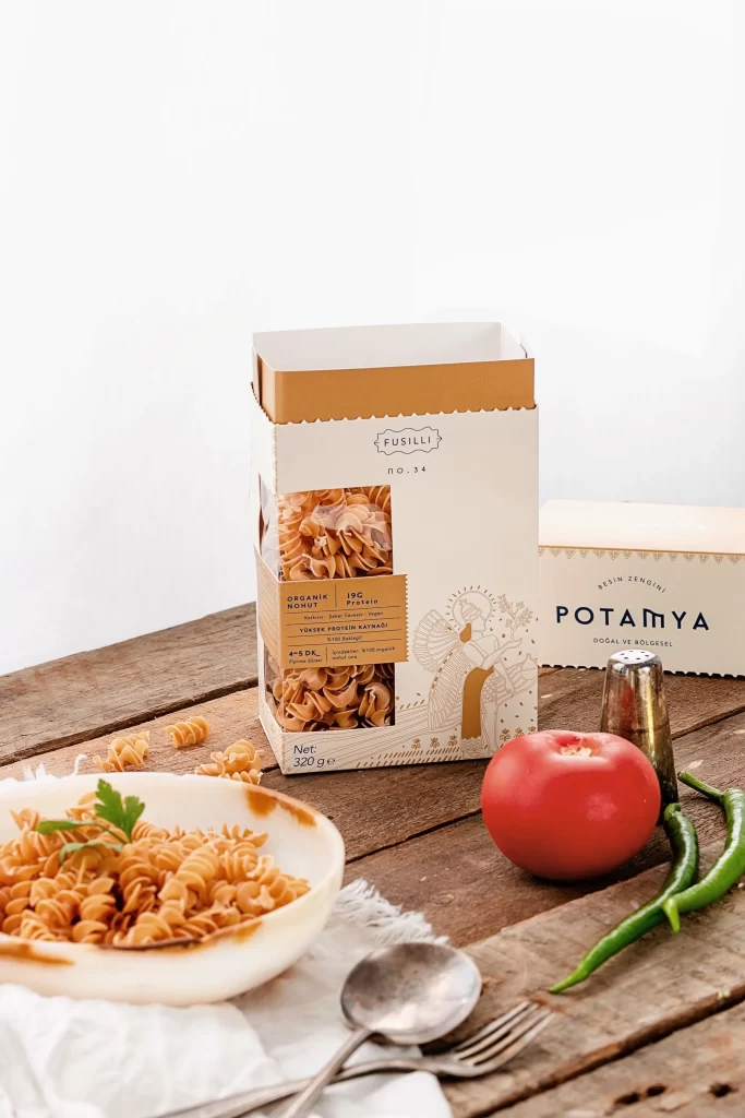
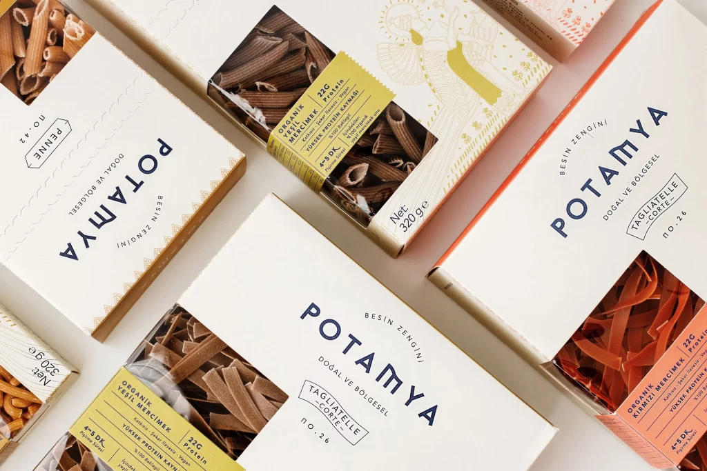
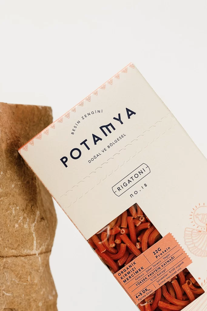
A rectangular carton of Potamya organic pasta leans diagonally across the frame, its cream-colored surface embossed with subtle wave patterns and topped by a geometric border of terracotta triangles. The brand name appears in bold navy sans-serif above 'DOĞAL VE BÖLGESEL' and a rounded badge identifying the contents as Rigatoni no. 18, while a salmon-colored label at the bottom corner advertises 22g of protein from red lentil flour. To the left, a rough-hewn stone block provides textural contrast against the bright backdrop, with soft directional light casting gentle shadows that emphasize the paper's tactile quality.
The packaging achieves visual distinction through its restrained palette of warm neutrals and deep blue, avoiding typical food photography saturation in favor of an artisanal aesthetic. Embossed details catch the light to create physical depth on the flat surface, while the transparent window reveals the reddish-orange hue of the legume-based pasta itself. Designers studying sustainable branding will appreciate how typographic hierarchy guides the eye from the prominent logo down to specific nutritional claims without cluttering the composition. The full-resolution source file can be accessed at no cost for closer inspection of these material interactions.
Packaging engineers and brand strategists might reference this shot when developing eco-conscious food products that require clear nutritional communication without sacrificing elegance. Art directors working on natural-food campaigns could analyze the color balance between the stone prop, paper substrate, and product photography window. Print specialists may also find value in examining how spot UV or debossing techniques translate under studio lighting conditions for their own production specifications.