Giovanni Rana Tonnarelli Pasta Packaging
DownloadTopics
Details
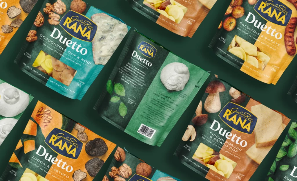
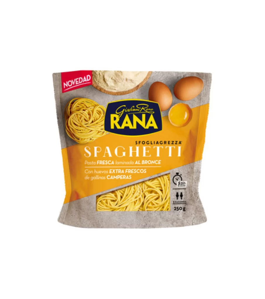
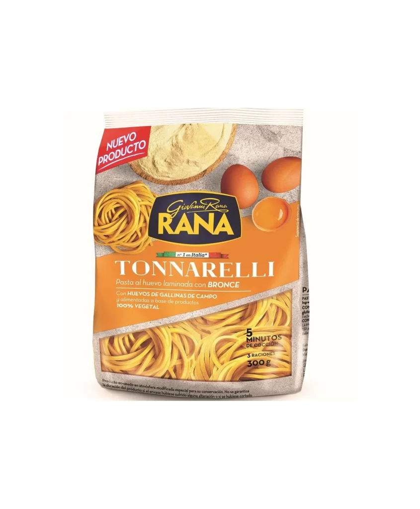
Bright orange dominates the lower half of this 300g pasta package, transitioning into a textured gray upper section that mimics a stone or concrete surface. The Giovanni Rana logo sits in a dark navy oval with gold lettering, while 'TONNARELLI' appears in large white serif font just below. A red diagonal banner reading 'NUEVO PRODUCTO' anchors the top left corner, and the front face displays photographic elements including two brown eggs, one cracked open, a nest of yellow noodles, and a dusted circular shape resembling flour or dough.
Color blocking creates immediate visual hierarchy, separating product information from ingredient imagery through that sharp orange-to-gray divide. The mix of photography and typography feels balanced yet dynamic, especially with how the noodle cluster at the bottom echoes the smaller nest shown above the brand mark. Anyone studying food packaging layouts can grab the full-resolution file to examine how the Italian flag ribbon sits between the brand name and product title.
Packaging designers analyzing European grocery aesthetics will find useful material in the typographic scale and color palette choices here. Illustrators working on food-related projects could reference the egg textures and pasta strand arrangements for realistic rendering practice. Marketing teams launching new SKU lines might study how the 'new product' badge integrates without overwhelming the core brand identity.