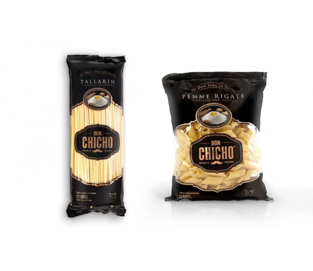
Pasta Packaging Brown Black Minimalist Modern
DownloadTopics
Details
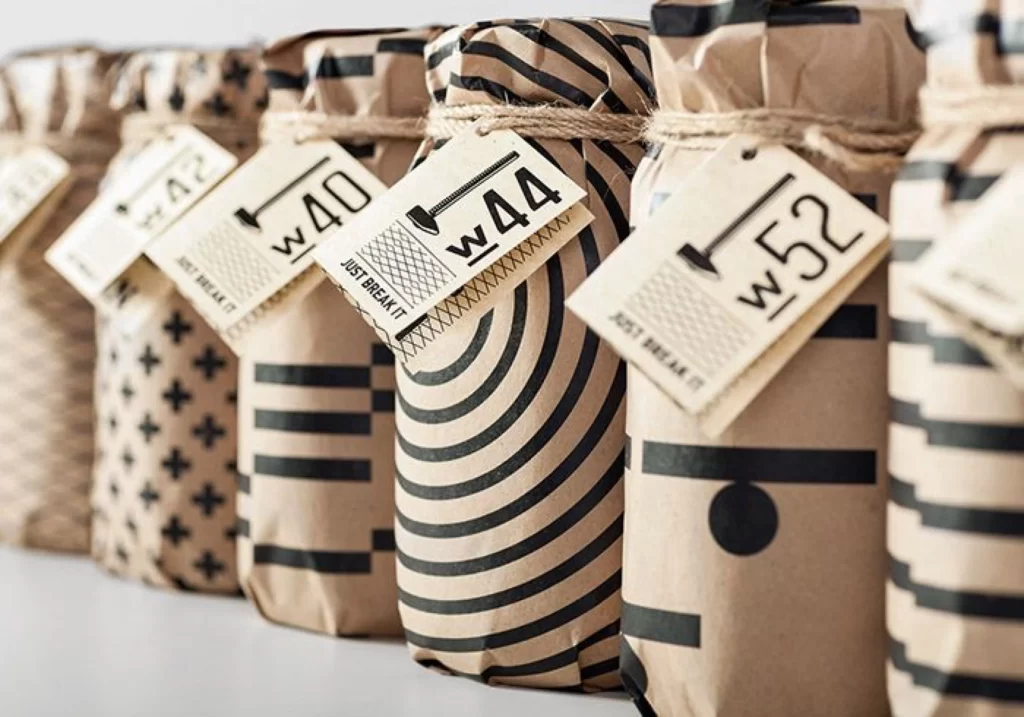
Kraft paper cylinders wrapped in bold black geometric patterns—stripes, spirals, crosses, and dots—stand in a tight row, each secured with rough twine and bearing a cream tag stamped with a hammer icon and weight numbers like W40, W44, and W52. The phrase "JUST BREAK IT" appears in small type beneath the numerals on the central tag, while soft natural light from the left casts gentle shadows across the neutral surface beneath the jars.
What sets this packaging apart is its playful subversion of industrial labeling conventions, where utilitarian weight markers meet hand-drawn graphics and cheeky copy that invites destruction rather than preservation. The contrast between the organic texture of the paper and twine against the crisp, screen-printed black ink creates a tactile visual tension that feels both handmade and mass-produced. You can grab the full-resolution file at no cost if you want to study those material interactions up close.
Brand strategists developing artisanal food lines might mine this for how to balance whimsy with clear product information, while packaging students could analyze how pattern variation maintains cohesion across a product range. Print designers working on limited-edition releases would benefit from examining how the tag hierarchy guides the eye from icon to number to instructional text without feeling cluttered.