Pasta Gusto Di Roma Black Red White
DownloadTopics
Details
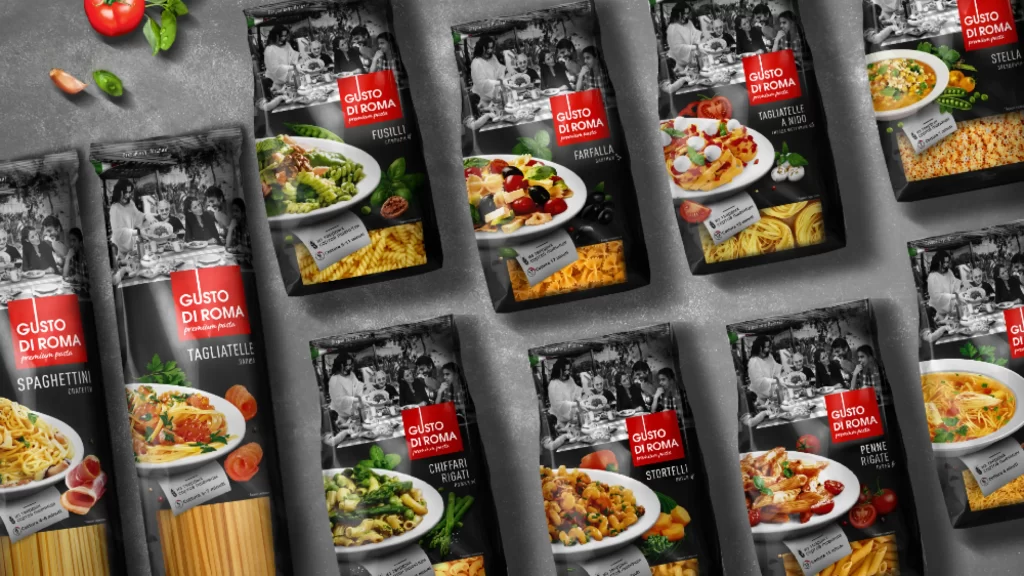
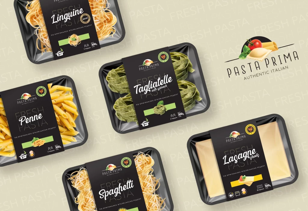
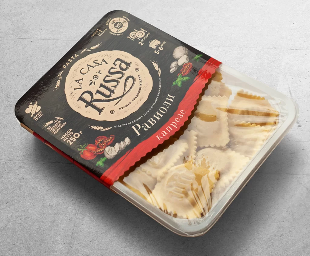
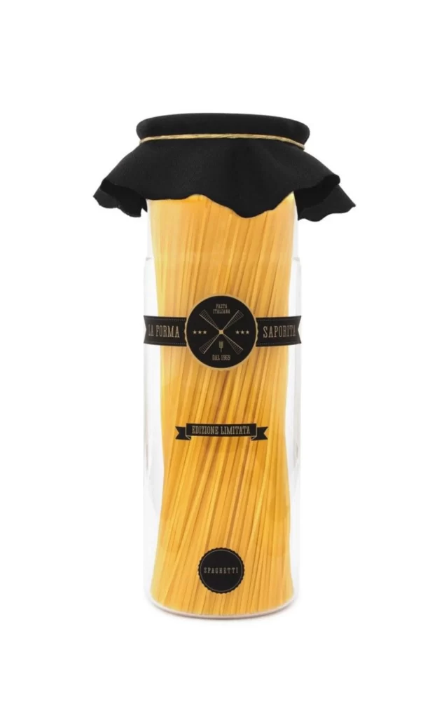
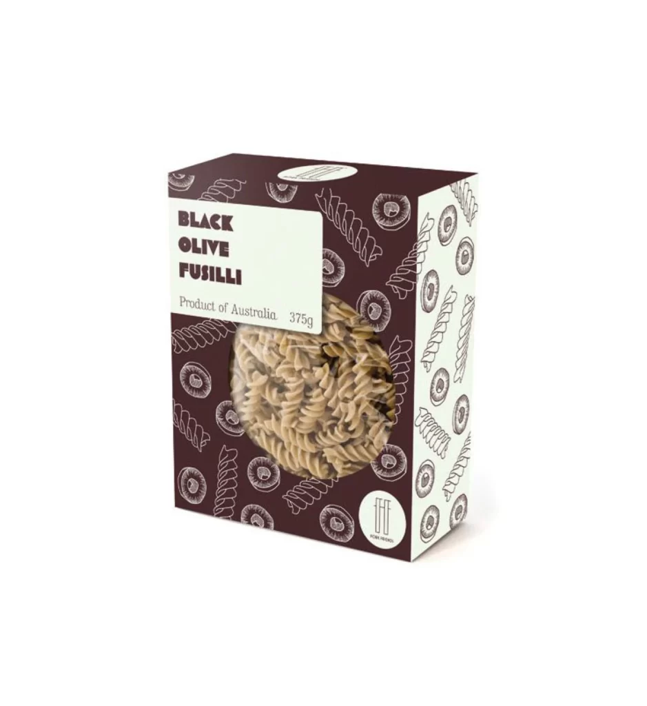
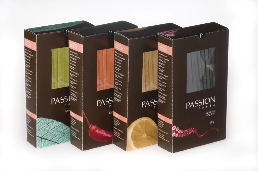
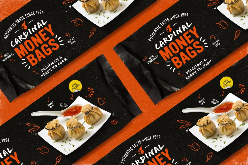
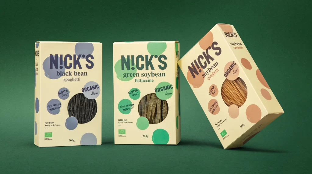
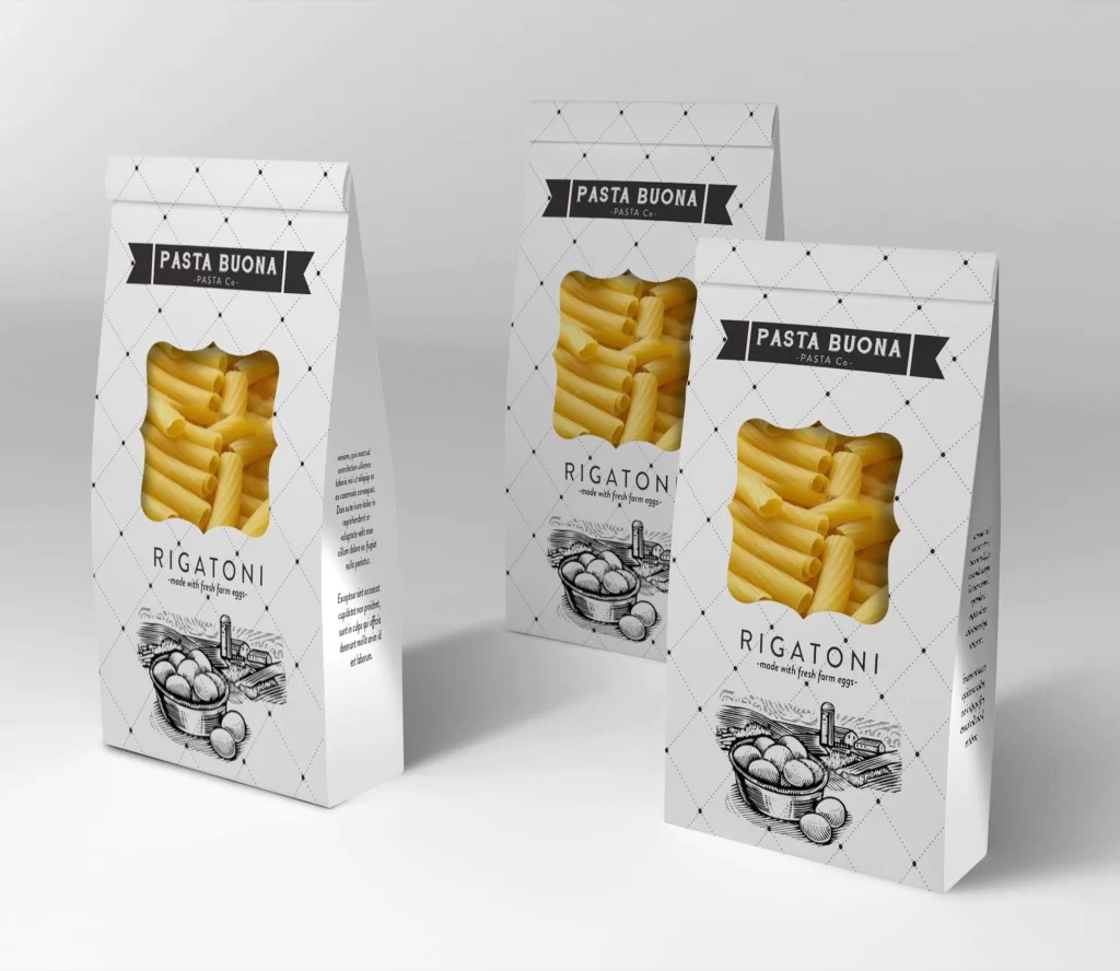
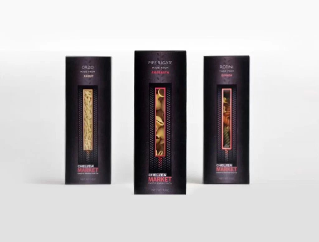
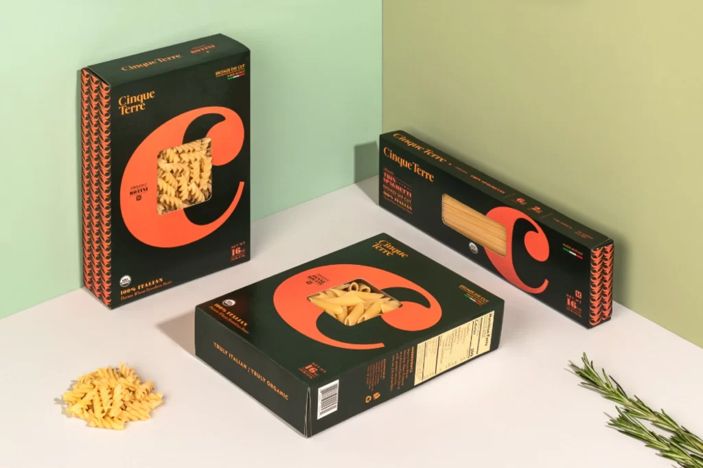
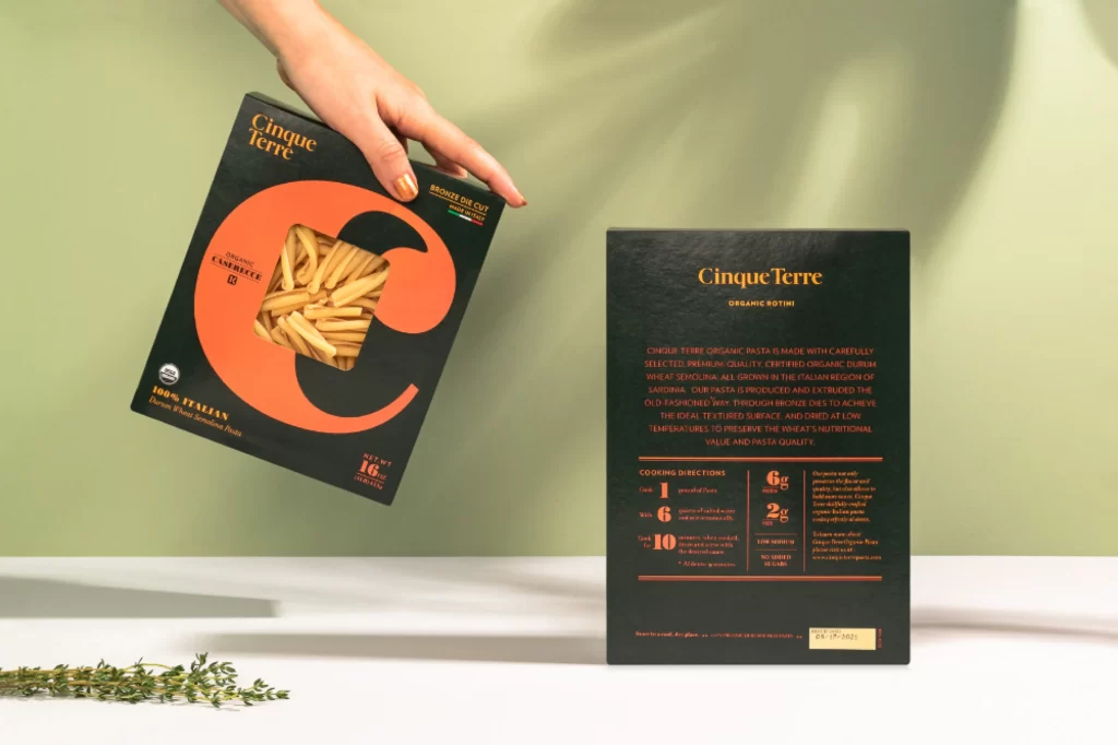
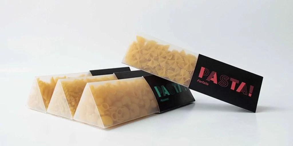
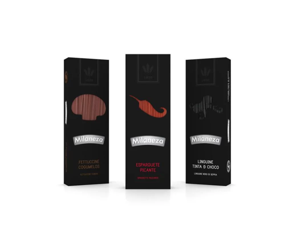
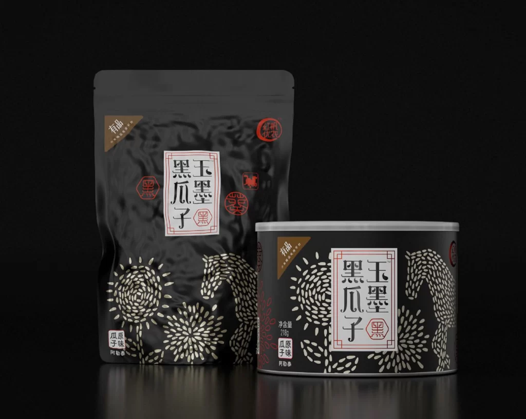
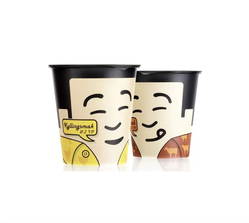
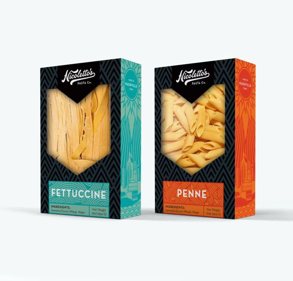
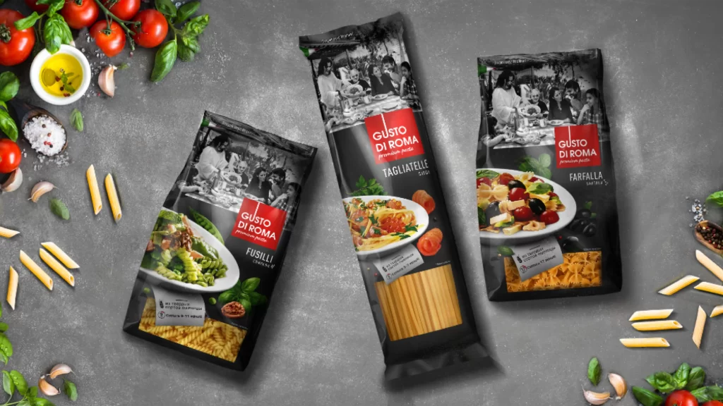
Three distinct pasta packages from the Gusto Di Roma brand dominate the frame, each featuring a sophisticated black background punctuated by a bold red logo and crisp white typography. The packaging displays Fusilli, Tagliatelle, and Farfalla varieties through transparent windows that reveal the actual pasta shapes alongside vibrant food photography of prepared dishes. A textured gray surface anchors the composition while scattered ingredients—cherry tomatoes on the vine, fresh basil leaves, garlic cloves, coarse salt crystals, and loose penne noodles—create an organic border around the products.
The visual identity relies on a striking tricolor palette where the deep matte black creates dramatic contrast against the saturated red branding block and the monochrome lifestyle imagery printed across the upper portions. This particular execution balances commercial clarity with editorial sophistication by layering photographic realism over graphic elements, making the product feel both artisanal and mass-market ready. Designers studying this composition will note how the red acts as a visual anchor that draws the eye immediately to the brand name before allowing it to wander across the culinary details. You can access the complete high-fidelity asset at no cost directly from the resource library.
Packaging art directors and food photographers frequently turn to such references when developing campaigns for premium Italian grocery lines or Mediterranean restaurant supply brands. The arrangement demonstrates effective prop styling techniques for flat-lay photography, offering concrete guidance on how to scatter raw ingredients without cluttering the primary subject matter. Students of commercial illustration might also analyze the typographic hierarchy here, particularly how the product names maintain legibility despite competing with rich visual textures surrounding them.