Pasta Gusto Di Roma Black Red White Italian
DownloadTopics
Details
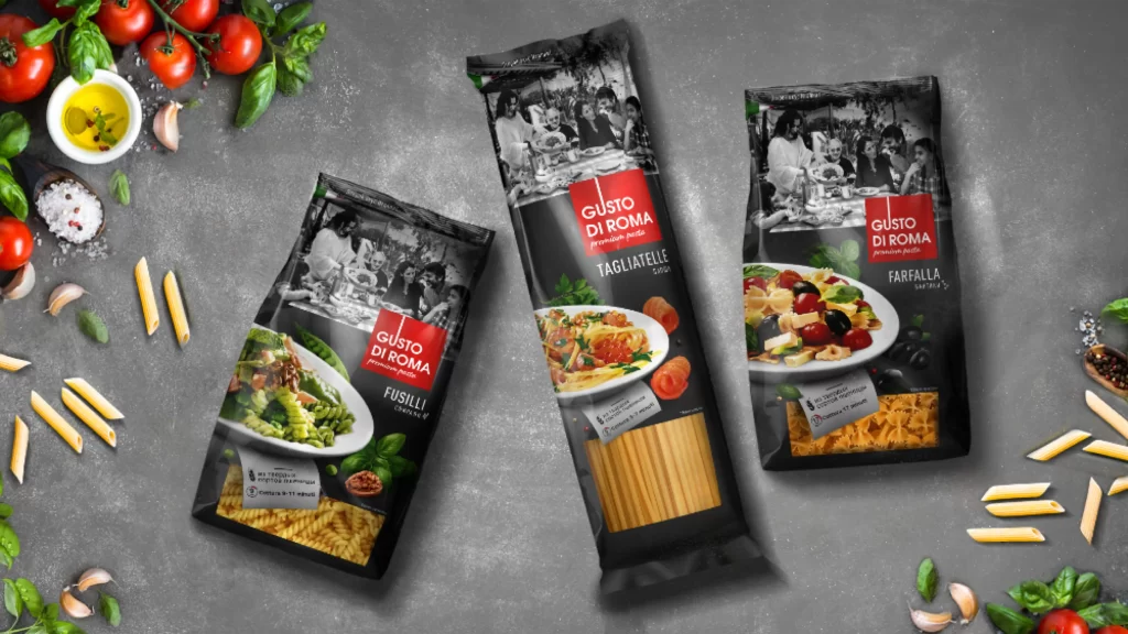
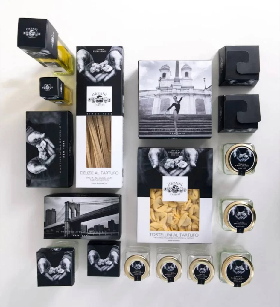
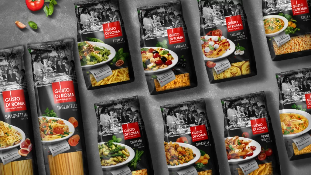
Multiple packages of Gusto Di Roma pasta are arranged in a loose grid across a textured gray surface, each bag featuring a bold black background with a red rectangular logo containing white text. The packaging displays high-contrast photography of prepared dishes in white bowls alongside the raw pasta shapes, while the upper portion of every bag shows a monochrome vintage-style photograph of people dining together. Fresh ingredients including a ripe tomato, basil leaves, and garlic cloves occupy the upper left corner, adding organic color accents to the composition, which is captured from a slightly elevated angle under even studio lighting that eliminates harsh shadows.
The visual identity relies on a strict tri-color palette of black, red, and white that creates immediate shelf presence through high contrast and clear typographic hierarchy. By combining historical black-and-white imagery with vibrant food photography, the design establishes both authenticity and appetite appeal within a cohesive modern framework. Designers studying this layout will notice how the consistent placement of the brand mark across different pasta varieties maintains recognition while allowing product-specific imagery to differentiate each SKU.
Packaging designers and brand strategists can analyze the grid arrangement to understand how multiple SKUs maintain visual cohesion while remaining individually distinguishable at retail. Food photographers might reference the lighting setup and prop styling to achieve similar appetizing results in their own commercial work. The complete high-resolution file is accessible at no cost for those needing to examine typographic details or color values closely.