Pasta Chelsea Market Black Red Typography Modern
DownloadTopics
Details
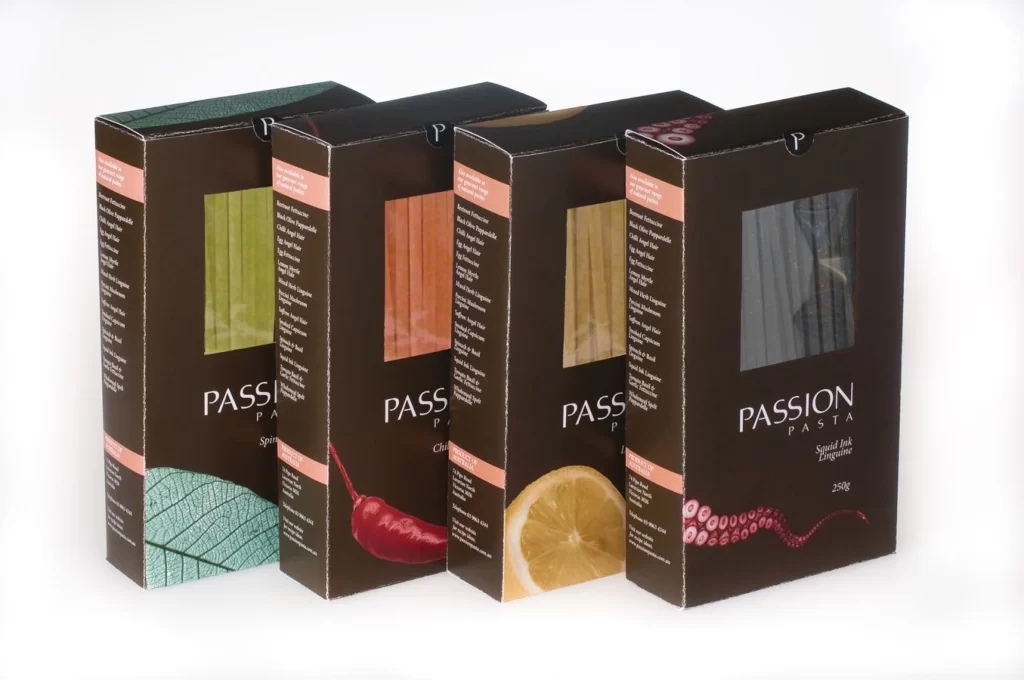
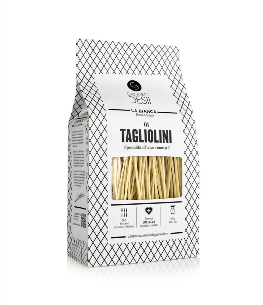
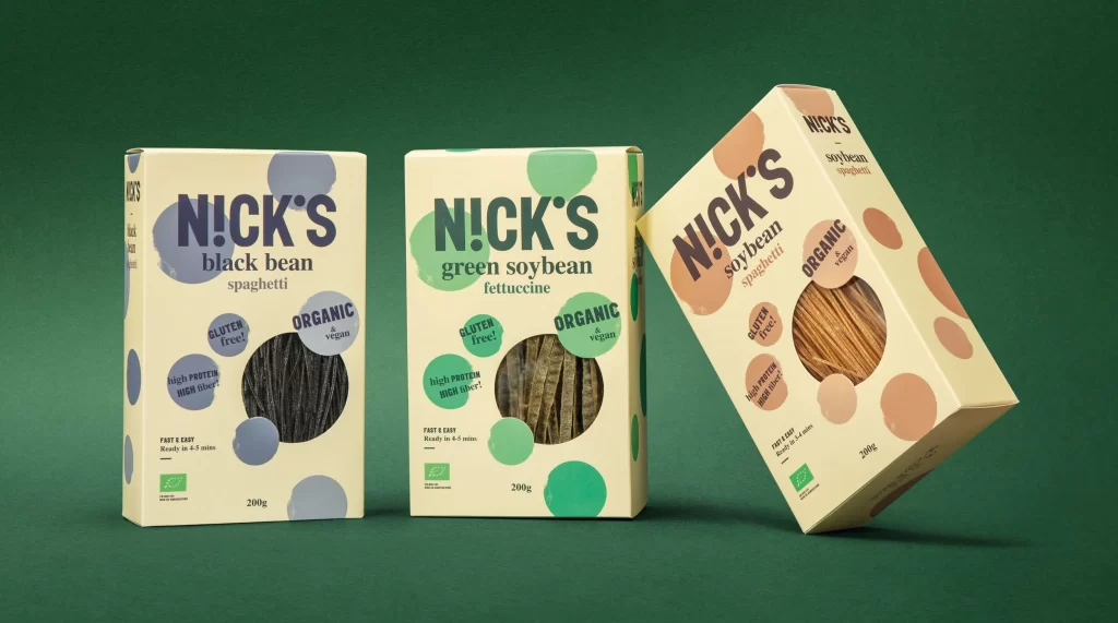
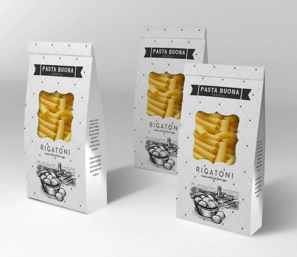
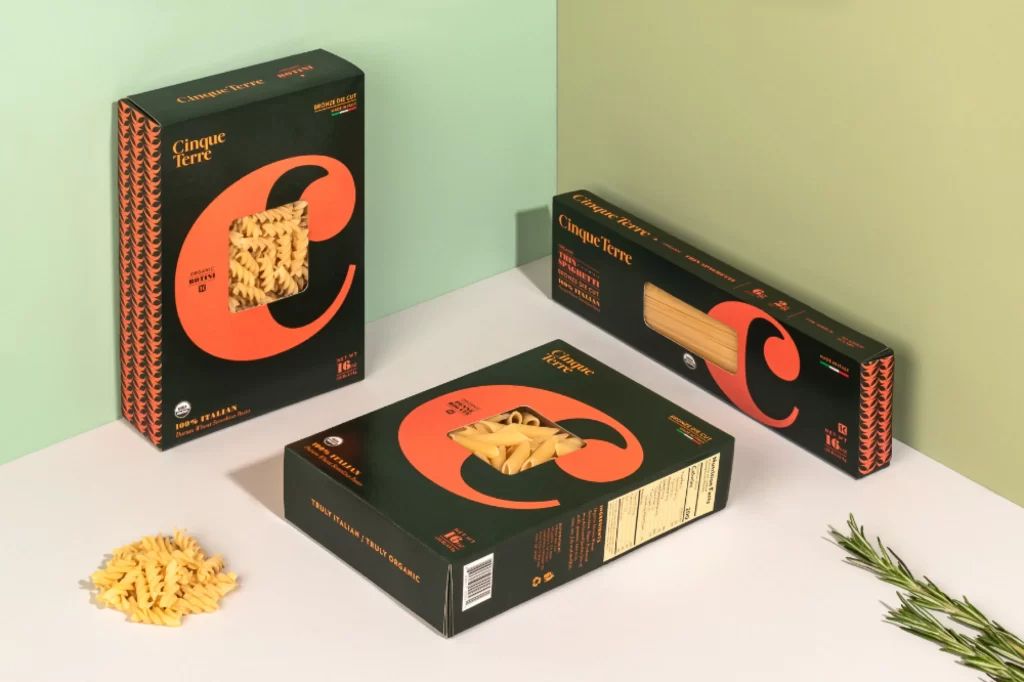
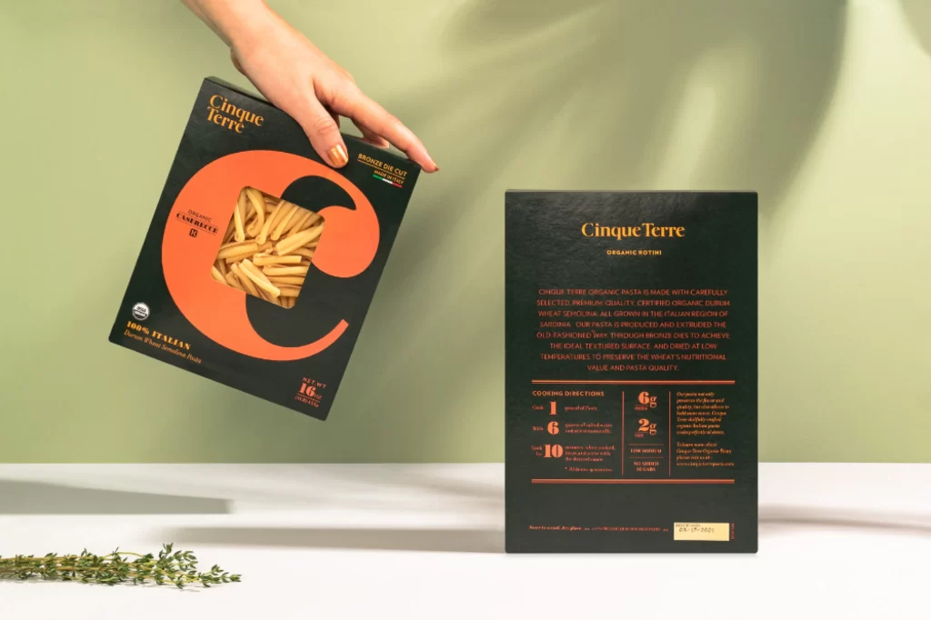
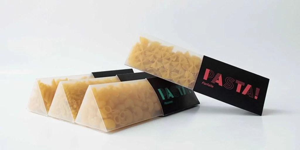
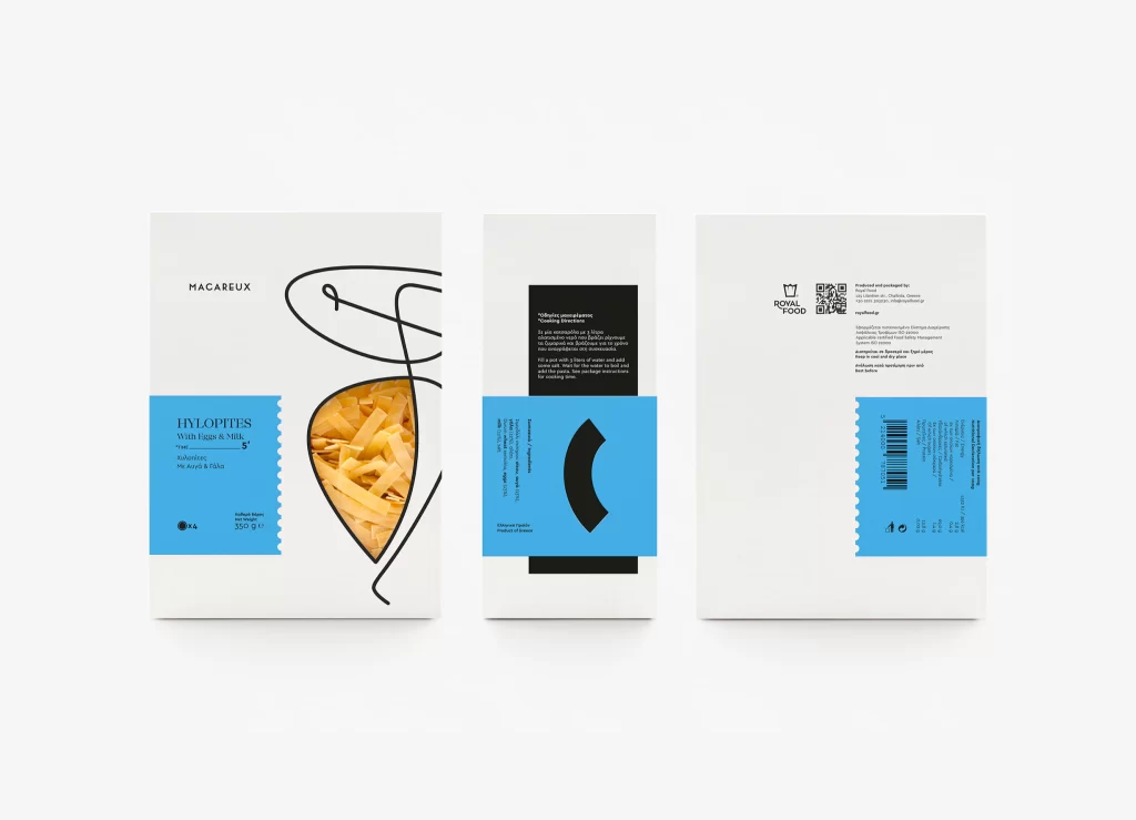
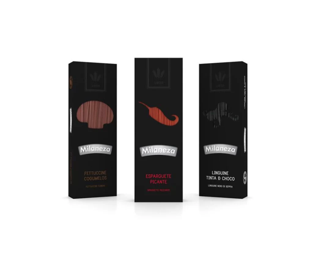
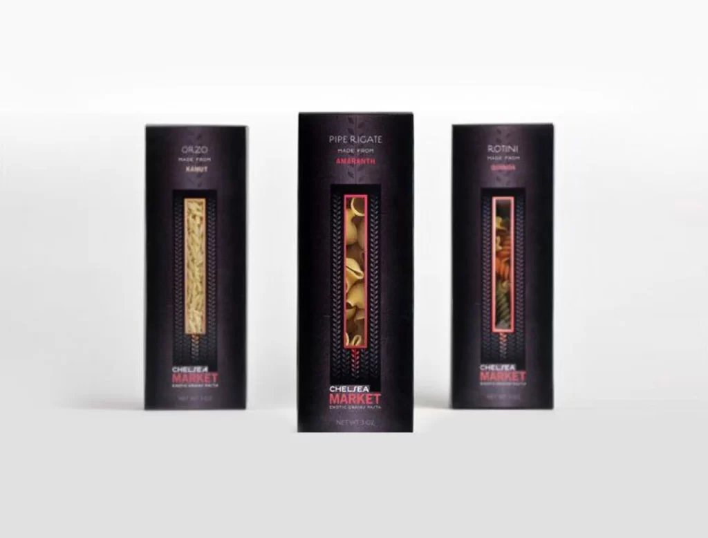
Three tall, slender pasta boxes stand in a shallow row against a light gray backdrop, each featuring a matte black surface with subtle vertical ribbing. The left box displays golden orzo grains, the center one showcases curved pipe rigate in warm amber tones, and the right reveals multicolored rotini spirals, all visible through narrow rectangular windows. White and coral-red typography identifies each variety—Orzo from Kamut, Pipe Rigate from Amaranth, and Rotini from Quinoa—with 'Chelsea Market' branding anchored at the bottom of every package.
Dark packaging creates dramatic contrast against the pale ingredients, making the natural textures and colors pop with unusual intensity. The restrained color palette of black, white, and muted red lends an upscale, contemporary feel that distinguishes these from typical grocery-store pasta containers. Designers can grab the full-resolution file at no cost to study how minimal elements achieve maximum visual impact.
Packaging professionals might analyze this composition when developing premium food product lines that require sophisticated shelf presence. Typography enthusiasts will appreciate the clean hierarchy between product names, ingredient sources, and brand identity. Art directors working on editorial spreads could reference the balanced spacing and window placement for their own luxury goods photography layouts.