Pasta Cinqe Terre Black Orange Modern Typography
DownloadTopics
Details
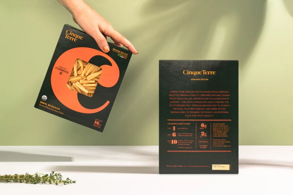
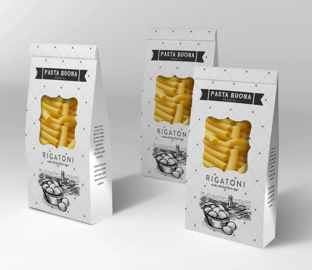
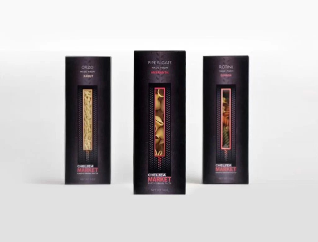
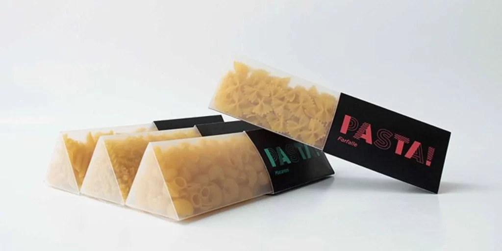
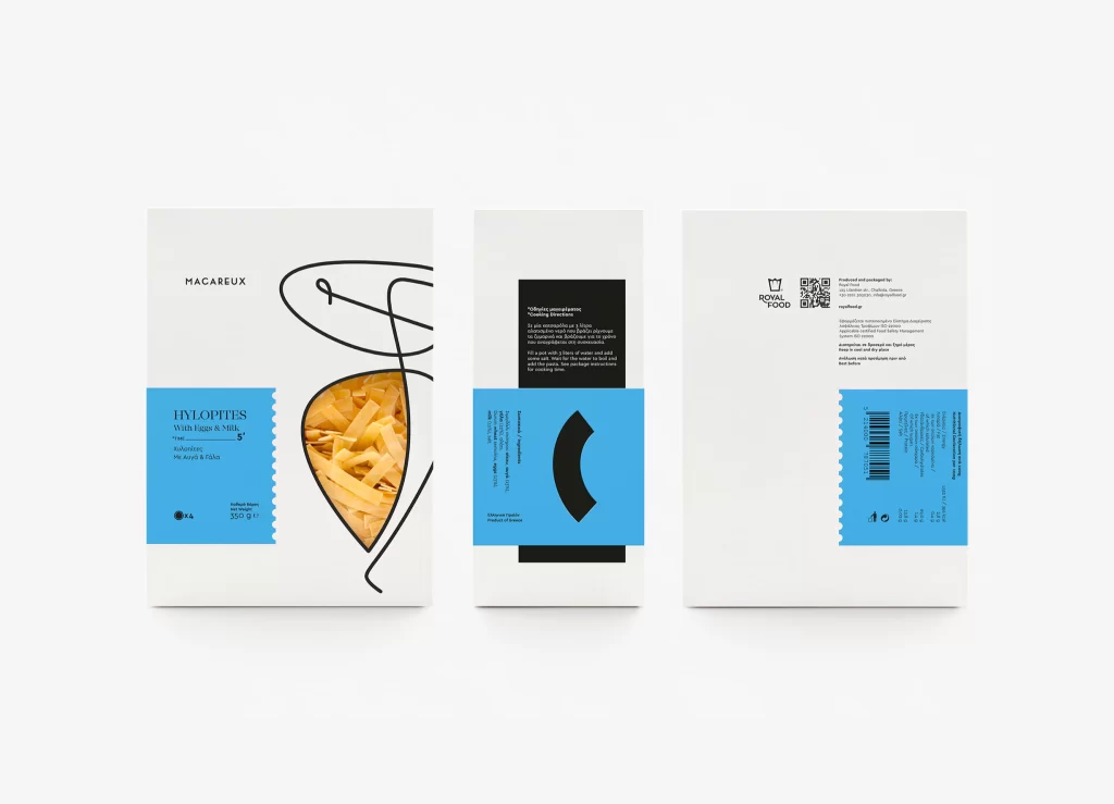
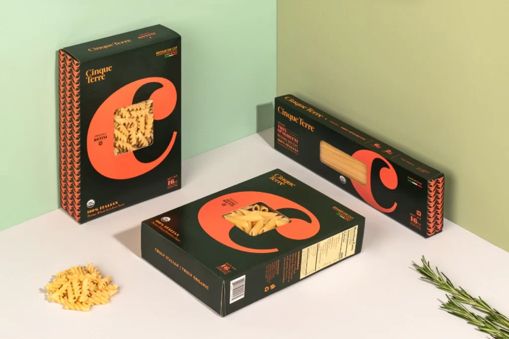
Three dark forest-green pasta boxes dominate the composition, each featuring a massive, vibrant coral-orange letterform 'C' that doubles as a die-cut window revealing the dried noodles within. The packaging displays the brand name 'Cinque Terre' in a clean, golden-yellow serif typeface, while the side panels exhibit a repeating chevron pattern in the same orange hue. Soft, diffused lighting casts gentle shadows across a pale mint and sage two-tone backdrop, with the camera positioned at a slight three-quarter angle to emphasize the dimensional depth of the boxes.
Visual hierarchy is established through the bold interplay between the matte black substrate and the saturated accent color, creating immediate shelf presence without relying on traditional food photography. The typographic treatment integrates the product window directly into the letterform, turning functional transparency into a graphic element that reinforces brand identity. Designers studying this layout will appreciate how the geometric side patterns provide textural contrast to the smooth front panels, and the complete high-fidelity asset can be accessed at no cost for closer inspection of these production details.
Packaging engineers and brand strategists frequently utilize such compositions to evaluate structural die-cutting feasibility alongside color-way testing for premium grocery categories. Art directors working on organic or artisanal food lines might reference the specific balance between modernist typography and traditional Italian culinary cues when developing their own visual systems. Students of industrial design could deconstruct the spatial relationships between the primary logo mark and secondary informational text to understand effective information architecture on rectangular substrates.