Pasta Tortiglioni Capellini Black White Minimalist
DownloadTopics
Details
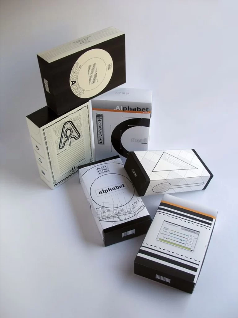
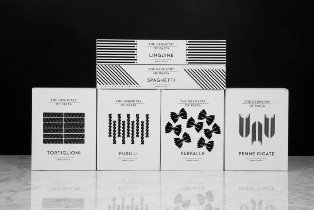
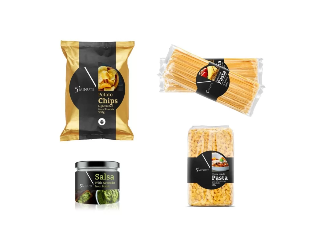
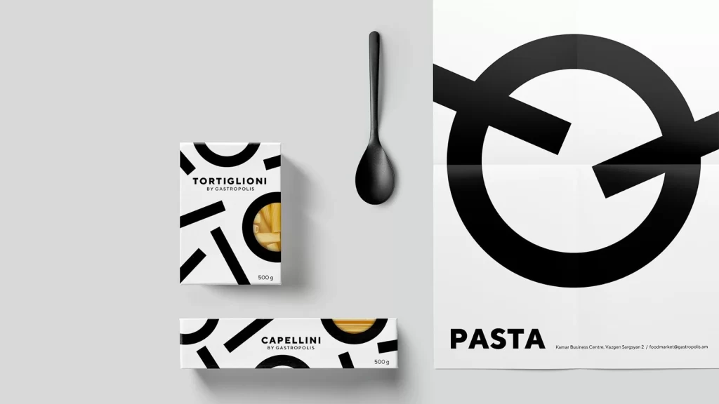
Black geometric shapes slash across white packaging for Tortiglioni and Capellini pasta, with bold sans-serif text identifying each variety by Gastropolis. A matte black spoon hangs vertically between the two boxes, while a large circular logo with a diagonal bar dominates the right side of the composition. Soft, even lighting illuminates the entire arrangement against a light gray surface, photographed from a direct overhead perspective that flattens the scene into clean graphic planes.
The visual language here relies on aggressive contrast between thick black strokes and negative white space, creating an almost architectural feel that feels distinctly modern rather than traditional Italian. Circular cutouts revealing the actual dried pasta inside break up the abstract pattern with organic texture, while the oversized branding element suggests this is part of a cohesive identity system meant to stand out on retail shelves. You can grab the full-resolution file at no cost if you want to study those line weights and typographic hierarchies up close.
Packaging designers working on premium food brands would mine this for ideas about how minimal color palettes can still convey luxury and confidence without decorative clutter. Art directors planning photoshoots might reference the precise object placement and shadow behavior when briefing photographers on similar product flat-lays. Students learning brand identity systems could analyze how the same graphic motif scales from small box fronts to large format posters while maintaining visual impact.