Pasta Corleone Blackwhite Yellow
DownloadTopics
Details
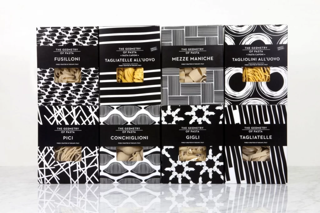
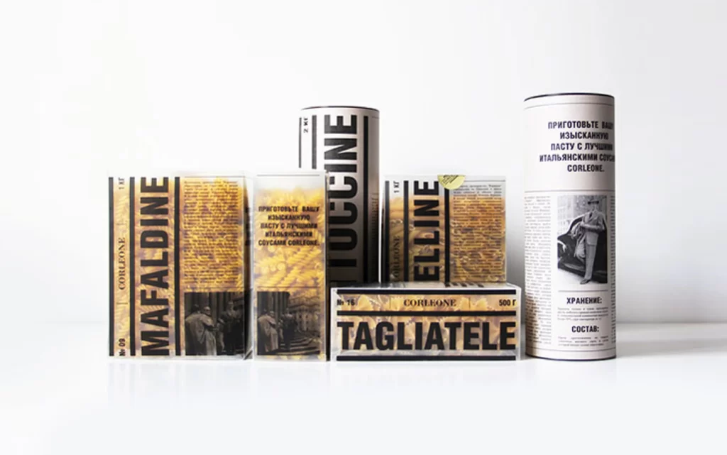
Six pasta packages and cylindrical containers stand in a loose row, their surfaces dominated by a strict palette of matte black typography, warm golden-yellow photographic textures, and off-white paper stock. Bold sans-serif lettering spells out MAFALDINE, FUSILLI, ELLINE, and TAGLIATELE across the front panels, while smaller Cyrillic cooking instructions and vintage black-and-white figure photographs occupy the remaining real estate. Soft directional lighting from the upper left casts gentle shadows to the right of each object, emphasizing the dimensional variance between flat rectangular boxes and rounded tubes against an uncluttered light-gray surface.
The visual tension arises from the collision of utilitarian pharmaceutical labeling aesthetics with artisanal food product conventions, creating a pseudo-medical or archival document feel that subverts typical grocery packaging expectations. Monochromatic portrait photography and dense text blocks interrupt the organic yellow grain patterns, establishing a rigorous grid system that feels simultaneously institutional and nostalgic. Designers can grab the full-resolution source file to study how restricted color palettes amplify typographic hierarchy without sacrificing legibility.
Brand identity developers working on premium dry-goods lines or boutique food packaging would mine this composition for its sophisticated balance of historical imagery and modernist type treatment. Art directors constructing mood boards for editorial spreads about Italian culinary culture might reference the specific way vintage portraiture integrates with ingredient photography. Print production specialists could also utilize this as a technical benchmark for evaluating how metallic inks and uncoated paper interact under studio lighting conditions.