Pasta Italian Yellow Packaging Traditional
DownloadTopics
Details
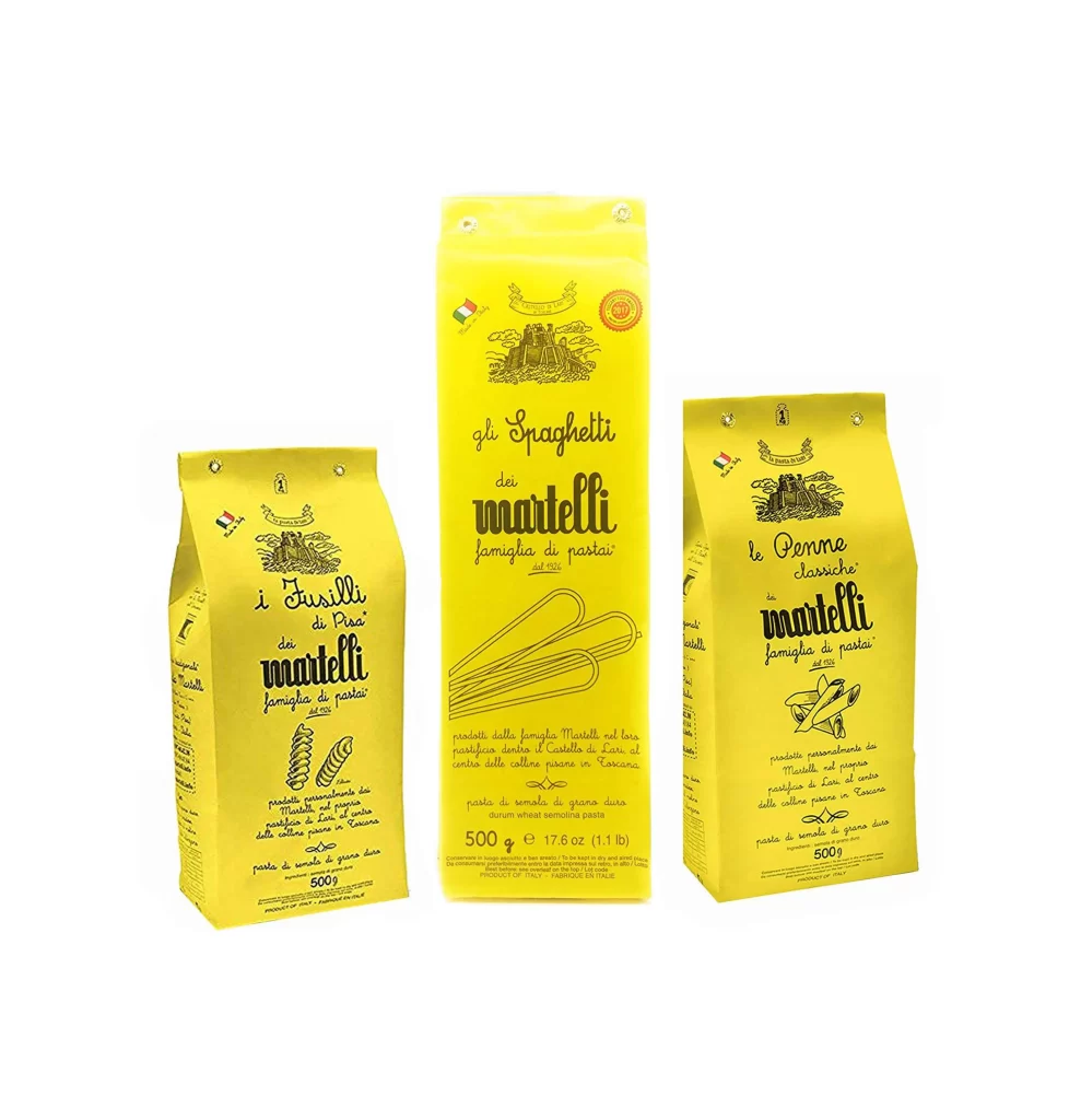
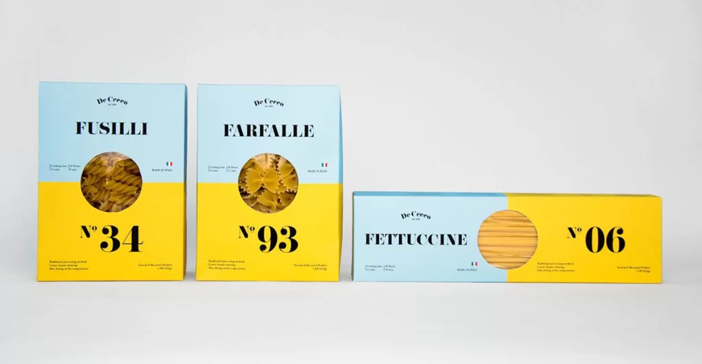
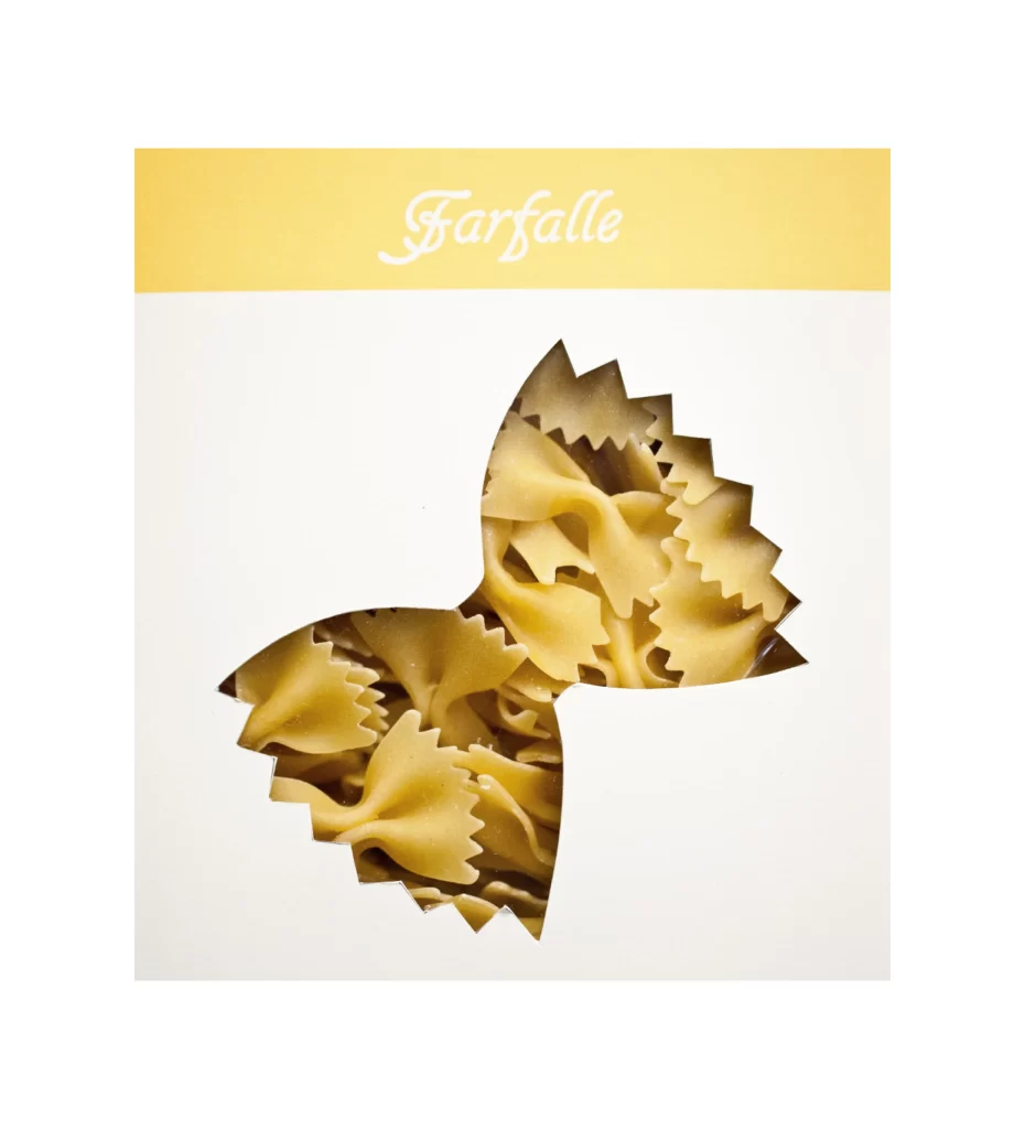
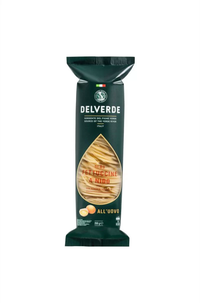
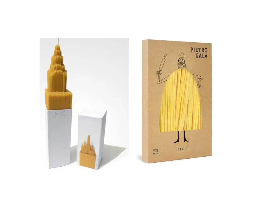
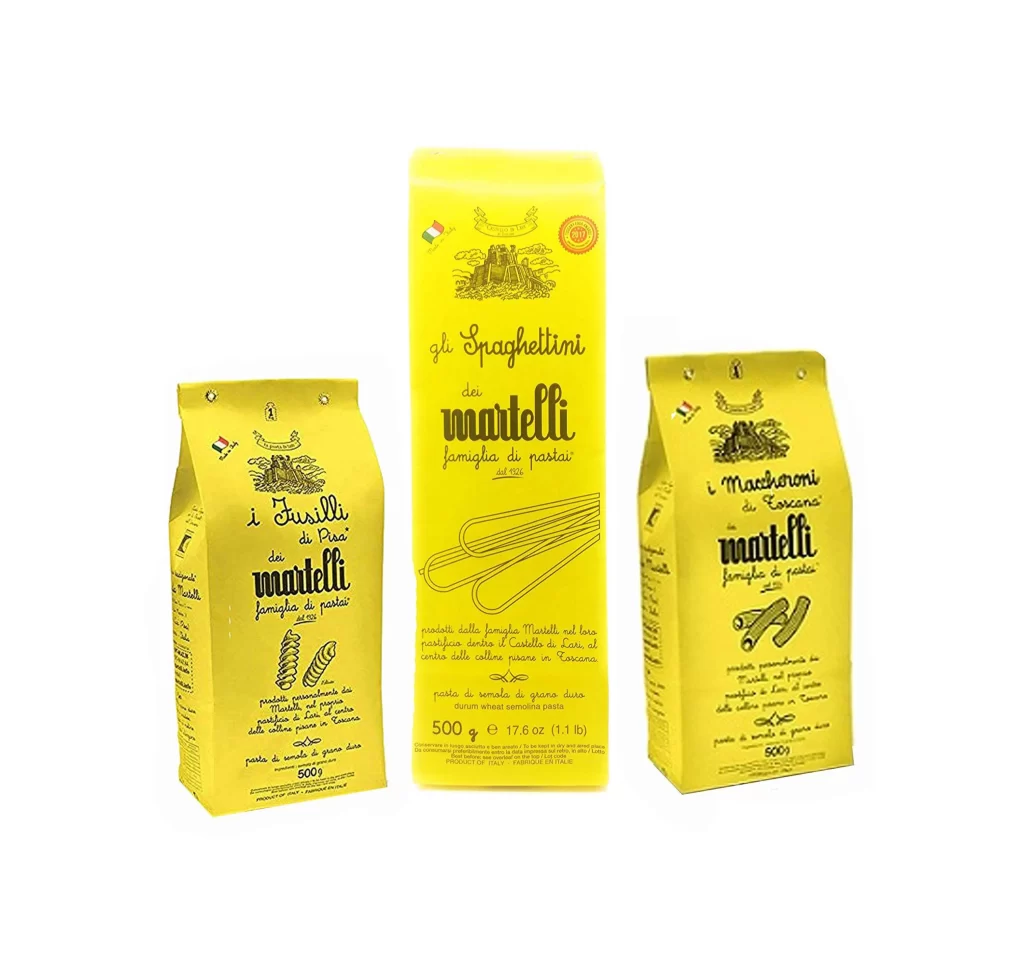
Three yellow pasta packages stand in a staggered arrangement, with the central rectangular box flanked by two taller gusseted bags. The packaging material has a matte, slightly textured finish in a warm golden-yellow hue, printed with dark charcoal or black typography and line-art illustrations. Visible text includes 'gli Spaghettini', 'i Fusilli', and 'i Maccheroni' alongside the brand name 'Martelli', all rendered in a mix of elegant cursive and serif fonts. The composition is shot from a straight-on camera angle under even studio lighting that eliminates harsh shadows while maintaining subtle depth across the paper surfaces.
The visual identity relies on a restrained palette of mustard-yellow substrate against monochromatic ink, creating high legibility without the distraction of photographic food imagery. Hand-drawn illustrations of the pasta shapes—spirals for fusilli, elongated strands for spaghetti, and curved tubes for maccheroni—provide immediate product recognition through minimalist graphic language. This particular iteration demonstrates how traditional Italian branding leverages negative space and typographic hierarchy to convey artisanal quality. Designers can access the full-resolution source file at no cost to study these specific print production details.
Packaging engineers studying sustainable paper-based food containers would find value in examining the structural differences between the center box and side pouch formats. Brand identity specialists working on heritage food products could analyze the interplay between vintage-style illustration and modern sans-serif weight distribution. Print production managers might reference the color separation between the yellow base and overprinted text to calibrate their own packaging runs. The image serves as a concrete case study for anyone developing retro-inspired grocery retail aesthetics.