Pasta Farfan Yellow Green Red Black
DownloadTopics
Details
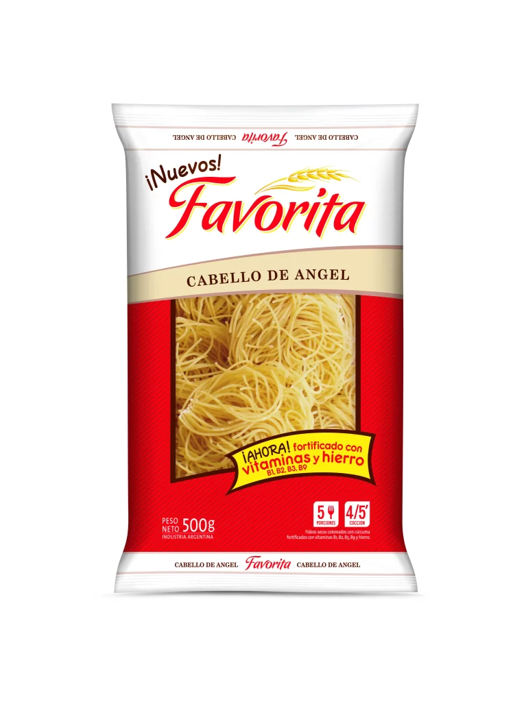
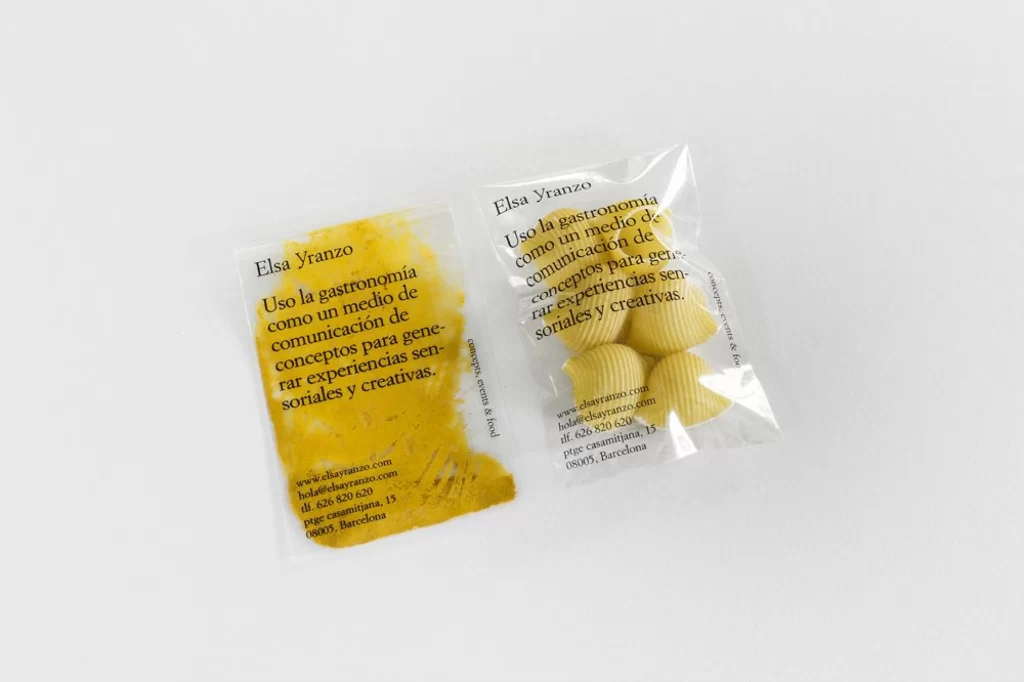
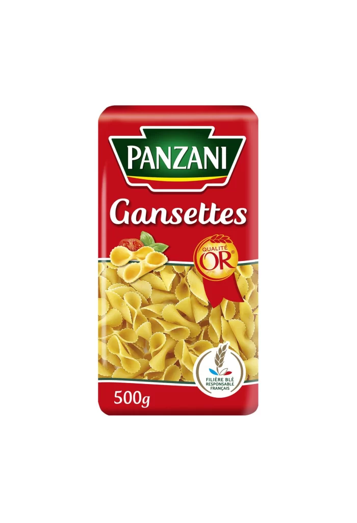
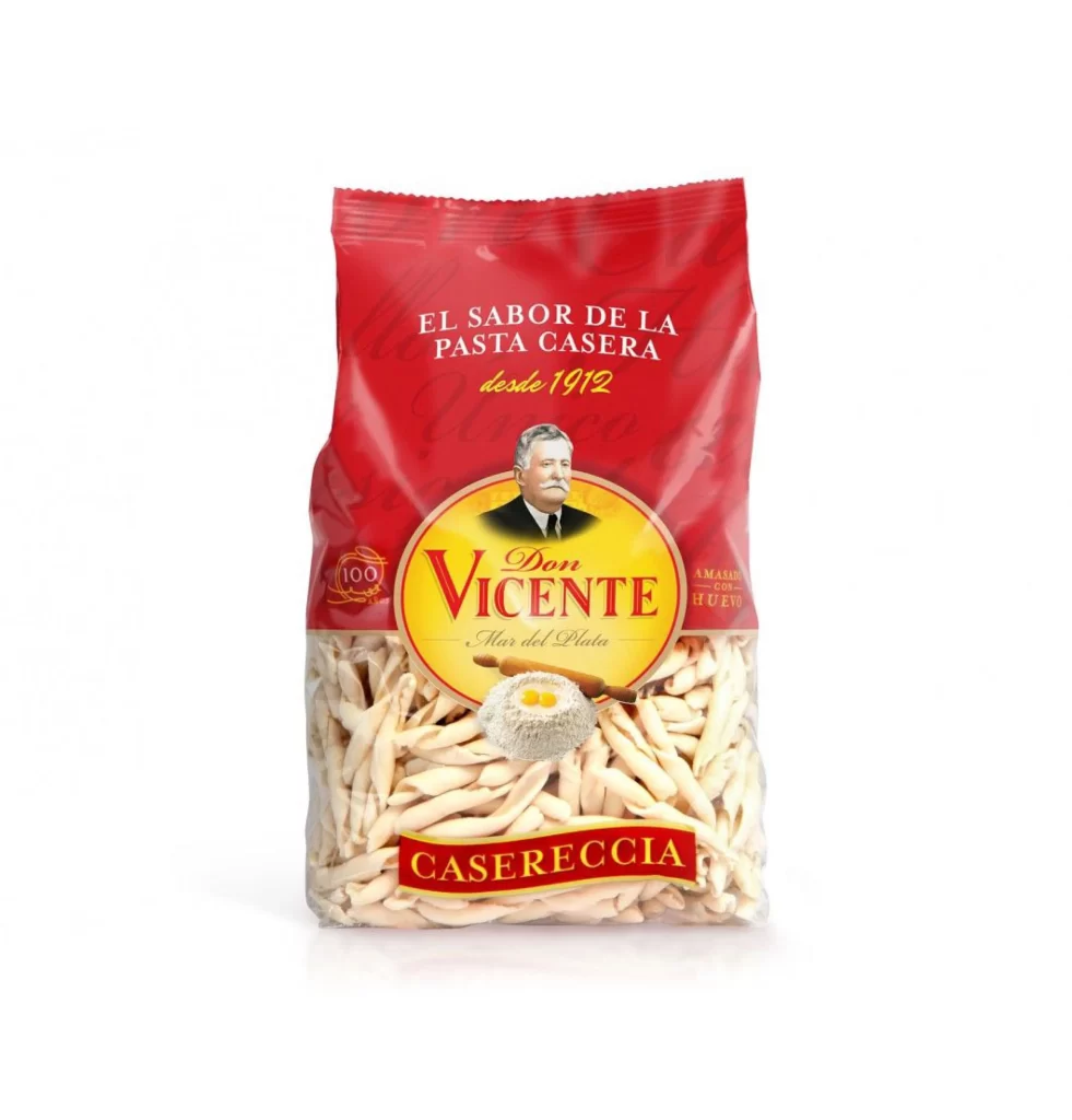
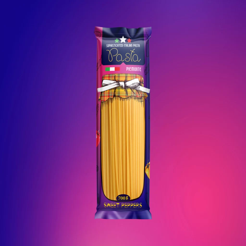
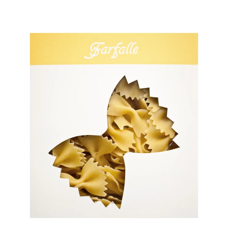
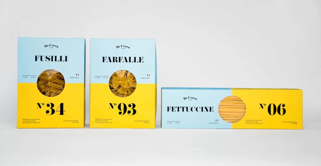
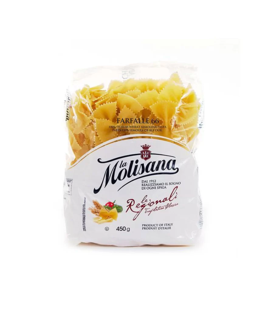
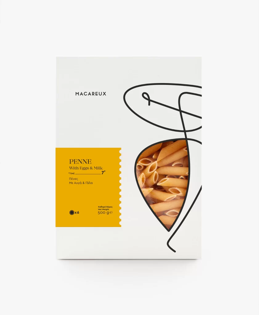
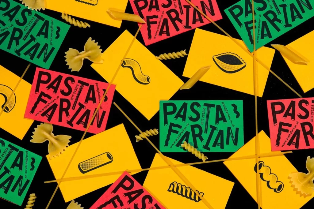
Vibrant yellow, emerald green, and hot pink cards scatter across a deep black surface, each bearing the bold 'PASTA FARIAN' logotype in chunky black lettering. Real dried pasta shapes—bow-tie farfalle, spiral fusilli, and long spaghetti strands—weave between the paper elements, creating a tactile contrast against the flat printed graphics. The composition captures everything from a slightly elevated angle, allowing bright even lighting to emphasize the matte texture of the cardstock alongside the glossy sheen of the actual noodles.
What makes this arrangement particularly compelling is the deliberate interplay between two-dimensional branding and three-dimensional food photography. The yellow cards feature minimalist line drawings of various pasta shapes that mirror the physical specimens scattered nearby, creating a clever visual dialogue between illustration and reality. Designers can grab the full-resolution file at no cost to study how these saturated primary colors pop against the dark void without losing legibility.
Packaging professionals developing artisanal food brands would find this layout invaluable for understanding how to balance typography with product photography in a crowded visual field. Social media managers crafting content for Italian restaurants or pasta shops could reference the dynamic scattering technique to make their feed feel energetic rather than static. Anyone building a mood board for a retro-inspired culinary project will appreciate how the 1970s color palette combines with modern sans-serif typefaces to create something that feels both nostalgic and fresh.