Pasta Fettuccine Soja Spaghetti Eco
DownloadTopics
Details
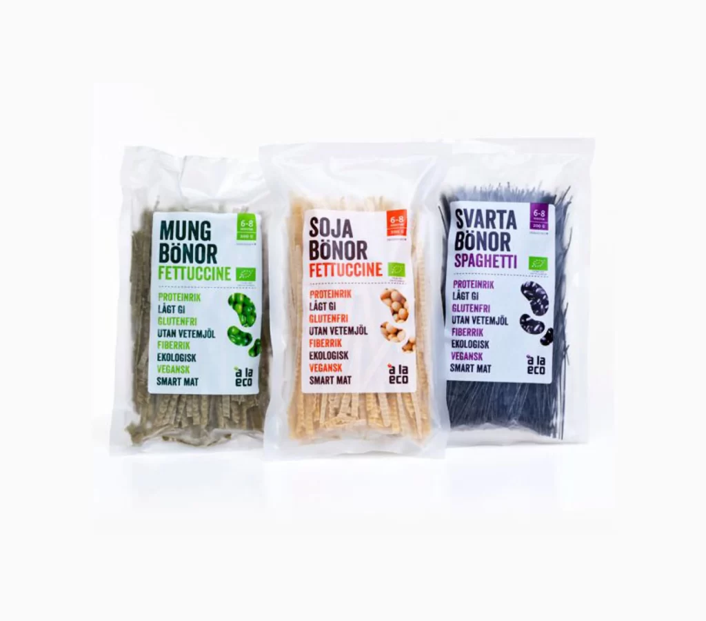
Three transparent plastic pouches of legume-based pasta stand in a row, each filled with noodles of a distinct natural hue. The left package contains olive-green mung bean fettuccine, the center holds tan soybean fettuccine, and the right encloses dark purple-black black bean spaghetti. White labels on each bag display bold Swedish product names—Mung Bönor, Soja Bönor, and Svarta Bönor—above smaller text listing attributes like proteinrik, lågt GI, glutenfri, and vegansk, with the brand 'a la eco' printed at the bottom.
Color coding organizes the visual hierarchy across the trio, with green, orange, and purple accents matching the pasta inside each respective bag. Small photographic icons of the raw beans appear beside the ingredient lists, creating a direct link between source and final product. The consistent typographic layout allows for quick comparison of nutritional claims while the varied pasta shapes—flat ribbons versus thin strands—offer textural contrast within a unified packaging system. Designers can grab the full-resolution file at no cost to study these labeling conventions up close.
Packaging designers studying Scandinavian food branding would find this arrangement useful for analyzing how health claims translate across multiple SKUs. E-commerce photographers might reference the even lighting and slight shadow placement when shooting similar dry-goods collections. Anyone building a mood board for plant-based product lines could pull specific color values from these earthy tones to ensure palette consistency across a range.