Pasta Makaroner Spaghetti Penne Rigate Pank Blue Orange
DownloadTopics
Details
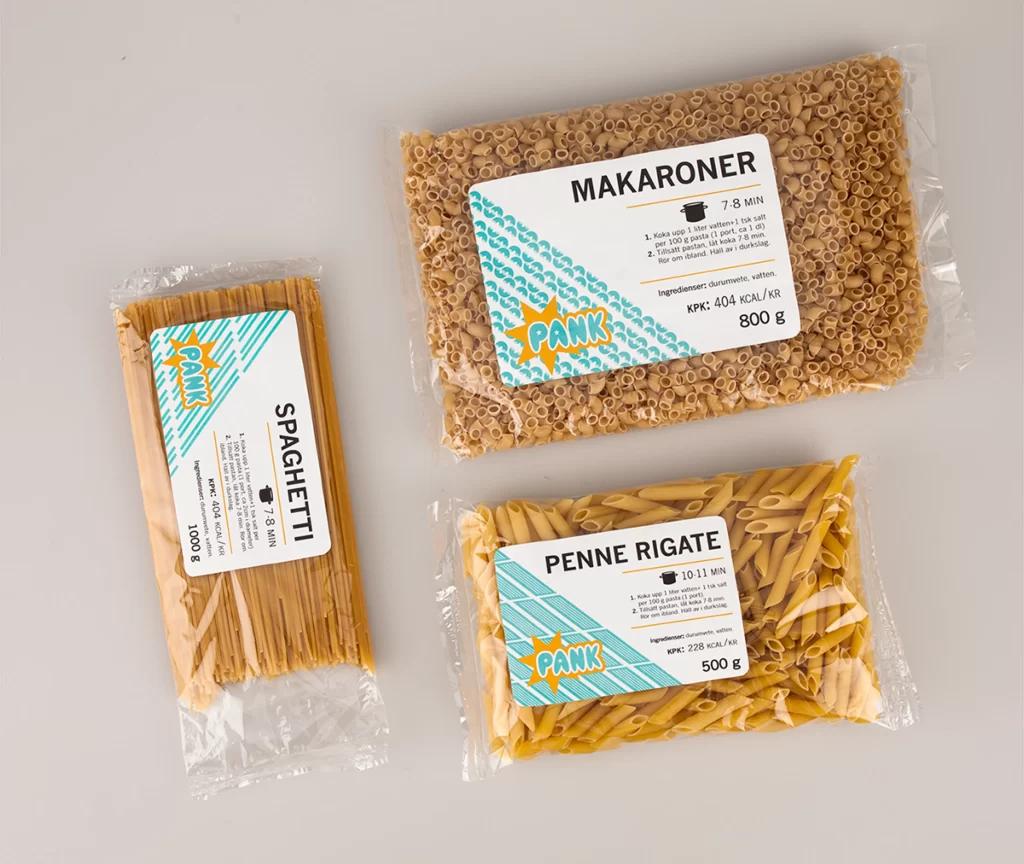
Three transparent plastic bags of dried pasta sit on a light gray surface, each bearing a white label with teal diagonal stripes and a bold orange starburst containing the word "PANK" in yellow. The top-right package holds 800g of small elbow macaroni labeled "MAKARONER" with a 7-8 minute cook time, while the left bag contains 1000g of long spaghetti strands marked "SPAGHETTI", and the bottom-right holds 500g of penne rigate tubes requiring 10-11 minutes to boil. Soft, even lighting illuminates the golden wheat tones of the pasta and the crisp black typography detailing nutritional information in Swedish, including kilocalorie counts per kilogram.
What sets this packaging apart is its playful yet systematic visual language that balances retro comic-book energy with clean Scandinavian minimalism. The repeating teal pattern shifts between wavy lines on the macaroni package and rigid diagonals on the spaghetti and penne labels, creating subtle variety while maintaining brand cohesion across different pasta shapes. Designers studying this mockup will appreciate how the saturated orange burst acts as an anchor point that draws the eye immediately to the brand name without overwhelming the essential cooking instructions printed below.
Food photographers and packaging students can study the way light interacts with both the matte pasta surfaces and the glossy plastic film wrapping. Brand identity teams developing product lines might use these layouts as a starting point for their own label systems, particularly when needing to accommodate varying text lengths across different package sizes. Anyone building a mood board for artisanal grocery branding will find the full-resolution file ready to grab from the resource library for closer inspection of typographic hierarchy and color balance.