Pasta Prima Spaghetti yellow spaghetti Packaging
Topics
Details
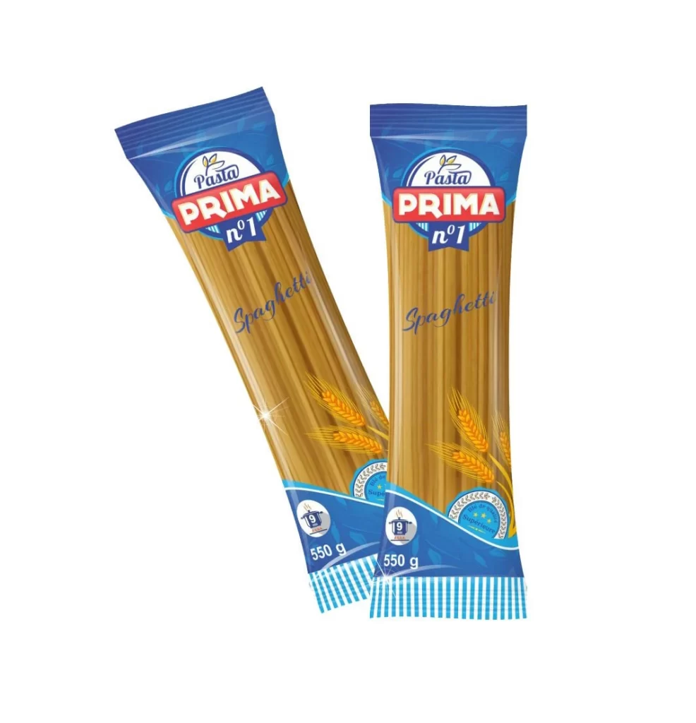
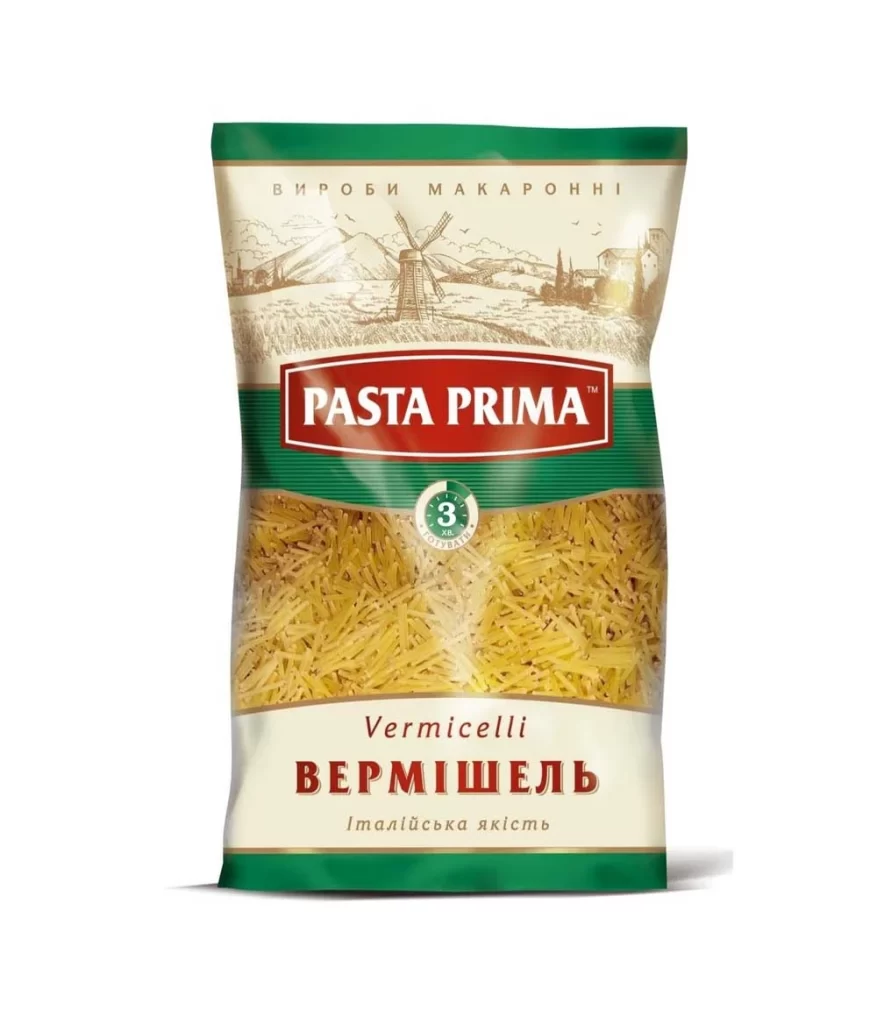
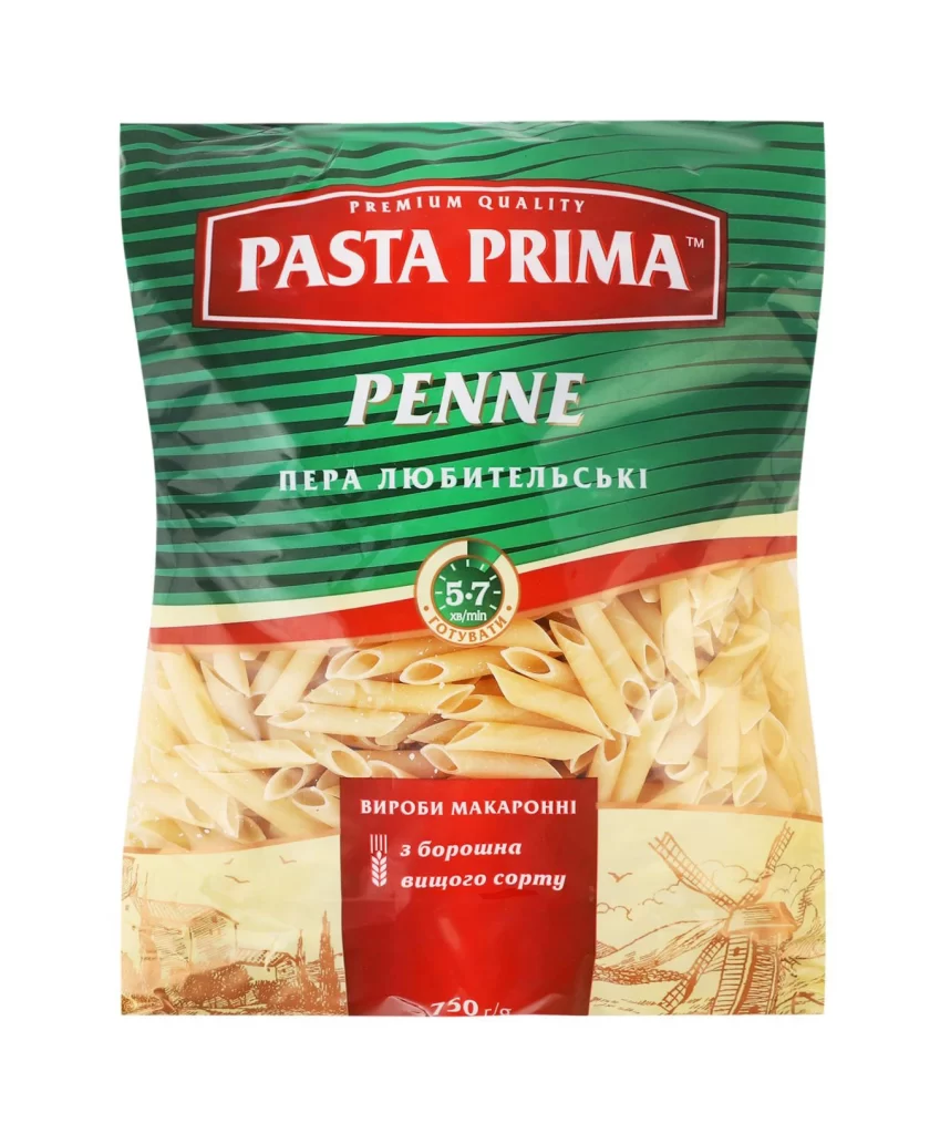
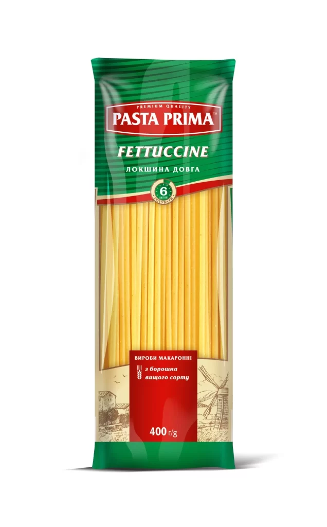
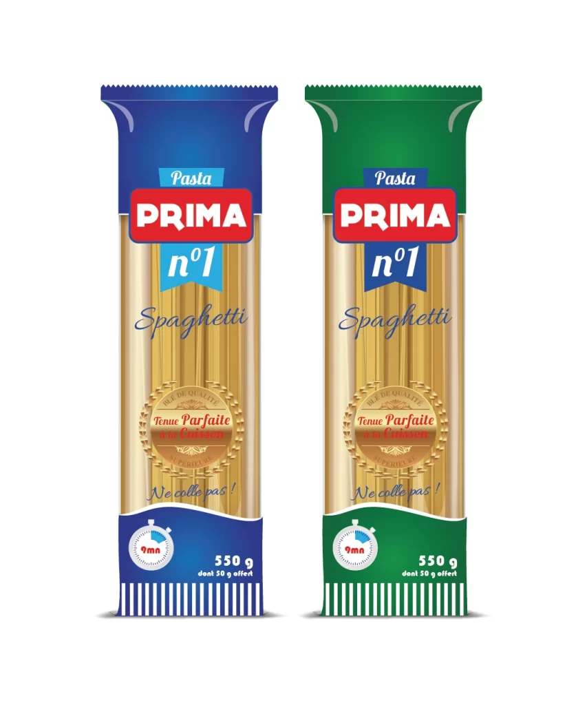
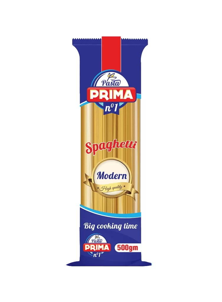
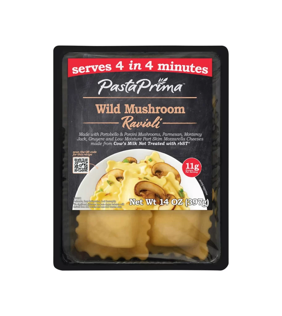
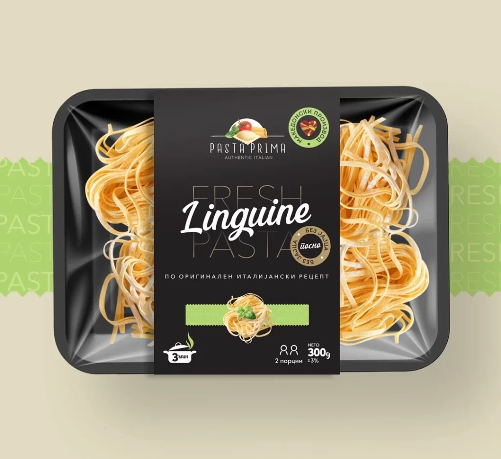
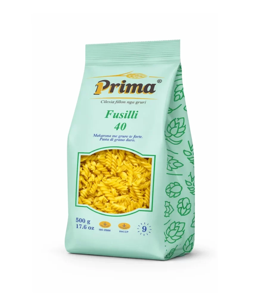
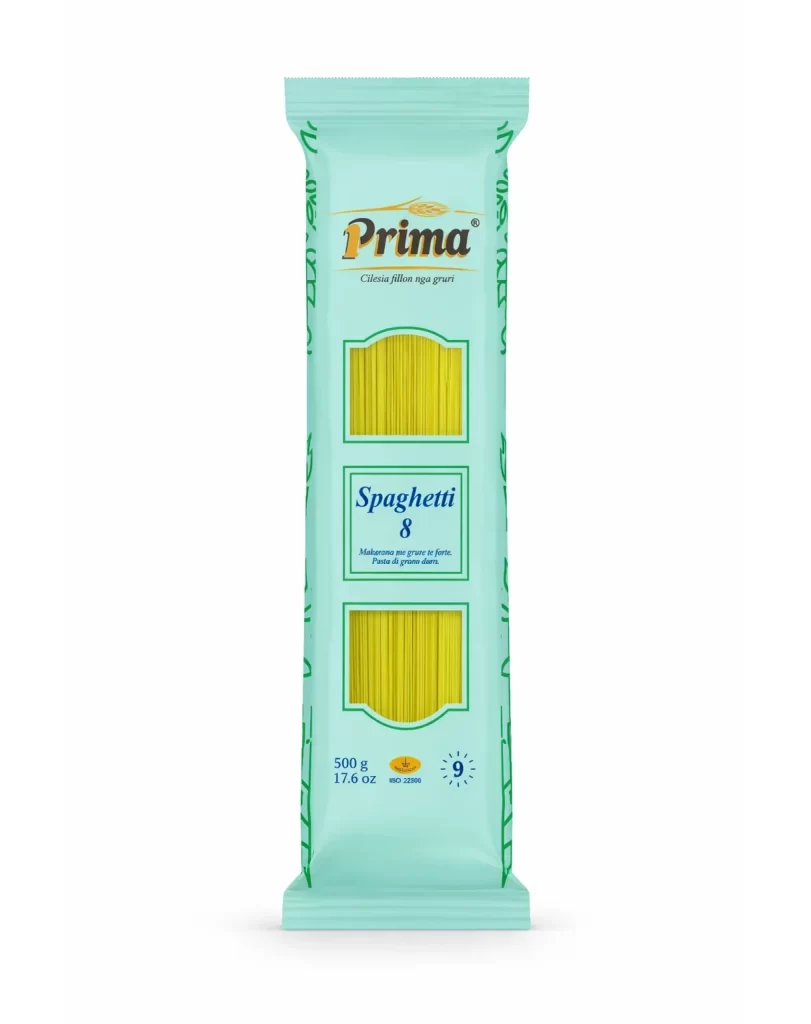
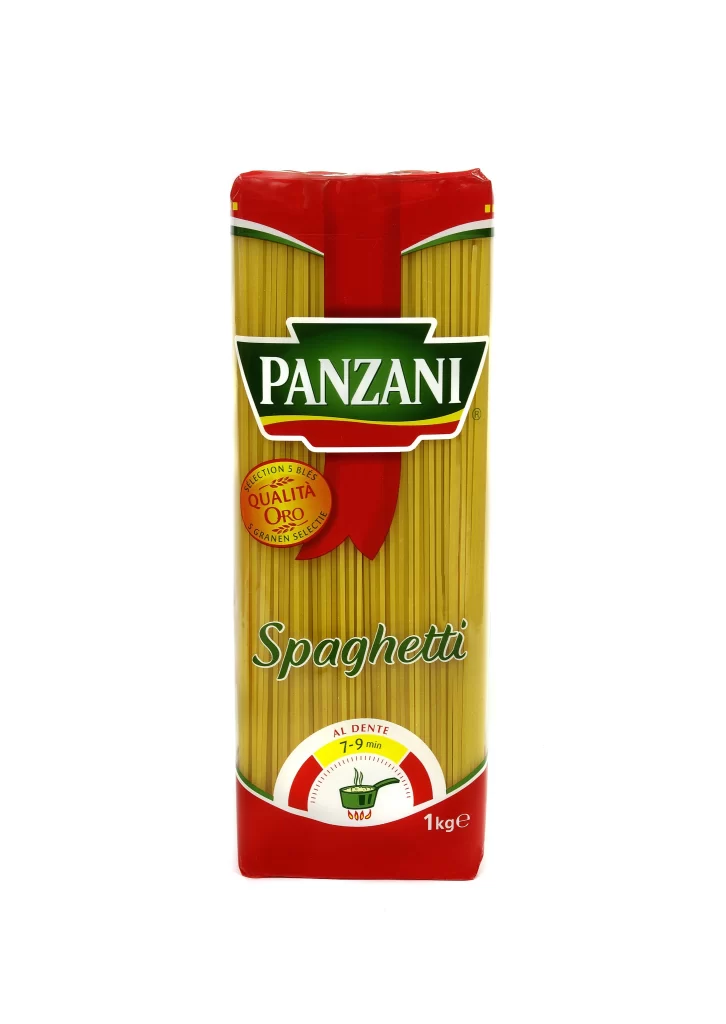
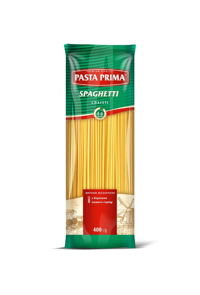
A vertical Pasta Prima spaghetti package dominates the view with a deep forest green header featuring subtle diagonal ribbing. A bold crimson banner anchors the upper third, housing the brand name in white serif lettering, while 'SPAGHETTI' appears below in clean white sans-serif type above the Cyrillic translation 'СПАГЕТТИ'. The lower two-thirds reveal pale golden pasta strands visible through clear packaging, with a red bottom label indicating 400g weight and Ukrainian text describing premium durum wheat semolina.
Visual hierarchy relies on the striking contrast between the saturated green and red zones, creating immediate brand recognition through color blocking rather than complex illustration. The transparent section serves dual functionality, allowing product verification while breaking up the solid color fields with organic linear textures of the pasta itself. Notable is the inclusion of a small circular cooking time indicator and a delicate windmill sketch in the lower corner, adding narrative elements that suggest traditional Italian craftsmanship without overwhelming the primary commercial messaging.
Packaging designers analyzing FMCG retail strategies would examine this layout for its efficient use of vertical real estate and bilingual typography integration. Brand identity specialists might reference the color palette consistency when developing premium food product lines requiring cross-market appeal. Marketing teams could deconstruct the information architecture to understand how cooking instructions and ingredient claims are prioritized within limited label space on mass-market dry goods.