Pasta Prima Spaghetti Fresh Pasta Packaging
Topics
Details
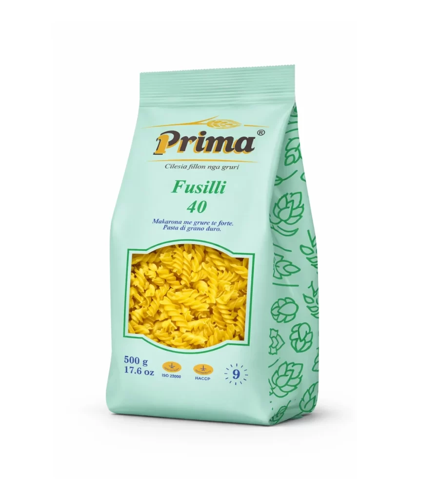
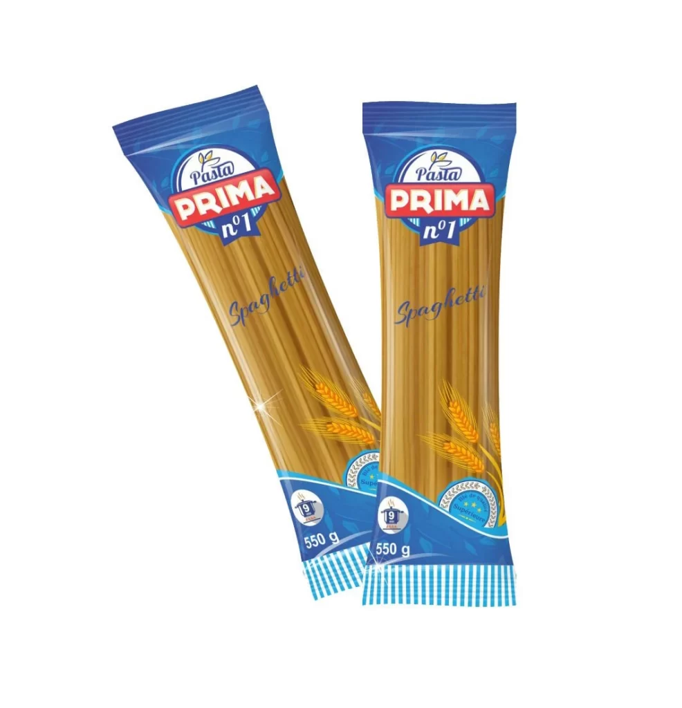
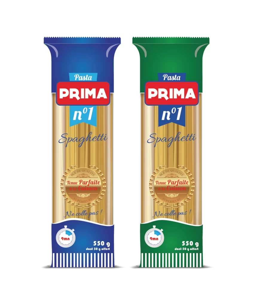
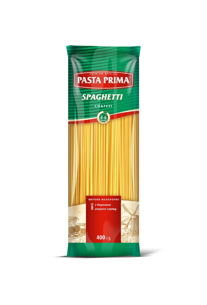
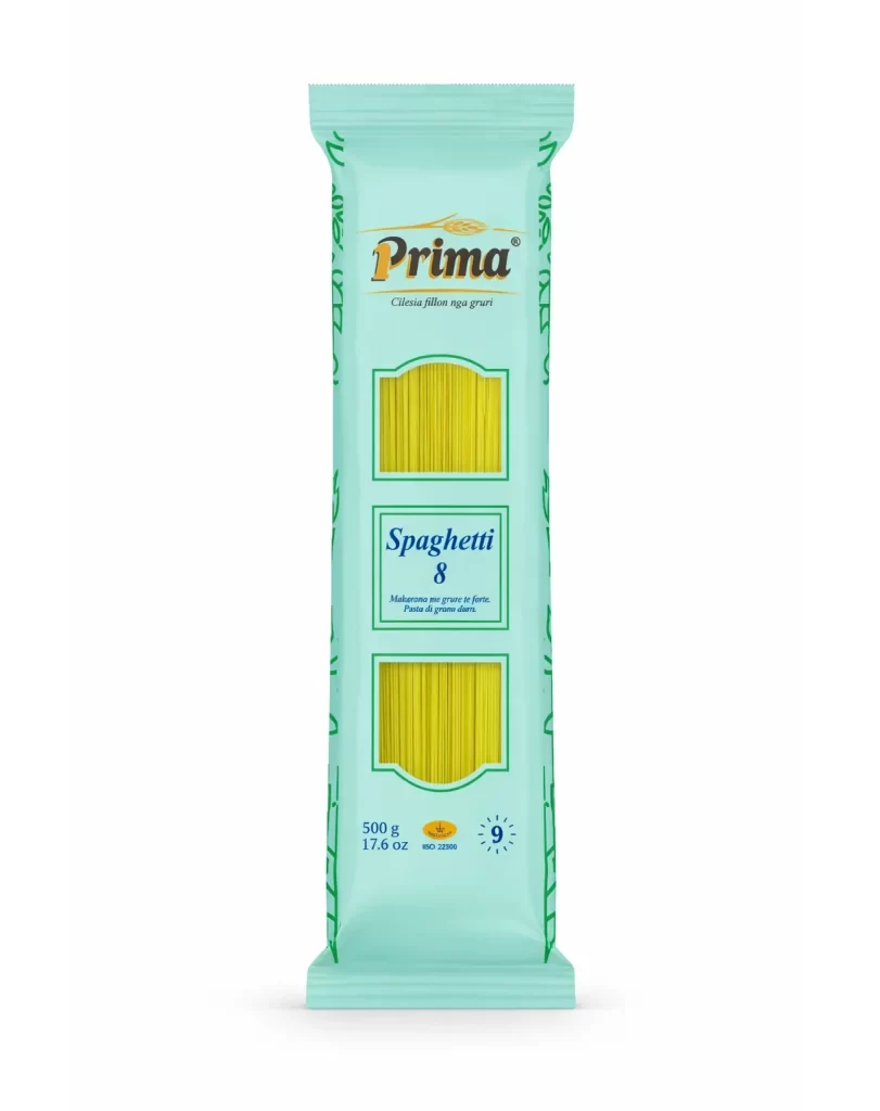
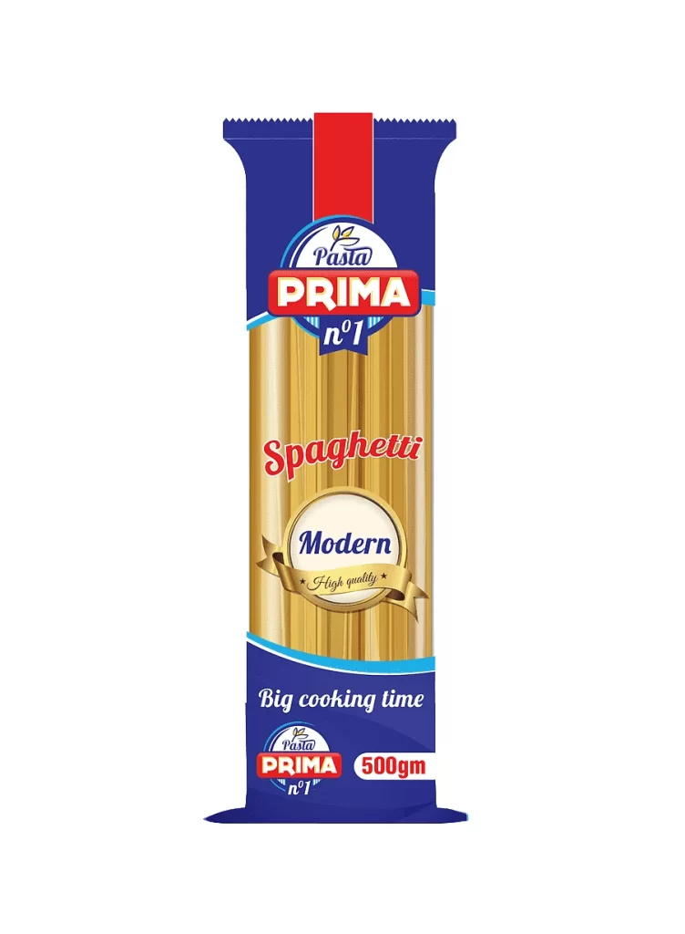
A vertical, rectangular package of Prima brand spaghetti stands centered against a stark white background, showcasing a deep navy blue wrapper with a serrated top edge and a bold red vertical stripe. The central transparent window reveals long, golden-yellow pasta strands, while the upper portion features the brand name 'PRIMA' in white serif lettering inside a red rounded rectangle, topped by 'Pasta' in script. Below this, 'Spaghetti' appears in red cursive, followed by an oval gold badge containing the word 'Modern' and a ribbon inscribed with 'High quality', with 'Big cooking time' and '500gm' noted at the bottom.
Visual hierarchy is established through the strategic layering of typographic styles, contrasting the authoritative block letters of the brand name against the fluid, handwritten quality of the product descriptor. The inclusion of the 'Modern' seal and the specific mention of cooking time suggests a marketing approach that emphasizes both contemporary branding and practical culinary information. Color blocking between the royal blue background, crimson accents, and the natural wheat tone of the pasta creates a classic yet vibrant commercial aesthetic typical of mid-range grocery staples.
Food packaging analysts might examine this composition to study how transparency is utilized to display product density and texture without opening the container. Brand identity specialists could reference the specific arrangement of badges and ribbons to understand how premium cues are integrated into mass-market goods. Additionally, retail merchandisers may use this visual to assess shelf-presence strategies, specifically looking at how vertical orientation and high-contrast color palettes draw the consumer's eye in a crowded aisle environment.