Pasta Prima Spaghetti Pasta Packaging
Topics
Details
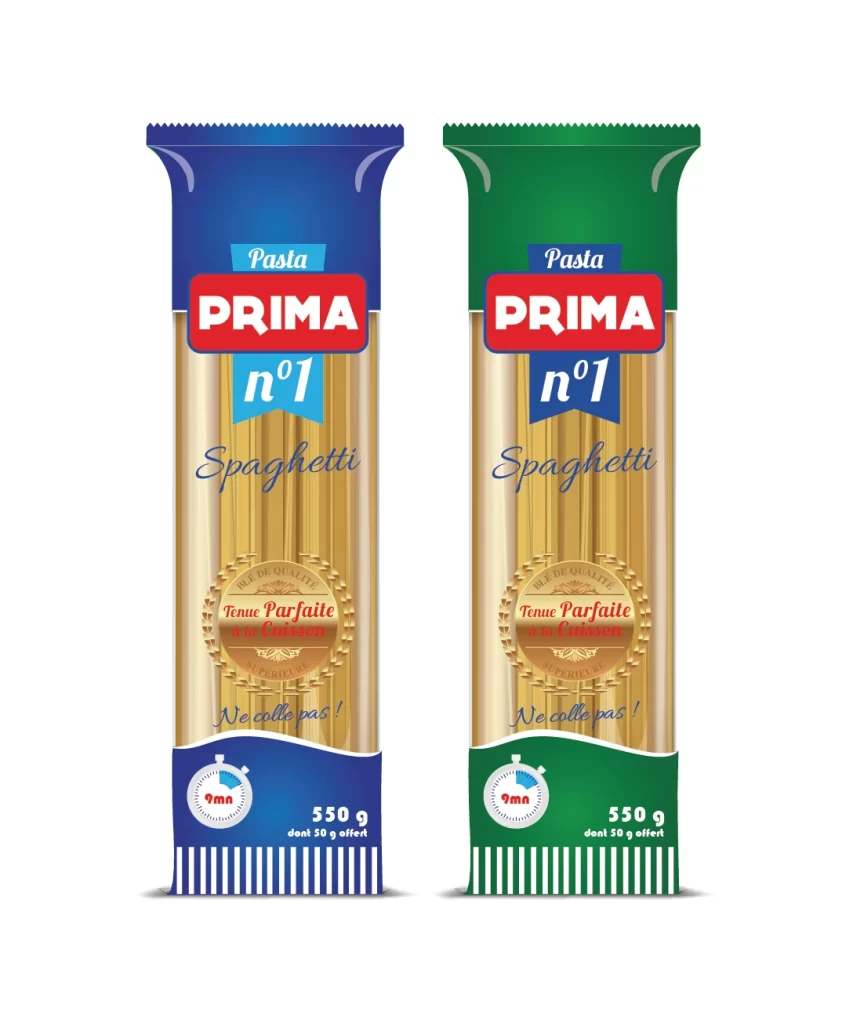
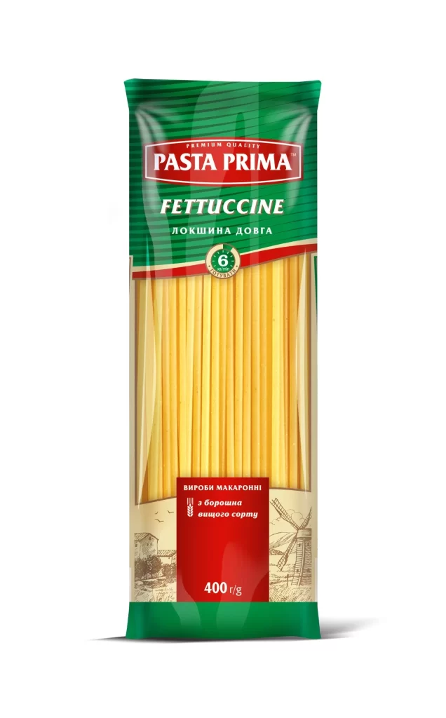
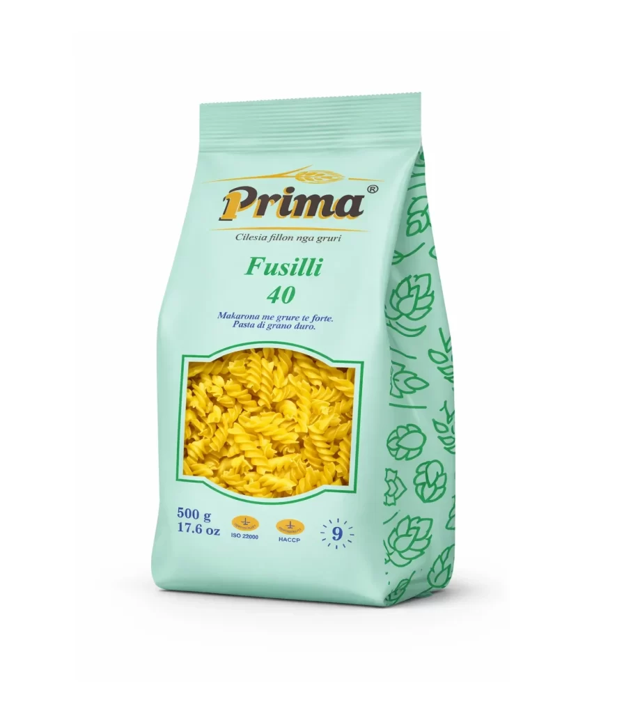
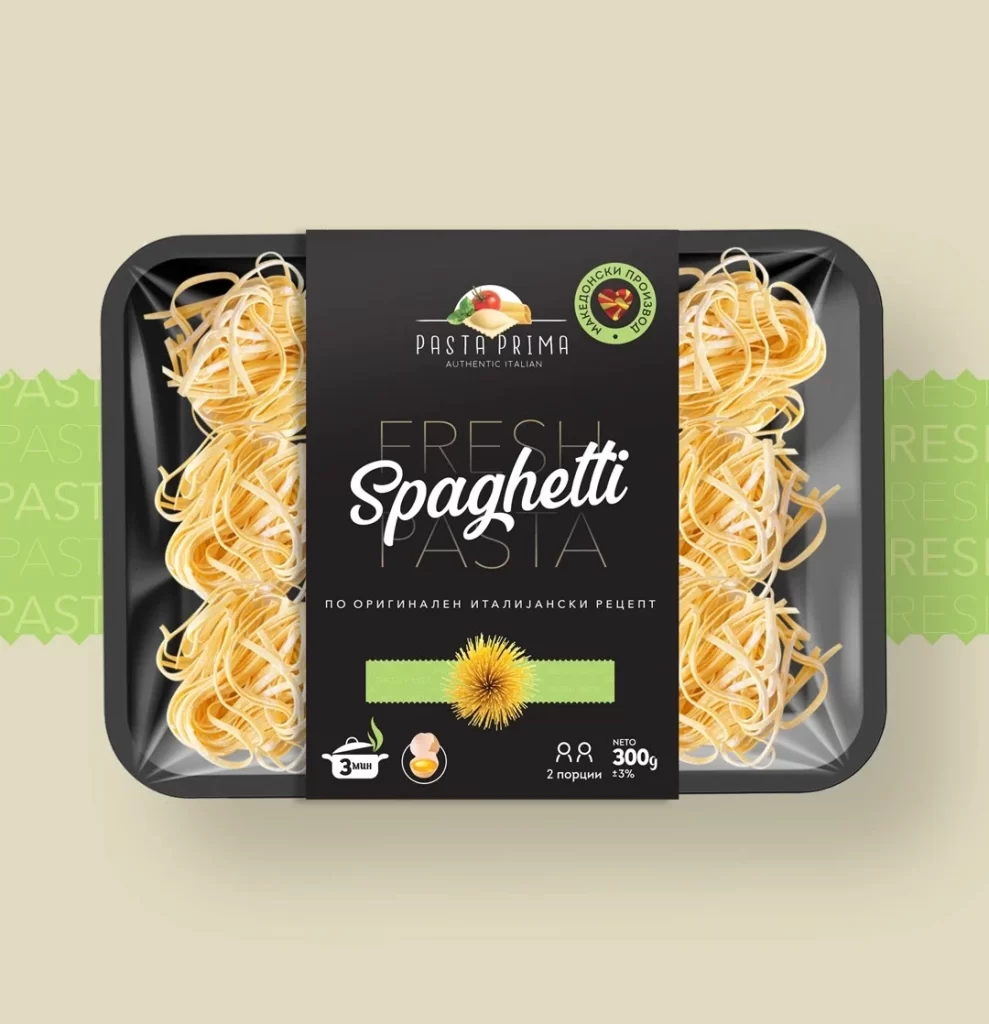
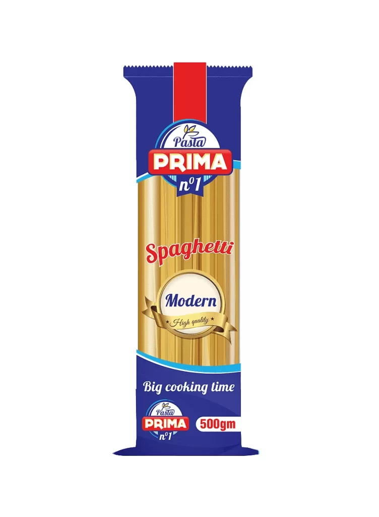
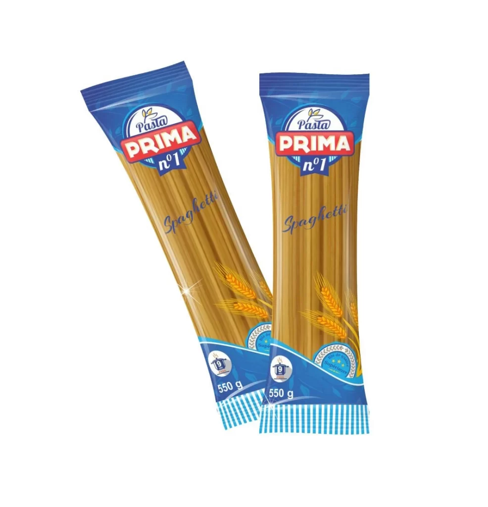
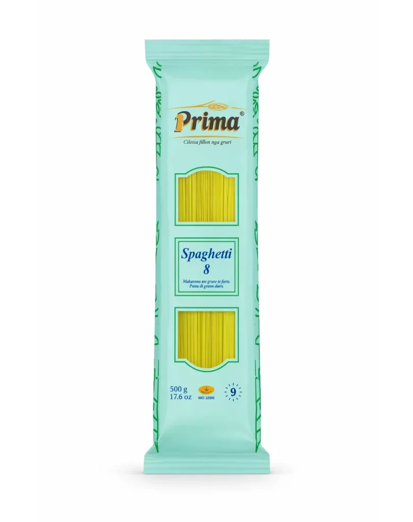
A vertical pouch of Prima brand spaghetti commands the center of the frame with a soft, mint-green hue and a clean rectangular silhouette sealed at both ends. Subtle dark green botanical line-art runs vertically along the edges of the packaging, while the bold serif 'Prima' logotype dominates the upper third. The design features two windows displaying golden-yellow pasta strands alongside the product name 'Spaghetti 8' in blue script.
Visual interest is derived from the striking contrast between the cool, clinical teal background and the warm, organic yellow of the dried noodles visible through the die-cut frames. The typographic hierarchy is strictly organized, utilizing a mix of elegant script for the brand name and a sturdy sans-serif for the specific ‘Spaghetti 8’ designation and weight information. Furthermore, the inclusion of technical data points—such as the 500g mass, ISO 22000 certification mark, and a cooking time indicator—grounds the aesthetic in functional utility, creating a balance between commercial branding and consumer transparency.
Brand strategists analyzing market positioning in Eastern Europe would find this artifact useful for deconstructing color psychology in food retail packaging. Students of industrial design could utilize this composition to study how negative space and vertical orientation influence shelf-presence and legibility. Additionally, illustrators seeking to understand the integration of realistic photography within vector-based graphic frameworks would benefit from examining the precise alignment of the pasta imagery relative to the surrounding border elements.