Pasta Prima Wild Mushroom Fresh Pasta Packaging
Topics
Details
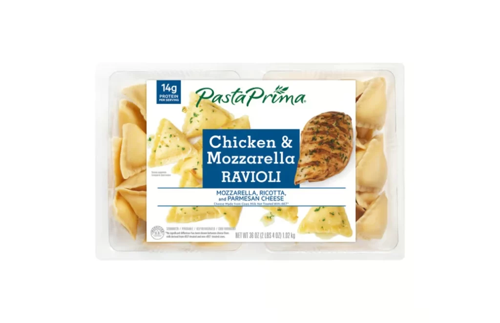
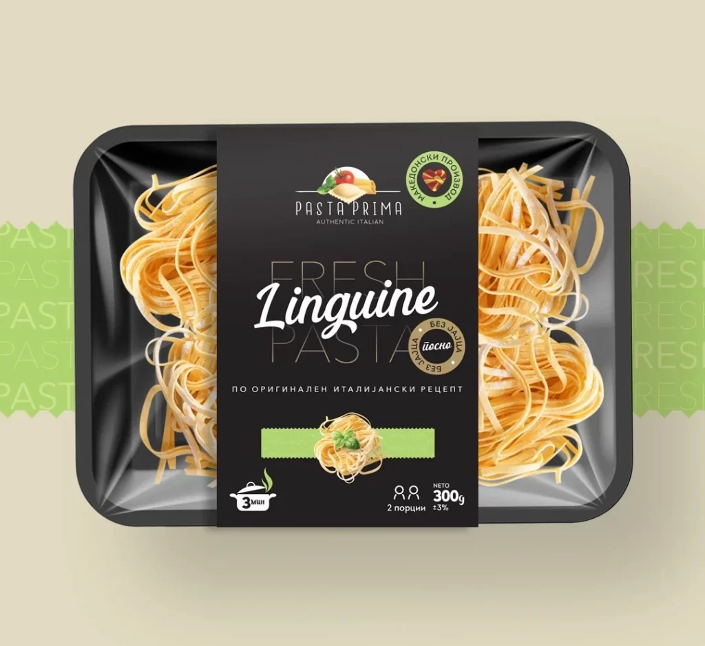
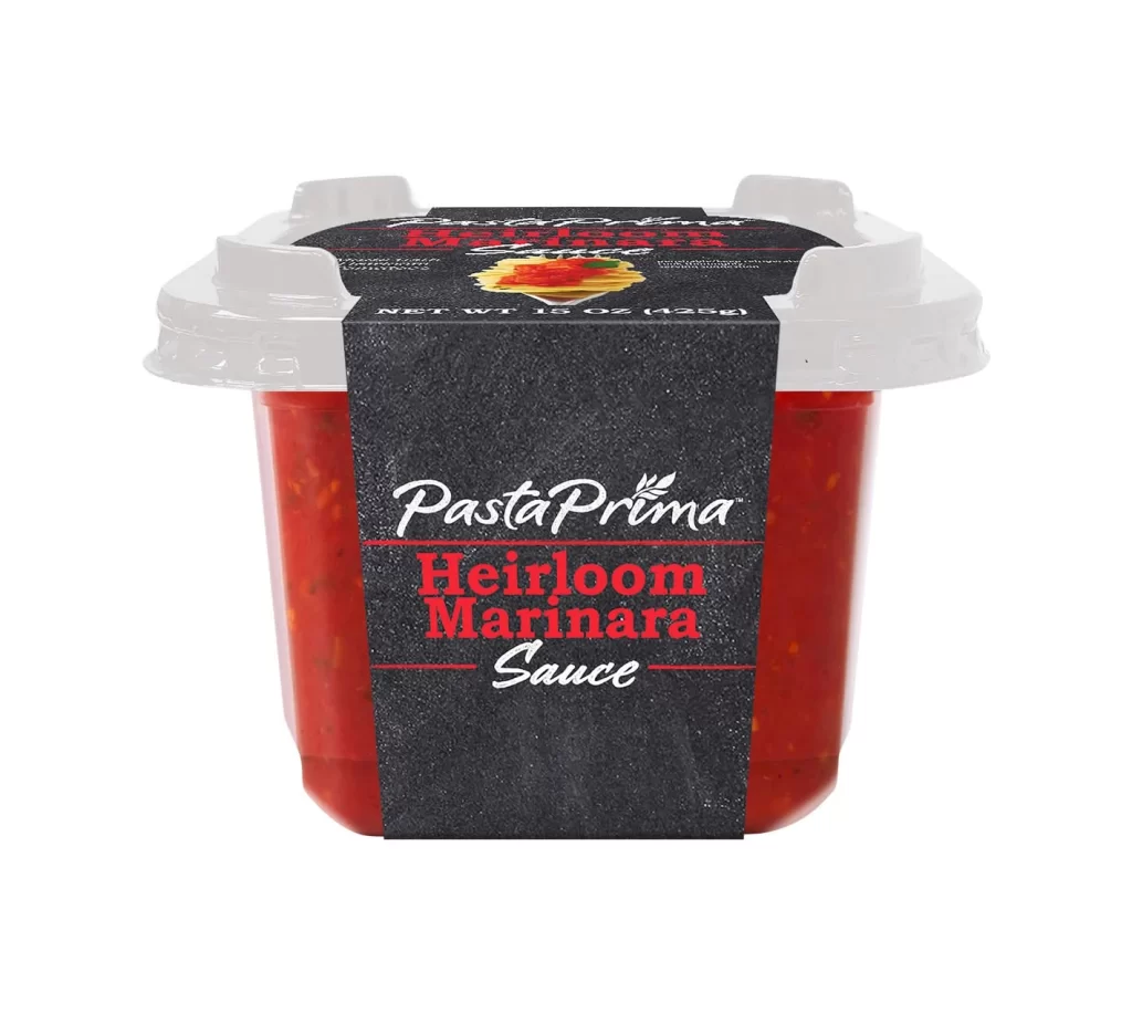
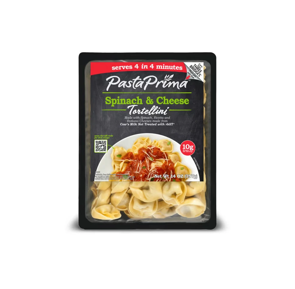
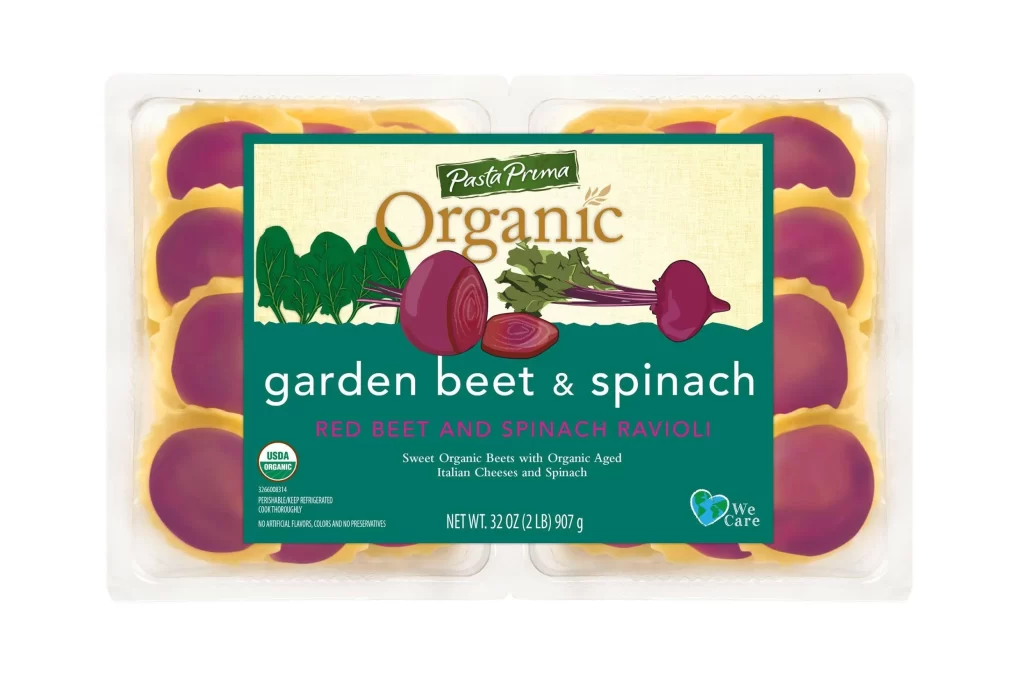
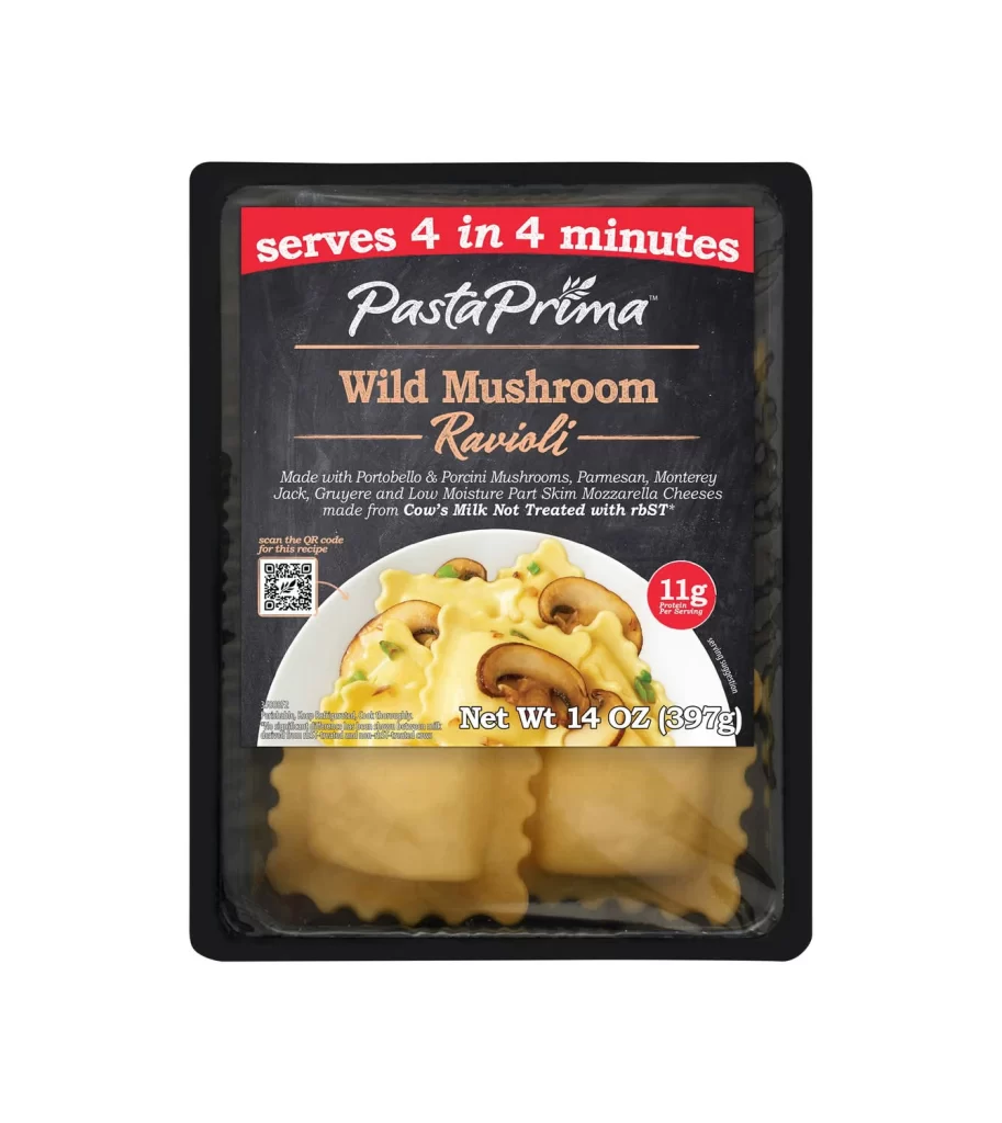
A rectangular black plastic tray containing the Pasta Prima Wild Mushroom Ravioli package sits on a white surface, photographed from a direct frontal perspective that emphasizes the label's graphic hierarchy. The upper portion of the packaging features a deep charcoal background dominated by a bold red banner proclaiming "serves 4 in 4 minutes" in white sans-serif type, positioned above the brand name.
Visual distinction emerges from the sophisticated interplay between the rustic chalkboard aesthetic of the dark upper panel and the transparent window revealing the pale golden pasta beneath. The typographic contrast creates immediate readability, balancing the urgency of the red promotional banner with the refined copper serif fonts used for the flavor designation. Such deliberate color blocking—crimson, charcoal, and cream—guides the eye efficiently from cooking convenience to gourmet appeal, while the inclusion of a scannable QR code and rbST-free certification adds layers of modern utility to traditional packaging cues.
Food photographers might study the lighting techniques used to highlight the glossy sauce texture without creating harsh reflections on the plastic film. Brand strategists could analyze how the layout balances regulatory text with appetite appeal, particularly the strategic placement of the protein claim near the hero image. Packaging engineers would benefit from examining how the clear lower section allows product visibility while maintaining structural integrity for frozen goods, offering lessons in material transparency and consumer trust-building through visual honesty.