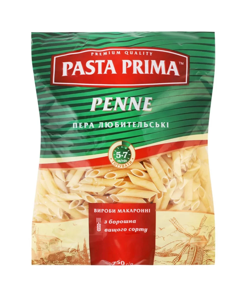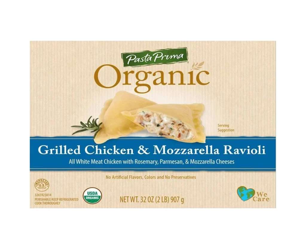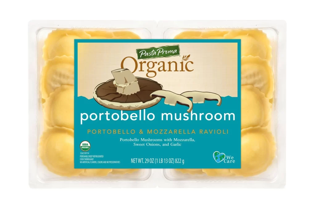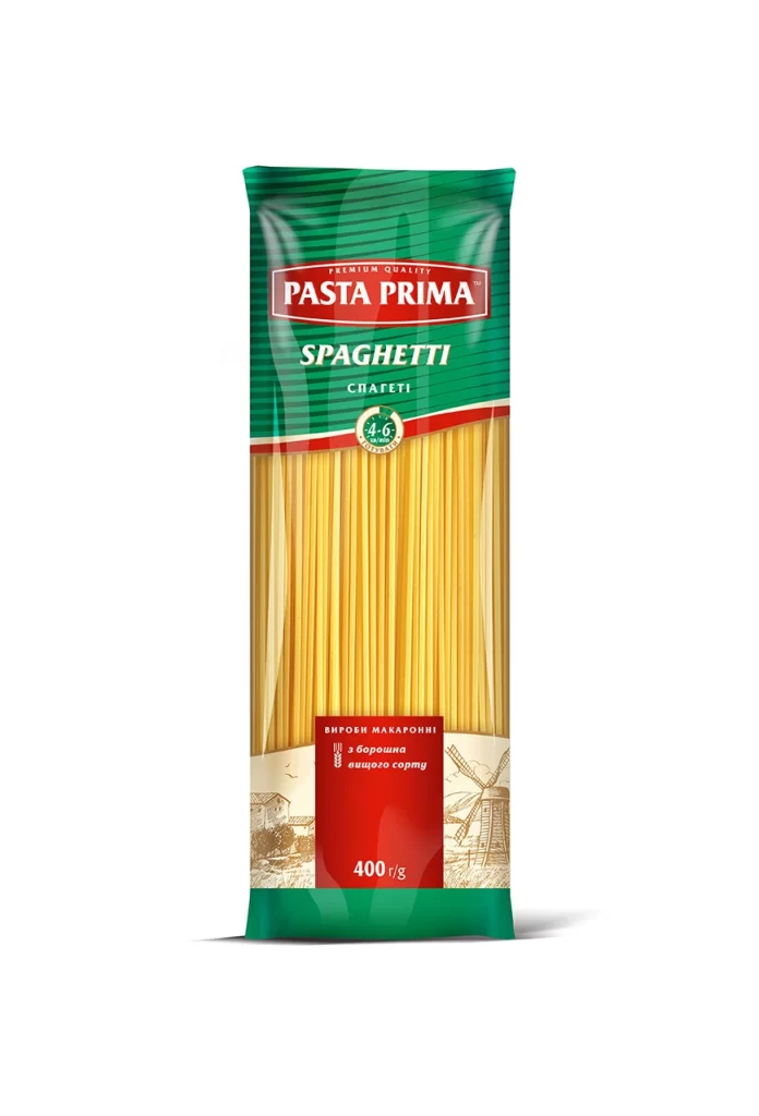
Pasta Prima Fresh Penne Yellow Fresh Pasta Packaging
Topics
Details
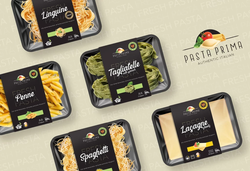
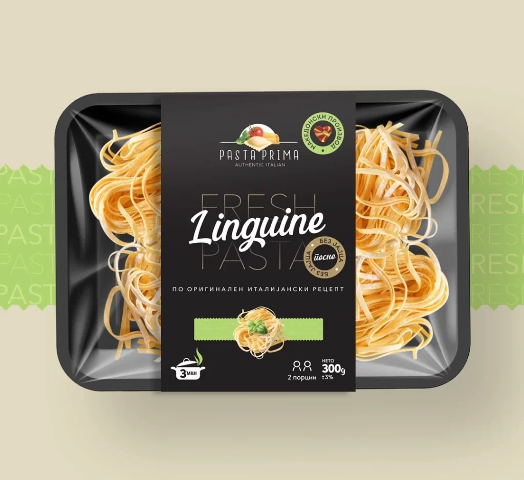
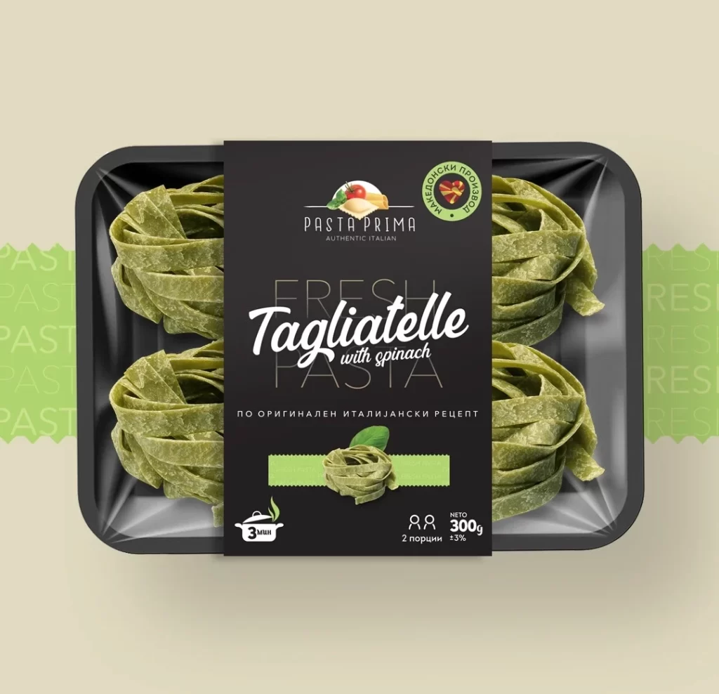
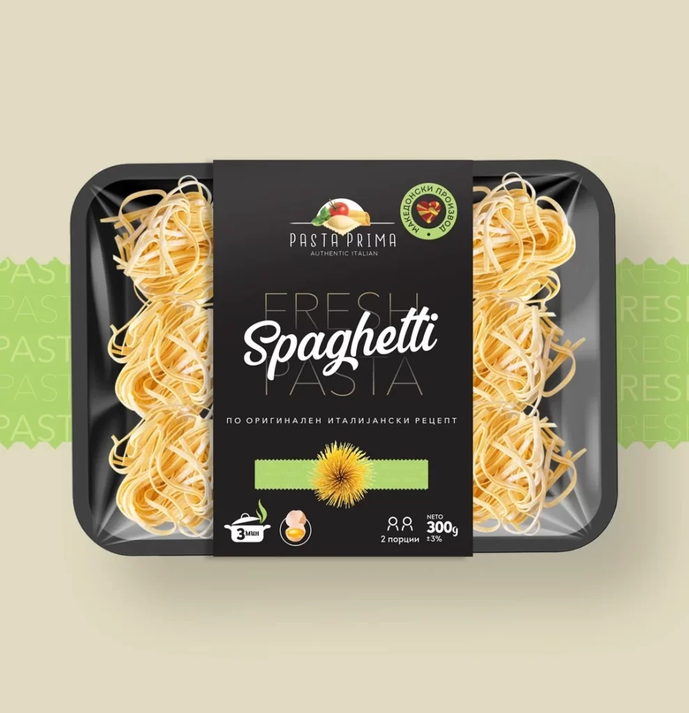
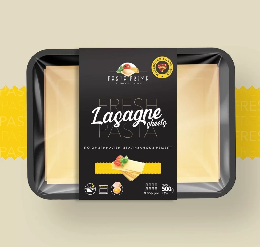
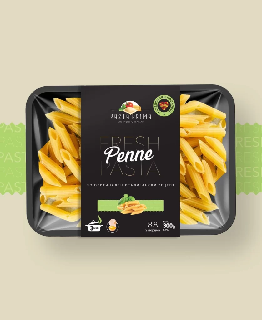
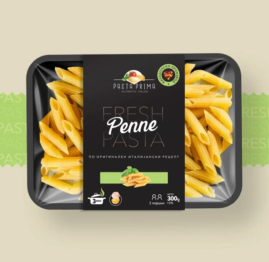
A black plastic tray containing fresh yellow penne pasta sits beneath a clear film that reveals the pasta on both the left and right sides. A dark charcoal label spans the center, displaying 'PASTA PRIMA' and 'AUTHENTIC ITALIAN' above large 'FRESH Penne PASTA' lettering in mixed serif and script fonts, with Cyrillic text reading 'ПО ОРИГИНАЛЕН ИТАЛИЯНСКИ РЕЦЕПТ' positioned below. The packaging rests on a pale cream backdrop accented by green patterned side panels.
Visual distinction emerges from the sophisticated contrast between the matte black packaging substrate and the vibrant golden-yellow pasta tubes peeking through glossy transparent windows. Typography creates hierarchy through weight variation, with delicate outlined letters framing the bold white cursive ‘Penne’ that draws immediate focus. Green graphical elements—including a basil leaf illustration and a quality seal with heart iconography—provide organic accents that break the dark palette while signaling freshness and artisanal positioning.
Brand developers studying premium refrigerated food packaging can examine how this layout balances transparency with branded real estate for messaging. Packaging engineers might reference the structural relationship between the rigid tray base and the sleeve label when designing similar fresh pasta containers. Marketing teams could analyze the multilingual labeling approach and iconographic system for communicating cooking instructions across different consumer markets.